Skip to content
Art & Craft
Paint Color
DIY Guide
Home Decor
Furniture
Exterior Design
Art & Craft
Paint Color
DIY Guide
Home Decor
Furniture
Exterior Design
February 5, 2025
Recent
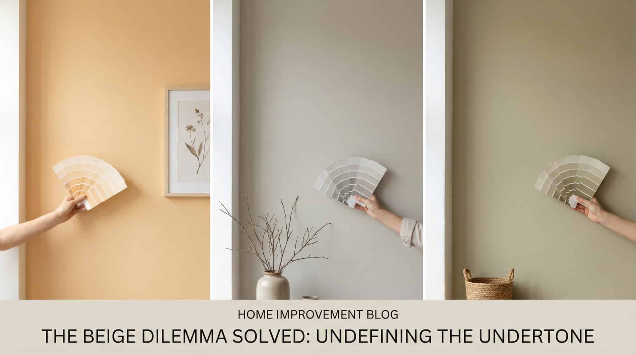
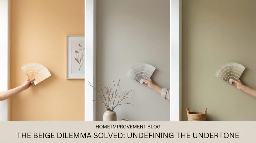
Beige Paint Undertones: Spot Warm, Cool, and Green
Michelle Anderson
Read
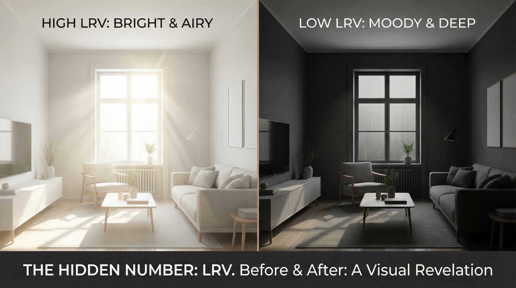
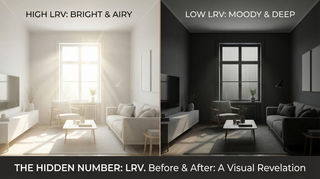
LRV In Paint: How Light Reflectance Value Affects Rooms
Michelle Anderson
Read
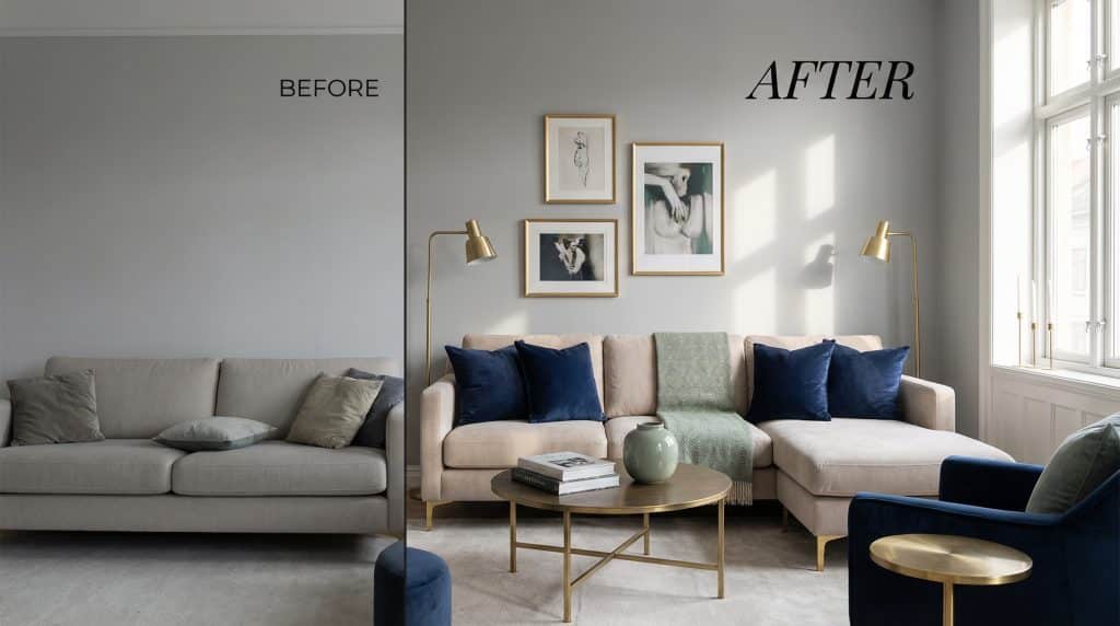
Accent Colors For Gray And Beige Rooms By Undertones
Ava Rodriguez
Read
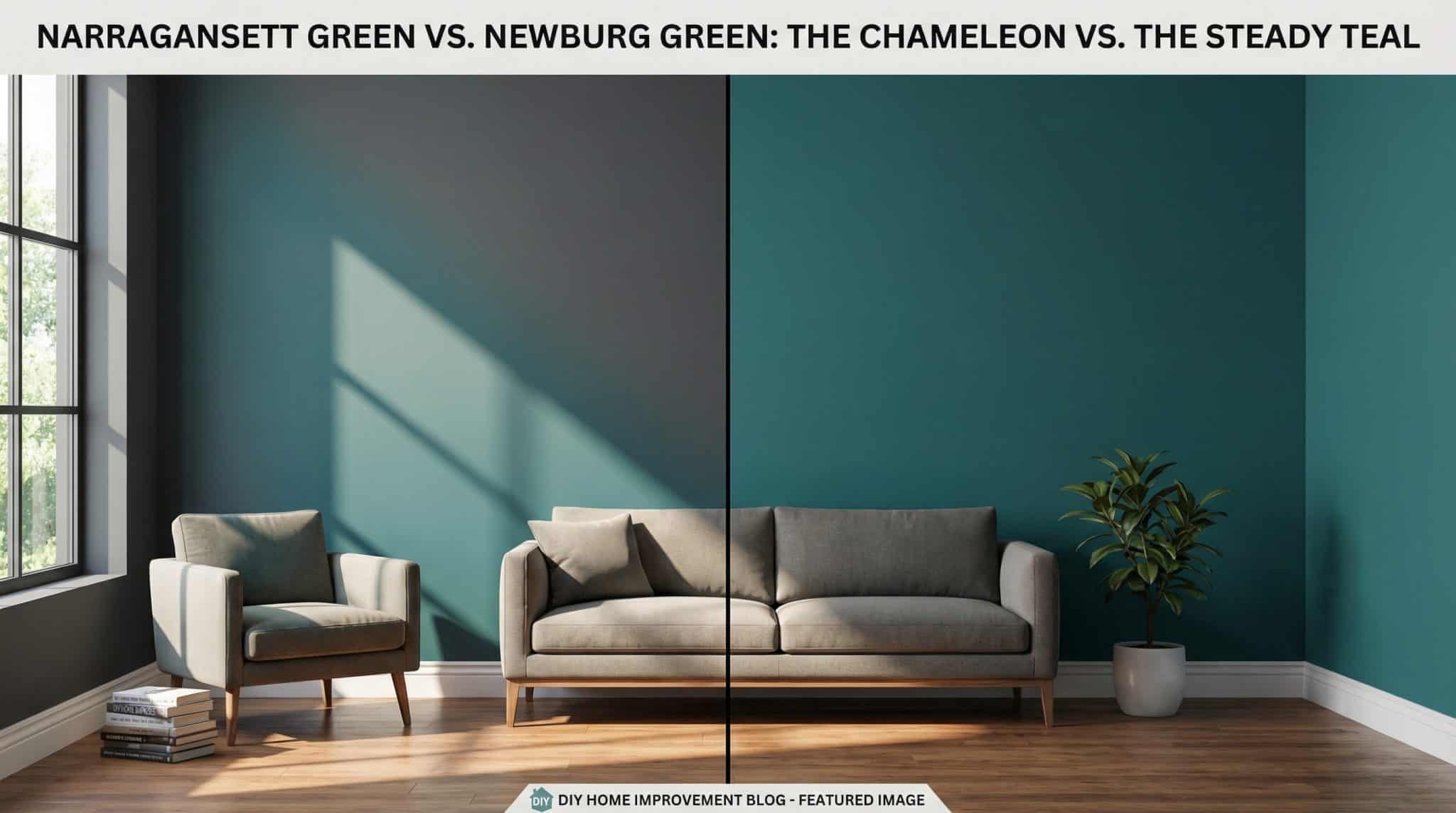
Newburg Green vs Narragansett Green: How They Shift
Michelle Anderson
Read
Beige Paint Undertones: Spot Warm, Cool, and Green
Michelle Anderson
Read
LRV In Paint: How Light Reflectance Value Affects Rooms
Michelle Anderson
Read
Accent Colors For Gray And Beige Rooms By Undertones
Ava Rodriguez
Read
Newburg Green vs Narragansett Green: How They Shift
Michelle Anderson
Read
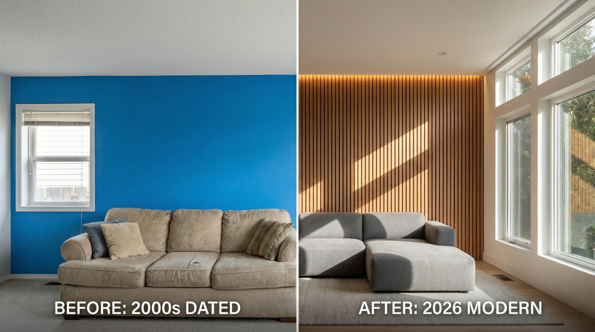
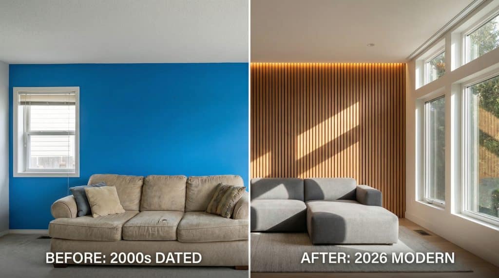
Accent Walls In 2026: What’s Dated And What Works
Michelle Anderson
Read
Beige Paint Undertones: Spot Warm, Cool, and Green
Michelle Anderson
Read
LRV In Paint: How Light Reflectance Value Affects Rooms
Michelle Anderson
Read
Accent Colors For Gray And Beige Rooms By Undertones
Ava Rodriguez
Read
Newburg Green vs Narragansett Green: How They Shift
Michelle Anderson
Read
Accent Walls In 2026: What’s Dated And What Works
Michelle Anderson
Read
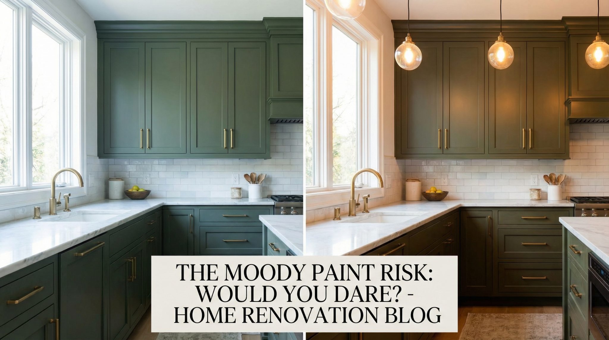
Rock Garden Kitchen Cabinets: Pros, Cons, And Tips
Madison Taylor
Read
Read more
Rock Garden Kitchen Cabinets: Pros, Cons, And Tips
by
Madison Taylor
Read 8 min
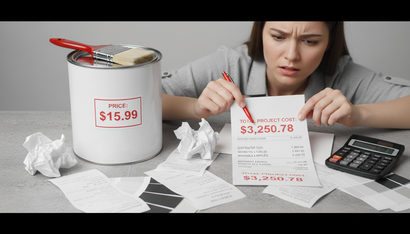
Paint Cost Per Gallon: Budgeting, Coverage, Hidden Costs
by
Michelle Anderson
Read 8 min
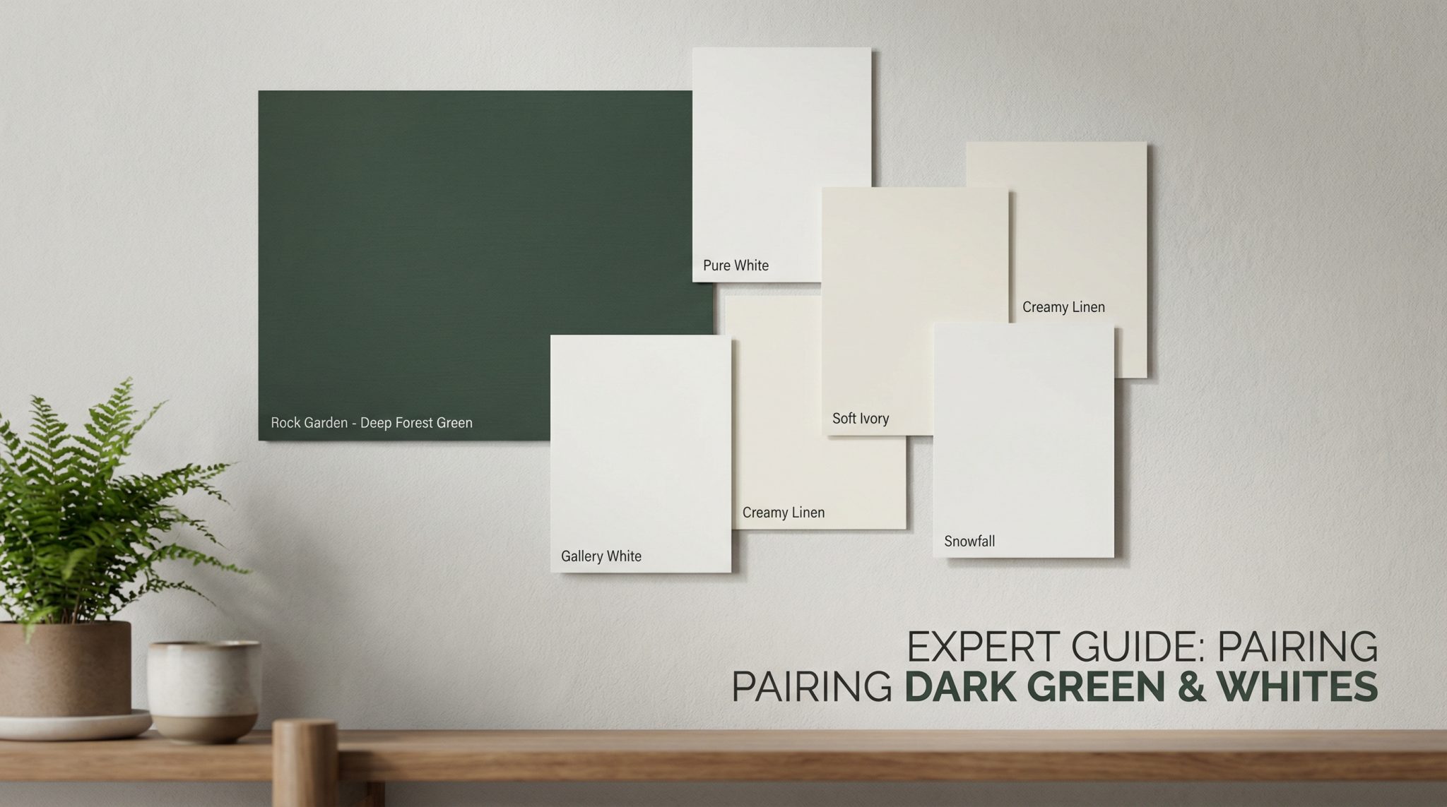
Rock Garden SW 6195: Best White Paint Pairings
by
Michelle Anderson
Read 8 min
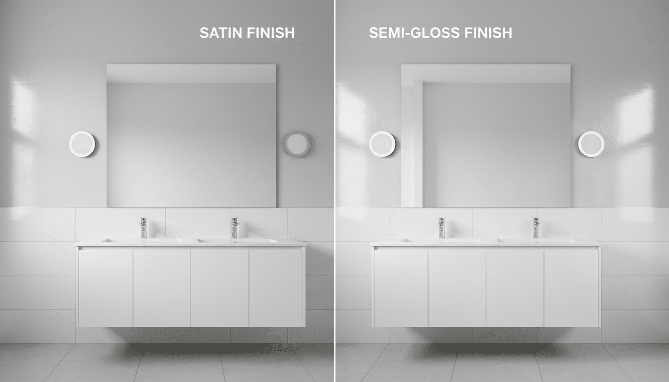
Bathroom Paint Sheen Guide: Satin vs Semi-Gloss
by
Michelle Anderson
Read 6 min
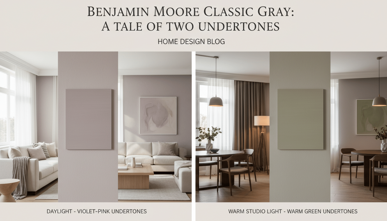
Benjamin Moore Classic Gray Undertones And Light Shifts
by
Michelle Anderson
Read 8 min
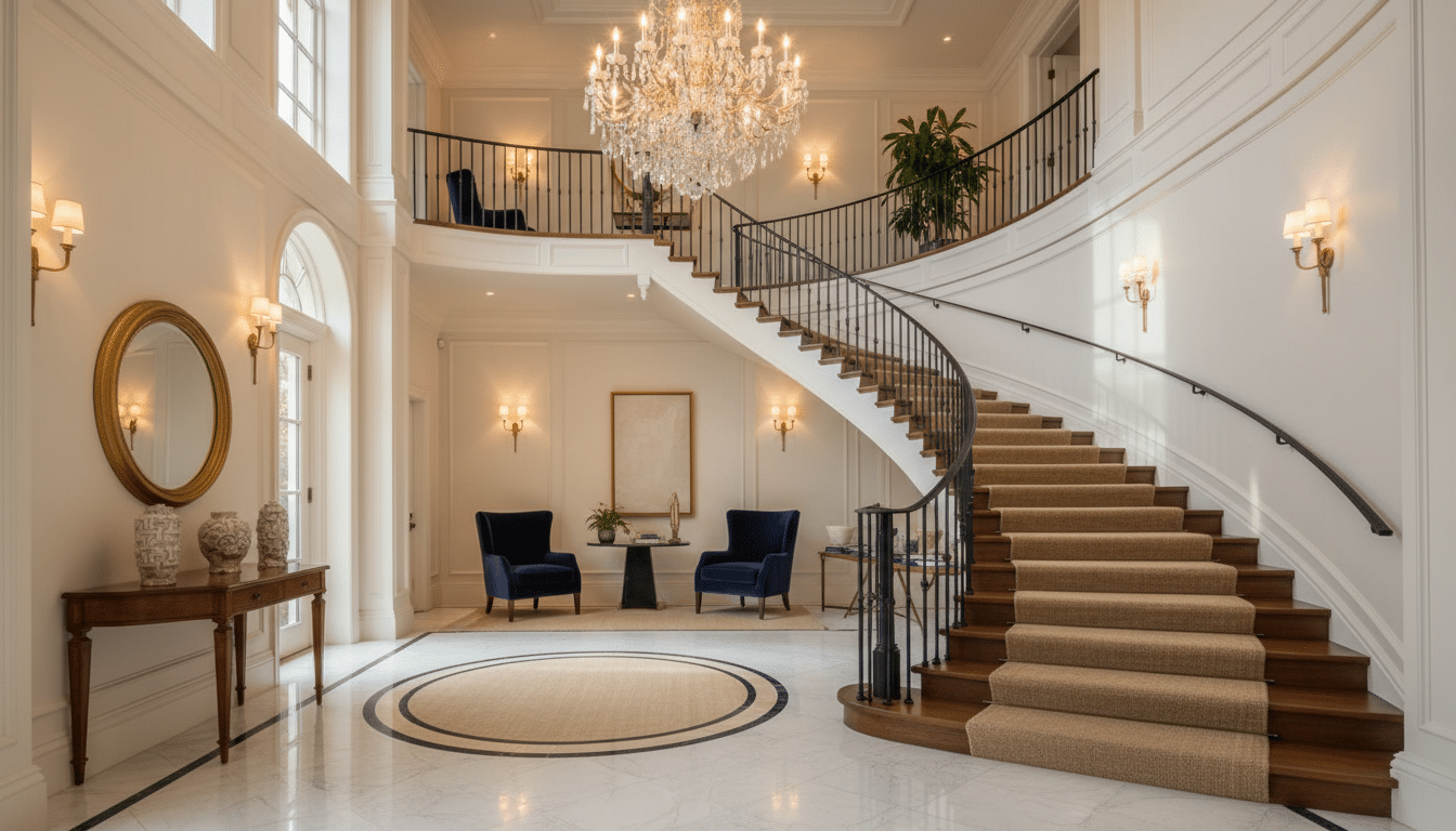
Grand Staircase Decorating Ideas for Entry Halls
by
Michelle Anderson
Read 8 min
Load More
Other Categories
Academics
Architecture
Art & Craft
DIY Guide
Search
Art & Craft
Paint Color
DIY Guide
Home Decor
Furniture
Exterior Design
Art & Craft
Paint Color
DIY Guide
Home Decor
Furniture
Exterior Design