
Ever walked into a room and felt immediately at ease, but couldn’t quite figure out why?
The secret might be on the walls, specifically, in a perfectly chosen neutral like SW Warm Stone.
I’ve found that this chameleon-like paint color works magic across different lighting conditions and design styles, something most neutrals fail to accomplish. What looks warm and inviting on a paint chip often disappoints on walls, but SW Warm Stone delivers consistently.
Imagine recasting your space with a color that adapts to your existing decor while creating the perfect backdrop for your next design direction.
Ready to see how this versatile neutral can heighten your home? Keep reading to discover the surprising ways SW Warm Stone can work in your space.
What Color is SW Warm Stone?
| Attribute | Description |
|---|---|
| Color Name | SW Warm Stone |
| Sherwin-Williams Code | SW 7032 |
| Tone | Medium-toned neutral |
| Undertones | Subtle warm undertones, slightly taupe |
| Hex Value | #887B6C |
| Temperature | Warmer neutral, does not lean bluish like cooler greiges |
| Light Reflectance Value (LRV) | 20 |
| RGB | 136 / 123 / 108 |
| Behavior in Low/North Light | Appears deeper, more gray |
| Design Quality | Sophisticated, adaptable, contemporary, doesn’t overwhelm |
| Best Use Cases | Works well in various lighting conditions and spaces throughout the day |
Best Places to Use SW Warm Stone
1. Living Room Walls for a Grounded Feel
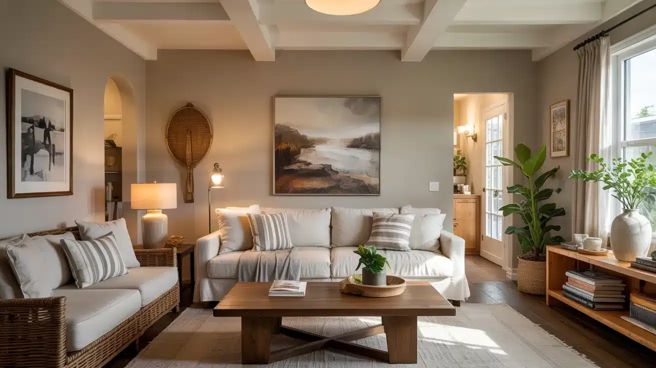
Living rooms dressed in Warm Stone instantly feel more settled and inviting. I painted my living room in this shade last year, and visitors always comment on how “at home” they feel.
The color’s depth creates a perfect backdrop for artwork and family photos without competing for attention. In open floor plans, it helps define the living space while still flowing beautifully with adjacent rooms.
Pro Tip: For the most balanced look, test Warm Stone on at least two walls of your living room. Colors can appear different depending on how natural light hits them throughout the day. I recommend painting a 2-foot square sample on both north and south-facing walls before committing.
2. Bedroom Accent Walls
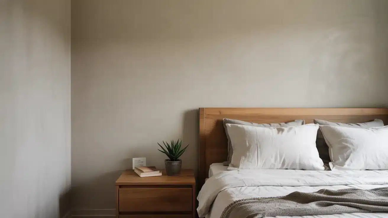
Looking to add character to your bedroom without overwhelming the space? A Warm Stone accent wall behind your headboard creates a focal point while maintaining that peaceful vibe essential for rest.
The combination of crisp white bedding and natural wood nightstands against this backdrop creates a hotel-worthy retreat that still feels personal and cozy. The subtle depth of the color adds just enough interest without disrupting sleep.
Pro Tip: For bedrooms, consider using the slightly lighter version (Accessible Beige) on the other walls if you’re worried about the room feeling too dark. This creates a subtle, cohesive look while maintaining the accent wall effect.
3. Kitchen Cabinets for Earthy Grace
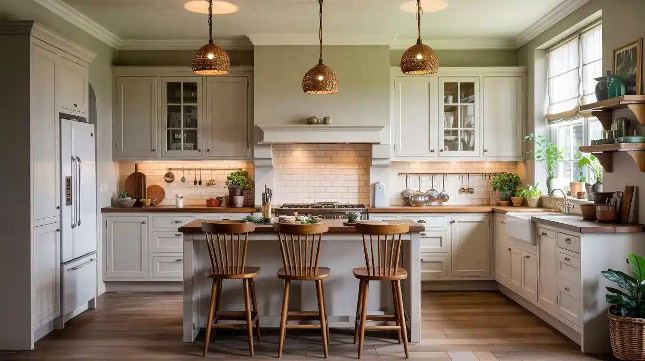
While white kitchens remain popular, Warm Stone cabinets offer a refreshing alternative that hides everyday wear and tear much better. The color adds warmth to what can sometimes be a clinical space, especially when combined with marble or quartz countertops.
I’ve seen stunning kitchens where Warm Stone lower cabinets were paired with white uppers, creating a grounded yet airy feel.
Pro Tip: Always request a cabinet door sample painted in Warm Stone before committing to the whole kitchen. Cabinet finishes reflect light differently than walls, and you’ll want to see how the color looks with your specific lighting and countertop materials.
4. Trim for Timeless Curb Appeal
Warm Stone truly shines outdoors, creating homes with enduring appeal that neither fade into the background nor scream for attention. On a recent neighborhood renovation project, the entire exterior was painted in Warm Stone with bright white trim.
The house instantly became the street’s subtle standout. Contemporary yet classic, it has a warmth that welcomes visitors before they even reach the door.
Pro Tip: Exterior light is much stronger than indoor lighting. Warm Stone often appears lighter outside, so don’t be alarmed if your sample looks different from what you expected. For best results, paint a small section on both the sunny and shady sides of your home before making your final decision.
Why Homeowners Love SW Warm Stone
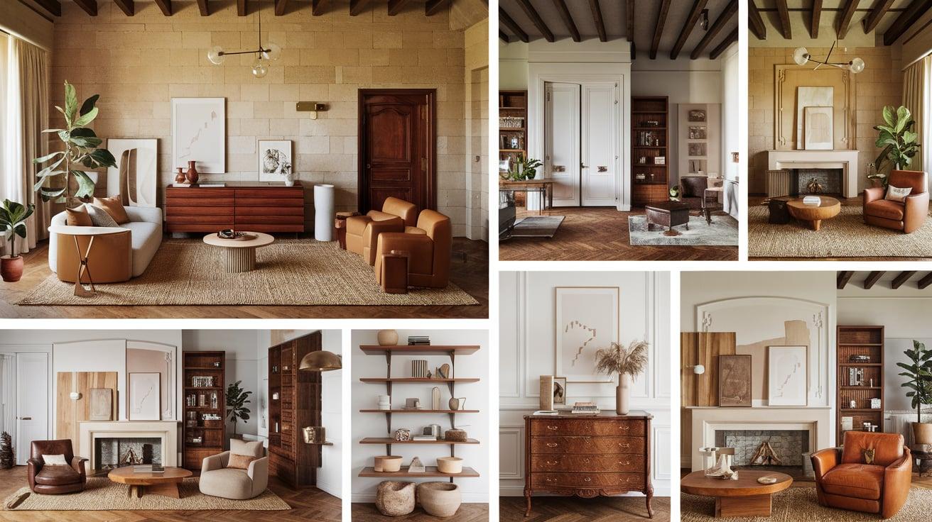
The magic of SW Warm Stone lies in its remarkable flexibility. I’ve seen it transform ultramodern spaces with clean lines and sleek furniture just as beautifully as it complements traditional rooms filled with antiques and classic moldings.
Design Versatility Without Boundaries
- What really sets Warm Stone apart is how it creates a cozy, welcoming feeling without darkening your space. Many homeowners tell me they want warmth but worry that darker colors will make their rooms feel small or cave-like.
- Warm Stone solves this problem perfectly; it adds that inviting quality while keeping spaces feeling open and airy.
Perfect Harmony With Natural Elements
- Natural elements absolutely sing against this backdrop. Rich wood tones, whether in flooring, furniture, or exposed beams, stand out beautifully against Warm Stone walls.
- The color’s subtle warmth makes brass fixtures and hardware glow, while natural textures like jute, linen, and stone feel right at home. I’ve noticed that plants look especially vibrant against this neutral, adding life and energy to any room.
Creates a Foundation That Lets Decor Shine
- What homeowners appreciate most is how Warm Stone creates a peaceful foundation that lets their favorite decor pieces shine.
- Unlike stronger colors that demand attention, this versatile neutral steps back and allows your personality to take center stage through the items you choose to display.
Complementary Colors and Pairing Tips
Are you unsure what goes well with SW Warm Stone?
Here’s a handy guide to the best color pairings, finishes, and design elements to bring out its full potential.
| Category | Pairings & Suggestions | Pro Tip |
|---|---|---|
| Top Sherwin-Williams Pairings |
Alabaster (SW 7008): Great for trim and ceilings Urbane Bronze (SW 7048): Bold contrast for accents Extra White (SW 7006): Crisp, modern trim |
Save the lightest colors for rooms with minimal natural light. |
| Metals & Woods |
Brass & Gold: Enhance warmth Brushed Nickel & Chrome: Add a contemporary edge Light Oak: Brightens space |
Stick to a maximum of two metal finishes per room for a cohesive look. |
| Patterns, Textures, & Textiles |
Natural Fibers (Jute, Linen): Cozy and organic Blues: Soothing contrast Geometric Patterns: Add visual interest |
Layer different textures in the same color family to add depth without visual clutter. |
Common Mistakes to Avoid with SW Warm Stone
- Warm Stone has distinct taupe undertones. Testing it beside true grays reveals its warmth immediately. This is not the color for spaces where you want a cool, contemporary feel.
- Too many warm colors create a muddy, dated look. Avoid combining Warm Stone with oranges, yellows, and reds in large doses. Balance is key to preventing an overly warm, stuffy feeling.
- North-facing rooms can make Warm Stone appear darker and muddier. Rooms with minimal natural light may lose the nuanced warmth that makes this color special.
- Warm Stone changes dramatically under different bulb temperatures. Cool LED lighting can strip away its warmth, while incandescent or warm LED lighting enhances its cozy feel.
- White trim can look stark and disconnected against Warm Stone. Choosing the wrong white undertone creates a disjointed rather than cohesive appearance.
- Too much contrast between the wall and trim sheen levels can make Warm Stone look patchy. Flat, Warm Stone can look drab, while too glossy can emphasize wall imperfections.
Conclusion
SW Warm Stone offers that rare balance many homeowners search for, a neutral that brings warmth without dominating your space.
Throughout this article, we’ve seen how it adapts to different lighting conditions, complements various design styles, and works in multiple areas of your home.
What makes this color truly special is its ability to create a foundation that supports rather than competes with your style. Whether paired with crisp whites, rich woods, or metal accents, Warm Stone provides a backdrop that feels both current and timeless.
Ready to try it in your home?
Start with a test patch in the room you’re most excited about. Watch how it changes throughout the day, and consider how it works with your existing furnishings.
Frequently Asked Questions
1. Is Warm Stone a Grey?
No, Warm Stone isn’t a true gray. It’s a neutral that sits between beige and gray with warm taupe undertones, making it more versatile than a typical gray paint color.
2. What is a Cool Gray and a Warm Gray?
Cool grays have blue, green, or purple undertones that create a crisp, modern feel. Warm grays have beige, yellow, or red undertones that feel cozier and more inviting.
3. What is the Most Popular Grey in Sherwin-Williams?
Agreeable Gray (SW 7029) is Sherwin-Williams’ most popular gray. It’s a versatile beige that works in many lighting conditions and pairs well with most design styles.