Ever walked into a room and just felt good without knowing why? Color plays a huge part in that feeling, and Melrose is making waves in homes everywhere for good reason.
This isn’t just another shade that designers are pushing. Melrose has staying power because it hits that sweet spot—bold enough to make a statement, but calm enough to live with day after day.
We all want our homes to feel special, comfortable, and put together. The right color choice makes that happen with minimal effort and cost.
In this guide, we’ll look at why Melrose works so well, where it shines brightest, and how to use it in ways that make sense for real homes, not just magazine spreads.
Let’s find out what this trendsetting color can bring to your space.
What is Melrose Color?
Melrose color is a soft, muted shade that blends elements of pink and lavender with subtle earthy undertones. It offers a warm, inviting atmosphere.
This color strikes a perfect balance between vibrant and neutral, making it ideal for a wide range of interior designs. Unlike bold, overwhelming hues, Melrose creates a sense of calm and serenity.
Its versatility allows it to complement various color schemes, from minimalist to eclectic, making it suitable for almost any room in the home. Melrose adds a refined touch to modern decor.
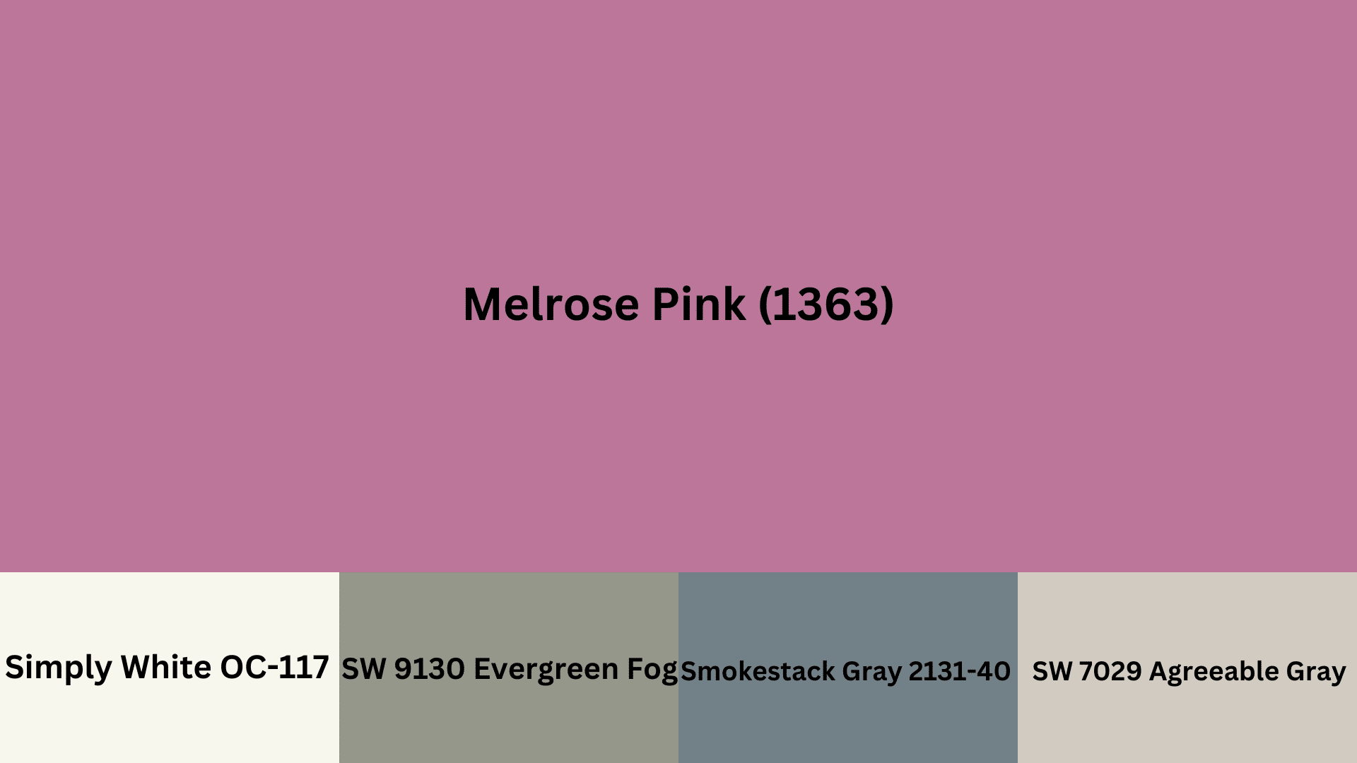
Here’s a table for Melrose Pink (1363):
| Attribute | Value |
|---|---|
| LRV (Light Reflectance Value) | 8 |
| RGB | (186, 118, 153) |
| Hex Value | #BA7699 |
| Color Family | Browns/Beiges |
| Undertone | Violet |
| Best Use | Living rooms, Bedrooms, Offices |
Melrose in Different Rooms
Melrose Pink brings a gentle charm that adapts beautifully to different rooms, from cozy bedrooms to vibrant kitchens. Here’s how it works in different spaces:
Living Rooms
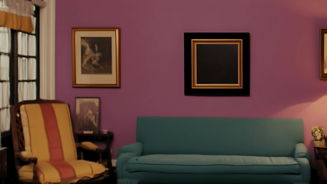
- Melrose color can create a striking focal point on one feature wall, making the room feel bold and trendy. It adds visual interest while keeping the overall space grounded.
- This color pairs well with neutral tones, offering an excellent contrast without overpowering the rest of the room. It’s perfect for balancing bold furniture or vibrant decor elements.
- When used alongside lighting accents, Melrose becomes more dynamic, amplifying the room’s mood and highlighting the textures and details in the space.
Bedrooms
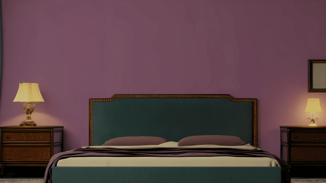
- The soft and muted tones of Melrose promote a serene, relaxing atmosphere, making it ideal for a peaceful bedroom environment. It helps reduce visual clutter and encourages restful sleep.
- It complements soft textures like linen and cotton and the color pairs well with simple, minimalist furniture, adding a touch of beauty without overwhelming the space.
- Melrose creates a cozy feel, ideal for creating a balanced environment. It works well with different accents, such as soft lighting, making the room feel both refined and inviting.
Kitchens
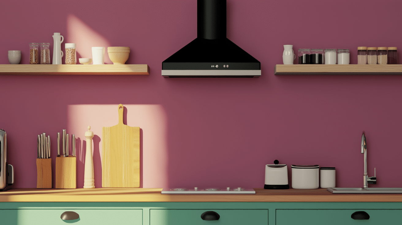
- Melrose adds vibrancy to the kitchen, particularly when used in cabinetry or as an accent wall. It brings an exciting energy to the space while remaining warm and inviting for cooking and socializing.
- Paired with neutral elements like white or light wood, it brightens up the room, offering a fresh, modern feel. Melrose balances the kitchen’s utility with its lively charm, making the space both functional and appealing.
- The color works well with metallic finishes and modern appliances, creating a high-end, contemporary kitchen that’s both stylish and energizing.
Bathrooms
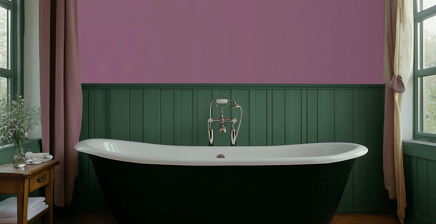
- Melrose creates a soothing atmosphere in bathrooms, making it perfect for creating a spa-like environment. It adds a sense of luxury without being too overwhelming.
- Used in accent pieces like towels, mirrors, and shower curtains, Melrose complements the clean lines of bathroom fixtures, improving the overall look without dominating the space.
- This color pairs beautifully with light fixtures and natural stone elements, creating a balanced look. It brings a touch of serenity to the bathroom while maintaining a contemporary, fresh appeal.
Complementary Colors with Melrose Color
Here are some color combinations that pair beautifully with Melrose Pink color (1363), allowing you to create harmonious, inviting, and stylish spaces:
1. Melrose Pink + OC-117 Simply White
• Simply White is a clean, bright white with a hint of warmth that gently offsets the soft, muted tones of Melrose Pink, creating a fresh and airy look.
• Use: Melrose Pink works beautifully on walls in bedrooms or nurseries, while Simply White can be used on trims, ceilings, or cabinetry for a crisp, classic contrast.
2. Melrose Pink + SW 9130 Evergreen Fog
• Evergreen Fog is a soft, sage green with gray undertones that offers a subtle, grounded balance to the gentle charm of Melrose Pink.
• Use: This pairing is ideal for living rooms or reading nooks. Use Melrose Pink as the primary wall color and Evergreen Fog for built-ins, accent furniture, or entryways.
3. Melrose Pink + 2131-40 Smoke
• Smoke is a cool, dusty blue-gray that adds a modern, relaxed contrast to the warmth of Melrose Pink without overpowering it.
• Use: Try Smoke on cabinets, textiles, or an accent wall in a kitchen or bathroom, with Melrose Pink on adjacent walls or accessories for a calm, balanced palette.
4. Melrose Pink + SW 7029 Agreeable Gray
• Agreeable Grayis a warm greige that works as a versatile neutral backdrop, softening and grounding the playful nature of Melrose Pink.
• Use: Use this pairing in living rooms or offices—Melrose Pink on furniture, accent pieces, or one wall, and Agreeable Gray as the dominant color on surrounding surfaces.
Alternatives to Melrose Pink (1363)
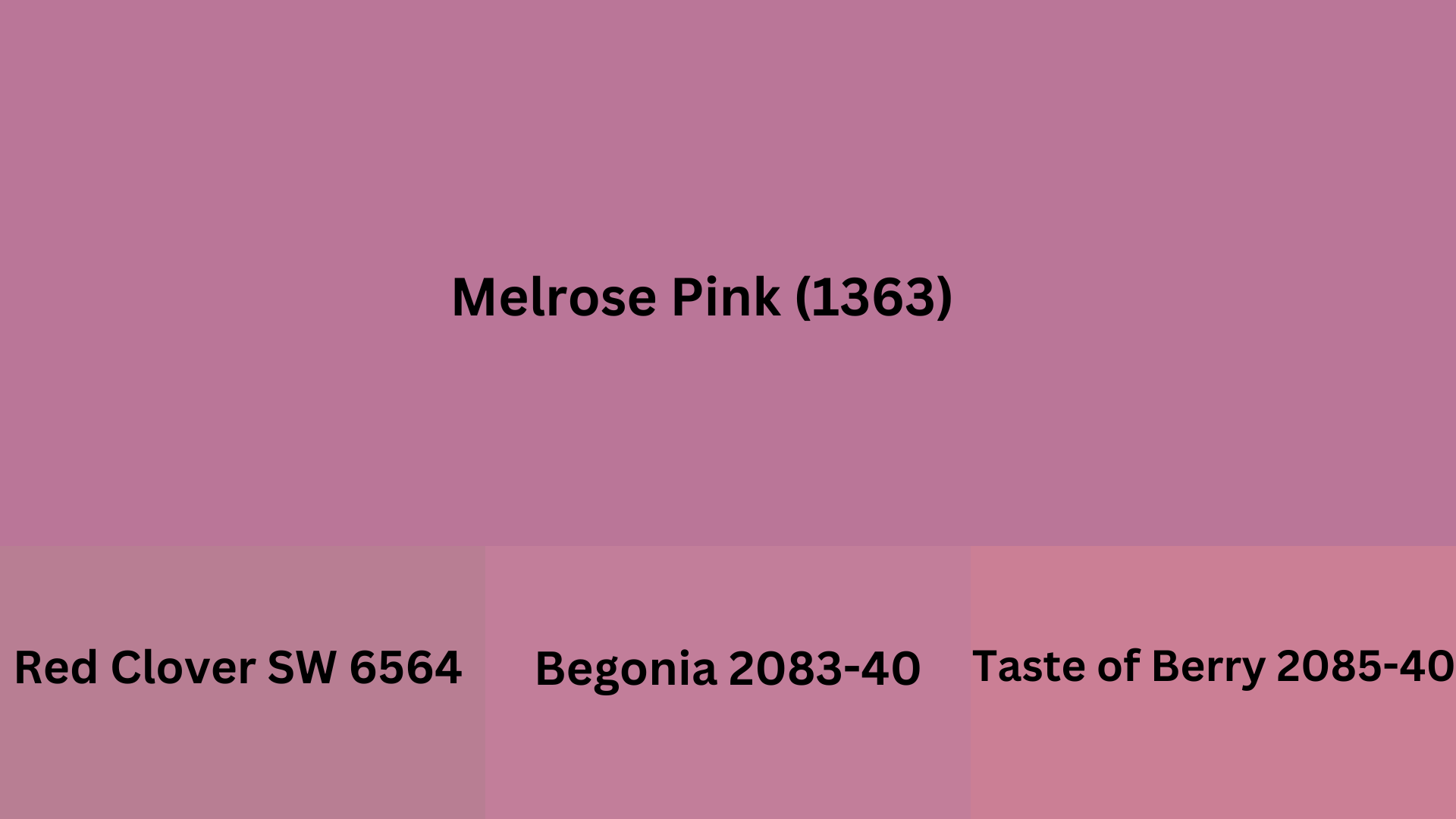
Red Clover SW 6564: This rich, bold pink carries hints of raspberry and red, making it a vibrant choice for accent walls or playful interiors. It brings warmth and energy while still feeling refined.
Begonia 2083-40:A warm, medium-toned coral-pink that adds a lively and welcoming atmosphere to any space. It works beautifully in both modern and traditional settings without overwhelming the room.
Taste of Berry 2085-40:With its deep berry undertone and velvety pink finish, this shade creates a cozy, expressive environment. It’s perfect for spaces that aim to feel both inviting and full of character.
Finding Your Perfect Shade
Melrose brings something special to homes—a warm touch that works in just about any room. We’ve seen how this color creates both calm spaces and lively ones, depending on what you pair it with.
What’s nice about Melrose is how flexible it is. It plays well with whites and neutrals but also holds its own next to bolder choices.
Your home tells your story. Maybe Melrose fits into that story perfectly, or maybe it’s just given you ideas for other colors you might like better.
Trust your gut when picking colors. The right shade feels right—you’ll know it when you see it in your own space.
Ready for something new on your walls? Melrose might be exactly what you’ve been looking for.
Looking for more inspiration? Check out our other paint color guides to find the perfect shades for your home.
