
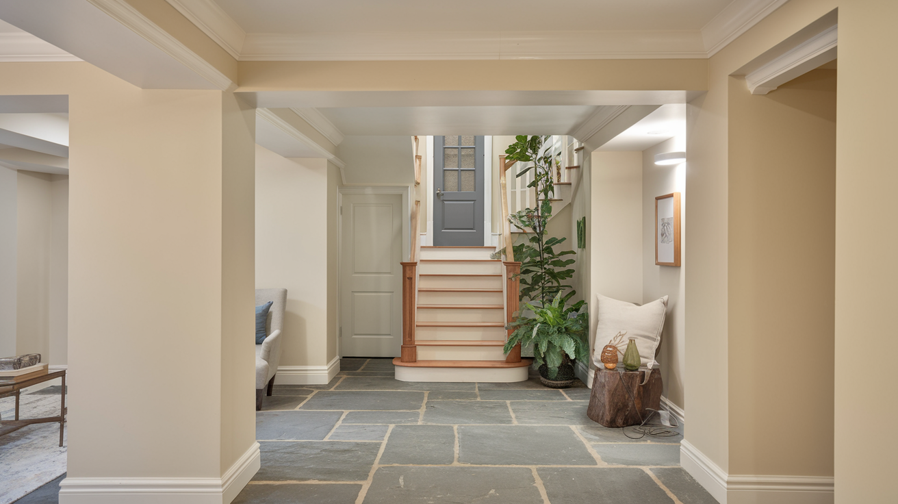
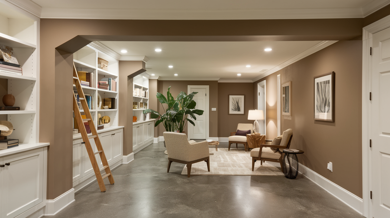
Considering painting your basement?
The color you select makes a significant difference in how that downstairs space feels and functions. With the right paint color, many basements transform from ordinary to extraordinary!
It’s remarkable what a fresh coat can do to brighten up a space with limited sunshine. When examining color swatches, remember that your basement likely receives minimal natural light.
Consider your artificial lighting setup, ceiling height, and intended use for the space. Will it be a movie room? Home office? Children’s play area? Each purpose might require a different color approach.
How to Choose the Right Basement Paint Color

Selecting the perfect basement paint color goes beyond aesthetics—it influences the mood, functionality, and overall feel of the space.
Understanding key factors will help you make a choice that enhances both style and comfort.
1. Consider Your Lighting Situation
Basements typically have minimal windows and natural light.
Your color choice should account for the type and amount of artificial lighting in your space. Lighter colors reflect more light, making spaces appear larger and brighter.
2. Factor in Room Purpose
What will your basement become?
A home entertainment center requires different color considerations than a home office, gym, or guest bedroom. The function guides appropriate color selection.
3. Understand Warm vs. Cool Tones
Warm colors (reds, oranges, yellows) create cozy, intimate feelings but can make spaces seem smaller. Cool colors (blues, greens, purples) tend to expand visual space but might feel less inviting without proper balance.
4. Paint Finish Matters
- Matte: Hides imperfections but less durable
- Eggshell/Satin: Balances durability with a subtle sheen
- Semi-gloss: Highly durable, moisture-resistant, easier to clean
Best Basement Paint Color Ideas
Finding the right shade for your basement can change the entire feel of the space. Here are top picks that will help you create the mood and function you want in your downstairs area.
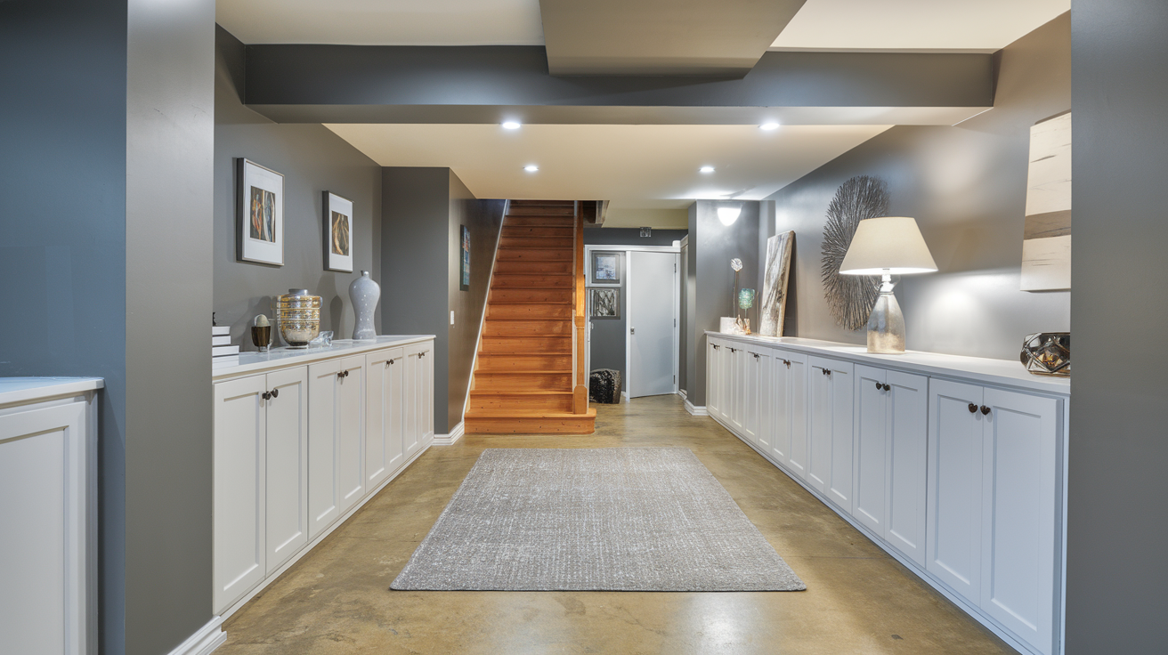
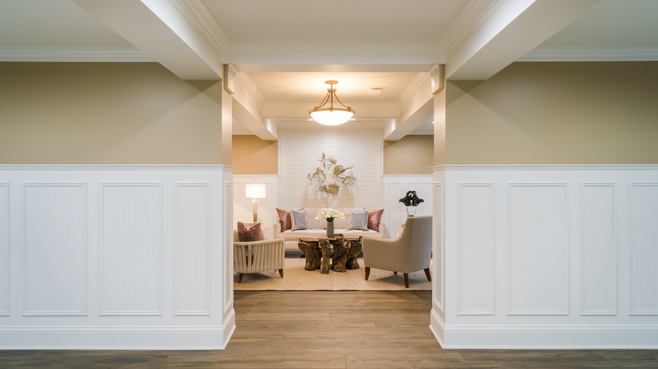
1. Soft Eggshell White by Zinsser
Soft Eggshell White brings brightness to dim corners without harsh glare. This gentle white creates airy feelings in tight spaces while making furniture stand out nicely against walls.
- Visual Effect: Creates a clean, airy, and spacious feel. Reflects light well, making the basement appear brighter.
- Lighting Consideration: Can take on a slightly cool tone under LED lights but remains crisp and neutral.
- Complementary Colors: Works beautifully with black, navy, and light wood tones for contrast.
- Styling Tips: Use textured decor like rugs and throw blankets to prevent the space from feeling too stark.
2. Moroccan Moonlight by Glidden Total
Moroccan Moonlight provides depth without darkness. This medium-toned Moonlight changes throughout the day, maintaining visual interest in spaces with limited windows.
- Visual Effect: Adds a cozy, inviting warmth without feeling too dark or heavy.
- Lighting Consideration: Works well with both warm and cool lighting, providing a balanced look.
- Complementary Colors: Pairs well with deep browns, soft whites, and earthy greens.
- Styling Tips: Add wooden furniture and woven textures for a natural, welcoming atmosphere.
3. Interior Gull Color by RECOLOR
Interior Gull Color balances modern appeal with everyday comfort. This versatile Gull shade works effectively in game rooms and social spaces where mood matters.
- Visual Effect: A modern, versatile shade that makes the basement feel sleek and sophisticated.
- Lighting Consideration: Can appear slightly blue under cool lighting, so test swatches beforehand.
- Complementary Colors: Works great with white trim, navy accents, and metallic finishes.
- Styling Tips: Use pops of color in décor like mustard yellow or emerald green to add depth.
4. Satin Hierloom White by Rust-Oleum
Satin Hierloom White makes ceiling heights feel more generous. This subtle Hierloom finish offers warmth that fluorescent lighting won’t wash out or distort.
- Visual Effect: Softens the space with a warm, welcoming touch while still keeping it bright.
- Lighting Consideration: Looks warm under yellow-toned lighting and stays neutral in natural light.
- Complementary Colors: Matches well with warm woods, gold accents, and deep blues.
- Styling Tips: Layer with soft textiles and light-colored furniture for a timeless look.
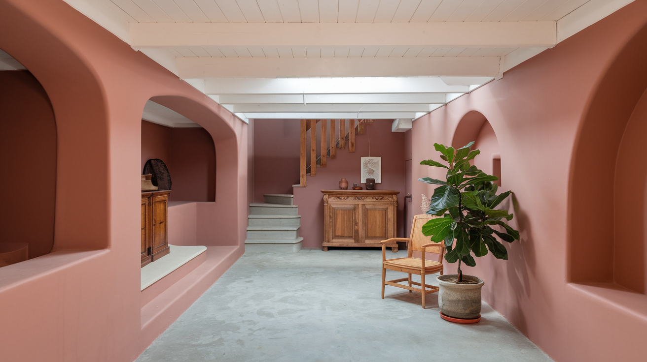
5. Warm Taupe by ViVa Decor
Warm Taupe creates a neutral foundation for changing decor styles. This balanced Taupe absorbs shadow patterns while maintaining dimension on large wall surfaces.
- Visual Effect: A soft, earthy tone that brings warmth and elegance without overpowering the room.
- Lighting Consideration: Can lean slightly pink or gray depending on the light source.
- Complementary Colors: Works well with dusty rose, warm browns, and soft grays.
- Styling Tips: Combine with plush textures and brass or bronze accents for a refined aesthetic.
6. Champagne White by Kilz Tribute
Champagne White softens harsh lighting common in basement spaces. This delicate Champagne provides just enough color to avoid feeling sterile while maximizing brightness.
- Visual Effect: A crisp, refreshing shade that keeps the space feeling open and airy.
- Lighting Consideration: Slightly cool-toned, making it ideal for basements with warmer lighting.
- Complementary Colors: Looks great with deep blues, charcoal gray, and warm wood accents.
- Styling Tips: Add navy blue or dark green accents for contrast and visual interest.
7. Moth Gray by Glidden Interior (Greige)
Moth Gray shifts between warm and cool depending on lighting. This adaptable Moth shade works perfectly for spaces that transition between daytime work and evening relaxation.
- Visual Effect: A perfect neutral balance that combines the warmth of beige with the modern appeal of gray.
- Lighting Consideration: Adapts to various lighting conditions, shifting between warm and cool tones.
- Complementary Colors: Matches beautifully with white trim, soft blues, and natural wood.
- Styling Tips: Incorporate natural textures like linen and jute for a cozy, layered look.
8. More Maple by Glidden Total (Soft Almond)
More Maple brings natural warmth to windowless rooms. This inviting Maple creates a cozy atmosphere for entertainment spaces without feeling heavy or dark.
- Visual Effect: A subtle, creamy hue that provides warmth without being overpowering.
- Lighting Consideration: Warms up under artificial lighting, creating a welcoming ambiance.
- Complementary Colors: Pairs well with deep browns, muted greens, and warm whites.
- Styling Tips: Use wooden furniture and beige-toned textiles to enhance the natural warmth.
9. Silver Gray by Kilz
Silver Gray hides minor wall flaws while providing sophistication. This versatile Silver works equally well with modern fixtures or traditional basement furnishings.
- Visual Effect: A rich, earthy gray with warm undertones, making the basement feel sophisticated and inviting.
- Lighting Consideration: Works well in both dim and bright lighting, keeping the space cozy yet modern.
- Complementary Colors: Blends nicely with olive green, warm whites, and deep blues.
- Styling Tips: Pair with soft textiles and rustic wood accents for a contemporary yet cozy vibe.
10. Gloss Sand by Rust-Oleum
Gloss Sand catches and distributes limited light effectively. This practical Sand finish feels fresh year-round while hiding everyday wall scuffs and marks.
- Visual Effect: A light, sandy beige that adds warmth and softness to the basement.
- Lighting Consideration: Enhances warmth under yellow lighting but stays neutral with natural light.
- Complementary Colors: Looks great with muted blues, soft greens, and white trim.
- Styling Tips: Add woven baskets, beige rugs, and wooden furniture for a relaxed, beachy feel.
11. Sky Blue by Prestige
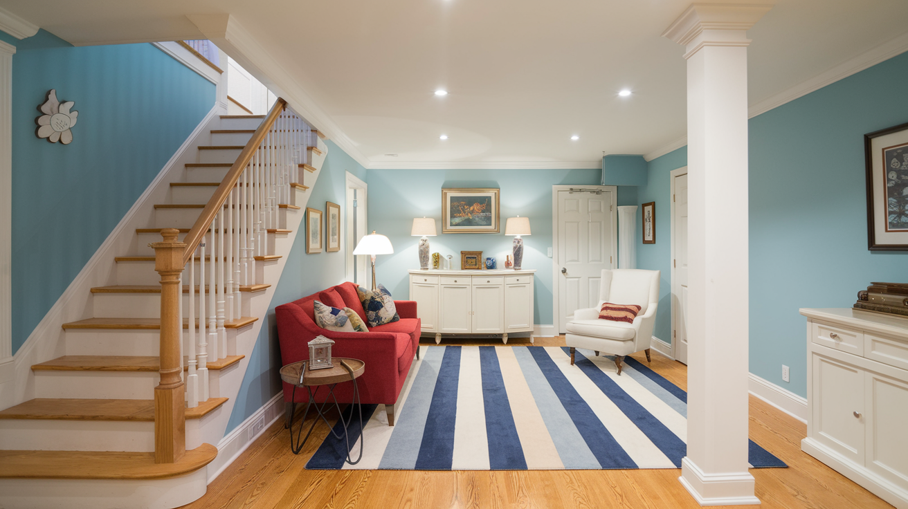
Sky Blue opens up smaller rooms visually. This gentle Sky shade provides subtle movement on walls in changing light conditions without overwhelming the space.
- Visual Effect: Creates a light, airy, and uplifting atmosphere, making the basement feel more open.
- Lighting Consideration: Works well in dimly lit spaces, reflecting available light to brighten the room.
- Complementary Colors: Pairs beautifully with white, light gray, and sandy beige for a coastal look.
- Styling Tips: Add sheer curtains and soft white furniture for a breezy, relaxed feel.
12. Pool Blue by Epoxy
Pool Blue creates calm without coldness. This balanced Pool color functions well in exercise areas and home offices where focus matters.
- Visual Effect: A delicate, pastel blue that exudes softness and tranquility.
- Lighting Consideration: Can appear slightly gray in cool lighting, so pair it with warm accents.
- Complementary Colors: Matches well with soft whites, cream, and warm wood tones.
- Styling Tips: Use brass or gold accents to add warmth and sophistication.
13. Muted Teal by Kilz
Muted Teal balances color impact with practical subtlety. This versatile Teal works in multi-function spaces where different activities occur throughout the day.
- Visual Effect: A sophisticated blend of blue and green, adding depth without overwhelming the space.
- Lighting Consideration: Appears slightly darker in artificial lighting but maintains a rich, serene look.
- Complementary Colors: Works well with grays, whites, and soft beige tones.
- Styling Tips: Pair with natural textures like linen and woven baskets for a contemporary feel.
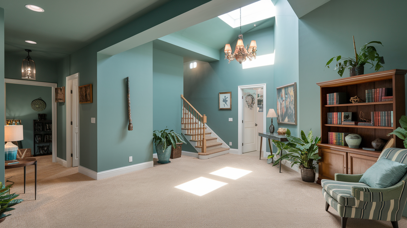
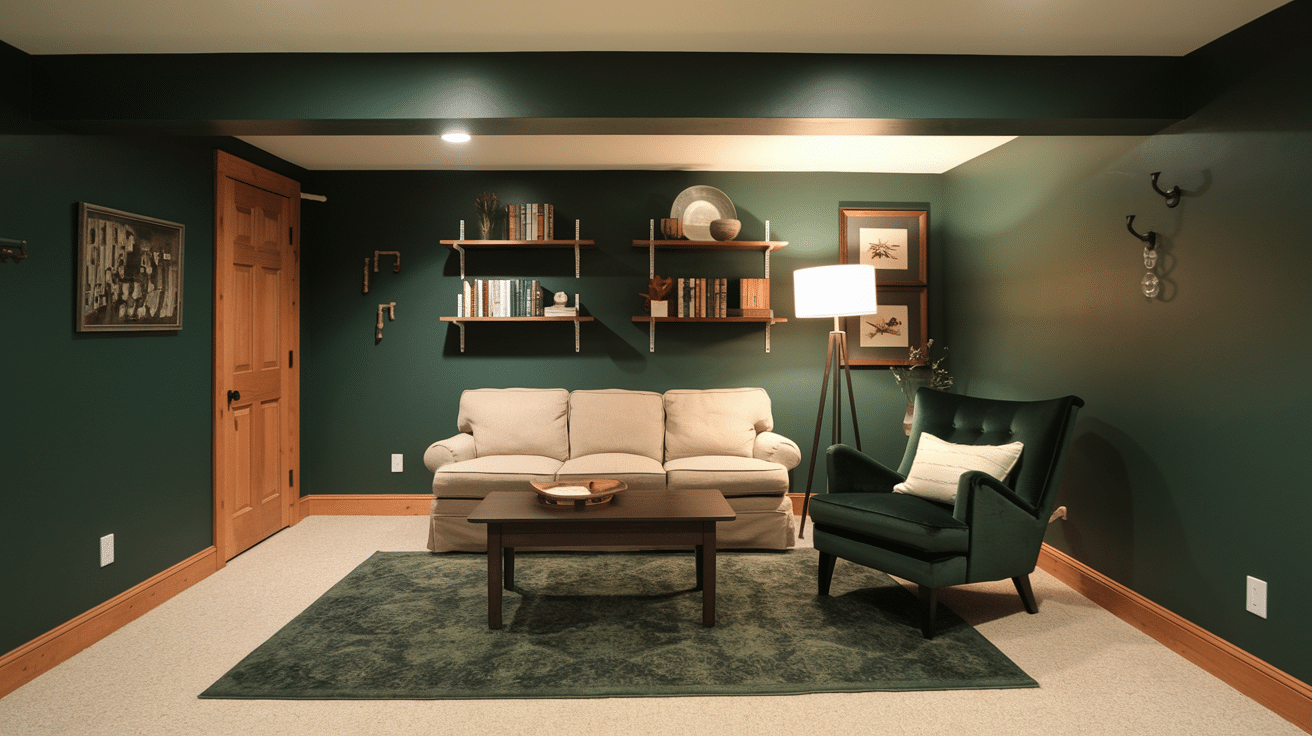
14. Sage Green by Glidden
Sage Green brings outside elements indoors naturally. This earthy Sage pairs well with artificial light sources without looking washed out or flat.
- Visual Effect: A soft, earthy green that brings a sense of nature indoors.
- Lighting Consideration: Looks warm in natural light but remains soothing under artificial lighting.
- Complementary Colors: Pairs well with muted browns, warm grays, and off-whites.
- Styling Tips: Use wooden furniture and stone elements to enhance the organic feel.
15. Soft Mint Green
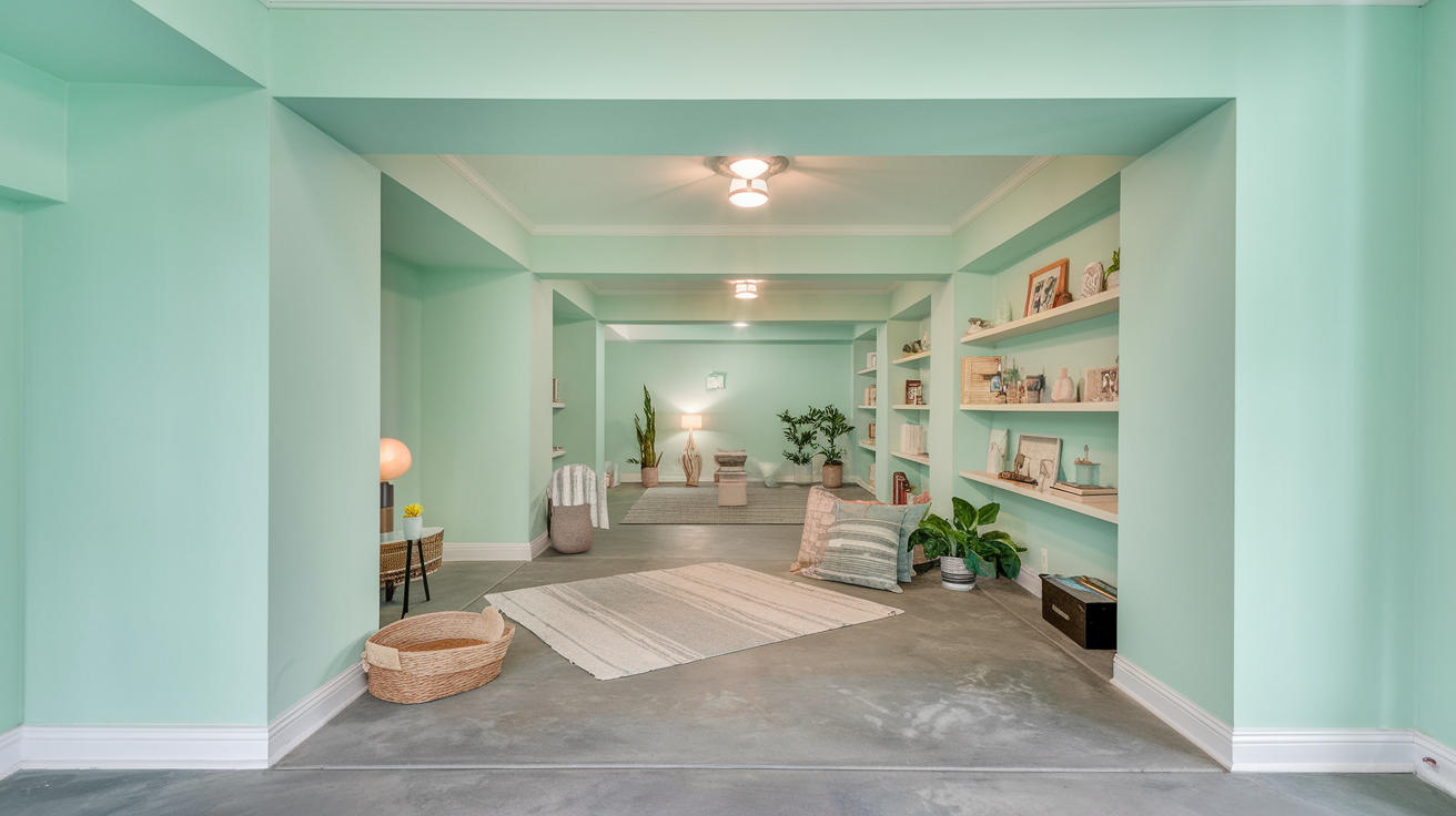
Soft Mint Green creates visual freshness in windowless spaces. This light Mint functions well in laundry areas and workout rooms where clean impressions matter.
- Visual Effect: A light, fresh green that adds a rejuvenating touch to basement spaces.
- Lighting Consideration: Brightens up dim spaces while maintaining a soothing feel.
- Complementary Colors: Looks great with white, light gray, and pastel blue.
- Styling Tips: Add floral or botanical decor to enhance the fresh and airy vibe.
16. Tate Green by Rust-Oleum
Tate Green offers subtle color that doesn’t tire the eyes. This balanced Tate shade works equally well in daylight or evening lighting scenarios.
- Visual Effect: A balanced mix of blue and green that gives off a beachy, calming ambiance.
- Lighting Consideration: Appears slightly more green in warm lighting and more blue in cooler tones.
- Complementary Colors: Matches well with sandy beige, crisp white, and soft coral.
- Styling Tips: Use woven furniture and light-colored fabrics for a relaxed, coastal look.
17. Turquoise by Artecho
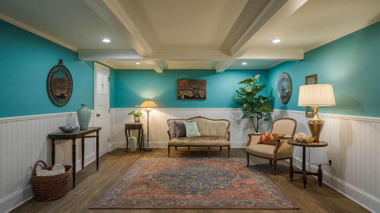
Turquoise provides quiet color without dominating. This gentle Turquoise maintains visual interest in plain rooms with minimal architectural features.
- Visual Effect: A refreshing, barely-there blue-green that enhances a light, airy feel.
- Lighting Consideration: Reflects light well, making small basements feel more open.
- Complementary Colors: Works beautifully with crisp white, soft grays, and warm wood accents.
- Styling Tips: Use soft textiles like linen and cotton to keep the space cozy and inviting.
18. Coastal Blue by Rust-Oleum
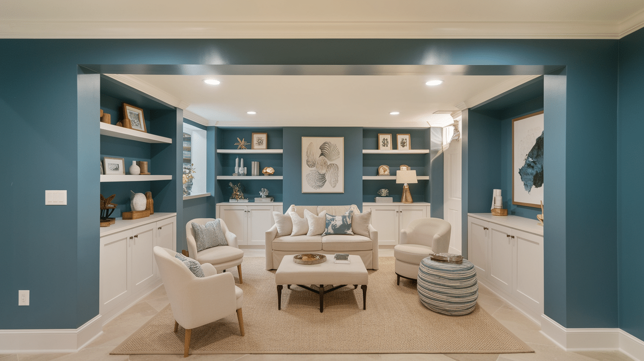
Coastal Blue creates depth without heaviness. This medium Coastal shade balances nicely with wooden furniture and natural textile elements.
- Visual Effect: A deep yet muted blue that brings a cozy, sophisticated feel to the basement.
- Lighting Consideration: Can appear slightly gray in dim lighting but maintains richness.
- Complementary Colors: Pairs well with warm beiges, soft golds, and deep greens.
- Styling Tips: Incorporate plush furniture and metallic accents for a luxe touch.
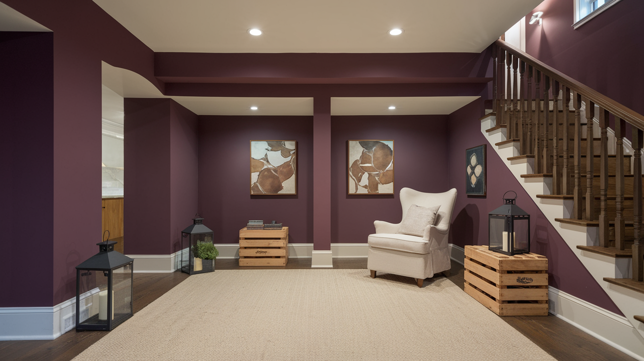
19. Vintage Indigo by KILZ TRIBUTE
Vintage Indigo absorbs shadows while maintaining visual texture. This rich Indigo works effectively with various lighting arrangements without looking flat.
- Visual Effect: A medium blue with a slightly faded, vintage look that adds character to any basement.
- Lighting Consideration: Holds its depth well in various lighting conditions, staying rich but not overpowering.
- Complementary Colors: Looks great with off-white, charcoal gray, and deep brown.
- Styling Tips: Use leather or wood furniture to enhance the rustic yet modern feel.
20. Smoked Navy by Rust-Oleum
Smoked Navy provides sophistication without darkness. This balanced Navy creates a pleasant backdrop for movie watching without competing with screen colors.
- Visual Effect: A smoked navy that adds a sleek, contemporary touch without feeling too cold.
- Lighting Consideration: Reflects light well and maintains a balanced, cool look in most lighting conditions.
- Complementary Colors: Works beautifully with white, black, and brushed metal finishes.
- Styling Tips: Use minimalist furniture and geometric decor for a modern aesthetic.
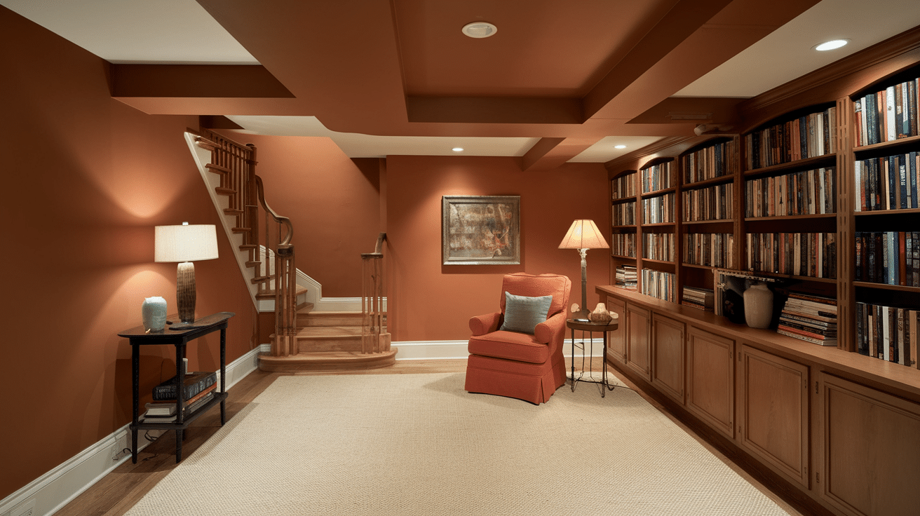
21. Soft Terracotta by EVOLVE Porch
Soft Terracotta warms rooms with limited light. This gentle Terracotta brings comfort to spaces that feel cold due to concrete floors or walls.
- Visual Effect: A muted, earthy orange that brings warmth and a subtle Mediterranean charm to the basement.
- Lighting Consideration: Looks soft and inviting under warm artificial lighting.
- Complementary Colors: Pairs well with beige, off-white, and muted greens.
- Styling Tips: Add woven textures and clay decor for a rustic, cozy feel.
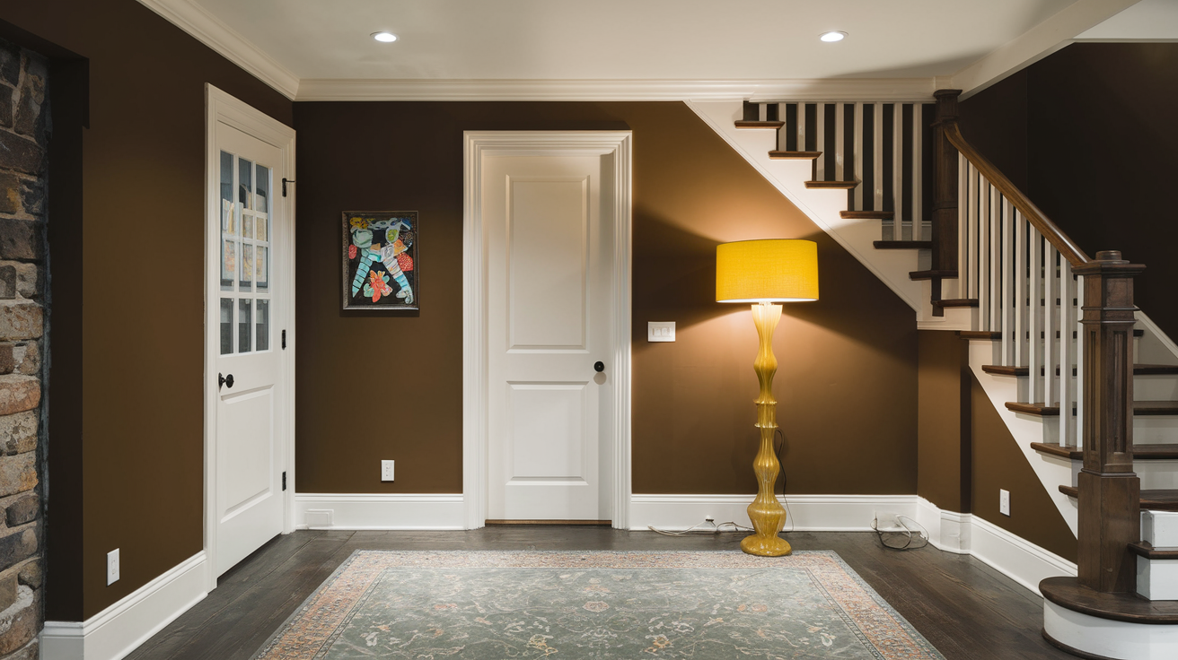
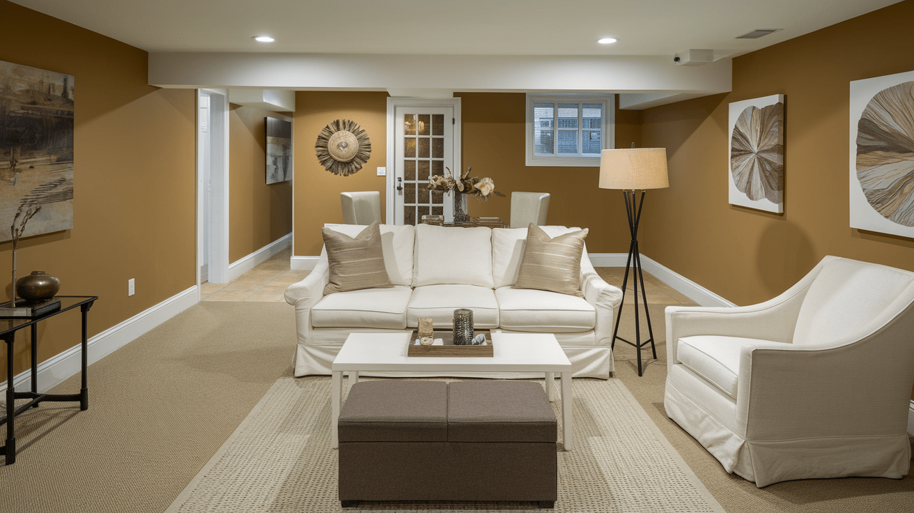
22. Bread Brown (Warm Caramel) by EVOLVE Signature
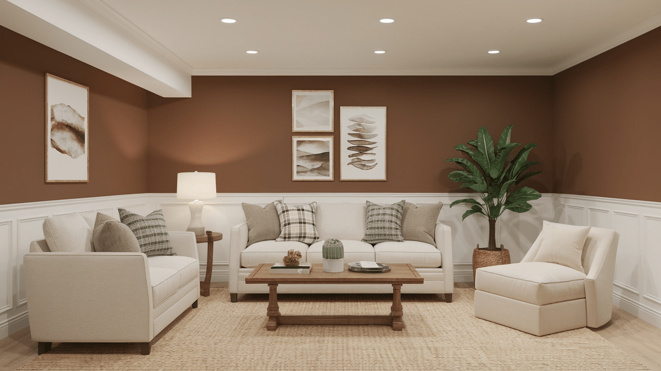
Bread Brown creates visual richness without heaviness. This warm Brown makes basement walls recede visually, helping spaces feel less boxy and confined.
- Visual Effect: A rich, golden-brown shade that adds depth and warmth to any space.
- Lighting Consideration: Enhances coziness, making dimly lit basements feel more inviting.
- Complementary Colors: Works beautifully with cream, deep red, and dark wood tones.
- Styling Tips: Use plush fabrics and vintage-style lighting for an elegant, welcoming space.
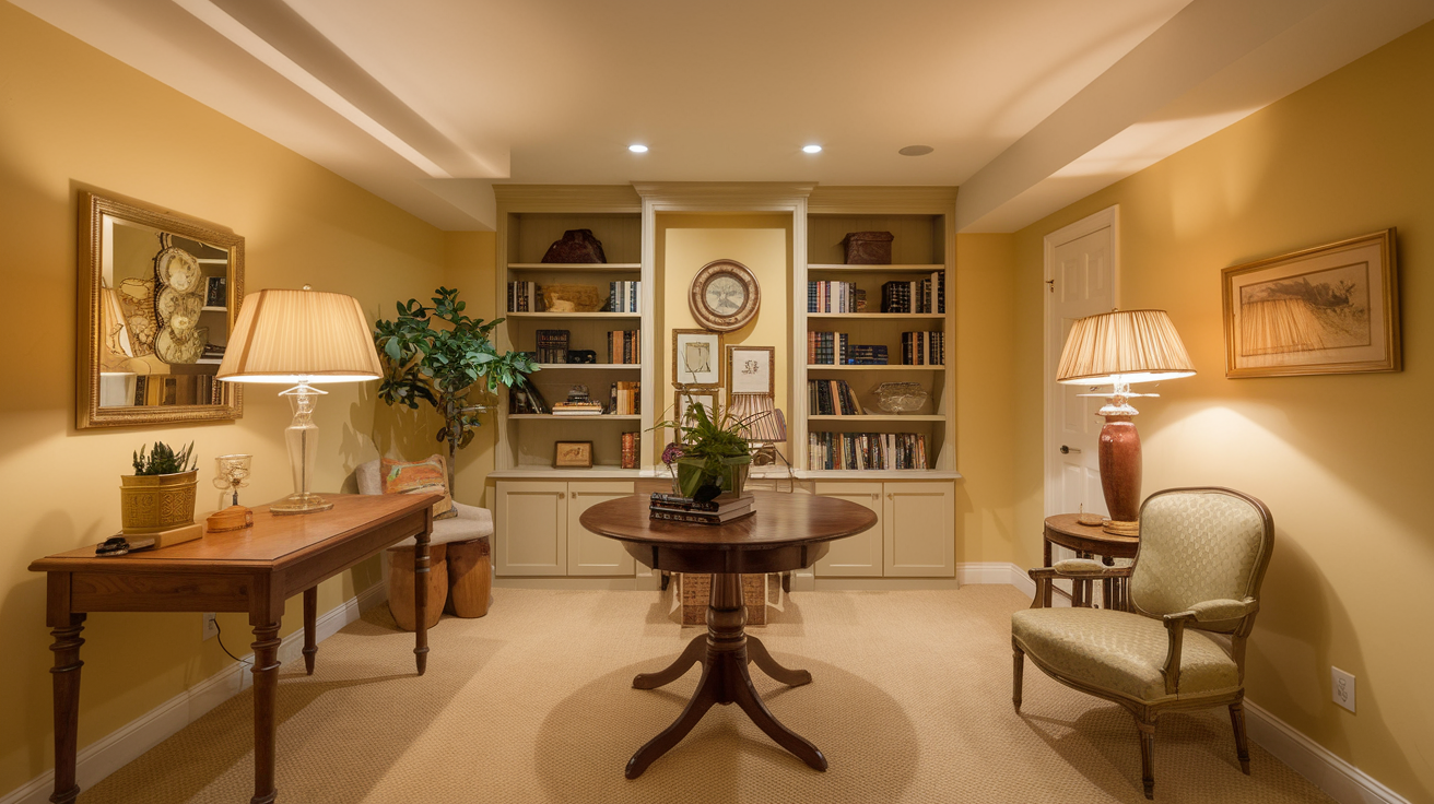
23. Venetian Yellow by Rust-Oleum
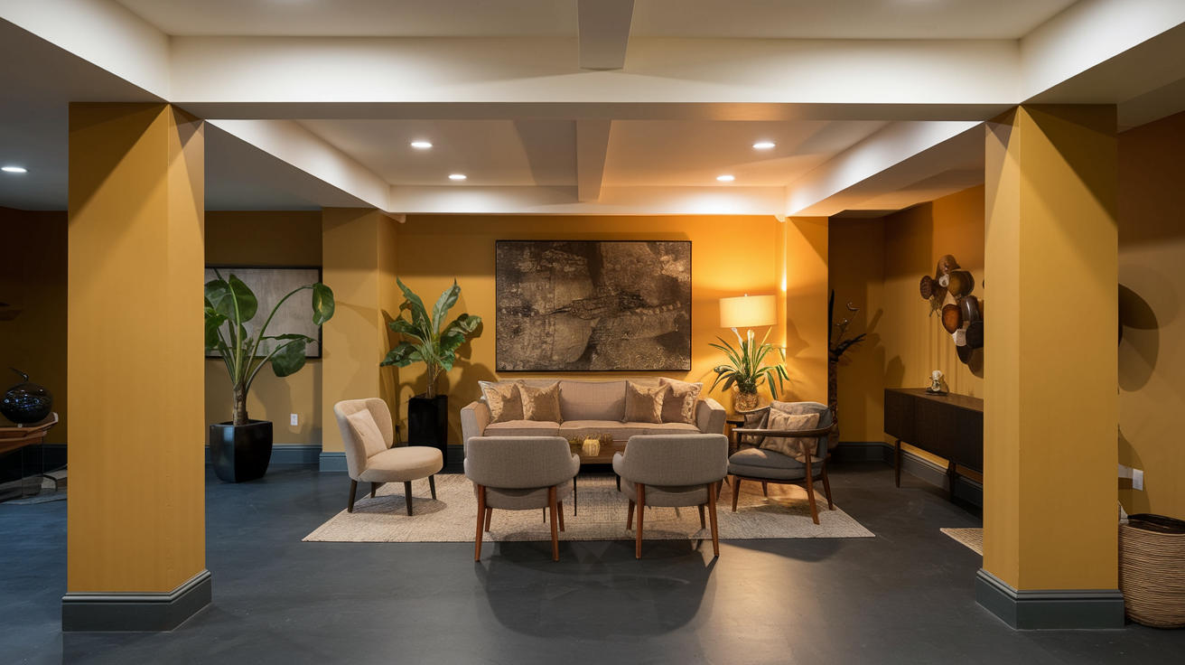
Venetian Yellow brightens rooms naturally without feeling artificial. This subtle Venetian maintains warmth even under fluorescent or LED lighting.
- Visual Effect: A warm, golden hue that adds a cheerful touch without being too overpowering.
- Lighting Consideration: Works well in both natural and artificial lighting, keeping spaces feeling vibrant.
- Complementary Colors: Blends well with soft gray, navy blue, and off-white.
- Styling Tips: Pair with dark wood furniture and brass accents for a sophisticated yet cozy look.
24. Burnt Orange by KILZ Tribute
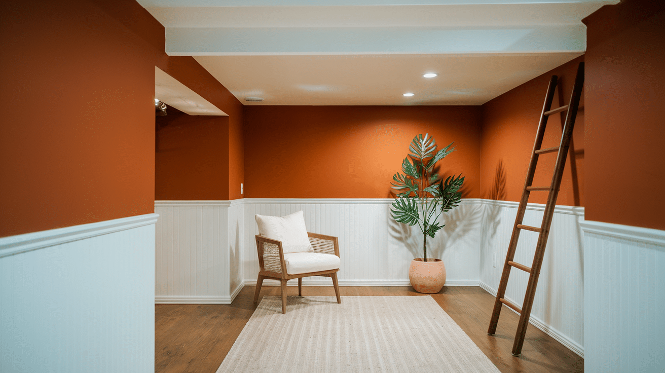
Burnt Orange provides visual warmth in cool spaces. This rich Orange creates a pleasant contrast with concrete and other structural elements.
- Visual Effect: A bold yet refined color that creates a rich, autumn-inspired atmosphere.
- Lighting Consideration: Appears softer in warm lighting and deepens under cooler tones.
- Complementary Colors: Matches beautifully with deep brown, olive green, and cream.
- Styling Tips: Add warm metallics and natural textures like linen for balance.
25. Cozy Cocoa Brown by KILZ Tribute
Cozy Cocoa Brown absorbs shadows while creating intimacy. This deep Cocoa works well in rooms designed for relaxation and evening activities.
- Visual Effect: A deep, chocolatey brown that exudes warmth and comfort.
- Lighting Consideration: Works best in well-lit basements or paired with light-colored furniture.
- Complementary Colors: Pairs well with beige, white, and soft gold tones.
- Styling Tips: Use soft lighting and plush rugs to enhance coziness.
26. Jazz Age Yellow by KILZ Tribute
Jazz Age Yellow creates sunshine where windows cannot. This warm Yellow maintains visual interest throughout the day in spaces with artificial lighting.
- Visual Effect: A rich, golden-yellow hue that adds warmth and a luxurious glow.
- Lighting Consideration: Brightens up basements with minimal light, creating a warm ambiance.
- Complementary Colors: Looks great with deep reds, soft whites, and warm browns.
- Styling Tips: Incorporate wood and velvet accents for a timeless, inviting feel.
27. Canary Song (Light Rich Mocha) by KILZ Tribute
Canary Song provides subtle depth that varies with lighting. This nuanced Canary creates comfortable spaces for long-term activities like home offices.
- Visual Effect: A velvety, deep brown that adds richness and sophistication.
- Lighting Consideration: Pairs best with ample lighting to prevent spaces from feeling too dark.
- Complementary Colors: Works beautifully with taupe, beige, and muted gold.
- Styling Tips: Use contrasting light-colored furniture and soft textiles to balance the depth.
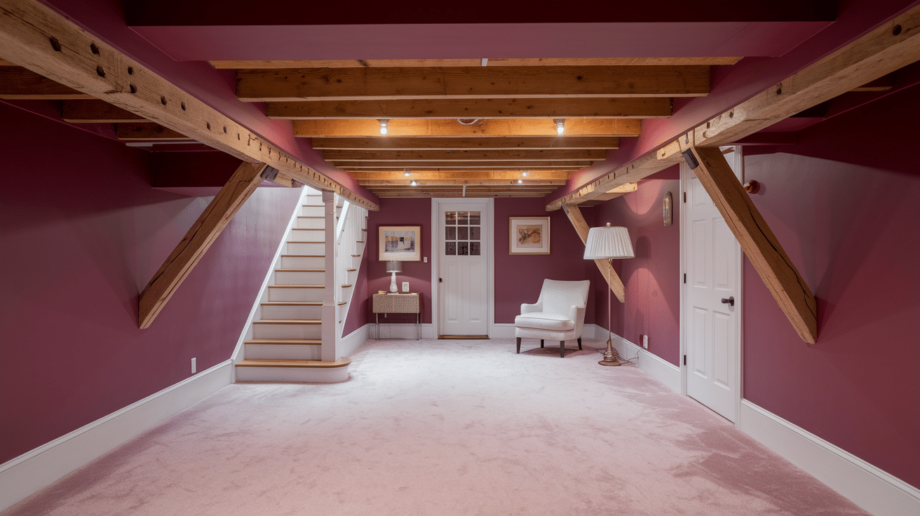
28. Haute Red (Rustic Brick) by KILZ Tribute
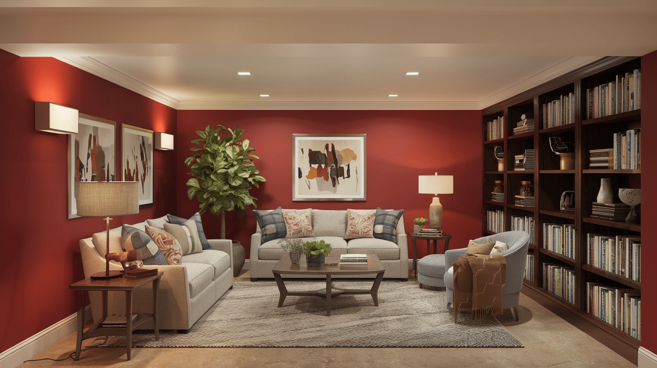
Haute Red creates visual warmth without feeling cramped. This balanced Red balances nicely with neutral furniture and standard basement fixtures.
- Visual Effect: A deep, earthy red that brings a classic and cozy touch to the basement.
- Lighting Consideration: Creates a warm and inviting glow, especially under soft lighting.
- Complementary Colors: Matches well with beige, dark wood, and charcoal gray.
- Styling Tips: Pair with rustic wooden furniture and vintage decor for a charming look.
29. Golden Feather by KILZ Tribute
Golden Feather reflects limited light effectively. This subtle Golden shade maintains a natural quality even in spaces with few windows.
- Visual Effect: A soft, warm off-white with subtle yellow undertones for a comforting feel.
- Lighting Consideration: Reflects light beautifully, making basements feel brighter and cozier.
- Complementary Colors: Looks great with brown, light gray, and navy blue.
- Styling Tips: Add warm lighting and soft furnishings for an elegant, inviting aesthetic.
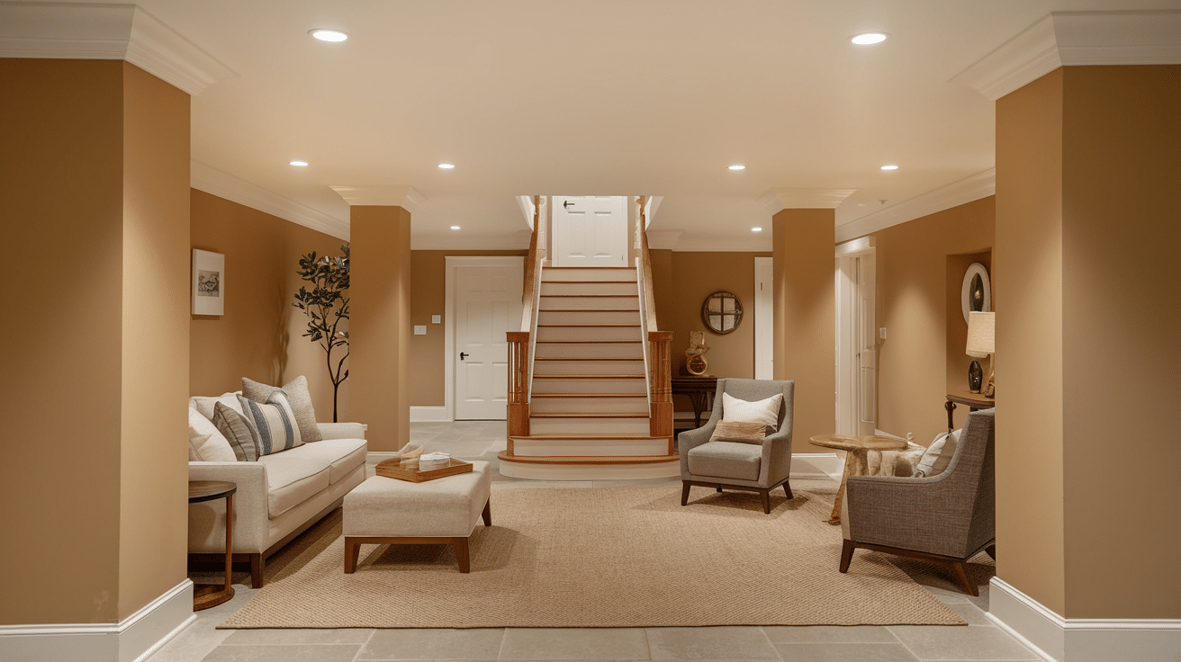
30. Warm Cappuccino by PRESTIGE Paints
Warm Cappuccino provides subtle richness without darkness. This inviting Cappuccino creates comfort in spaces where people gather for conversations.
- Visual Effect: A soft, coffee-inspired brown that brings warmth without being too dark.
- Lighting Consideration: Works well in all lighting conditions, keeping spaces cozy and welcoming.
- Complementary Colors: Blends beautifully with creamy whites, deep reds, and warm grays.
- Styling Tips: Pair with leather furniture and brass accents for a sophisticated touch.
31. Gray Flannol by PRESTIGE Gray (Charcoal Gray)
Gray Flannol provides a modern foundation without coldness. This versatile Flannol works well with various decor styles without clashing.
- Visual Effect: A deep, neutral gray that adds a modern, moody aesthetic.
- Lighting Consideration: Works well with both warm and cool lighting, creating a bold yet inviting atmosphere.
- Complementary Colors: Pairs beautifully with crisp white, metallics, and warm wood tones.
- Styling Tips: Add soft textures like velvet or plush rugs for a cozy touch.
32. Hawaiian Ocean by KILZ TRIBUTE
Hawaiian Ocean creates depth without gloom. This rich Ocean makes a statement without making rooms feel smaller or closed-in.
- Visual Effect: A deep, almost-black blue that adds a sophisticated, elegant vibe.
- Lighting Consideration: Works best with accent lighting or warm light sources to enhance depth.
- Complementary Colors: Pairs well with gold, white, and soft gray for a luxurious look.
- Styling Tips: Use metallic accents and soft fabrics to balance the richness.
33. American Pine by KILZ TRIBUTE
American Pine brings natural elements indoors. This earthy Pine connects basement spaces with upper floors through color continuity.
- Visual Effect: A dark, earthy green that brings a sense of nature and richness to the basement.
- Lighting Consideration: Looks best with warm lighting to maintain a cozy ambiance.
- Complementary Colors: Works well with warm neutrals, leather furniture, and gold fixtures.
- Styling Tips: Incorporate wood and brass accents for a refined, vintage touch.
34. Crimson Velvet by KILZ TRIBUTE
Crimson Velvet creates visual interest and depth. This rich Crimson works effectively in entertainment spaces and home theaters where mood matters.
- Visual Effect: A bold, rich red with deep undertones that add warmth and drama.
- Lighting Consideration: Looks best in well-lit spaces or paired with soft white trim to prevent a heavy feel.
- Complementary Colors: Pairs well with black, white, and muted golds.
- Styling Tips: Use vintage decor and plush seating to create a warm, inviting setting.
35. Espresso Brown by Rust-Oleum
Espresso Brown provides rich background for furniture pieces. This deep Espresso creates visual structure in open-concept basement layouts.
- Visual Effect: A deep, coffee-colored brown that adds a refined and cozy touch.
- Lighting Consideration: Best paired with warm lighting and light-colored accents.
- Complementary Colors: Works well with beige, warm white, and deep greens.
- Styling Tips: Incorporate textured elements like suede or wood to enhance depth.
36. Flat Black (for accent walls) by Rust-Oleum
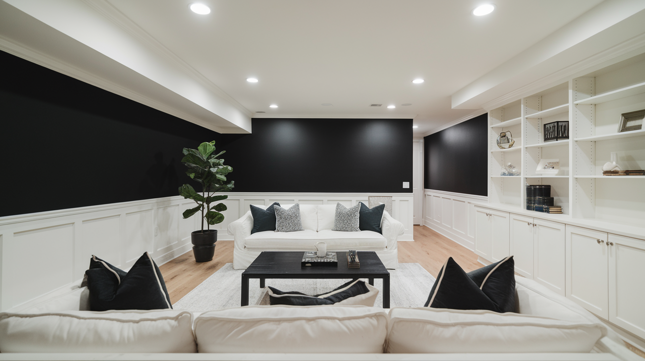
Flat Black frames wall sections effectively. This clean Black creates visual focus points without making the entire space feel small.
- Visual Effect: A sleek, bold black that adds a striking and dramatic contrast.
- Lighting Consideration: Best used on an accent wall with ample lighting to avoid feeling too enclosed.
- Complementary Colors: Pairs well with white, gold, or deep jewel tones for balance.
- Styling Tips: Use in combination with mirrors and soft lighting for a chic, modern look.
37. Eggplant Purple by Glidden Total
Eggplant Purple provides color depth without typical purple brightness. This subtle Eggplant works well in spaces used mainly during evening hours.
- Visual Effect: A deep, luxurious purple that adds a regal and moody atmosphere.
- Lighting Consideration: Works best with warm lighting and gold or brass accents.
- Complementary Colors: Matches well with soft neutrals, warm grays, and deep blues.
- Styling Tips: Use rich textiles like velvet or silk to elevate the look.
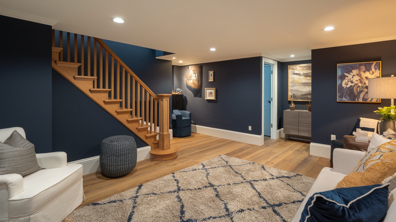
38. Satin Nantucket Navy by Rust-Oleum
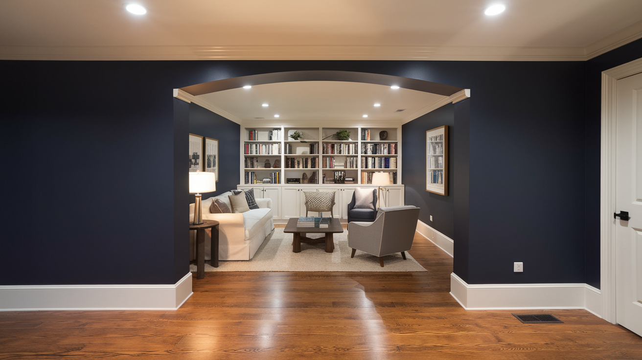
Satin Nantucket Navy creates subtle background for artwork and photos. This classic Nantucket balances traditional and modern elements easily.
- Visual Effect: A rich, timeless navy that exudes sophistication and depth.
- Lighting Consideration: Pairs beautifully with both warm and cool lighting, depending on the desired effect.
- Complementary Colors: Looks great with white trim, brass details, and natural wood.
- Styling Tips: Incorporate coastal or classic decor for a balanced and polished look.
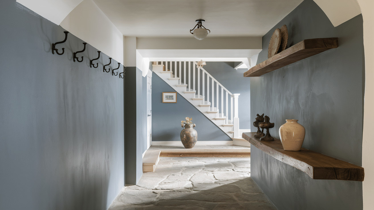
39. Deck Gray by ALLFLOR Porch
Deck Gray hides wall imperfections without feeling heavy. This practical Deck shade provides subtle texture that changes with different lighting.
- Visual Effect: A smoky, moody gray with subtle blue undertones.
- Lighting Consideration: Works best with warm lighting to avoid feeling too cold.
- Complementary Colors: Pairs beautifully with white, light gray, and metallic tones.
- Styling Tips: Use sleek, modern furniture and soft textures for a high-end finish.
40. Tan by KILZ
Tan creates warmth balanced with neutrality. This versatile Tan works effectively in multi-purpose spaces serving different functions throughout the day.
- Visual Effect: A slightly softened brown with a rich, matte finish that adds depth without feeling too stark.
- Lighting Consideration: Needs strategic lighting to prevent a heavy, enclosed feel.
- Complementary Colors: Matches well with deep wood tones, muted blues, and warm neutrals.
- Styling Tips: Use glossy or textured decor pieces to break up the darkness and add dimension.
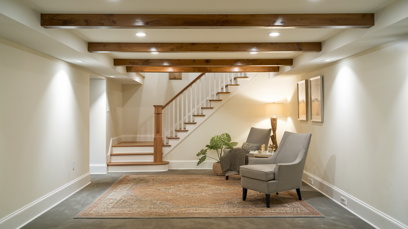
Additional Basement Painting Tips to Improve Your Space
Choosing the right basement paint isn’t just about color—application techniques and finishes play a crucial role in achieving the best results.
Follow these expert tips to ensure your basement looks great and lasts for years.
1. Test Before Committing for the Best Results
Before fully committing to a color, apply sample patches on different walls and observe how they appear:
- During daylight (if natural light is available)
- Under various artificial lighting conditions
- At different times of the day as lighting shifts
This helps ensure your chosen shade looks just as good in your basement as it does in a paint swatch.
2. Consider Two-Tone Approaches for Added Depth
Using multiple shades can enhance your basement’s visual appeal and dimension:
- Paint the lower half of the walls in a darker shade and the upper half in a lighter color to create the illusion of height.
- Use an accent wall to define different sections in an open-concept basement.
- Incorporate contrasting colors to add personality and break up large, monotonous spaces.
3. Select the Right Paint Finish for Durability
Basements often deal with humidity and moisture, so selecting the right paint finish is crucial:
- Semi-gloss or satin finishes offer better moisture resistance and are easier to clean.
- Mildew-resistant paint helps prevent mold growth in damp environments.
- Quality primers ensure proper adhesion, especially on concrete or masonry walls.
By choosing the right finish and preparation methods, your basement walls will stay looking fresh and beautiful for years to come.
Final Thoughts
There you have it! Picking the perfect paint color can transform a basement from a storage space into the most appealing room in your house. The right color choice makes a major difference.
Take your time with this decision. Purchase a few sample pots and apply the colors on different walls.
Check them out in the morning, afternoon, and at night with your lights on. Depending on the lighting, colors can sometimes look quite different!
Based on your basement’s specific characteristics, these recommendations can point you in the right direction. Then grab your rollers and get painting!
That basement makeover is just a weekend project away, and you’ll be showing it off to friends before you know it.
