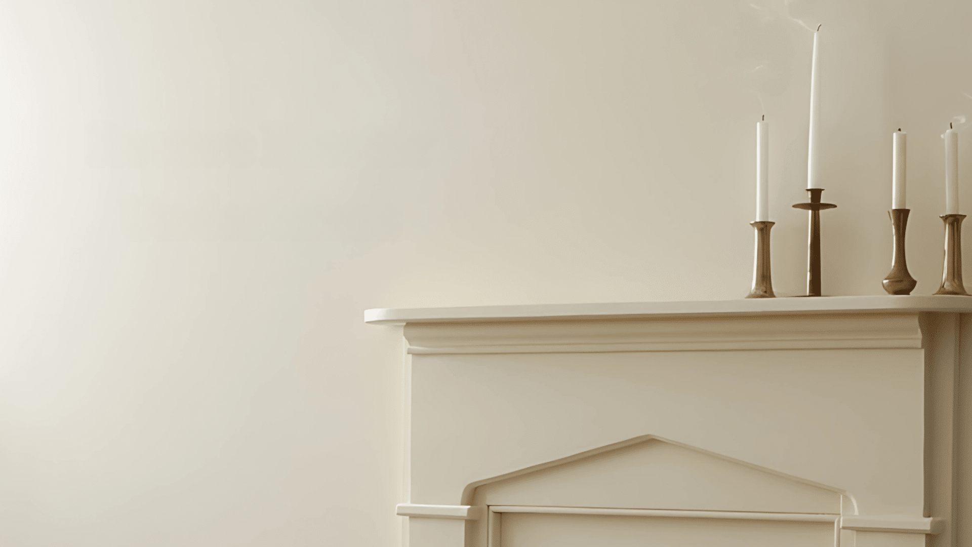
Revere Pewter by Benjamin Moore is not just a safe neutral. It is a calculated design move.
This greige shade carries subtle undertones that can dramatically shift depending on lighting, materials, and surrounding colors. Many get it wrong by expecting it to behave like a flat gray or beige. It never does.
This color adapts. It reflects olive greens, hints of taupe, slight blues, and the rare touch of purple. That flexibility makes it powerful but also easy to misuse without a sharp eye.
Understanding the science of these undertones changes everything. From furniture choices to flooring tone, each decision matters.
This breakdown shows what to look for and how to avoid regret. Revere Pewter can absolutely work for your space when applied with clarity and intention. It is not about guessing. It is about getting it right.
The Science of Undertones in Revere Pewter
Revere Pewter is a “greige” color, combining gray and beige, with a special undertone composition.
It has a Light Reflectance Value (LRV) of 55.51, placing it in the medium range, neither too light nor too dark.
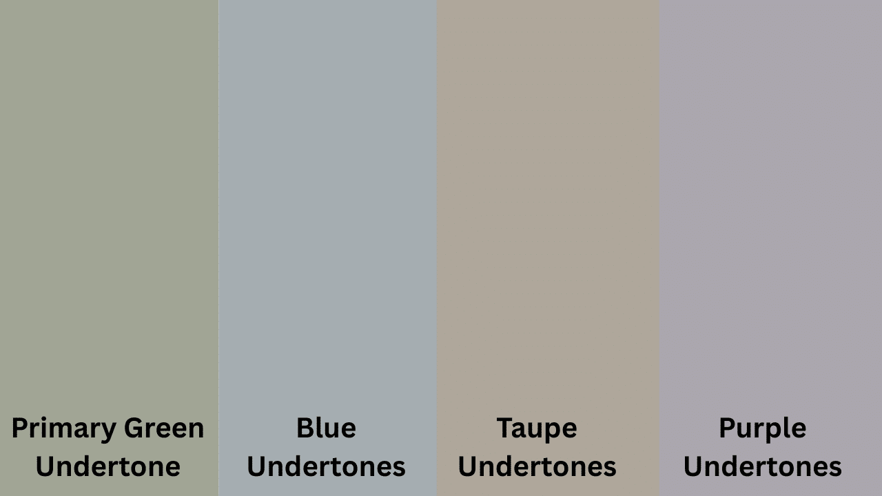
Its primary undertone is green, with secondary hints of blue, taupe, and occasional purple.
Unlike pure grays or beiges, these undertones are subtle and shift depending on lighting, adjacent colors, and room orientation, giving it a “chameleon-like” quality.
Understanding its dynamic undertones is key to using Revere Pewter successfully, as the color adapts to its environment, making it a versatile neutral.
The Primary Green Undertone
Revere Pewter’s dominant undertone is a soft, muted green with olive influences, giving it a grounded, organic quality.
This green undertone is subtle compared to pure grays or beiges, and becomes more pronounced in natural light or when paired with white trim, especially in north-facing rooms.
This adds depth and warmth, preventing the color from feeling cold like flat grays. Revere Pewter’s unique green undertone allows it to feel both contemporary and timeless in various settings.
Secondary Undertones Spectrum
While the green undertone forms Revere Pewter’s foundation, several secondary undertones contribute to its complex personality.
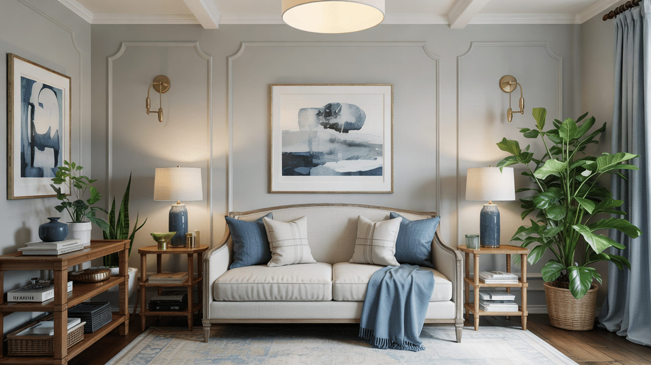
- Blue Undertones: Revere Pewter can show subtle blue undertones in rooms with northern light or late afternoon sun. These blue notes are faint, shifting the color slightly cooler.
- Taupe Undertones: Revere Pewter has taupe undertones that add warmth and prevent it from feeling too cool. These undertones are most visible in southern light or with incandescent lighting.
- Purple Undertones: Revere Pewter has a subtle purple undertone that appears in mixed lighting or at dusk when natural light takes on a purplish hue. Though rarely dominant, this undertone adds depth and sophistication.
Environmental Factors Affecting Undertones
Beyond lighting, numerous environmental factors in your space can bring out specific undertones from Revere Pewter. Understanding these interactions is crucial for a successful application.
Adjacent Colors
The colors placed next to Revere Pewter can significantly influence its undertones.
- Pure White: Enhances Revere Pewter’s green undertone.
- Cream: Brings out taupe undertones.
- Blue Elements: Reinforces blue undertones.
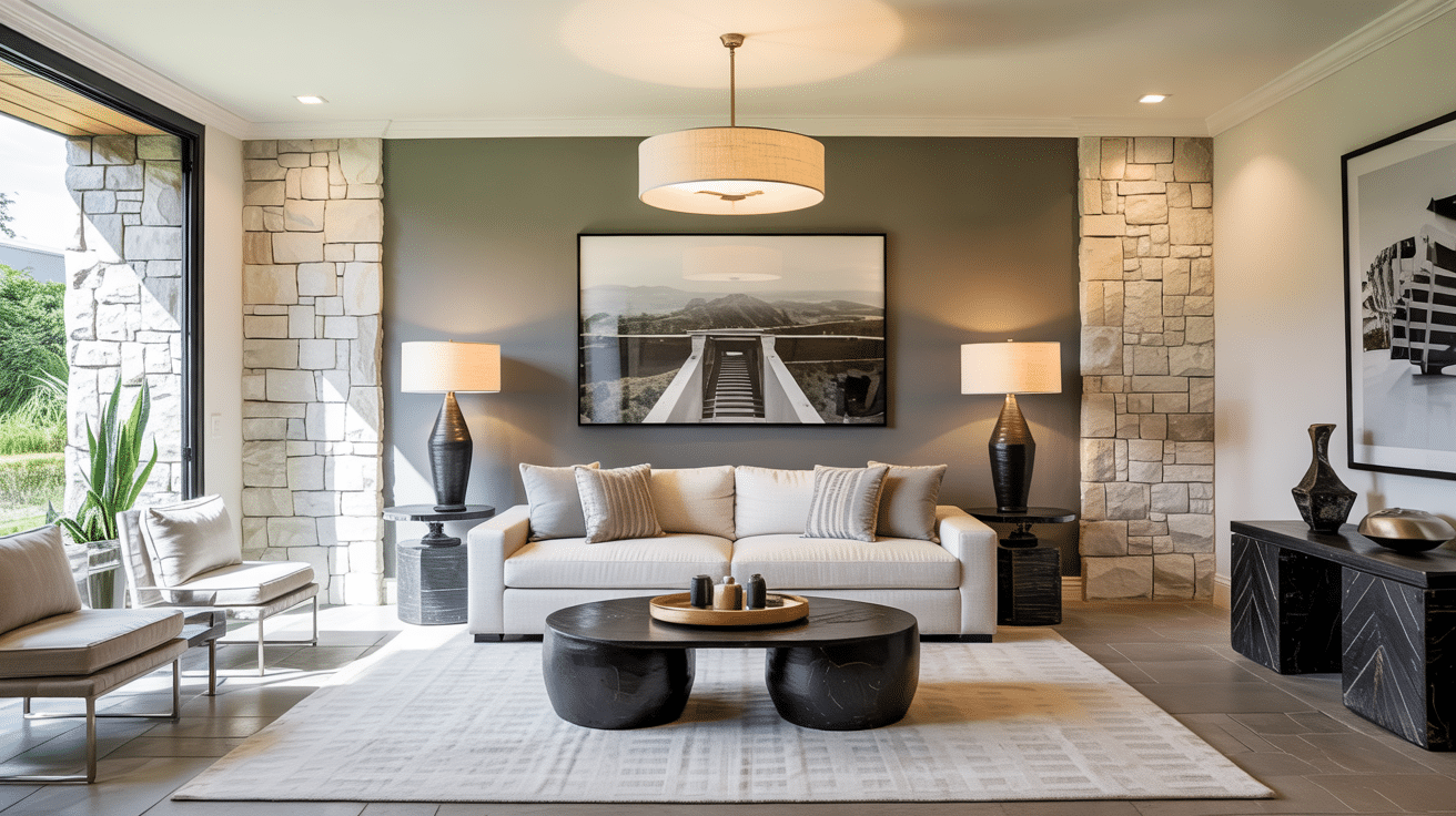
- Green Fabrics/Plants: Strengthens the green undertone.
- Warm Woods/Terracotta: Amplifies warmer undertones.
Material Reflections
The type of material surrounding Revere Pewter affects how its undertones are perceived.
- Polished Surfaces: Emphasize cooler undertones.
- Matte Finishes: Make the color appear truer to its balanced state.
- Natural Materials: Highlight complementary undertones.
- Textured Surfaces: Add depth and complexity to the undertones
Flooring Undertone Interactions
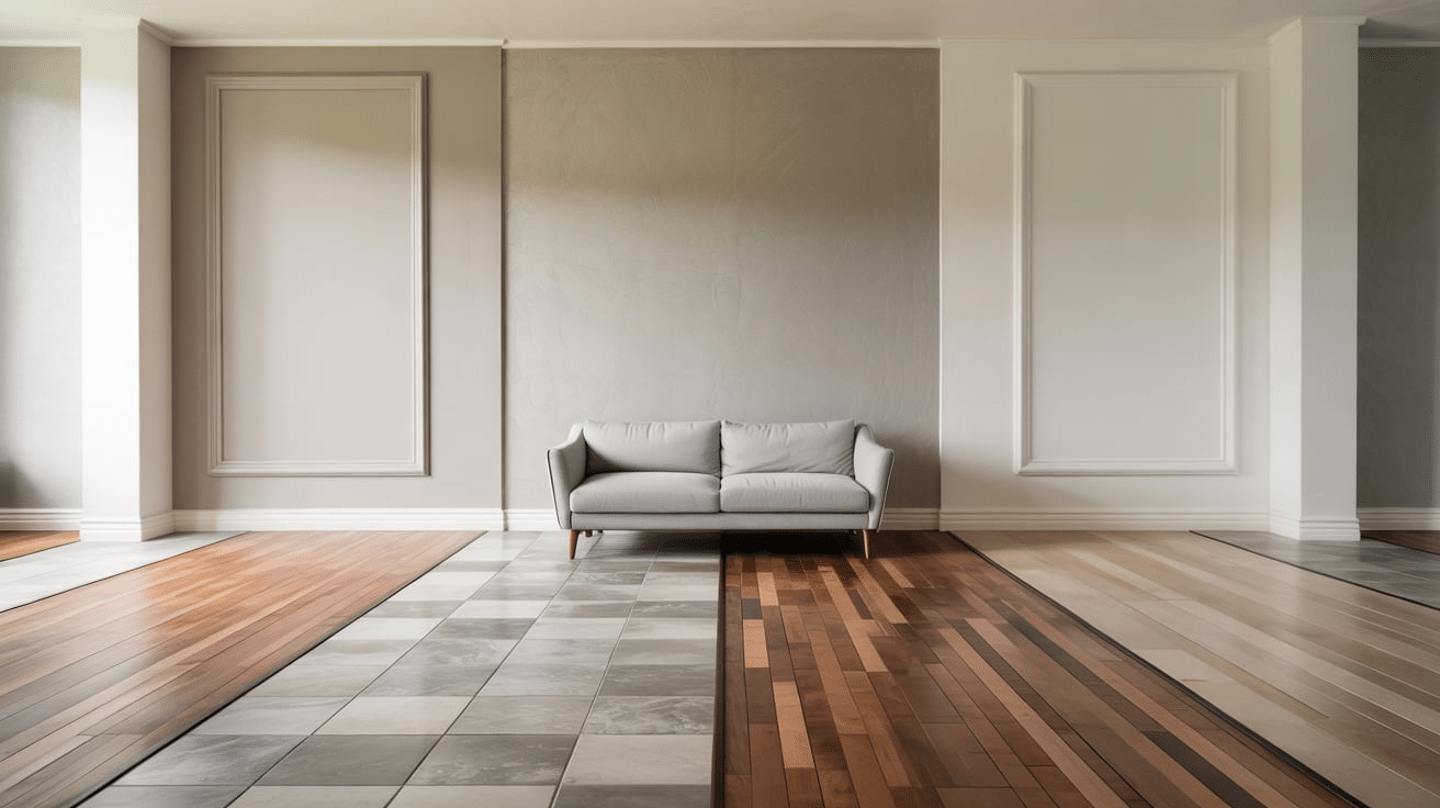
The type of flooring in a room strongly impacts the appearance of Revere Pewter’s undertones.
- Warm Flooring: Pulls out warmer taupe undertones.
- Cool Flooring: Enhances green and blue undertones.
- Red-Toned Woods: Can bring out subtle purple undertones.
- Natural Oak/Maple: May neutralize the green undertone.
Undertone Visualization Techniques
To accurately identify Revere Pewter’s undertones, use these proven techniques:
- Testing Methods: Use large sample boards (2′ x 2′) on multiple walls to evaluate undertones under different lighting conditions and times of day. Compare the color against true white to reveal undertones more clearly.
- Sample Boards: Use heavyweight white poster board, apply two coats of paint, and create multiple boards for comparison. Leave a white border for contrast and document observations.
- Comparison Techniques: Compare Revere Pewter to true grays, warmer greiges, and whites to reveal its undertones.
- Tools: Use color wheels, gray scales, light meters, and digital apps to analyze undertones, or consult a professional for expert advice.
A thorough, patient approach ensures you accurately understand how Revere Pewter’s undertones will behave in your space, preventing costly mistakes later.
Common Undertone Misinterpretations
Revere Pewter’s undertones can surprise homeowners and designers if not carefully tested:
- Green Misidentified as Gray: The green undertone is often mistaken for gray, only to appear more prominent later.
- Taupe Misidentified as Beige: Taupe may be mistaken for beige, leading to expectations of a warmer color.
- Blue Undertone Overlooked: The subtle blue undertone can be missed during testing and only appears in specific lighting.
- Purple Undertone Missed: The purple undertone is often undetected, only emerging at certain times of day.
- Warm vs. Cool Expectation: Revere Pewter’s balance can be mistaken for leaning too warm or cool.
Benjamin Moore Alternatives with Distinct Undertone Differences
These alternatives within the Benjamin Moore collection provide options when you appreciate Revere Pewter’s quality but need a different undertone emphasis for your specific environment.
- Rodeo (1534): Similar depth but with stronger gold undertones for consistent warmth.
- Collingwood (OC-28): Similar versatility but with stronger purple undertones for sophisticated spaces.
- Pashmina (AF-100): Deeper with more evident green-gray undertones for a more dramatic neutral.
- Classic Gray (OC-23): Much lighter with subtle purple-gray undertones for an airier feel.
- Thunder (AF-685): Deeper with blue-gray undertones for a more dramatic cool neutral.
Final Thoughts: Your Revere Pewter Success Blueprint
Revere Pewter will always react to its surroundings. That is both its magic and its challenge. The key to mastering it lies in recognizing how lighting, textures, flooring, and neighboring colors bring out its undertones.
Do not assume it is just a neutral. It shifts and responds to its environment with intention. That is why so many get it wrong. They expect consistency, but this paint delivers personality instead.
Compare it with truer grays and warmer shades to understand its leanings. This is how successful color decisions are made.
Have you used it before? Noticed a shift you did not expect?
Share your experience in the comments and join the conversation below.
