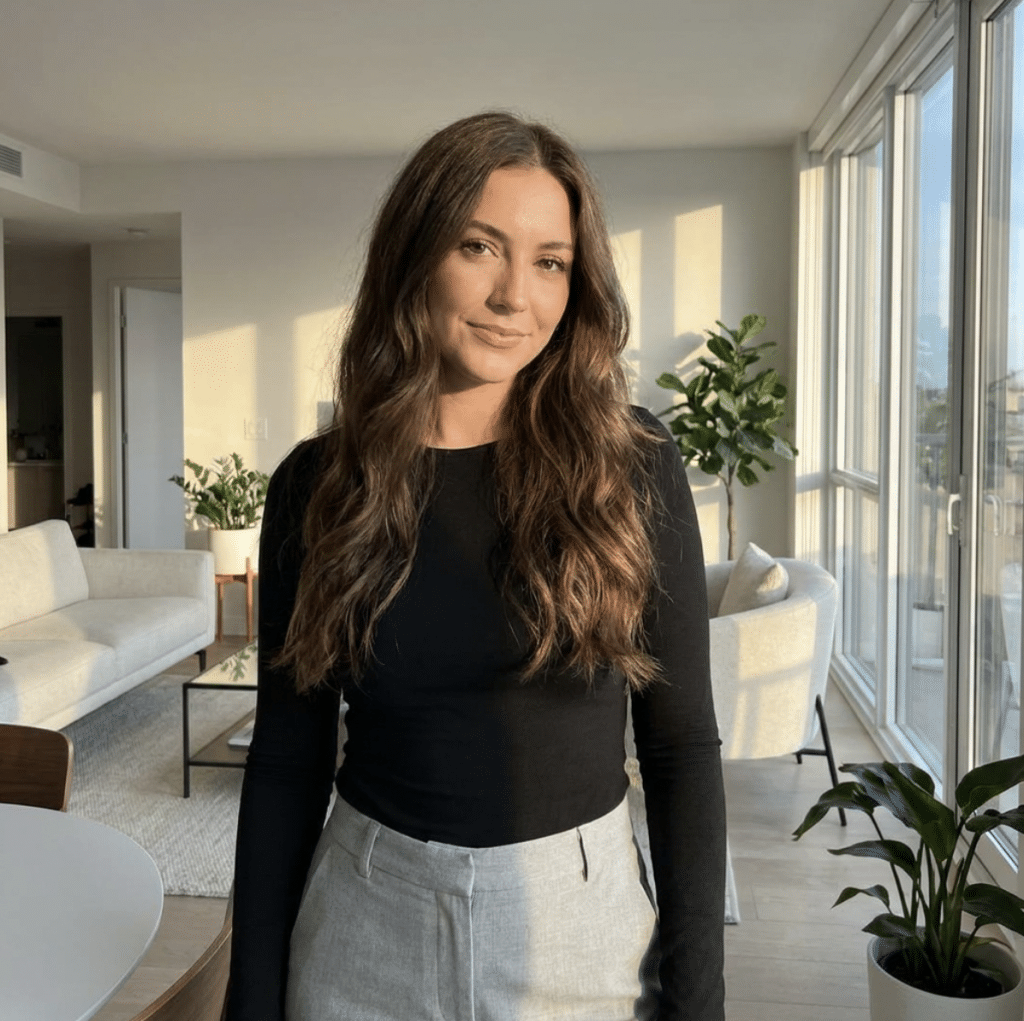
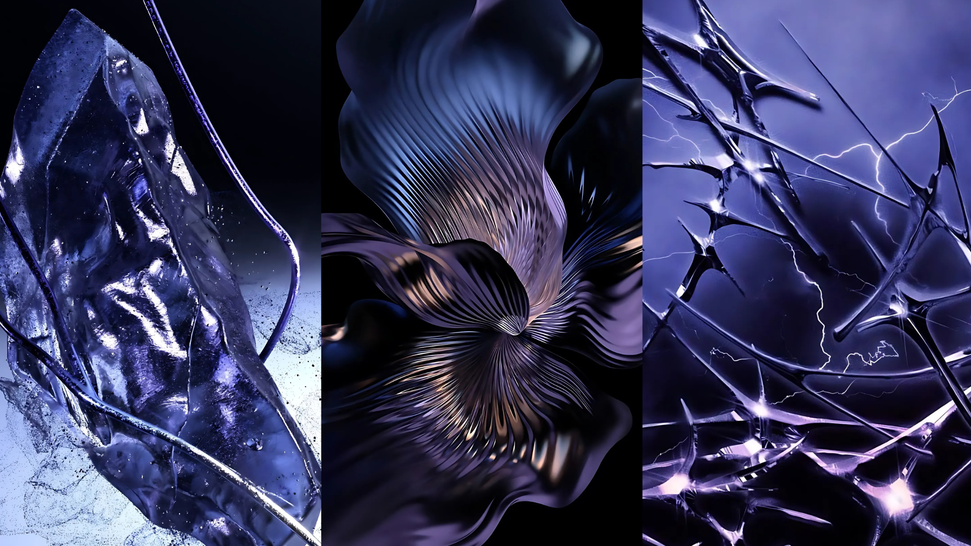
Step into the world of Future Dusk (#532D3A), the color of the year that’s capturing hearts and redefining spaces!
Finding the perfect color for your home or wardrobe can be challenging, but this year, Future Dusk, a stunning blue-violet tone, is here to refresh your style and space.
In this blog, we discuss why Future Dusk is the standout color of the year, how to incorporate it into your home and wardrobe, and its lasting impact on design trends.
From mood-setting interiors to fashion-forward outfits, find out how to make Future Dusk work for you.
Why is Future Dusk the Color of the Year?
Pantone and major color forecasters have selected Future Dusk as this year’s standout shade after months of careful study into global trends, consumer habits, and cultural movements.
- Color Expert Selection: Pantone picked Future Dusk after studying global trends and cultural movements.
- Day-Night Balance: This blue-violet brings calm, suggests forward thinking, and works with many skin tones.
- Subtle Shift: Social media users prefer softer colors for spaces that feel current yet lasting.
- Digital Rest: Connects to night skies, giving eyes a break from screens and daily tasks.
It connects to our shared interest in night skies and twilight beauty, giving us a visual rest from screen time and daily tasks.
How to Incorporate Future Dusk in Your Home
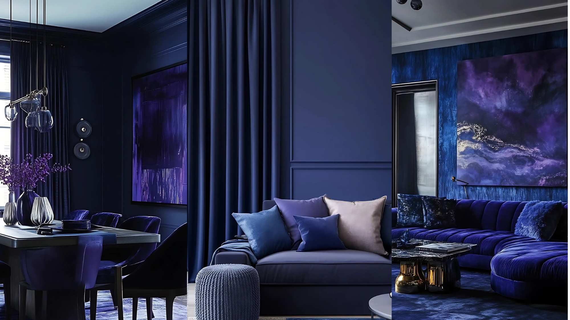
Future Dusk can be integrated into your living space without requiring a complete renovation. This blue-violet tone works well as a focal point in any room – try painting one wall for visual interest without making the space feel dark.
Small Updates, Big Impact: Not ready for paint? Try cushions, throws, or curtains in Future Dusk. They add color without a long-term commitment and can be easily moved from one room to another.
Style Compatibility: Future Dusk improves modern and traditional homes, adding warmth to minimalism and updating wooden or vintage spaces.
Lighting Considerations: Light significantly affects the appearance of this color. Daylight highlights blue tones, while warm evening lighting accentuates violet depths. Use warm bulbs to create rich, Future-Dusk surfaces after sunset.
Texture Effects: The finish matters with this shade. Matte creates soft, cozy feelings, while glossy makes the color more dramatic and bold.
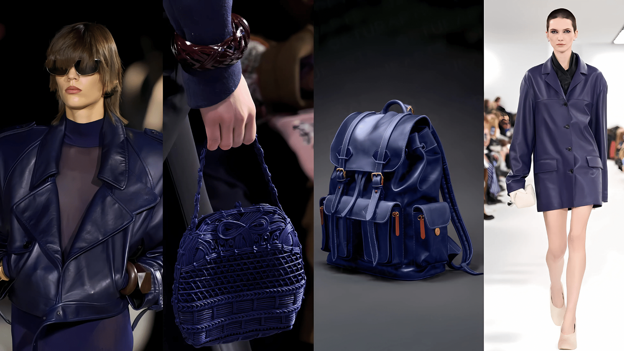
Future Dusk in Fashion: The Cool Hue
| Category | How to Wear Future Dusk | Best Fabrics | Styling Tips |
|---|---|---|---|
| Casual Wear | Future Dusk denim as an alternative to traditional jeans | Cotton, denim | Pair with white tops for a clean look or neutrals for everyday style |
| Relaxed Style | Oversized sweaters and hoodies | Knits, fleece | Create laid-back yet fashion-forward looks |
| Evening Wear | Slip dresses and jumpsuits | Satin, crepe | Minimal accessories needed – the color makes its statement |
| Formal Events | Long gowns | Velvet, satin | Stands out among traditional black attire; photographs beautifully |
| Accessories | Handbags, shoes, scarves | Leather, silk | An easy way to try the trend without a full outfit commitment |
Fabric Effects on Future Dusk
- Velvet: Captures light, making the color look rich and luxurious
- Satin: Creates a refined sheen that shifts between blue and purple tones
- Denim: Takes on a sophisticated edge in this color
- Silk: Highlights the color’s depth and movement
Why Fashion Editors Call it “The Cool Hue” ?
Fashion experts notice how this blue-violet shade feels both current and timeless. The color works well for casual outfits and formal events alike.
You’ll find it on fashion shows from New York to Paris this season. Many clothing brands like it because it gives shoppers a fresh option beyond basic fashion colors.
The shade stands out in photos while still looking natural and not forced.
Coordinating Colors that Work Well with Future Dusk
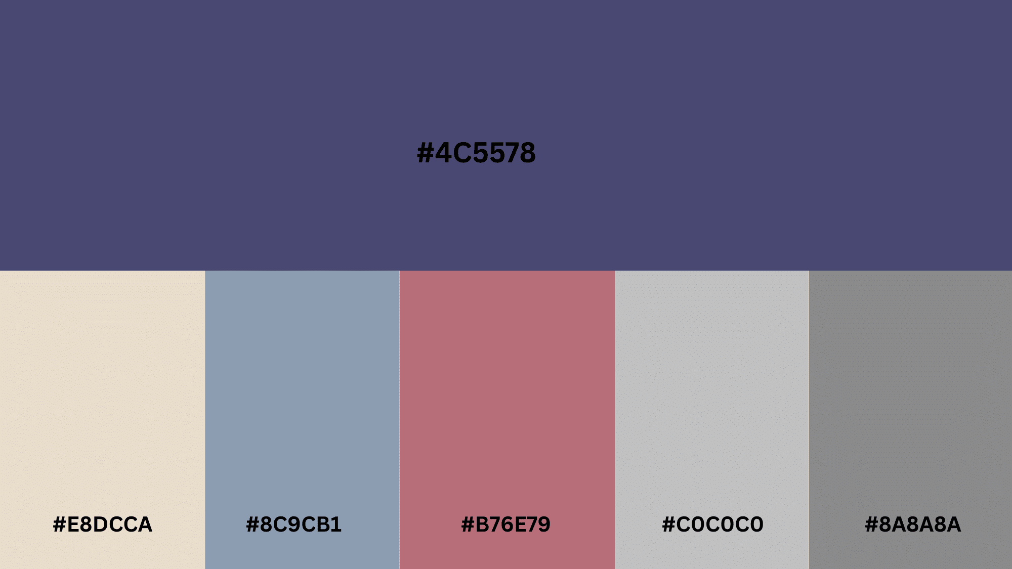
1. Soft Beige (#E8DCCA)
The warmth of beige softens the coolness of Future Dusk’s blue-violet tone. This combination creates a calm, grounded feel that works well in living spaces and casual fashion.
2. Cool Gray (#8C9CB1)
This neutral partner lets Future Dusk shine while adding a modern touch. The pairing works exceptionally well in contemporary spaces and professional wardrobes.
3. Rose Gold (#B76E79)
This metallic tone warms up Future Dusk, adding a touch of luxury. The combination feels both current and classic, making it ideal for accessories and accent pieces.
4. Brushed Silver (#C0C0C0)
Creates a cool, contemporary partnership with Future Dusk that works well in modern settings. This pairing feels sophisticated and clean without being cold.
5. Pewter (#8A8A8A)
Adds an industrial edge when combined with Future Dusk’s blue-violet hue. This combination brings depth and character to spaces and looks particularly effective with matte finishes.
Future Dusk in Graphic & Digital Design
In a world where colors speak volumes about cultural trends, Future Dusk has emerged as the defining shade of our time, connecting our past comfort with our hopes for what is to come.
Web Design Applications: Web designers use Future Dusk as a background for 2025 projects, featuring good contrast for white text. Tech startups often use this color to convey a professional and modern image.
Branding Benefits: Future Dusk shows class and creativity in branding. It helps companies look modern yet professional. In logos, it stands apart from typical blue corporate looks while showing trust.
Visual Storytelling: Brands pair this color with matching tones in mood boards. Photos with Future Dusk elements work well across social platforms without looking too bright or fake.
UI/UX Advantages: This blue-violet creates eye-friendly screens for long viewing. Dark mode users like it as a softer option than black. Mobile apps report longer user time with this color.
Conclusion
Celebrate the lasting charm of Future Dusk!
With its distinctive blend of blue and violet, Future Dusk isn’t just a trend.
It’s a color that evokes both comfort and refinement. Its lasting appeal ensures it remains stylish, fitting seamlessly into modern and classic designs.
Ready to incorporate Future Dusk into your home or style? Start with small accessories or go bold with a painted wall; it’s your canvas to create.
Comment below on your favorite part of incorporating the color into your life.
Frequently Asked Questions
What Plants are Used in Future Dusk?
The Future Dusk tone leans towards cool blue rather than warm, purple-red, so accentuate it with plantings of cobalt and ultramarine flowers.
What is the Color for 2026?
WGSN and Coloro have named “Transformative Teal” as the 2026 Color of the Year, blending blue and green to represent nature and an earth-focused mindset.
Who Said Future Dusk is the Color of the Year?
WSGN, a company that calls itself the number one consumer trend forecaster in the world, has identified Future Dusk as a key color trend, following their annual color forecast research.