What’s the secret behind those show-stopping homes that make you slow down while driving by?
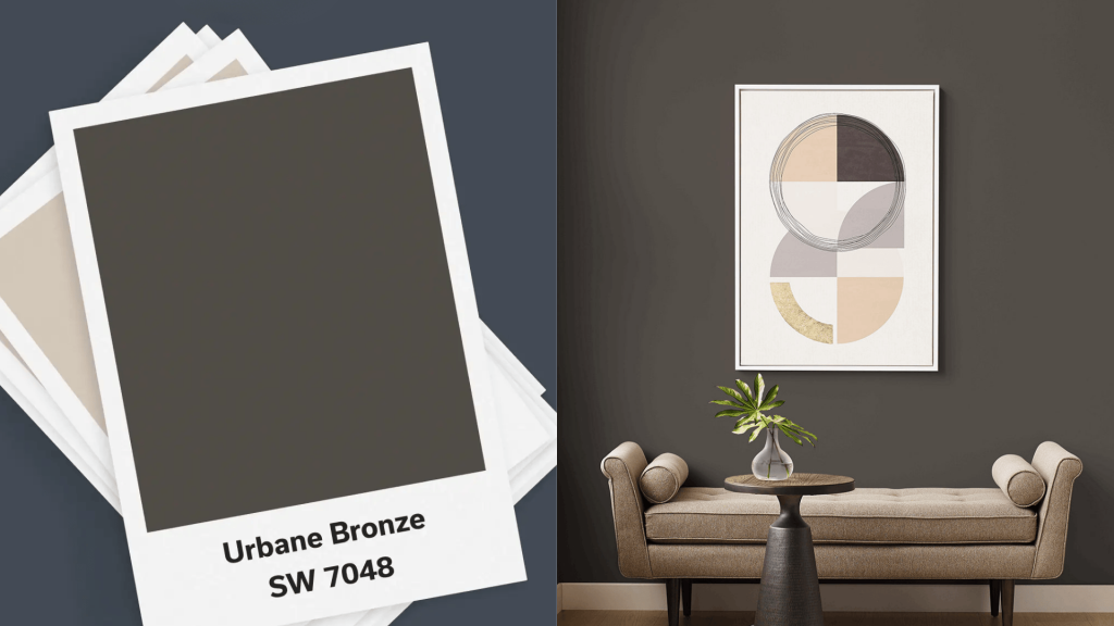
Sherwin-Williams Urbane Bronze is a rich greige that brings instant suaveness to any home style.
Named the 2021 Color of the Year, this isn’t just another dark paint color – it’s a carefully balanced blend of gray and beige that creates warmth without feeling heavy.
But here’s the thing about using such a bold exterior color: the magic happens when you pair it with the right coordinating colors.
Urbane Bronze’s flexibility lies in its earthy undertones, which complement natural outdoor elements like wood, stone, and landscaping.
It’s warm enough to feel welcoming but suave enough to look modern and fresh, making it perfect for any architectural style.
Understanding Urbane Bronze: LRV and Undertones
The secret to successfully using urbane bronze lies in understanding its undertones and how they affect your color choices. Those earthy undertones we mentioned, the green, brown, and gray, are what make this color so special.
Urbane bronze has a Light Reflectance Value (LRV) of 6, meaning it absorbs most of the light that hits it.
This low LRV creates a rich, vivid appearance that makes the color so appealing.
However, it also means you’ll want to use it thoughtfully, especially on homes that don’t get a lot of natural light.
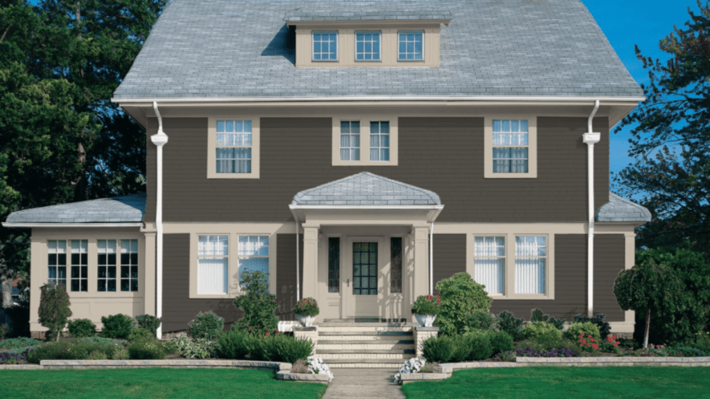
The low LRV works best when paired with plenty of contrast, particularly with lighter trim colors. This contrast prevents the color from feeling too heavy or overwhelming and helps highlight your home’s architectural features.
Color characteristics:
- Dark greige base with warm undertones
- Earthy hints of green, brown, and gray
- Works on both modern and traditional home styles
- Creates a rich, inviting exterior presence
Is Urbane Bronze Warm or Cool?
Urbane Bronze has a warm undertone, thanks to its blend of brown, gray, and green hues.
While it may lean towards cooler tones in certain lighting conditions, it retains its overall warm and welcoming feel, making it perfect for both modern and traditional home styles.
What are the Urbane Bronze Undertones?
The undertones of Urbane Bronze include earthy shades of green, brown, and gray. These undertones lend the color depth and make it blend beautifully with natural surroundings, such as stone, wood, and landscaping elements.
This makes it perfect for creating a seamless, cohesive look in both contemporary and rustic settings.
Exterior Urbane Bronze Coordinating Colors
While white trim is classic, other colors can create interesting combinations with urbane bronze.
| Color | Best For | Effect Created |
|---|---|---|
| Iron Ore | Accent Trim, Doors | Vivid, More Dramatic Look |
| Peppercorn | Window Frames, Shutters | Subtle Contrast with Warmth |
| Accessible Beige | Softer Trim Alternative | Warm, Cohesive Appearance |
These alternatives work well when you want something different from traditional white trim, while maintaining the suave feel that makes urbane bronze so appealing.
Best White Trim Colors for Urbane Bronze Exteriors
White trim is the classic choice for urbane bronze exteriors, and for good reason.
The contrast between the dark siding and bright trim creates a crisp, clean look that beautifully highlights your home’s architectural details.
| Trim Color | Best For | Why It Works |
|---|---|---|
| Alabaster | Trim, Doors, Windows | Warm White that Balances the Dark Tones |
| Pure White | Doors, Shutters | Clean, Crisp Contrast for Modern Looks |
| Seapearl | Light Accents | Soft White with Subtle Warmth |
Alabaster is particularly popular because it brings warmth to the pairing without feeling too stark. Pure white works well for homeowners who want a more modern, high-contrast look.
Seapearl offers a softer approach that still provides good contrast while feeling more subtle.
Color Palette Ideas with Urbane Bronze for Exteriors
Creating the perfect exterior color scheme means thinking beyond just the primary color and trim. Here are some tested combinations that work beautifully with urbane bronze:
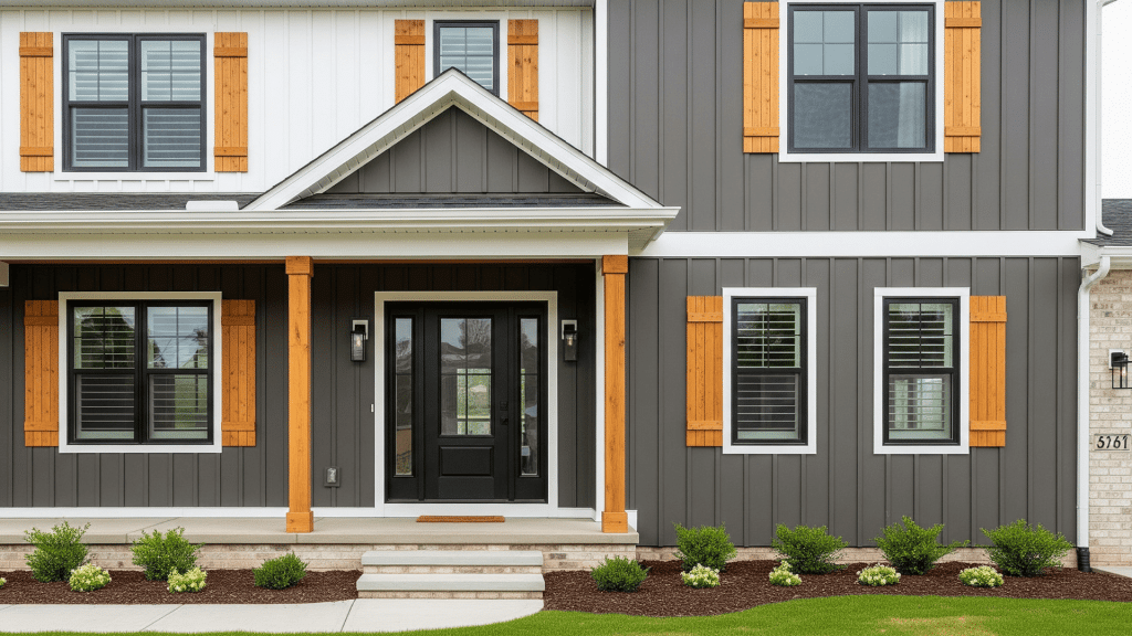
1. Modern Farmhouse Palette
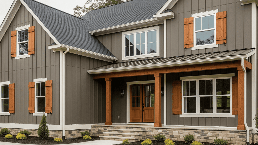
This combination starts with Urbane Bronze siding as your suave foundation, paired with Alabaster trim on windows and doors to create that essential warm contrast.
The magic happens when you add warm wood tones through shutters, porch details, or pergola elements, creating a bridge between the paint colors and natural materials.
The result combines contemporary polish with rustic charm, making it perfect for homeowners who want modernity without sacrificing the welcoming, lived-in farmhouse appeal.
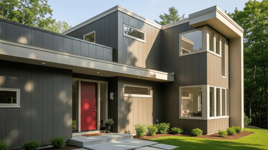
2. Contemporary Palette
Urbane Bronze on the main exterior walls creates a bold, architectural statement that’s backed by Pure White trim for clean, crisp lines throughout.
The drama intensifies with black accents on the front door and window frames, creating a striking monochromatic scheme with serious visual impact.
This palette delivers a sleek, modern appearance with strong contrast that works particularly well on homes with geometric architecture and minimal landscaping.
3. Traditional Palette
Urbane Bronze siding provides rich depth while Seapearl trim offers soft, subtle contrast that feels more relaxed than stark white alternatives.
The personality comes through with vivid red or navy blue on the front door, colors that complement rather than compete with the primary palette.
This combination creates a classic, welcoming feel with rich color depth that works beautifully on colonial, craftsman, or transitional home styles where urbanity meets approachability.
Is Urbane Bronze Right for Your Exterior Siding or Trim?
Urbane bronze works wonderfully for both siding and trim applications, but each use creates a different effect.
Understanding these differences helps you make the best choice for your home.
- For the main siding: Using urbane bronze as your primary exterior color creates a bold, suave statement.
- For trim and accents: When used as trim color, urbane bronze creates a subtle contrast against lighter siding colors. This approach adds depth without making too bold a statement.
- Best applications: the color works exceptionally well on larger surfaces where its richness can be fully appreciated. It’s particularly striking on homes with multiple levels or interesting rooflines.
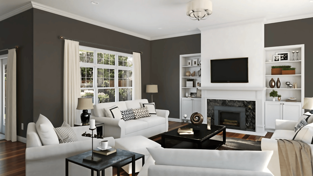
Using SW Urbane Bronze for Interiors
While the Urbane bronze Sherwin-Williams exterior applications receive the most attention, this flexible color creates equally stunning results indoors.
It works beautifully on accent walls, cabinetry, or trim to create suave focal points that pair well with soft neutrals, metallic accents, and warm wood tones.
Can I Try SW Urbane Bronze on Cabinets?
Yes, urbane bronze is perfect for cabinetry in both kitchens and bathrooms. Use it for kitchen islands, lower cabinets, or bathroom vanities to create a striking contrast with lighter countertops and backsplashes.
The key is to ensure adequate lighting and balance dark surfaces with plenty of lighter elements throughout the space.
What are the Best Interior Trim and Ceiling Colors to Pair with Urbane Bronze?
| Color | Best for | Why it works |
|---|---|---|
| Alabaster | Trim, baseboards, and crown molding | Warm white that balances richness without feeling stark |
| Seapearl | Trim in bedrooms, bathrooms | Soft white with subtle warmth for a relaxed, spa-like feel |
| Pure white | Contemporary spaces, door casings | Sharp, modern contrast is perfect for clean architectural lines |
| Soft whites/pale grays | Ceilings | Light tones ensure rooms feel balanced and airy |
Pro tip: Use the same trim color on baseboards, crown molding, and door casings for continuity. The contrast between dark walls and light ceilings helps maintain proper visuals and prevents spaces from feeling cave-like.
Comparisons with Urbane Bronze Alternatives
While urbane bronze is unique in its perfect balance of warmth and urbanity, other brands offer similar colors that provide comparable richness with their distinct characteristics.
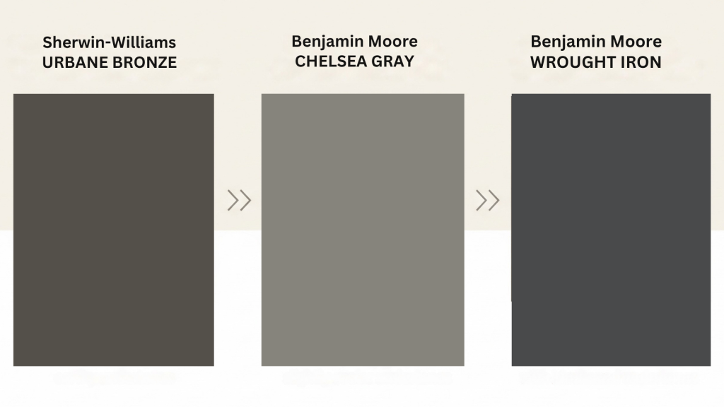
1. Which Benjamin Moore Colors Are Like Sw Urbane Bronze?
When urbane bronze isn’t available or you’re looking for subtle variations, these Benjamin Moore alternatives provide similar depth and complexity:
- Benjamin Moore’s Chelsea Gray: a warm gray with vivid undertones that’s slightly more neutral than Urbane Bronze. It offers similar urbanity but leans cooler, making it perfect for homes that want richness without the warmer brown undertones.
- Benjamin Moore’s wrought iron: darker and more dramatic with blackened undertones, this color creates a more intense statement. It works well when you want the boldness of urbane bronze but with a more modern, industrial feel.
These alternatives share urban bronze’s rich, dark appearance but offer subtle variations in tone and depth that might better suit specific design preferences or lighting conditions.
2. Trim Color Comparison Table
Here’s a comprehensive reference for choosing the perfect trim colors to complement your urbane bronze exterior:
| Trim color | Why it works | Lrv | Best usage tips |
|---|---|---|---|
| Alabaster | Balances dark tones with a warm, soft feel | 82 | Use for windows, doors, and architectural details |
| Pure white | Crisp contrast adds modern appeal | 84 | Ideal for contemporary looks with high contrast |
| Seapearl | Subtle warmth with a soft, inviting feel | 75 | Perfect for relaxed, muted contrast |
| Iron ore | vivid, dramatic look with high contrast | 8 | Best for accent trims and doors |
| Accessible beige | Soft, cohesive warmth blends with natural elements | 58 | Great for softer trim accents and doorways |
Pro Tip: Remember to consider your home’s lighting conditions and architectural features when making your final decision, as these factors significantly impact how each color combination will appear on your exterior.
3. Understanding LRV in Your Color Decisions
The light reflectance value (LRV) numbers in this table help you understand how much light each color reflects. Higher numbers mean more light reflection, which is crucial when pairing colors with urbane bronze’s low LRV of 6.
For maximum contrast, select trim colors with an LRV value above 70. For subtle urbanity, select colors with an LRV value between 50 and 70. For dramatic, monochromatic looks, use colors with LRV values below 20.
Tips for Choosing the Right Combination
Selecting the perfect color combination involves more than just picking colors you like. Consider these factors:
- Your home’s style: Modern homes can handle higher contrast combinations, while traditional styles often benefit from softer, more subtle pairings.
- Surrounding environment: consider your neighborhood, landscaping, and natural surroundings. The right combination should complement, not compete with, these elements.
- Maintenance considerations: Darker colors, such as urbane bronze, can show dirt and weathering more readily than lighter colors. Plan for regular maintenance to keep your exterior looking its best.
- Sample testing: Always test your color combinations on your actual home exterior. Colors can appear differently in various lighting conditions and when viewed against different materials.
Ready to Modify Your Home’s Exterior?
Urbane bronze offers a suave, classic choice for homeowners ready to make a statement with their exterior color.
When paired with the right coordinating colors, it creates a look that’s both current and classic, the kind of exterior that maintains its appeal for years to come.
The key to success lies in understanding how to balance this rich color with complementary tones that improve rather than compete with its natural beauty.
Remember, the best exterior color scheme is one that reflects your style while working harmoniously with your home’s architecture and surroundings.
Start planning your exterior modification today. Choose your favorite color combination and request samples to see how they look in your home!