
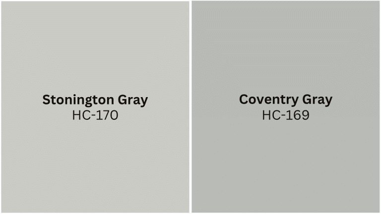
When it comes to refined gray paint colors, Benjamin Moore’s Stonington Gray and Coventry Gray reign supreme in the world of interior design.
These two powerhouse shades have captured the hearts of homeowners and designers alike, but choosing between them can feel overwhelming.
While both offer that coveted cool-toned refinement, they each bring distinct personalities to your space.
Stonington Gray whispers serenity with its lighter, airier presence, while Coventry Gray speaks in deeper, more dramatic tones.
Understanding their unique characteristics will help you make the perfect choice for your home modification.
Understanding Stonington Gray by Benjamin Moore
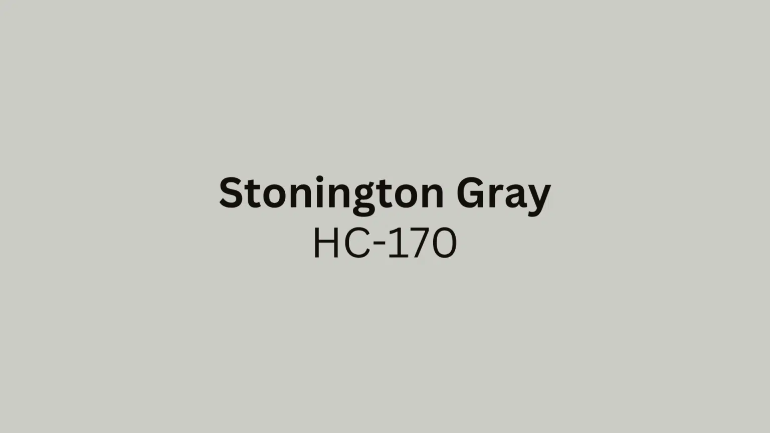
Stonington Gray (HC-170) is Benjamin Moore’s beloved light-to-medium gray that strikes the perfect balance between warm and cool.
This versatile chameleon has subtle blue undertones that shift beautifully throughout the day, appearing softer in natural light and more pronounced under artificial lighting.
Color Description: What makes Stonington Gray a versatile choice is its ability to adapt to different lighting conditions while maintaining its refined composure.
This medium-toned gray sits comfortably in the middle of the gray spectrum, neither too light nor too dark.
Undertones: The cool undertones with a subtle blue hue can appear different depending on lighting conditions.
In north-facing rooms, the blue undertones become more prominent, while in south-facing spaces, it appears more neutral and balanced.
Understanding Coventry Gray by Benjamin Moore
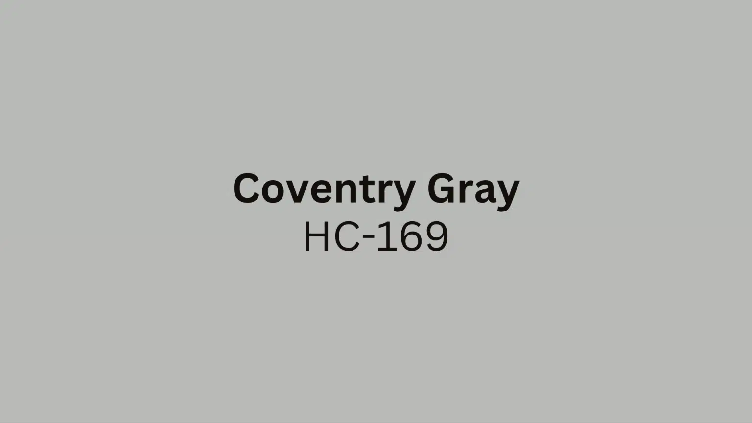
Coventry Gray (HC-169) is a refined, slightly darker gray that commands attention with its refined presence.
This deeper shade offers more drama and substance than its lighter counterpart, making it perfect for spaces where you want to create a sense of intimacy and classiness.
Color Description: A slightly darker, more subdued gray with cool undertones that provides a more substantial presence on the wall. It’s deep enough to feel rich and luxurious while still being considered a neutral.
Undertones: Much cooler and more muted compared to Stonington Gray, Coventry Gray offers a refined look with subtle green-gray undertones that become more apparent in certain lighting conditions.
Stonington Gray vs Coventry Gray: Key Differences
Benjamin Moore’s Stonington Gray and Coventry Gray are both refined paint choices, but they serve different design purposes. Understanding their key differences will help you select the perfect shade for your space.
| Aspect | Stonington Gray | Coventry Gray |
|---|---|---|
| LRV | 59.36 | 48.18 |
| Tone & Depth | Lighter, ethereal gray that opens up spaces | A darker, grounding presence that adds sophistication and intimacy |
| Cool Northern Light | Shows more blue undertones | Maintains a consistent, refined appearance |
| Warm Southern/Western Light | Appears more balanced and neutral | Less dramatic shifts in tone |
| Artificial Lighting | Brings out softer, muted qualities | Stays more consistent across different lighting |
| Best Spaces | Airy, open-concept areas where lightness and flow are desired | Smaller, cozier rooms need an intimate, enveloping atmosphere |
Both colors offer timeless appeal, but your choice should depend on the specific mood and lighting conditions of your room. Consider testing samples in your space at different times of day to see how each performs.
Note: Always test paint colors with large samples on your walls, as undertones and depth can vary significantly based on your specific lighting conditions and surrounding décor.
Where to Use Stonington Gray in Your Home
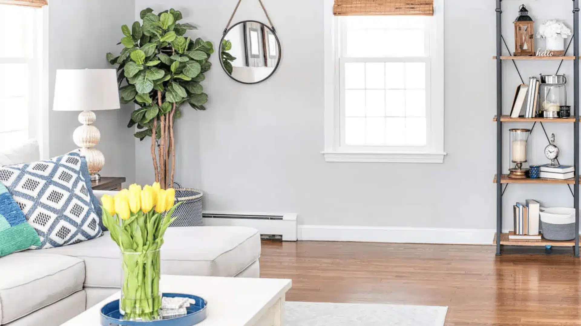
Living Rooms: The soft, welcoming tone works beautifully in both large and small spaces, providing a neutral backdrop that complements furniture and artwork. It’s particularly effective in rooms with abundant natural light.
Bedrooms: Creates a calming, neutral environment with subtle undertones that promote relaxation. The blue undertones can be particularly soothing in master bedrooms or guest rooms.
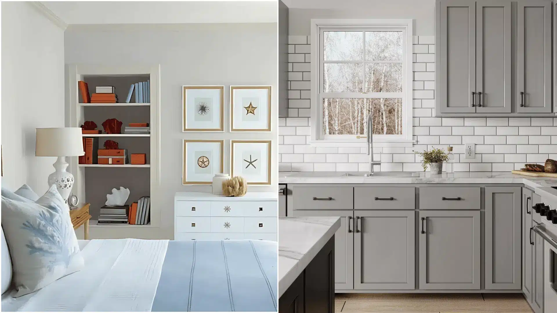
Bathrooms: Pairs beautifully with white subway tile, marble countertops, and black accents for a modern, spa-like look. The cool undertones complement chrome and brushed nickel fixtures perfectly.
Kitchens: Works exceptionally well with modern, sleek white or navy cabinetry, and is stunning in tuxedo kitchen designs where upper and lower cabinets are different colors.
Where to Use Coventry Gray in Your Home
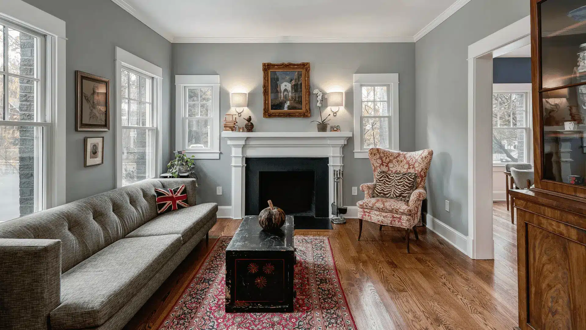
Living Rooms: Adds depth and sophistication when paired with contrasting lighter colors on adjacent walls or trim. It’s particularly effective in rooms with high ceilings where you want to create a more intimate feeling.
Dining Areas: Complements rich wood tones and metallic accents beautifully, creating a luxurious feel that’s perfect for entertaining. The deeper tone adds formality and classiness to dining spaces.
Exteriors: A timeless color choice for traditional or modern exteriors, perfect for front doors, shutters, or entire house exteriors. It provides refined curb appeal that photographs beautifully.
Accent Walls: An excellent option for adding subtle contrast in light-filled rooms without overwhelming the space. It creates focal points without being too dramatic.
Stonington Gray or Coventry Gray – Which is Right for You?
1. Choosing Large Spaces
Stonington Gray is typically better for larger, open areas due to its lighter nature, which helps maintain the airy feeling that makes large spaces feel welcoming rather than overwhelming.
Its subtle blue undertones reflect natural light beautifully, making expansive rooms feel bright and spacious without appearing stark or cold.
2. Choosing for Smaller Rooms
Coventry Gray can be ideal for smaller rooms where a deeper tone provides a sense of intimacy and coziness. However, ensure the room has adequate lighting to prevent it from feeling too enclosed.
The warmer gray undertones create a cocoon-like atmosphere that makes compact spaces feel intentionally snug rather than cramped.
3. Personal Style Preference
Your choice ultimately depends on whether you prefer the cool and calming vibe of Stonington Gray, which feels fresh and contemporary, or the rich and grounded feel of Coventry Gray, which leans more refined and dramatic.
Consider your existing decor and whether you gravitate toward minimalist, Scandinavian aesthetics or prefer more traditional, refined design elements.
The Best Paint Pairings for Stonington Gray and Coventry Gray
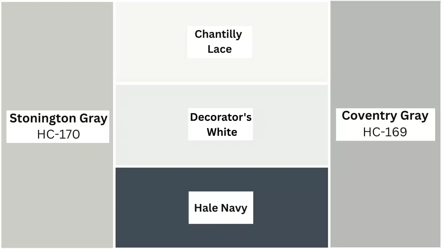
Trim and Ceiling Colors: For Stonington Gray –
Benjamin Moore’s Chantilly Lace (OC-65) creates a crisp, clean contrast that improves the refinement of the gray. For Coventry Gray, a cooler white like
Benjamin Moore’s Decorator’s White (OC-149) provides the perfect complement without competing with the deeper gray tone.
Complementary Accent Colors: It pairs beautifully with Hale Navy, soft blush pinks, warm brass accents, and natural wood tones. It also works well with other cool neutrals and can handle both warm and cool accent colors.
Coventry Gray works beautifully with deeper, richer tones like charcoal, black, deep burgundies, and forest greens. It’s particularly stunning with brass or black hardware and fixtures.
Conclusion
Choosing between Stonington Gray and Coventry Gray doesn’t have to be scary!
Think of Stonington Gray as your friendly, bright companion – perfect for making rooms feel open and cheerful. Coventry Gray is like that stylish friend who adds drama and makes everything look fancy.
The secret is knowing what feeling you want in your room. Do you want light and airy? Go with Stonington Gray. Want cozy and refined? Coventry Gray is your answer.
Remember, there’s no wrong choice here – both colors are winners that will make your home look amazing. The best part? You can always paint again if you change your mind!
Which gray are you leaning toward for your next room makeover? Tell us in the comments below – we’d love to hear about your painting adventures!