Ever walk into a room and instantly feel like you’ve stepped back into the coolest decade of design?
That’s the magic of mid-century modern style, and it all starts with the perfect color palette.
Those stylish homes from the 1950s and ’60s with their clean lines, warm wood furniture, and colors that somehow felt both bold and calming didn’t happen by accident.
Mid-century modern design mastered the art of using color to create spaces that are suave yet welcoming, minimal yet warm.
If you’re looking to bring this classic style into your home, you’ve come to the right place.
Today, you will go through some of the perfect mid-century modern color palettes that will turn your space into a retro haven.
The Essence of Mid-Century Modern Design
Mid-century modern design is all about keeping things simple while making them beautiful. This style focuses on clean lines, open spaces, and furniture that’s both functional and stylish.
Think low-profile sofas, sleek coffee tables, and lots of natural light streaming through large windows.
Color plays a huge role in making this style work. The right colors can make a space feel warm and inviting while keeping that clean, uncluttered look that mid-century modern is famous for.
The key is finding the perfect balance between neutral backgrounds and interesting accent colors that add personality without overwhelming the space.
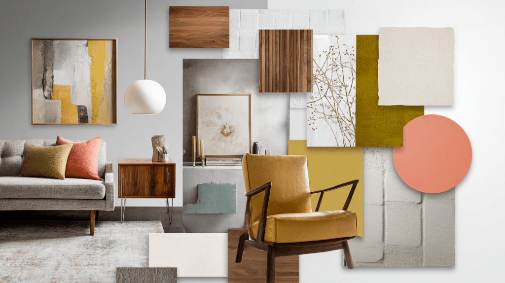
The Core Mid-Century Modern Colors
Getting the colors right is what separates a true mid-century modern space from a room that just has some retro furniture.
These aren’t random color choices; they’re carefully selected hues that work together to create that perfect balance of smoothness and comfort.
Muted Earth Tones
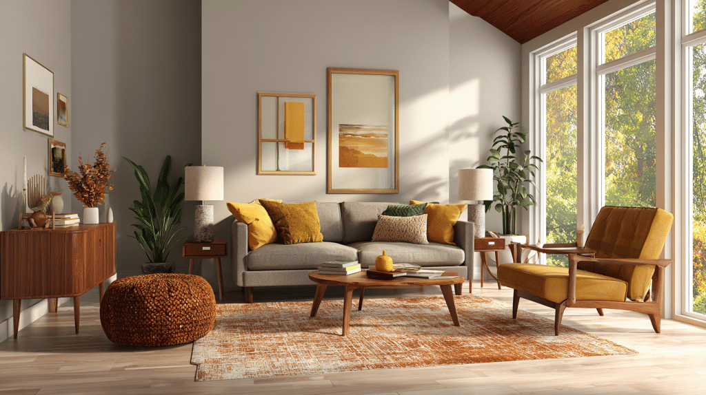
These are the colors that make a mid-century modern space feel warm and grounded. Think of the golden hour just before sunset; that’s the kind of warmth these colors bring to a room.
These earthy hues create the foundation of authentic mid-century design and help establish that cozy, lived-in feeling that makes a house feel like home.
Olive Green: This suave green works beautifully on kitchen cabinets or as an accent wall. Try Benjamin Moore’s “October Mist”.
Mustard Yellow: This rich, golden yellow adds instant warmth without being too bright. Consider Benjamin Moore’s “Golden Straw” or Sherwin-Williams’ “Citrine”.
Rust Orange: Perfect for creating a cozy, welcoming atmosphere. Benjamin Moore’s “Sedona Clay” and Sherwin-Williams’ “Cavern Clay” are excellent choices.
Neutral Shades
These are your foundation colors, the ones that create calm, clean backgrounds that let your furniture and decor shine.
Neutral shades in mid-century modern design are never boring or stark; they provide a suave backdrop that allows your statement pieces to take center stage.
Soft Grays: These create the perfect backdrop for mid-century furniture. Benjamin Moore’s “Classic Gray” and Sherwin-Williams’ “Agreeable Gray” are popular choices.
Warm Whites: Not stark white, but creamy, welcoming whites that feel cozy. Try Benjamin Moore’s “Simply White” or Sherwin-Williams’ “Alabaster”.
Bold Accents
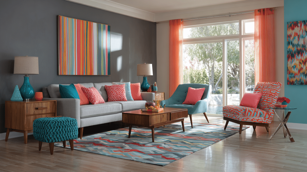
These are the colors that add personality and visual interest to your space. Use them sparingly for maximum impact.
Bold accent colors in mid-century modern design should feel intentional and confident, creating focal points that draw the eye and spark conversation.
Turquoise and Teal: These blue-green shades bring energy and freshness. Benjamin Moore’s “Aegean Teal” and Sherwin-Williams’ “Oceanside” are great options.
Coral Pink: This warm, suave pink adds a touch of playfulness. Consider Benjamin Moore’s “Coral Gables” or Sherwin-Williams’ “Coral Reef”.
Suggested Mid-Century Modern Color Palettes
Now that you understand the individual colors, let’s put them together into room-specific palettes that work. These combinations have been tested in real homes and consistently deliver the authentic mid-century modern look.
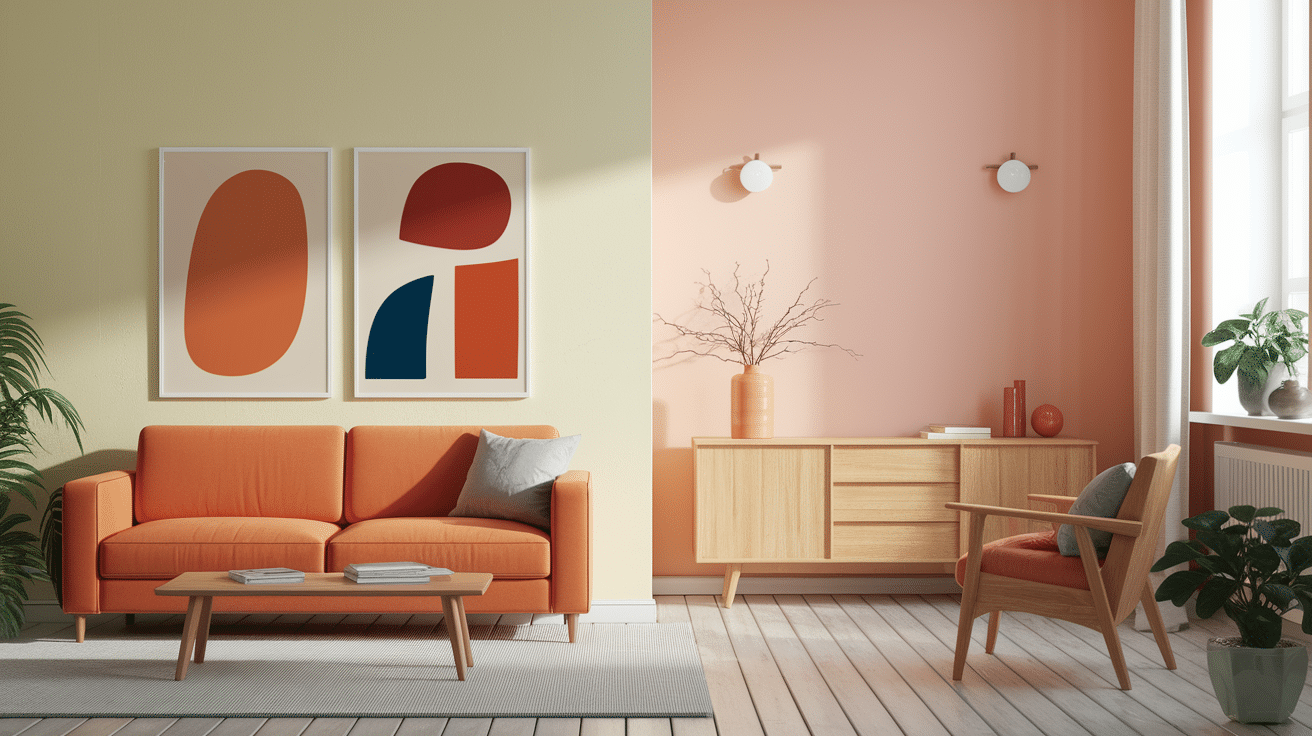
Living Room Palette
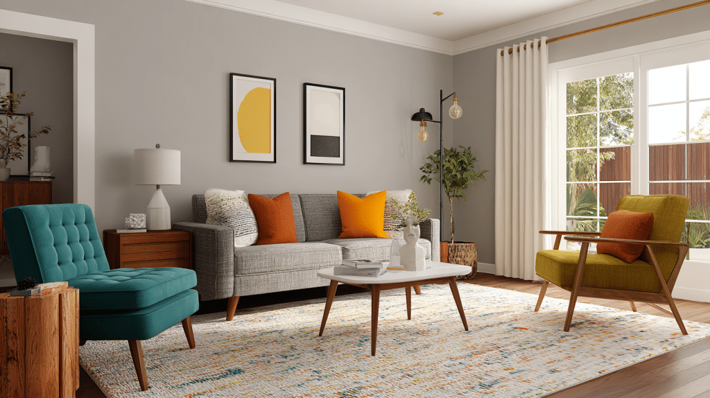
A welcoming space that’s perfect for entertaining with this warm combination.
This palette creates an inviting atmosphere that encourages relaxation and conversation while maintaining the clean, uncluttered aesthetic that defines mid-century modern style.
Main Wall Color: Sherwin-Williams’ “Alabaster” for a clean, bright background
Accent Wall: Benjamin Moore’s “Golden Straw” to add warmth behind your sofa
Pop of Color: Sherwin-Williams’ “Oceanside” for throw pillows or artwork
Kitchen Palette
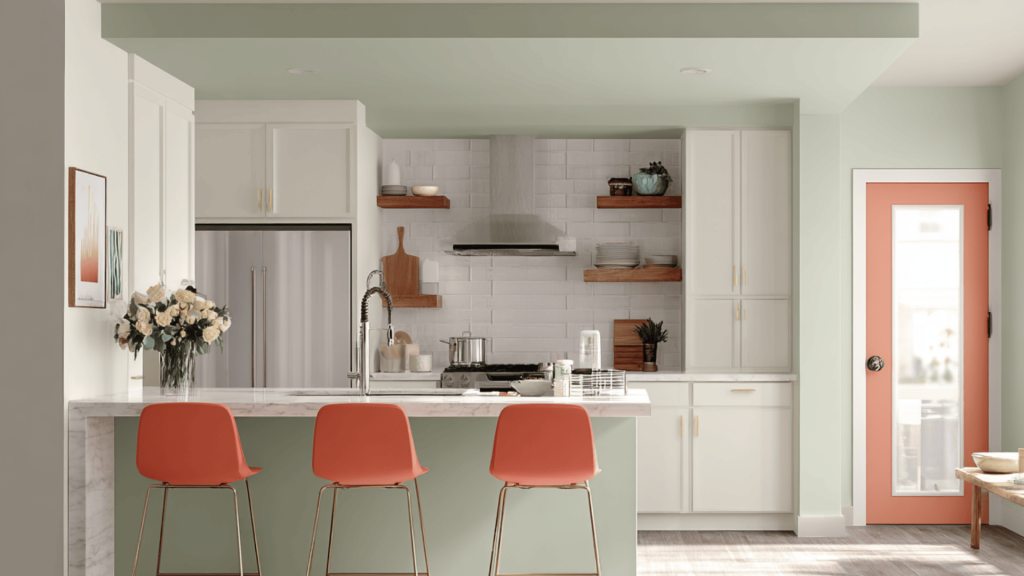
Make your kitchen feel fresh and inviting with this balanced combination. This color scheme creates a space that feels both timeless and current, perfect for everyday cooking and entertaining guests.
Cabinets: Benjamin Moore’s “Simply White” for a timeless, clean look
Island or Lower Cabinets: Benjamin Moore’s “October Mist” for visual interest
Accent: Benjamin Moore’s “Coral Gables” for bar stools or small appliances
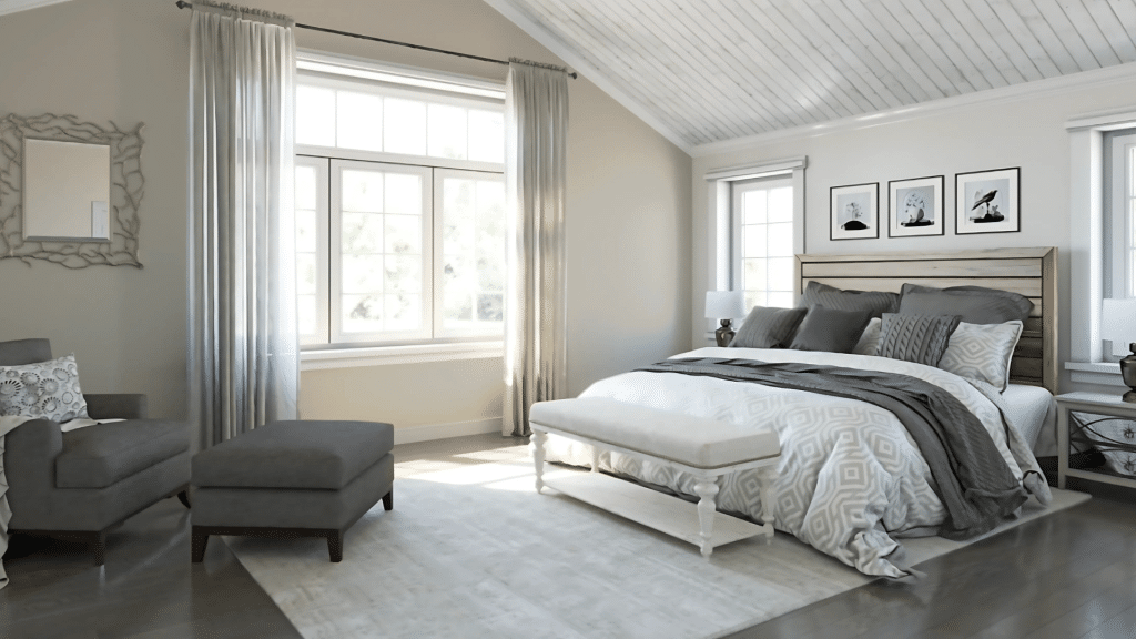
Bedroom Palette
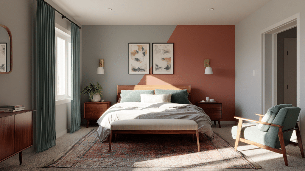
Create a peaceful retreat with this calming combination. This palette promotes restful sleep while maintaining the stylish sophistication that makes mid-century modern design so appealing.
Main Color: Benjamin Moore’s “Classic Gray” for a serene atmosphere
Accent Wall: Sherwin-Williams’ “Cavern Clay” behind the headboard
Soft Accent: Sherwin-Williams’ “Oceanside” in bedding or curtains
Bathroom Palette
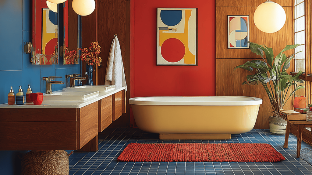
Make your bathroom feel like a spa with this fresh combination. This color scheme transforms your bathroom into a refreshing retreat that feels both modern and timeless.
Main Color: Sherwin-Williams’ “Agreeable Gray” for a clean, modern feel
Accent: Benjamin Moore’s “Aegean Teal” on one wall or in tiles
Trim: Benjamin Moore’s “Simply White” for crisp, clean lines
Combining Colors for a Harmonious Look
The secret to nailing the mid-century modern look is knowing how to combine these colors effectively. Here’s the formula that works every time:
1. Start with neutrals as your base – use soft grays or warm whites on most of your walls. These colors won’t compete with your furniture or decor, and they’ll make your space feel larger and brighter.
2. Add warmth with earth tones – use one or two muted earth tones like olive green or mustard yellow on an accent wall or in larger furniture pieces. These colors bring that signature mid-century warmth to your space.
3. Finish with bold accents – use bright colors like turquoise or coral sparingly in pillows, artwork, or small furniture pieces. Think of these as the jewelry of your room.
The key is balance. If you use a bold color on one wall, keep the rest of the room neutral. If you have colorful furniture, use neutral wall colors to let it shine.
The Psychology of Mid-Century Modern Colors
There’s a reason mid-century modern paint colors make us feel so good. Each color group serves a specific purpose in creating the perfect atmosphere:
1. Earthy tones like olive green and mustard yellow make us feel grounded and comfortable. They remind us of nature and create a sense of stability and warmth in our homes.
2. Bold accent colors like turquoise and coral energize us and spark creativity. They add just enough excitement to keep a space from feeling boring, but they’re not so bright that they become overwhelming.
3. Neutral tones like soft grays and warm whites help us feel calm and peaceful. They provide visual rest for our eyes and create a sense of spaciousness that’s essential in mid-century modern design.
The Influence and Legacy of Mid-Century Modern Color Palettes
Mid-century modern color palettes drew inspiration from multiple influential design movements that continue to shape contemporary design today.
The Bauhaus movement from Germany emphasized functional beauty and the emotional power of color, establishing that colors should serve both beauty and psychological purposes.
Scandinavian design contributed the emphasis on light, natural materials, and connection to nature, translating into the warm whites, soft grays, and earthy tones that became style signatures.
The optimism of post-war America infused palettes with bold accent colors like coral pink and turquoise, reflecting a society ready for innovation after wartime austerity.
These historical influences created a lasting legacy that continues to impact modern design.
Contemporary minimalism directly adopted the neutral background with a strategic accent color approach, while sustainability movements promote the natural, earth-based hues that connect us to the environment.
Modern color psychology research has validated what mid-century designers intuitively knew – that balanced color combinations promote well-being, creativity, and calm, making these palettes as relevant today as they were decades ago.
Natural Materials: Wood, Leather, and Textiles
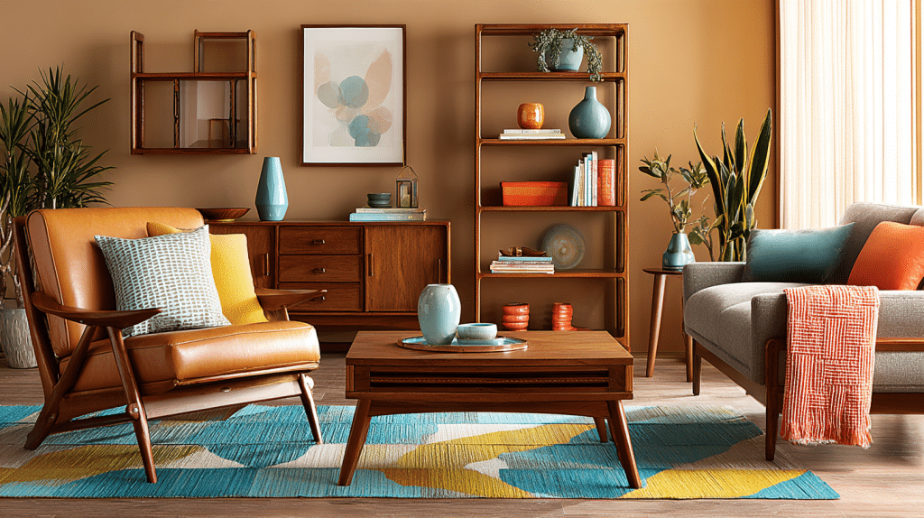
Mid-century modern color palettes come alive when paired with authentic natural materials that create the signature warm-yet-sophisticated atmosphere.
| Material | Best Options | How They Amplify Colors |
|---|---|---|
| Wood Elements | Rich walnut, warm teak, blonde birch | Natural grain patterns add visual interest while warm brown tones bridge neutral backgrounds and bold accents. |
| Leather Accents | Cognac, black, or tan leather | Add suave texture while maintaining clean lines, aging beautifully over time. |
| Textile Choices | Wool throws, linen curtains, geometric rugs, velvet pillows | Should feel luxurious yet approachable – coral or turquoise throws, warm white curtains, olive green or mustard yellow pillows, amplify colors without competing |
Pro Tip: Layer different textures within the same color family – a cognac leather chair with a rust orange throw pillow and walnut side table creates depth while maintaining color harmony.
Ready to modify Your Space?
The right mid-century modern color palette can change your home, blending classic charm with contemporary appeal.
Choose bold mustard yellow accent walls or subtle combinations of soft grays and warm whites.
These carefully curated mid-century modern colors will help you achieve that iconic look that has charmed homeowners for decades.
The beauty of mid-century modern design lies in its balance – each color serves a purpose in creating spaces that feel both classic and fresh.
Start small with one room and experiment with a single accent wall to experience the change.
Pair your chosen colors with authentic materials like walnut wood and cognac leather to complete the look.
Share your mid-century modern color modification in the comments below!
