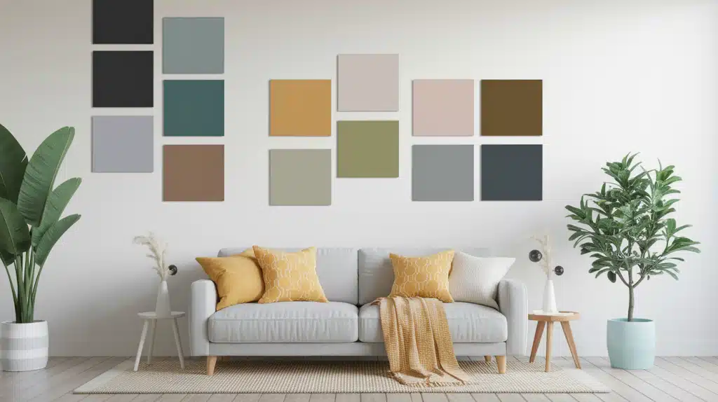
Staring at blank walls, wondering which color will make your space feel like home?
Most homeowners struggle with paint decisions because the wrong color choice can make rooms feel cramped, cold, or completely off-balance.
Here’s the truth: the right paint color isn’t just about following trends; it’s about understanding how colors work with your specific space, lighting, and lifestyle to create rooms that actually feel good to live in.
This guide reveals the best interior paint colors and wall color ideas, plus room-by-room strategies that help you choose colors based on your home’s unique characteristics.
You’ll learn how to test colors properly, match them to your existing furnishings, and create cohesive palettes that work beautifully together throughout your entire home.
What Are the Best Paint Colors for Your Home?
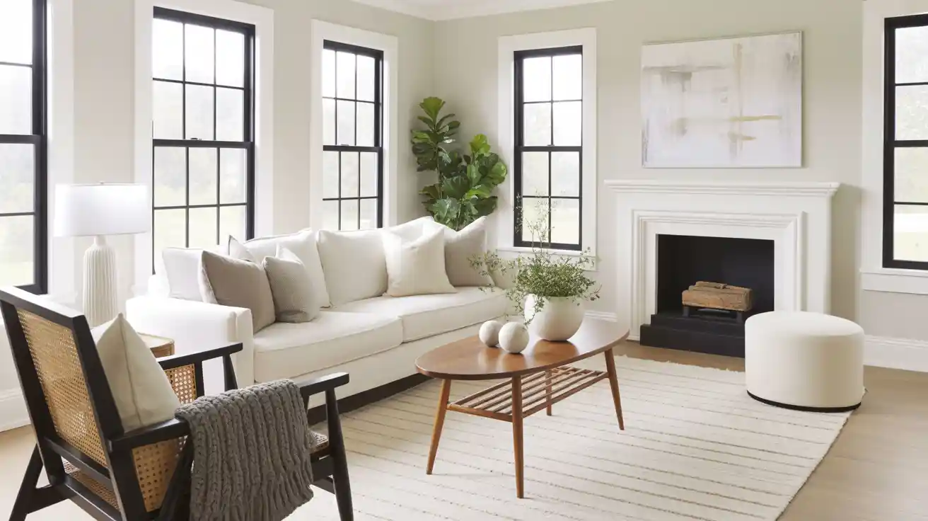
The “best” paint color isn’t just trendy, it’s your home’s secret weapon for creating magic. Top-tier colors master three essentials: flexibility (playing nice with any décor style), light dynamics (making rooms feel bigger and brighter), and classic appeal (staying stunning through design trends).
Think classy grays that anchor bold artwork, crisp whites that amplify natural light, or warm beiges that blend modern minimalism with rustic charm.
The champions? Colors that adapt like chameleons, shifting from cozy morning coffee vibes to a dinner party classiness with just a lighting change.
Best Paint Colors Ideas for 2025
Paint trends for 2025 focus on colors that evoke a sense of calm and coziness. These shades work well in any home and won’t go out of style quickly. Here are the top picks that designers and homeowners love this year.
1. Cinnamon Slate by Benjamin Moore
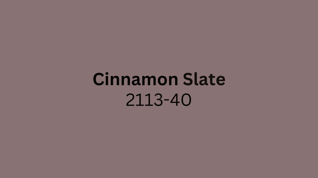
Benjamin Moore’s 2025 Color of the Year, Cinnamon Slate, is a nuanced blend of purple and brown that brings soothing familiarity and balance to any space.
This rich plum-brown shade works beautifully in bedrooms, powder rooms, and as accent walls. The color changes throughout the day as sunlight shifts, making it feel fresh and engaging in any lighting.
2. Rumors by Behr

Behr’s 2025 Color of the Year, “Rumor,” is a deep ruby red that adds warmth and class.
This modern take on the classic red creates energy and makes a lasting statement in dining rooms and front doors. Pair it with brass fixtures and cream accents to create a subtle, luxurious atmosphere.
3. Quietude by HGTV Home
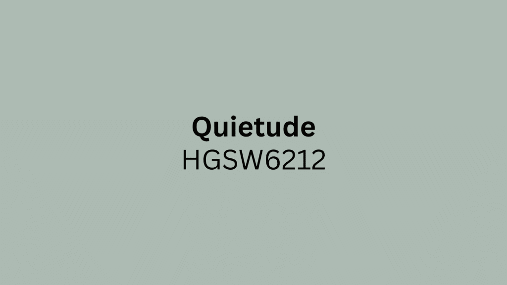
HGTV Home by Sherwin-Williams’s Color of the Year “Quietude” is a cool sage green with a slight blue undertone that emphasizes slowing down and seeking happiness.
Perfect for bathrooms and bedrooms where you want a spa-like feel. This calming shade works exceptionally well with natural wood vanities and white subway tile.
4. Encore by Valspar

Valspar’s 2025 Color of the Year, “Encore,” is a rich blue hue with atmospheric deep blue tones and a tinge of violet. This anchoring shade creates joyful respites and works well in living rooms and home offices.
The violet undertones become more visible in low lighting, making evening spaces feel cozy and intimate.
5. Purple Basil by Glidden
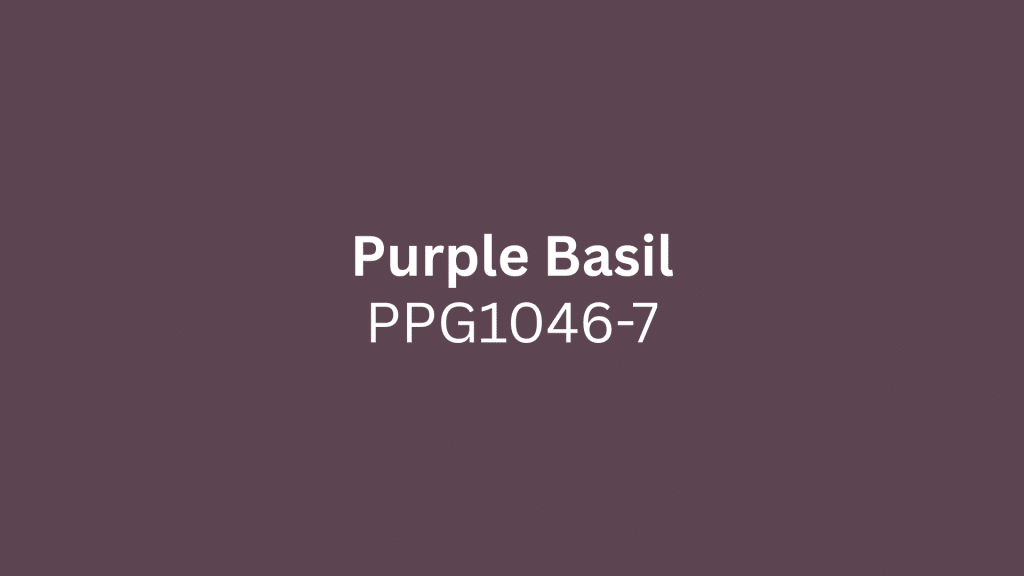
Glidden’s 2025 Color of the Year, “Purple Basil,” is a warm, deep purple with neutral undertones, making it well-suited for both traditional and modern interiors.
Great for office spaces and kitchen cabinetry. This adaptable shade pairs beautifully with both gold and silver hardware for a truly custom look.
6. Mocha Mousse by Pantone
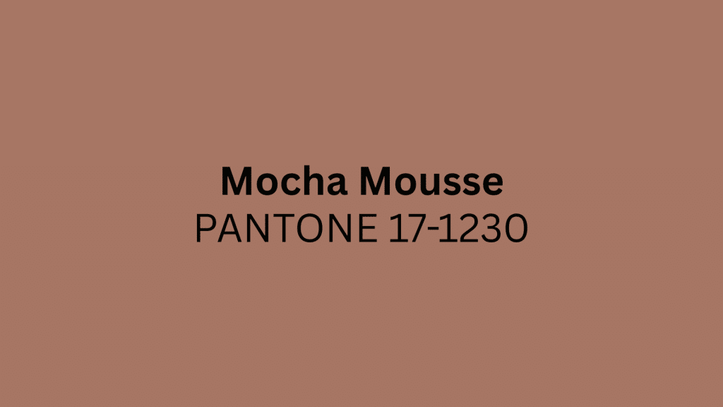
Pantone’s Color of the Year 2025, “Mocha Mousse,” is a gentle shade of brown that exudes comfort and proves warm neutrals are set to endure.
This adaptable brown works in living rooms and bedrooms for a calming atmosphere. The chocolate-coffee inspired hue feels both indulgent and familiar, perfect for creating cozy gathering spaces.
7. Mauve Finery by Sherwin-Williams

Mauve Finery is a classy mauve with a hint of red that doubles as a subtle violet, acting as a soft neutral.
Perfect for nurseries, bedrooms, and bathrooms with its fresh, modern feel. This mid-tone shade with an LRV of 51 provides the perfect balance between color and neutrality.
8. Grounded by Sherwin-Williams
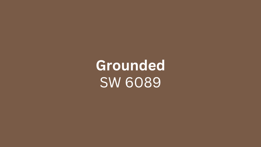
Grounded is a rich, warm brown that’s like a comforting cup of coffee, made to envelop spaces in eternally calming nature.
This earthy tone works well in family rooms and studies. The color brings stability and refinement while maintaining the warmth needed for comfortable living spaces.
9. Rain Cloud by Sherwin-Williams

Rain Cloud has an LRV of 11, making it a deep medium-dark depth that’s perfect for creating cozy, intimate bedrooms or reading nooks.
Use this dramatic shade for accent walls or kitchen cabinets. This stormy gray-blue hue from the Designer Collection creates classy, moody environments that feel both modern and ageless.
10. Simply White by Benjamin Moore

Benjamin Moore’s Simply White is a fan favorite that suits a variety of home styles, from farmhouse to coastal.
This classic white allows homeowners to personalize with accent colors and fixtures. The clean, crisp finish reflects light beautifully while maintaining enough warmth to avoid a sterile or cold feel.
11. Shoji White by Sherwin-Williams

Sherwin-Williams’ Shoji White represents the evolution of white paint, with increased warmth while maintaining the classic appeal.
Perfect for whole-home use where you want bright, warm neutrals. This trending white choice reflects the move away from stark, cool whites toward more livable, comfortable tones.
12. Caramelized by Dunn-Edwards
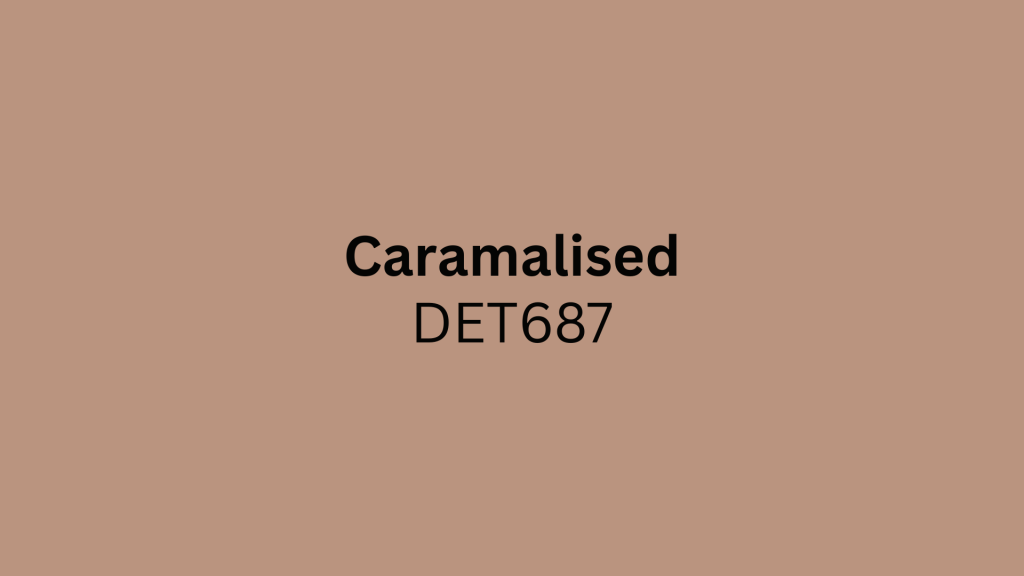
Dunn-Edwards’ 2025 Color of the Year, “Caramelize,d,” is an earthy terracotta with hints of brown, serving as a neutral that provides subtle warmth.
Ideal for those wanting to move beyond beige without going too bold. This flattering shade serves as a unique alternative to traditional neutrals, adding an earthy, grounded quality to any space.
13. Mapped Blue by Dutch Boy

Dutch Boy’s 2025 Color of the Year, “Mapped Blue,” is a medium blue with subtle yellow undertones. This flexible shade works well in kitchens and family rooms, creating a fresh, clean look.
The one-coat coverage makes it practical for busy families, while the classic blue tone ensures it won’t feel dated quickly.
14. Raku by C2 Paint

C2 Paint’s 2025 Color of the Year, “Raku,” is a rich mahogany shade inspired by ancient Japanese tea ceremonies.
This burnt, brownish-red color adds class to dining rooms and studies. Named after the centuries-old pottery technique, this color brings depth and cultural richness to modern interiors.
15. Elderton by Graham & Brown
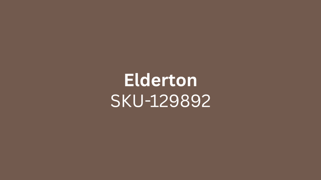
Graham & Brown’s “Elderton” is a well-balanced neutral brown reminiscent of deep brown leaves, leaning into earthy tones.
Perfect for creating cozy, grounded spaces in any room. This nature-inspired shade connects interior spaces to the outdoors while maintaining the versatility of a true neutral.
16. Pitch Black by Farrow & Ball

Pitch Black by Farrow & Ball is a trending paint color that gives off a coveted speakeasy vibe while being surprisingly multifunctional.
Use this dramatic shade for accent walls in modern homes. Despite being super dramatic and saturated, it works well even when the rest of the home is light and airy.
17. Deep Creek by Benjamin Moore

Benjamin Moore’s Deep Creek offers warmth and depth, challenging black’s dominance with rich brown shades.
Perfect for urban buildings and transitional homes, this color is ideal as a main exterior or interior hue. This classy brown provides all the drama of black while adding the warmth that makes spaces feel more inviting.
18. Urbane Bronze by Sherwin-Williams

Sherwin-Williams’ Urbane Bronze offers warmth, depth, and drama, making it a sought-after choice for many home styles, including urban buildings and rustic homes.
Great for front doors and accent walls. This rich brown shade offers a contemporary alternative to traditional black, while maintaining the same level of visual impact.
19. Gossamer Blue by Benjamin Moore

Benjamin Moore’s Gossamer Blue provides a light, cheerful ambiance that suits coastal and suburban settings well.
This breezy blue shade adds serenity to bedrooms and bathrooms. The soft, ethereal quality makes rooms feel larger and more peaceful, perfect for creating relaxing retreats within the home.
20. Chelsea Gray by Benjamin Moore
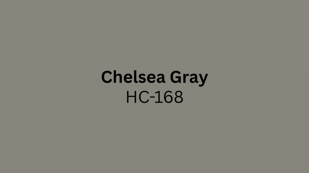
Chelsea Gray by Benjamin Moore is a charcoal gray that’s bold and sleek, making it great for both modern exteriors and traditional homes.
Use with light trim colors for stunning contrast. This classy shade commands attention while remaining classic enough to work with both contemporary and traditional architectural styles.
21. Snowbound by Sherwin-Williams

Snowbound by Sherwin-Williams is a light, soft trim color that pairs beautifully with charcoal grays. Perfect for trim work and ceilings in any room.
This gentle white provides the perfect contrast for bold wall colors while maintaining enough warmth to feel welcoming rather than stark.
22. Ballet White by Benjamin Moore

Ballet White by Benjamin Moore is a fan favorite that suits a variety of home styles and allows for personalization with accents. Ideal for whole-home neutral schemes.
This soft white has just enough warmth to feel comfortable while remaining clean and fresh throughout different lighting conditions.
23. Pinelands by Benjamin Moore

Benjamin Moore’s Pinelands creates moody spaces with rich color depth, recently used on ceilings and trim to complement botanical wallpapers.
Perfect for dramatic, classy interiors. This deep green shade brings the richness of nature indoors while creating intimate, cocooning environments that feel both luxurious and grounded.
24. Featherstone by Benjamin Moore

Benjamin Moore’s Featherstone 1002 represents the shift toward bold and personalized spaces with deep, rich tones. Great for millwork and accent walls in contemporary homes.
This clean shade reflects the growing demand for deeper, more dramatic spaces that make a strong personal statement.
25. True Joy by Dulux

Dulux’s “True Joy” is a bright yellow that feels modern and works beautifully in period homes. This vibrant shade brings cheerful energy to kitchens and creative spaces.
The sunny disposition of this color instantly rejuvenates rooms, creating spaces that feel optimistic and welcoming for daily activities.
26. Clove by Sherwin-Williams
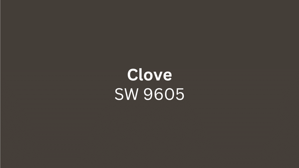
Sherwin-Williams’ Clove is part of their 2025 Color Capsule, a deep brown that mimics the richness of black, a color many will crave. Perfect for creating classy, grounded spaces.
While technically in the brown family, its depth creates the visual impact of black while maintaining the warmth that makes spaces feel comfortable.
27. Blank Canvas by Behr

Behr’s “Blank Canvas” is a clean, bright white that works beautifully as a whole-home neutral, giving a cohesive and airy feel. Perfect for modern minimalist spaces and as a fresh backdrop for colorful furniture and artwork.
This clean white provides the perfect foundation for any decorating style while maximizing natural light throughout your home.
28. Pure White by Sherwin-Williams
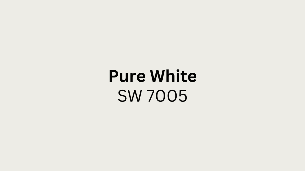
Sherwin-Williams’ Pure White has a brilliantly bright light reflectance value of 90, making it a favorite among design professionals.
Perfect for whole-home neutral schemes that create a spacious feel. This clean white maximizes natural light reflection while maintaining the crispness needed for modern, minimalist interiors.
29. Drift of Mist by Sherwin-Williams

Sherwin-Williams’ Drift of Mist SW 9166 is an excellent example of a warm-toned gray, representing a color that’s replacing traditional cool grays.
Ideal for open-concept spaces. This adaptable shade sits perfectly between warm and cool, making it deeper than white but not quite gray, venturing beyond traditional beige.
30. Rock Crystal by Behr

Behr’s Rock Crystal MQ3-28 is a traditional cool gray for those who still love gray tones. Works well in modern minimalist spaces and as a neutral backdrop.
This classic gray provides the clean, contemporary feel that made gray popular while offering a safe foundation for colorful accents and artwork.
Wall Color Ideas by Room
From rich, moody tones to serene neutrals, these shades are more than just eye-catching; they set the mood, boost your space, and speak volumes about your style.
1. Living Room
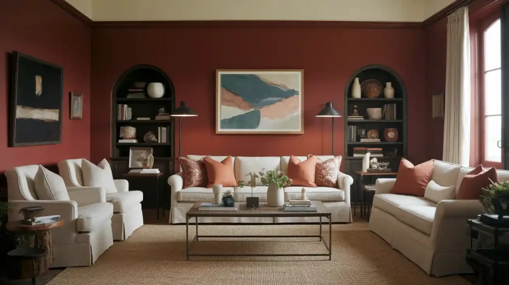
Warm, earthy hues are stealing the spotlight in living rooms this year. Think deep terracotta, burnt sienna, and golden ochre.
These shades bring a sense of comfort and grace, making your living space feel like a cozy retreat. Pair with neutral furniture or eclectic accessories for a laid-back yet stylish vibe.
Primary Color Recommendations:
- Deep terracotta (Benjamin Moore Sedona Clay)
- Burnt sienna (Sherwin-Williams Cavern Clay)
- Golden ochre (Farrow & Ball India Yellow)
- Warm mushroom gray (Benjamin Moore Revere Pewter)
Complete Palette Suggestions:
| Palette Type | Main Wall | Trim | Key Accents | Metals | Best For |
|---|---|---|---|---|---|
| Earthy Warmth | Terracotta/Burnt Sienna | Warm white + yellow undertones | Forest green, cream, rust orange | Brass, copper | North-facing rooms, cozy atmospheres |
| Modern Neutral | Mushroom gray + warm undertones | Pure white | Navy blue, blush pink, charcoal | Matte black, brushed nickel | Contemporary spaces, adaptive styling |
Always test your chosen colors throughout the day, as undertones shift with changing light conditions from morning sun to evening lamplight.
2. Bedroom
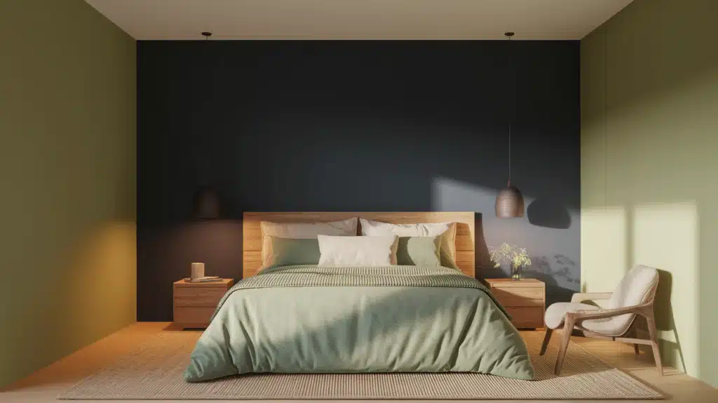
For the bedroom, it’s all about relaxation and restful retreats. Soft, muted greens, such as sage or olive, are perfect for creating a calm and rejuvenating atmosphere.
These colors not only promote relaxation but also work beautifully with natural materials, such as wood and linen. For a touch of glamour, try deep navy or indigo as an accent wall, adding depth and tranquility.
Primary Color Recommendations:
- Sage green (Sherwin-Williams Clary Sage)
- Soft olive (Benjamin Moore Fernwood Green)
- Dusty lavender (Benjamin Moore Lavender Mist)
- Warm taupe (Sherwin-Williams Accessible Beige)
Complete Palette Suggestions:
| Palette Type | Main Wall | Ceiling/Trim | Key Accents | Mood | Undertone Focus |
|---|---|---|---|---|---|
| Serene Green | Sage green + gray undertones | Soft white | Cream, linen, gold | Peaceful, natural | Green promotes relaxation |
| Neutral Sanctuary | Warm taupe + pink undertones | Crisp white | Dusty rose, cream | Cozy, classy | Pink adds warmth |
| Moody Accent | Warm white/light gray | White | Navy accent wall, gold | Dramatic, calming | Blue for tranquility |
Paint bedroom samples on the wall behind your headboard and observe them for a full week in both natural morning light and soft evening lighting to ensure your chosen color promotes relaxation rather than stimulation.
3. Kitchen
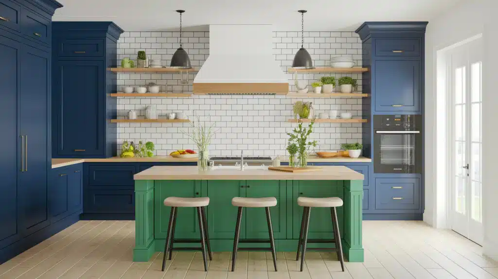
The kitchen is getting a refresh with bold, vibrant hues. Rich navy blues, spicy reds, and even emerald greens are becoming popular choices for cabinet colors.
These bold tones add personality and a fresh, modern twist to the heart of the home. Pair them with light countertops or white subway tiles for a perfect balance of color and brightness.
Primary Color Recommendations:
- Navy blue (Benjamin Moore Hale Navy)
- Emerald green (Sherwin-Williams Evergreens)
- Spicy red (Benjamin Moore Heritage Red)
- Warm white (Benjamin Moore Cloud White)
Complete Palette Suggestions:
| Palette Type | Cabinets | Walls | Countertops | Hardware | Backsplash |
|---|---|---|---|---|---|
| Bold Navy | Navy + true blue undertones | Warm white/light gray | White quartz, light marble | Brass, gold | White subway tile, natural stone |
| Fresh Green | Emerald + blue undertones | Cream + yellow undertones | White, light wood butcher block | Matte black, dark bronze | White/light green ceramic |
| Classic Red | Spicy red + brown undertones | Warm cream, soft yellow | Dark granite, black quartz | Oil-rubbed bronze, black iron | Natural stone, brick |
When choosing bold kitchen cabinet colors, paint a large sample board and lean it against your cabinets for at least a week, checking how it looks during cooking prep in bright task lighting and dinner time in ambient lighting.
4. Dining Room
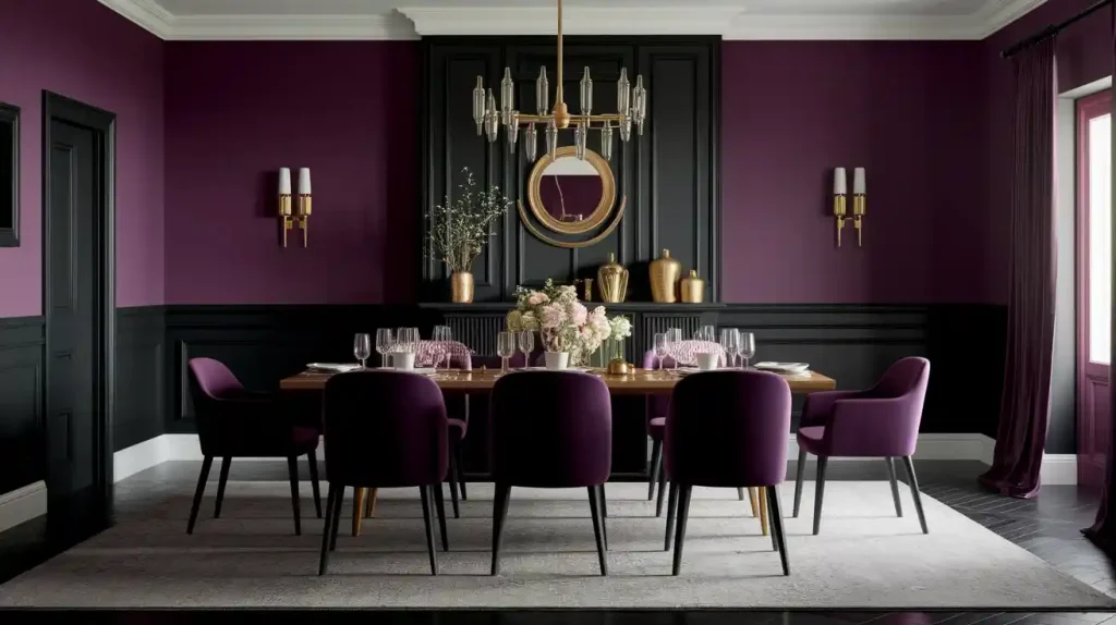
Moody and dramatic shades are taking center stage in dining rooms, where deep plum, charcoal gray, and midnight black add a touch of luxury.
These colors create a space that feels intimate and inviting, making it perfect for hosting dinner parties or enjoying a quiet meal.
Primary Color Recommendations:
- Deep plum (Benjamin Moore Elderberry)
- Charcoal gray (Sherwin-Williams Iron Ore)
- Midnight black (Benjamin Moore Black Beauty)
- Rich burgundy (Benjamin Moore Caliente)
Complete Palette Suggestions:
| Palette Type | Main Wall | Trim | Accent Colors | Metals | Lighting Style |
|---|---|---|---|---|---|
| Classy Plum | Deep plum + red undertones | Crisp white, cream | Gold, cream, deep green | Warm brass, crystal | Chandeliers, warm fixtures |
| Modern Charcoal | Charcoal + blue undertones | Pure white | Blush pink, cream, soft gold | Brushed nickel, chrome | Contemporary fixtures |
| Dramatic Black | Midnight black | White, light gray | Rich jewel tones, metallics | Gold, silver | Statement fixtures, warm metals |
Dark dining room colors can make the space feel intimate for dinner parties, but test your chosen shade with your chandelier or pendant lighting on dimmer settings to ensure it creates the mood you want for entertaining.
Choosing the Right Color Palette for Your Home Style
When designing your home’s interior, the color palette you choose serves as the foundation for creating the perfect atmosphere. Colors have the power to change spaces, influence moods, and reflect your personal style.
Understanding how different color schemes work with various home styles will help you make informed decisions that enhance the overall aesthetic and functionality of your living space.
- Modern Home: Opt for bold, neutral shades like charcoal and white, complemented by metallic accents to achieve a sleek, contemporary look.
- Farmhouse Style: Embrace warm, earthy tones, including soft creams, sage greens, and rustic reds, beautifully paired with distressed wood accents for that cozy, lived-in feel.
- Traditional Spaces: Incorporate deep, rich hues such as navy, burgundy, and warm beige, complemented by gold or dark wood trims to create a classic elegance.
- Minimalist Design: Focus on simple, muted tones such as off-whites, light grays, or soft pastels, combined with clean lines and minimal contrast, to create a serene and uncluttered atmosphere.
Remember that these color guidelines are starting points rather than strict rules. Consider your home’s natural lighting, room size, and existing furniture when making final color decisions.
How to Choose the Best Colors Based on Room Size and Lighting
The color you choose for your walls isn’t just about what looks good; it’s about how it feels in the space.
Room size and natural lighting significantly impact how a paint color appears. For small rooms, lighter shades such as soft whites, light grays, and pastels reflect more light, making the space feel larger and airier.
Want to make a large room feel cozier? Opt for deeper, warmer tones like rich navy, charcoal, or even earthy reds; they add intimacy and warmth.
Also, consider the natural light in your room. North-facing rooms benefit from warmer shades to combat cool light, while south-facing spaces can handle cooler tones for balance.
Quick Reference Table: Flooring Types & Paint Pairings
Your floors are the foundation of your color scheme and the most expensive element to change. Use this table to find wall colors that perfectly complement your existing floor.
| Flooring Type | Best Wall Colors | Why It Works | Popular Accent Colors |
|---|---|---|---|
| Light hardwood | Soft beige, sage green, pale gray | Enhances wood’s warmth, creates balance | Cream, olive, navy |
| Dark hardwood | Crisp white, navy, blush pastels | Shows off rich wood, prevents heaviness | Burnt orange, gold, deep green |
| White/light tile | Muted gray, misty blue, beige | Clean spa-like feel, complements cool tones | Soft green, matte black, brass |
| Gray/charcoal tile | Earthy terracotta, olive, sandy beige | Warms up cool surfaces, adds coziness | Cream, rust, sage |
| Neutral carpet | Bold navy, powder blue, sage | Freedom for drama, carpet anchors bold walls | White trim, natural woods, metallics |
Pro tip: Always test your chosen wall color next to your flooring in both natural and artificial light before committing to a full room.
How to Test Paint Colors Before Committing to a Whole Room
Before committing to a whole room of color, it’s crucial to test how the paint looks in your space.
Paint can appear differently depending on the room’s lighting, so always test the color in multiple conditions, including both natural and artificial light.
Use sample swatches on the wall in small sections, preferably in areas that get varied light throughout the day. This will help you see how the color changes with varying light conditions.
Apply two coats, as the shade may appear lighter after drying. Move your samples around the room to get a better sense of how the color will feel in different spots.
By testing first, you’ll avoid any costly surprises and ensure your chosen color is perfect!
Conclusion
Choosing the right interior paint colors is more than just a design choice; it’s about creating the atmosphere you want in your home.
The right wall color ideas can revolutionize a space, setting the tone for relaxation, creativity, or warmth.
Regardless of whether you’re looking for calming neutrals, vibrant accents, or classic shades, your color choices play a crucial role in shaping your experience in each room.
As you assess your options, consider your style, the room’s function, and the mood you want to evoke. Don’t be afraid to experiment and embrace colors that reflect your unique taste.
After all, the perfect paint color can make a world of difference in making your house feel like home.
Consider giving your basement a fresh new look? We’ve got plenty more color ideas to help you get started.
