
Walking into a well-designed space or seeing someone with a simple style, you might wonder what makes it all come together. The secret is often a suave yet easy design approach.
I learned this after years of colorful mistakes: my first apartment had bright yellow walls, a purple couch, and red curtains that seemed like a good idea at the time.
The catalyst was finding accented neutrals. It gave me that calm vibe while still adding warmth and personality. It struck the perfect balance between tedious and overwhelming.
Accented neutrals reflect how we naturally see the world, like a beach with neutral sand and sky, punctuated by colorful umbrellas.
If you’re looking for home or fashion inspiration, this approach simplifies color choices and lets you express your personality effortlessly.
What is an Accented Neutral Color Scheme?
Think of neutral colors as your foundation – whites, grays, beiges, taupes, and blacks. These colors never go out of style and work with almost everything.
The “accented” part is where you add one or two carefully chosen colors that bring the whole look to life. Maybe deep navy blue, warm mustard yellow, or soft blush pink.
What makes this approach appealing is its flexibility.
If you get tired of your accent color later, you can easily swap it out without starting over. Your neutral base stays the same, but the personality can change with your mood or the seasons.
How to Create a Perfect Palette
Start by choosing your neutral base. Warm neutrals like cream and beige create coziness, while cool neutrals like crisp whites and charcoal feel modern and clean. You can mix two or three neutrals for added depth.
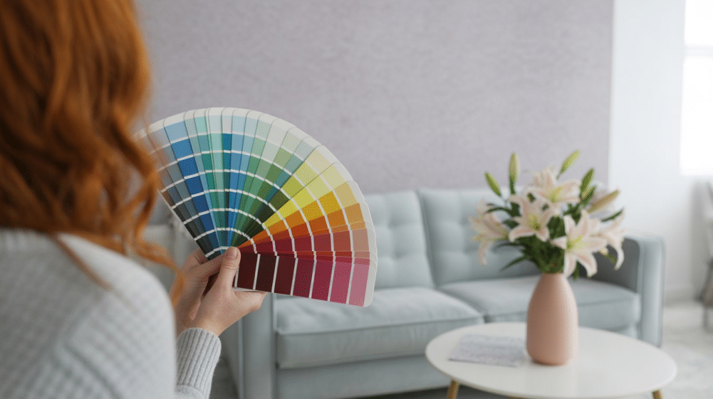
When selecting your accent color, consider the feeling you want.
Warm colors like coral or gold add energy, while cool colors like navy or forest green feel calming. Choose something that speaks to you personally.
The 60-30-10 rule works well here: use your main neutral for 60% of the space or outfit, a secondary neutral for 30%, and your accent color for 10%. This keeps everything balanced while ensuring your accent makes an impact.
Key Benefits of Accented Neutrals
Before diving into specific applications, it’s worth understanding why this approach works so well for both interior design and fashion.
| Benefit | What It Means | Why It Matters |
|---|---|---|
| Flexibility | Neutral foundation works across seasons and trends | Accent colors can be updated affordably without changing everything |
| Cohesiveness | Creates intentional, coordinated looks | Avoids a chaotic appearance and feels professionally designed |
| Simplicity | Most pieces coordinate well together | Makes decorating and dressing much easier and less stressful |
| classic Appeal | Won’t look dated like trendy colors | Wise long-term investment that maintains value over time |
| Flexibility | Easy to change personality without a significant overhaul | Adapts to mood changes, seasons, or life transitions |
These benefits make accented neutrals particularly appealing for anyone seeking a polished look without the complexity of managing multiple bold colors.
Bringing Accented Neutrals into Your Home
Start with your largest surfaces – walls, floors, and major furniture – in neutral colors since they’re expensive to change. Then add accent colors through smaller, changeable elements.
- Living rooms: Imagine a soft gray sofa with white walls as your neutral base. Add deep blue pillows and a matching throw to change the space instantly.
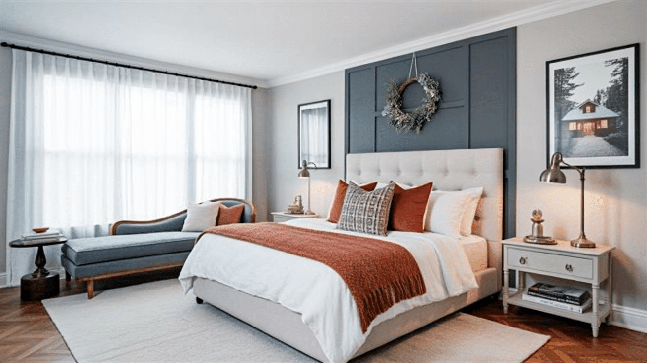
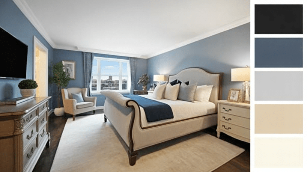
- Bedrooms: Keep walls and bedding neutral for calm vibes, then add personality through curtains, artwork, or a cozy reading chair. Mix in woven baskets, chunky knits, or natural wood for texture.
- Kitchens and bathrooms: These spaces have fixed elements, so accent colors come through towels, dishes, or small appliances. Even switching soap dispensers or adding a colorful cutting board makes a difference.
Creative Ideas for Your Accented Neutral Color Scheme
These inspiring examples show how flexible and modifiable the accented neutral approach can be across different spaces and styles.
From subtle seasonal changes to bold statement pieces, each idea demonstrates the power of combining a neutral foundation with carefully chosen accent colors.
1. Monochromatic Bedroom Sanctuary
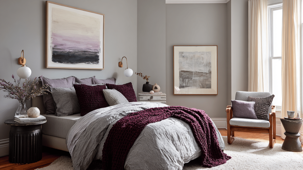
Create a serene bedroom using varying shades of gray as your neutral base, then add a single accent color like deep plum through bedding, artwork, and a reading chair.
This creates depth while maintaining tranquility.
2. Kitchen Counter Color Pop
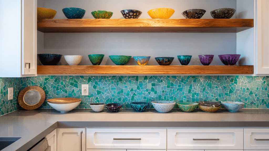
Keep your kitchen neutral with white or gray cabinets and countertops, then introduce your accent color through a vibrant backsplash or colorful small appliances.
Even a collection of ceramic bowls displayed on open shelving makes a striking difference.
3. Seasonal Living Room Refresh
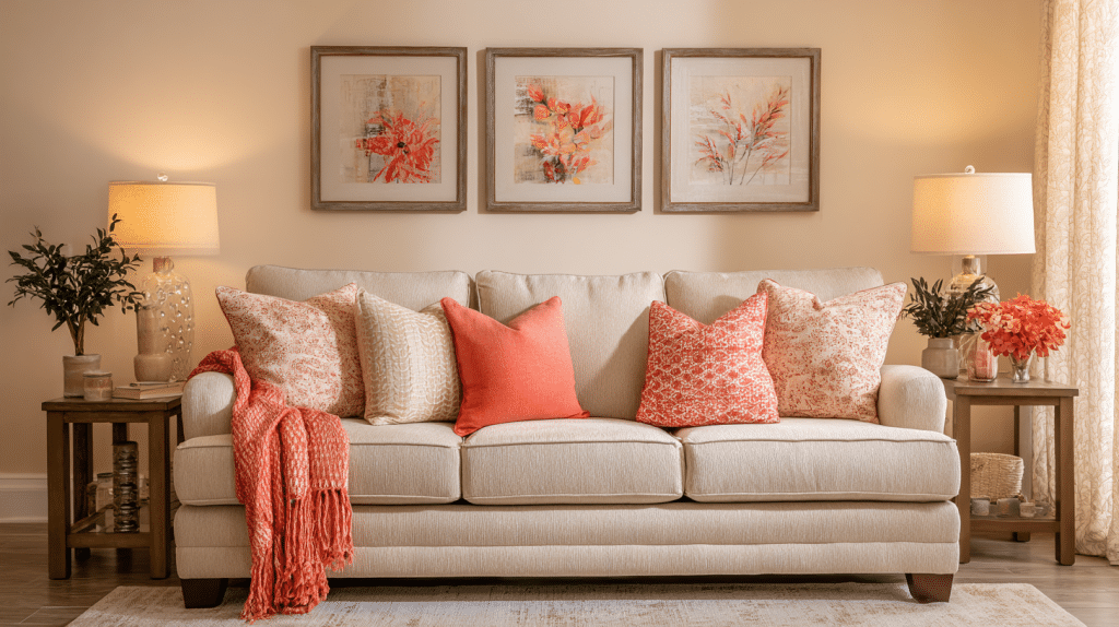
Maintain beige and cream furniture year-round, but switch accent colors seasonally through pillows, throws, and artwork.
Try warm oranges for autumn, deep blues for winter, fresh greens for spring, and coral tones for summer.
4. Capsule Wardrobe with Signature Color
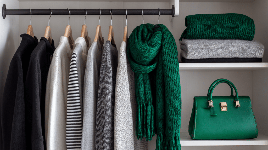
Build a wardrobe foundation of black, white, and gray pieces, then choose one signature accent color like emerald green or burgundy for all your accessories.
This creates a cohesive personal style that’s instantly recognizable and effortlessly chic.
5. Bathroom Spa Retreat
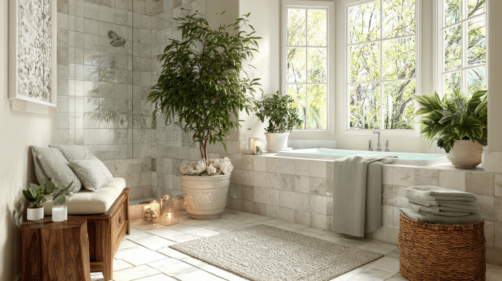
Modify your bathroom into a spa-like retreat using warm white tiles and fixtures as neutrals, then add calming sage green through towels, plants, and decorative accents.
The result is a natural, peaceful atmosphere that feels like a daily escape.
6. Office Productivity Boost
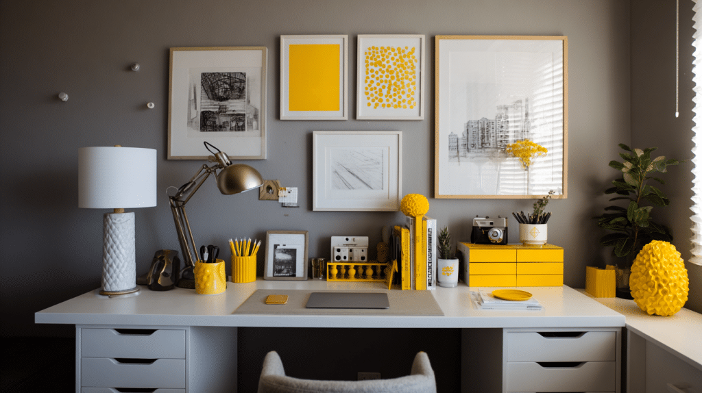
Create a focused work environment with a neutral gray and white office setup, then add energizing yellow accents through desk accessories, artwork, and lighting.
This boosts creativity and motivation without creating overwhelming distractions.
7. Entryway Welcome Statement
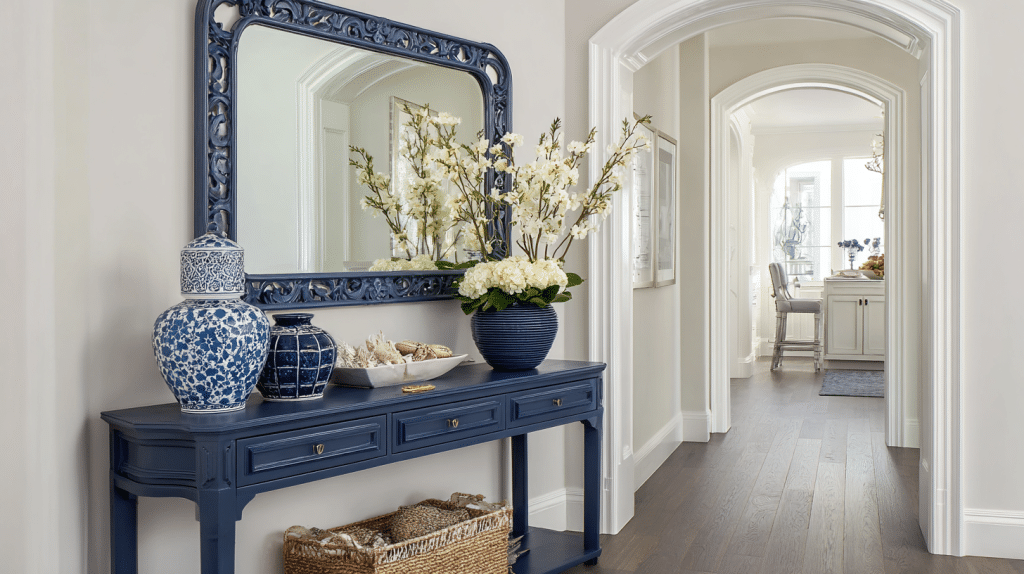
Make a strong first impression with neutral walls and flooring in your entryway, then add a bold accent color like navy blue through a statement console table, mirror frame, and decorative objects.
This approach welcomes guests warmly while setting the tone for your entire home.
8. Graceful Dining Room
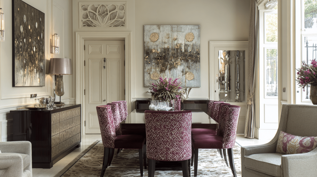
Design an elegant dining space using cream and taupe as your neutral foundation, then introduce rich burgundy through dining chair cushions, table runners, and wall art.
This creates an intimate, suave atmosphere perfect for entertaining and memorable dinner parties.
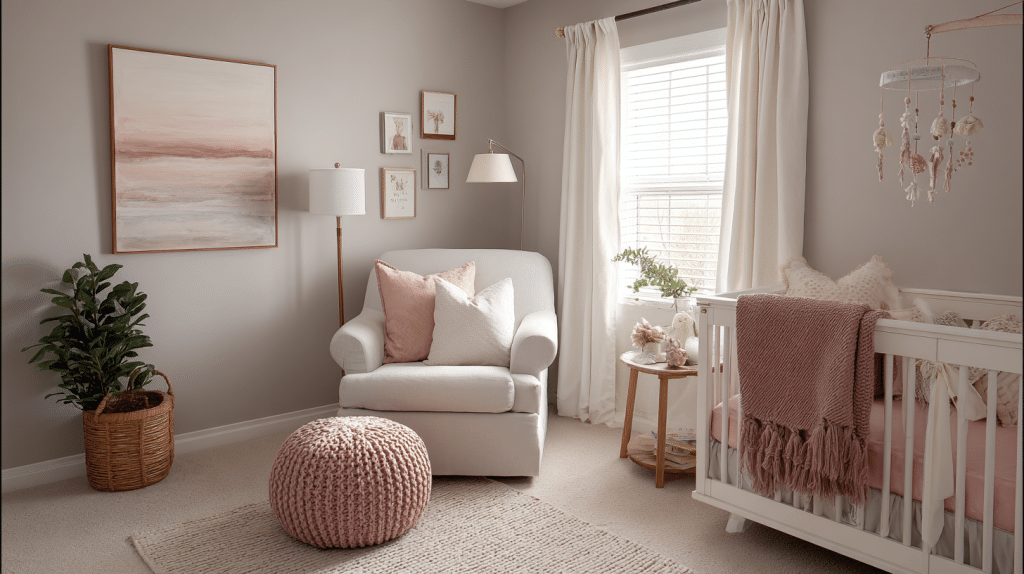
9. Nursery Gender-Neutral Design
Create a classic nursery with soft white and gray walls and furniture, then add personality through one gentle accent color like soft mint green or dusty rose.
Use this color in bedding, mobiles, and decorative elements that can grow with the child.
10. Outdoor Living Space Harmony
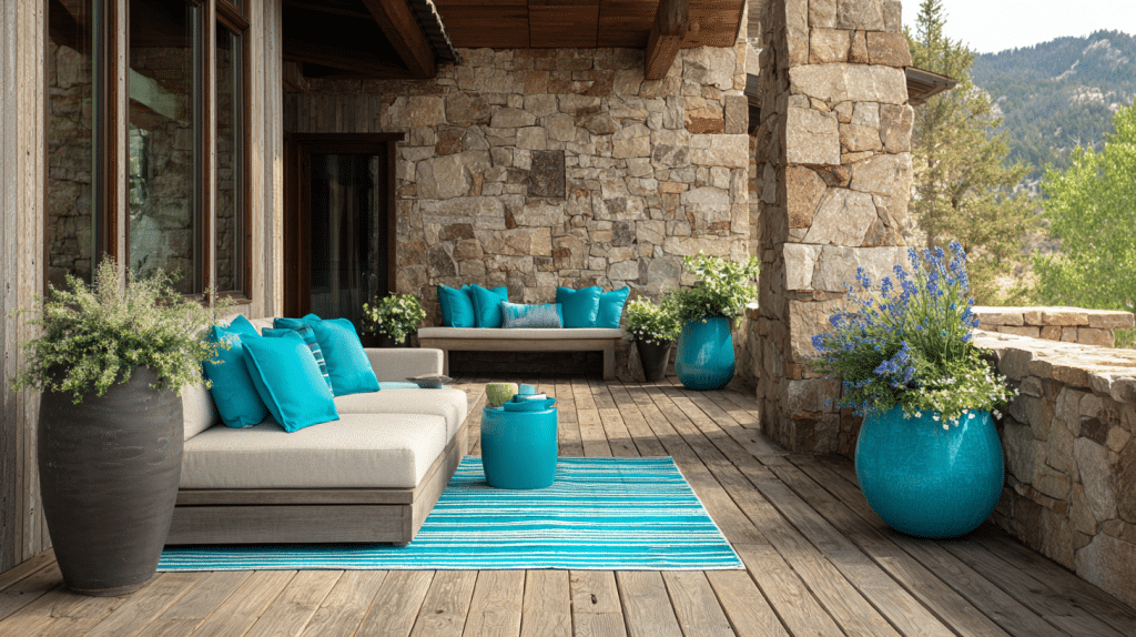
Extend your accented neutral color scheme to outdoor spaces using natural wood and stone as neutrals, then add vibrant outdoor-friendly accent colors like turquoise or coral.
Apply these through cushions, planters, and outdoor rugs that complement the natural surroundings.
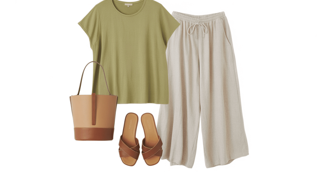
Making Accented Neutrals Work in Your Wardrobe
Building a wardrobe around neutrals means most pieces work together, making getting dressed more straightforward. Start with neutral basics in colors that flatter your skin tone – black and white, cream and camel, or gray and navy.
- Accessories for accent colors: Add personality through scarves, jewelry, shoes, or handbags. A black dress becomes completely different with red accessories versus soft pink ones.
- Seasonal accent approach: Try choosing one accent color per season – rust orange for fall, emerald green for winter. This keeps your look cohesive while letting you experiment with different moods.
- Neutral tones together: Don’t overlook mixing different neutral shades – a cream sweater with camel pants creates suave style without any bright colors.
The Psychology Behind Why This Works
Neutral colors are psychologically calming and don’t compete for attention, creating peace and balance. They feel classic, appealing to our desire for stability.
Accent colors provide just enough stimulation to keep things interesting without being overwhelming.
In homes, this creates spaces that feel both restful and welcoming.
In fashion, it means looking put-together without trying too hard. There’s something simply graceful about mostly neutrals with one perfect pop of color.
Current Trends and Classic Choices
Right now, warm neutrals paired with earthy accents are popular – think cream walls with terracotta accessories.
Sage green and soft blues are also trending as fresh, calming accent colors.
But trends change while the principle of neutral foundations remains constant. Some accent colors have staying power: navy blue has been popular for decades, and deep burgundy, forest green, and warm gold are classic choices that won’t look dated.
Budget-Friendly Ways to Try This Approach
Start small before making bigger investments. For homes, try new throw pillow covers, artwork, or paint one accent wall. Fresh flowers add natural color without commitment.
Thrift stores are great for finding experimental accent pieces. In fashion, accessories are your best friend.
A colorful scarf, a statement necklace, or bold lipstick can completely modify a neutral outfit.
Even painting your nails in your accent color is a temporary, inexpensive, and surprisingly effective way to add a pop of color.
Common Mistakes to Avoid
Even with such a forgiving color approach, there are a few pitfalls that can disrupt the harmony of your accented neutral scheme.
Learning to recognize these common missteps will help you create more polished, professional-looking results from the start.
| Mistake | Why It’s a Problem | Better Approach |
|---|---|---|
| Using too many accent colors | Creates chaos and overwhelms the neutral base | Choose 1-2 accent colors maximum and stick with them |
| Ignoring undertones | Colors clash even when they should work together | Match warm neutrals with warm accents, cool with cool |
| Not testing colors in your space | Store lighting deceives – colors look different at home | Test paint samples and fabrics in actual lighting conditions |
Fun Fact: Did you know that the human eye can distinguish between over 10 million different colors, but interior designers typically work with palettes of just 3-5 colors to create the most visually appealing spaces?
Bringing It All Together
Creating an accented neutral color scheme is about finding balance, rather than adhering to strict rules. Start with neutrals you love, add one accent color that makes you happy, and adjust from there.
The beauty lies in flexibility. Keep things subtle with hints of color, or make bolder statements while maintaining your neutral foundation.
Good design should make you feel comfortable and confident, and if your scheme accomplishes that, you’ve succeeded.
What’s your favorite neutral and accent color combination? Share your experiences in the comments below!
Frequently Asked Questions
Why Use Neutral Colors as A Base?
Neutral colors never go out of style and pair well with almost any shade. They provide a classic foundation that can be refreshed with new accent colors as your taste or the seasons change.
How Many Accent Colors Should I Use?
To maintain harmony, it’s best to stick with just one or two accent colors. This keeps your space or outfit looking polished, avoids visual clutter, and makes it easier to coordinate different elements.
Can I Mix Warm and Cool Neutrals?
Yes, but be mindful of undertones. Mixing warm and cool neutrals can work beautifully if they share complementary undertones. Otherwise, they might clash and disrupt the balance of your overall look.
What’s a Simple Way to Start?
Begin with small, affordable changes like throw pillows, accessories, or artwork in your chosen accent color. This lets you experiment with minimal commitment and see how the scheme works in your space or wardrobe.