
Are you ready to say goodbye to gray walls? The color that dominated interiors for the past decade is finally losing its grip.
Blue paint is making a bold comeback in 2025, bringing fresh energy to homes everywhere.
From deep navy tones, such as bracing blue by Sherwin-Williams, to softer coastal hues, this year’s blue palette offers something for every space.
Interior designers are moving away from neutral grays that felt safe but sterile. Instead, they’re choosing blues that create mood and personality.
Blue delivers tranquility and character that homeowners crave. It works beautifully in both traditional and modern settings.
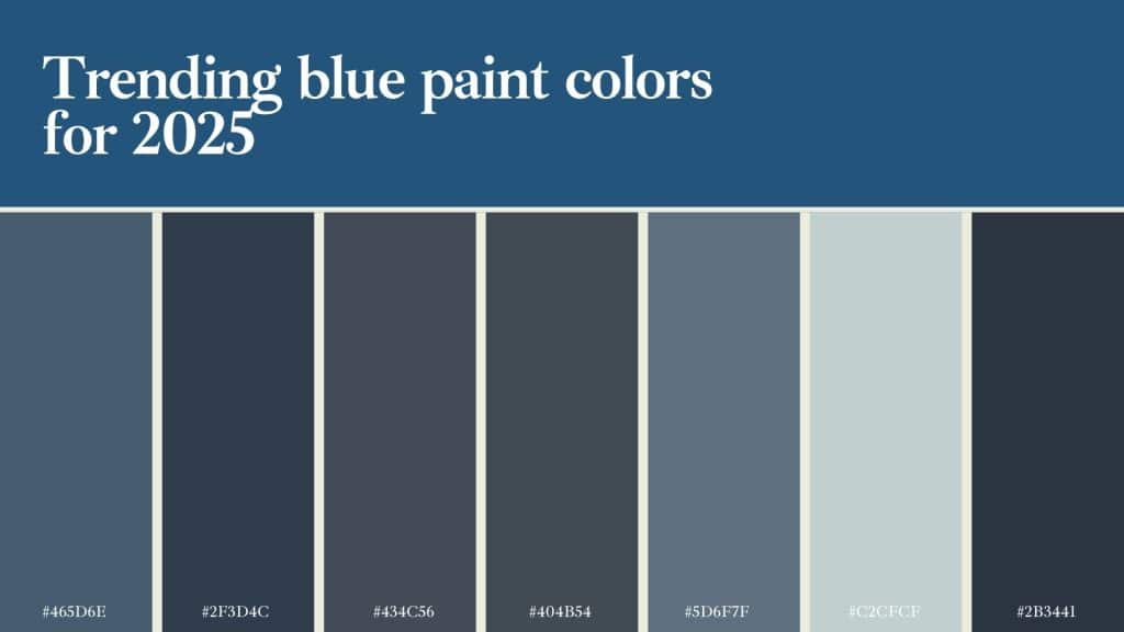
This guide reveals the seven hottest blue shades for 2025, along with expert tips on incorporating them effectively into your home.
Is Blue Taking Over in 2025?
Blue is definitely having a moment, and there are solid reasons why. After years of gray walls dominating homes, people want color that feels both calming and interesting. Blue delivers exactly that balance.
The shift began when homeowners craved richer colors that brought warmth and vibrancy. These neutral tones felt cold and impersonal after being used everywhere for so long.
Calming blue paint shades for stress-free rooms have become particularly popular as people focus more on wellness at home.
Blue offers warmth that gray simply can’t match, especially the richer, more complex blues trending now.
Key reasons for Blue’s comeback:
- Creates a natural retreat feeling we crave.
- Reduces stress and promotes better sleep.
- Photographs beautifully on social media.
- Works as both neutral and statement color.
The Bottom line: Blue provides harmony between serenity and style, answering what modern spaces truly demand.
The Hottest Blue Shades of 2025
These seven blue paint colors are leading the trend for 2025, each offering unique character and versatility for different spaces and styles.
1. Van Deusen Blue (HC-156)
This historic blue brings richness with complex undertones perfect for formal spaces. It works beautifully in dining rooms, libraries, and home offices where you want focus and intimacy. The gray undertones prevent it from feeling too bold or overwhelming.
2. Naval (SW 6244)
Naval stands out as one of the most versatile shades of deep blue available. In well-lit rooms, it appears as rich navy; in lower light, it looks almost black. This adaptability makes it perfect for accent walls or entire rooms.
3. Hale Navy (HC-154)
Hale Navy offers a perfect balance between blue and gray undertones. This shade strikes a balance between traditional and modern, making it suitable for a wide range of design styles. It’s deep enough to add visual interest, but won’t overwhelm smaller spaces.
4. Blue Note (2129-30)
Blue Note brings energy and freshness without being too bright or childish. This medium-toned blue has enough depth to feel grown-up while remaining cheerful. It works beautifully in kitchens, especially when paired with white uppers on islands.
5. Distance (SW 6243)
Distance offers a softer approach with its muted, weathered appearance. This color feels like perfectly broken-in denim – comfortable and familiar. It works particularly well in bedrooms and living spaces where you want color without intensity.
6. Tradewind (SW 6218)
Tradewind brings coastal vibes indoors with its blue-green undertones. This color evokes a gentle ocean breeze, making it perfect for bathrooms and bedrooms. It works well with both warm and cool accents, giving you decorating flexibility.
7. Anchors Aweigh (SW 9179)
Anchors Aweigh offers true navy with slight purple undertones that add richness and depth. This color creates drama while remaining livable and polished. It works beautifully in formal settings, such as dining rooms or studies.
Where Do These Shades Work Best?
Knowing where to use blue paint makes the difference between a space that works and one that doesn’t. Each application requires different considerations.
| Application | Best Shades | Key Tips |
|---|---|---|
| Full Room Walls | Distance, Tradewind | Use lighter blues and save darker ones for well-lit rooms only |
| Accent Walls | Naval, Hale Navy, Anchors Aweigh | Creates stunning focal points behind beds, sofas, or dining room tables |
| Kitchen Cabinets | Blue Note, Naval | Lower cabinets paired with white uppers create beautiful two-tone kitchen designs |
| Bathroom Vanities | Van Deusen Blue, Hale Navy | Rich dark colors hide wear better and create luxurious spa-like feelings |
| Front Doors | Anchors Aweigh, Naval | Creates a welcoming entrance that stands out from typical black or white doors |
Perfect Pairings for Blue Paint Colors:
- Warm wood tones, such as oak, walnut, and cedar, complement blue beautifully.
- Brass light fixtures and cabinet hardware add a touch of luxury and warmth to spaces.
- Coral and peach accent colors provide vibrant contrast without color clashing.
- Neutral backgrounds in cream, warm white, and soft gray support blue perfectly.
Key takeaway: The right blue shade in the proper location creates rooms that feel both calming and full of personality.
Impact of Lighting on Blue Paint
Lighting can dramatically affect how blue paint appears in your home. Understanding these changes helps you choose the right shade and avoid disappointment.
Natural Light: North-facing rooms receive cooler light, which can make blue appear cold or gray. South-facing rooms get warm light that makes blue feel more inviting and balanced.
Artificial Light: LED bulbs with cool temperatures make blue feel harsh and unwelcoming at night. Warm LEDs create a cozy atmosphere that complements blue beautifully in the evening hours.
Time of Day: Blue looks different in morning light versus evening light throughout the day. Test chosen blue at various times to ensure you love it consistently.
Room Considerations: Small rooms with limited light tend to exhibit more dramatic color shifts than larger spaces. Sample testing becomes critical; paint large samples on different walls first.
Final Thoughts
Blue paint colors for 2025 bring timeless depth, signaling a confident move toward color-driven design. Each shade brings a unique personality to your home.
Success lies in how lighting affects these colors and choosing the right application. Blue cabinets, accent walls, or full rooms work when planned thoughtfully.
Blue pairs beautifully with warm woods, brass accents, and soft neutrals. These combinations create balanced, inviting spaces that never feel cold.
The trend toward blue reflects our desire for a color that is both calming and energizing. It’s both a retreat and a statement rolled into one.
Ready to bring blue into your home? Share your favorite shade or tell us about your paint plans in the comments below.
