
Picking paint colors feels exciting until you’re standing in front of a wall of swatches, unsure which one will bring your vision to life. If you’re eyeing Sherwin-Williams Succulent, chances are you’ve also considered Retreat.
Both are shades of green, but they’re not twins. One is bold and earthy. The other is calm and understated. So, which one should you choose for your walls, cabinets, or even exterior?
This guide will take you through Succulent and Retreat side by side, showing their personalities, best uses, and pairings. By the end, you’ll know which green feels like the right fit for your home.
The Character of Succulent (SW 9650)
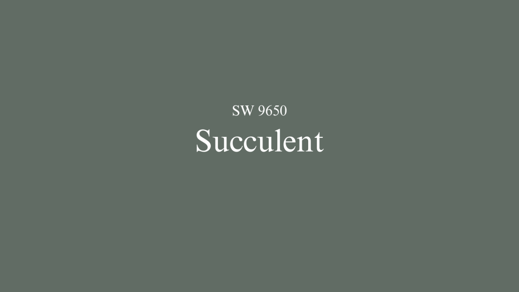
Succulent has presence. It doesn’t fade into the background; it makes a statement. Imagine the richness of nature — pine forests, mossy trails, deep leafy greens. That’s the energy Succulent carries into a room.
Undertones: It leans into a warm green, with a depth that keeps it from feeling flat.
Mood: Cozy, grounded, dramatic.
Where it shines: Accent walls in modern living rooms, Kitchen islands that need to stand out, Exteriors where boldness adds curb appeal.
Succulent is not for those afraid of color. But if you want a green that feels modern yet timeless, it’s hard to beat.
The Personality of Retreat (SW 6207)
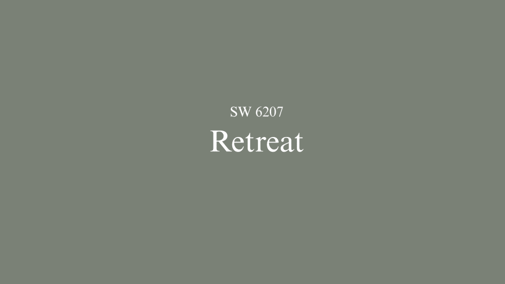
Retreat is Succulent’s quieter sibling. It has the green base, but is softened by gray undertones. The result? A shade that’s calm, versatile, and more adaptable in a variety of spaces.
Undertones: Green mixed with gray for a muted, slightly cooler effect.
Mood: Relaxed, balanced, soothing.
Where it works best: Bedrooms that need a restful tone, Home offices where focus and calm are key, living rooms designed for coziness over drama.
Retreat doesn’t scream for attention, but that’s its charm. It blends in, creates harmony, and lets other elements in the room shine.
Style Matchups: Which Green Fits Your Home?
Here’s a quick cheat sheet if you’re trying to match paint to your design style:
| Style | Succulent Works Best | Retreat Works Best |
|---|---|---|
| Modern | ✔ Statement walls, kitchen islands, cabinets | ✘ Can feel too muted in bold settings |
| Farmhouse/Cozy | ✔ Accent walls with wood beams or textures | ✔ Whole-room coverage with warmth |
| Minimalist | ✔ Single focal wall to add depth | ✔ Neutral backdrop that doesn’t distract |
| Traditional | ✘ Might overpower ornate décor | ✔ Elegant, timeless, easy to live with |
Head-to-Head Scenarios
Kitchens
- Succulent: A fantastic choice for lower cabinets or an island if you want your kitchen to pop. Pair it with brass or matte black hardware and lighter countertops for balance.
- Retreat: Works better if you want your kitchen to feel calm, seamless, and cozy. Great for all-over cabinetry, especially when paired with warm woods.
Living Rooms
- Succulent: Best used as a feature wall color. Too much may overwhelm, but an accent wall makes the space feel bold and inviting.
- Retreat: Ideal for painting the whole room. It brings coziness and warmth without closing in the space. This makes it one of the best green paints for north-facing rooms that need brightening without overwhelming the space.
Exteriors
- Succulent: A bold front-door or exterior wall shade that instantly elevates curb appeal. Works beautifully with stone or warm brick.
- Retreat: Great for those who want subtle elegance. It blends with natural surroundings and gives a soft, welcoming first impression.
Complementary Pairings
Pairing with Succulent
Succulent is a strong color, so it pairs best with tones that balance its boldness:
- Warm neutrals like cream, beige, or taupe.
- Natural textures: oak, walnut, or rustic woods.
- Metals: brass and copper for a luxurious edge.
- Accent colors: terracotta, blush, or soft gold.
Pairing with Retreat
Retreat’s muted nature makes it easier to mix and match:
- Crisp whites or soft grays for contrast.
- Cool woods like birch or ash for a clean look.
- Metals: brushed nickel, matte black, or steel.
- Accent colors: dusty blues, muted pinks, or mushroom tones.
When to Choose Succulent vs Retreat
Here’s a simplified decision guide:
Go for Succulent if You:
- Love bold, statement-making colors.
- Want to modernize a kitchen or add drama to a living space.
- Don’t mind balancing it with lighter tones.
Go for Retreat if You:
- Prefer soft, cozy, and timeless walls.
- Want a green that feels more neutral and versatile.
- Need something low-risk for bedrooms, offices, or entire rooms.
The Bottom Line
Your perfect green depends on your comfort with color. Succulent brings warmth and character to spaces that need a focal point. Retreat offers calm versatility for rooms where you want subtle beauty.
Think about how you use each space. Do you want your kitchen island to grab attention? Choose Succulent. Need a bedroom that feels restful? Retreat fits better.
Both colors work well with natural materials and warm metals. The key is matching the paint’s personality to your own style preferences.
Ready to convert your space? Start with a sample on your wall. See how each green feels in your lighting throughout the day. Then pick the one that makes you smile every time you walk into the room.
