Blue gray paint is the catfish of the paint world.
On the tiny swatch? Calm. Crisp. “Ooh, that feels expensive.”
On your actual walls? Suddenly it’s giving dusty lavender… or hospital aqua… or (my personal favorite) both depending on where you’re standing.
If you’ve ever painted a room “the perfect blue gray” and then spent the next week pacing around with coffee whispering, “Why is it purple,” you’re not alone. Blue grays are famously sneaky because they’re basically a two layer situation: the color you think you picked, plus the undertone quietly running the whole show like a backstage manager with opinions.
Let’s talk about why it happens and how to catch it before you commit to gallons and emotional damage.
The problem: “Neutral gray” is basically a myth
A true, no undertone gray is like a spotless junk drawer. It exists in theory, not in your house.
Most grays have a little something going on underneath—green, purple, blue, pink, beige… and blue grays are extra dramatic because you’re already starting with blue and then adding a second secret flavor. So yes, two paints can look nearly identical on a chip and then act like distant cousins who don’t speak at Thanksgiving once they’re on the wall.
The swatch is the first date.
The undertone is what you meet three weeks in when the paint gets comfortable and starts showing its real personality.
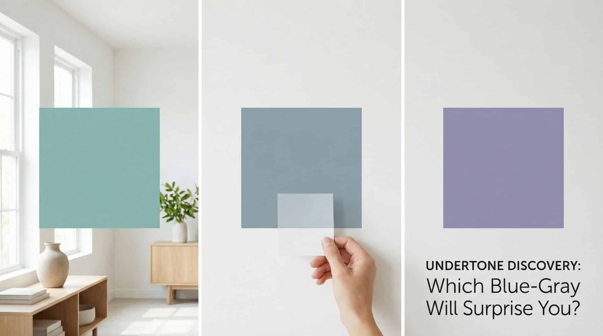
Blue gray vs. gray blue (yes, the name actually matters)
This isn’t paint company poetry. It’s a clue.
- Blue gray = reads blue first, softened by gray. It will look like a color choice. (Pretty! But not shy.)
- Gray blue = reads gray first, with blue quietly hanging out underneath. It usually behaves more like a neutral… until the light decides to expose it.
If you want your room to feel mostly neutral with a whisper of blue, you’re typically happier in gray blue land. If you want a noticeable moody blue vibe, blue gray is your lane.
And then—plot twist—undertones enter.
The three undertone “families” hiding in blue gray
When people say a blue gray “went weird,” it’s almost always one of these undertones getting loud.
1) The green leaning blue grays (a.k.a. “Hello, spa bathroom”)
These drift toward aqua/teal when the light hits them right (or wrong, depending on your feelings). They can look super fresh with crisp whites and wood tones, but in a cool room they can go a little… arctic.
If your house already runs cool and shadowy, a green undertone might make you feel like you should be wrapped in a towel waiting for a eucalyptus steam session.
2) The purple leaning blue grays (a.k.a. “Why is it lilac, Karen?”)
This is the one that gets people. A violet/lavender undertone can actually make a blue gray feel warmer and softer. It’s gorgeous in bedrooms and cozy living rooms… but it’s also the most likely to surprise you.
I once tested a “serene blue gray” that looked perfect all day, and then every evening it turned into a faint lavender sadness under warm lamps. Not terrible! Just… not what I signed up for.
3) The balanced ones (the responsible adults)
These are the rare blue grays that don’t swing hard green or purple. They tend to shift less from wall to wall, which makes them easier to live with.
Downside? Sometimes they can feel a bit flatter. Upside? You won’t wake up one morning and wonder who repainted your room in “Misty Seafoam Ghost.”
Lighting: the part nobody wants to deal with (but you have to)
Paint doesn’t just “look different” in different light when rooms face north. It basically changes outfits.
Room direction matters
- North facing rooms: cooler, steadier light. This can make blue grays look icier and pull out green undertones.
- South facing rooms: warmer light most of the day. This can pull out purple/violet undertones and make the color feel cozier (or slightly mauve-y, depending).
Time of day matters
Morning tends to be cooler. Evening tends to be warmer. So yes, your paint can look like two different colors at 9 a.m. and 8 p.m.
Your light bulbs matter (a lot)
- Cool/bright LEDs can amplify green-ish, crisp undertones.
- Warm bulbs can amplify purple-ish, cozy undertones.
And here’s the annoying truth: whatever lighting you use most is what your paint will “live” in. So if you’re a lamp at night person, that’s the light you should care about most—not the one magical sunny hour when your living room looks like a catalog.
How to test blue gray paint without losing your mind
This is the unglamorous part. It’s also the part that saves you from repainting and rage Googling “why does my blue gray look purple.”
Step 1: Do the “white paper lie detector” test
Take your paint chip (or sample card) and hold it next to bright white paper in natural daylight.
Whatever tint jumps out between the chip and the paper? That’s your undertone.
- Looks a little greenish next to white → green undertone
- Looks a little lavender/purple next to white → purple undertone
- Looks mostly just blue gray without a strong push → more balanced
This works because white gives your eyes a fixed reference point. Without it, your brain is like, “Sure, everything is gray, whatever.”
Step 2: Stop trusting tiny chips (they are liars)
You need a bigger sample. Like at least 12×12. Bigger is better.
Paint a sample square or use peel and stick samples. And don’t put it in one sad corner and call it a day.
Step 3: Try it on more than one wall
Put it on different walls if you can—especially if one wall gets more light than another. A color that looks dreamy on a sunny wall can look totally off in the shadows.
Step 4: Live with it for 48 hours
Look at it:
- morning
- midday
- evening
- under your lamps at night
Two days of “hmm”-ing is cheaper than repainting. (And cheaper than couples therapy if you’re painting with a partner.)
My two biggest “don’t do it” mistakes (learn from my scars)
1) Mixing undertones that fight each other
If your wall color leans green and your sofa leans purple, they can make each other look more extreme. Same with rugs, counters, tile—anything big and bossy in the room. If something feels “off” and you can’t explain why, undertones are usually the gremlin.
2) Trusting the name on the can
Paint names are pure marketing chaos. “Coastal Fog” might be purple. “Mountain Twilight” might be green. Ignore the vibe-y name and test the actual color like the suspicious adult you are.
What to do next (aka your no regrets plan)
If you remember nothing else, remember this: blue gray is always telling the truth… eventually. Your job is to make it confess before it’s all over your walls.
Grab a couple contenders for a blue for every mood, do the white paper test, slap up big samples, and watch them through a full day (and night) in your real lighting. Pinterest doesn’t live in your house. You do.
Now go paint a sample square and make that undertone show you its driver’s license.
