Why Hollywood Can’t Quit Orange and Blue
Once you see it, you cannot unsee it.
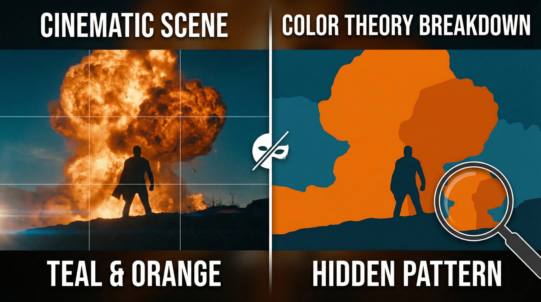
You know that one movie poster look? Glowy orange faces in front of a moody teal/blue background, like everyone’s having an intense emotional breakthrough in an aquarium? Yep. That.
It’s not just your imagination (and it’s not a conspiracy cooked up by Big Teal). A huge chunk of modern blockbusters lean on this orange and blue combo because it’s basically the cheat code of “readable, dramatic, cinematic” especially when you’re trying to sell a whole movie in one thumbnail the size of a postage stamp.
Let me show you what to look for, why it works on your brain, and why Hollywood keeps crawling back to it like a raccoon to an overflowing trash can.
First: a quick “spot it in the wild” test
Next time you watch a trailer or scroll Netflix for 47 minutes and end up rewatching The Office (no judgment, I live there too) look for these dead giveaways:
- Warm faces + cool everything else.
Skin looks peachy/orange/amber… while the background looks teal, steel blue, blue gray, or “mysterious fog bank.” - Teal shadows that shouldn’t be teal.
Concrete, walls, night scenes stuff that should feel neutral magically leans blue green, like the whole world got an underwater filter. - High contrast thumbnails.
Because at tiny sizes, bold warm vs cool contrast reads fast. Your eyeballs go: “Ah yes. A human. In danger.”
It’s everywhere because it’s effective. Which brings us to the real question: why does this combo work so annoyingly well?
Your brain likes it because it’s basically color wheel catnip
Orange and blue are color wheel opposites in basic color theory. That makes them complementary colors, which is a fancy way of saying:
Put them next to each other and they both look more intense, like they’re competing for attention.
Filmmakers usually don’t go full Crayola Orange + Primary Blue (unless they’re making a kids’ movie or a very loud superhero situation). The “grown up” version is more like:
- Teal (blue green) in shadows/backgrounds
- Amber (warm orange) in skin tones/lights
It’s high contrast without feeling like a traffic cone in front of a Smurf convention.
And there’s another sneaky trick: warm colors feel closer, cool colors feel farther away. So orange pops forward and blue recedes. Instant depth. Instant subject separation. Instant “this is a movie, not your cousin’s iPhone footage.”
The real reason: humans are… kind of orange
Okay, “orange” sounds rude. But stay with me.
Human skin across every skin tone tends to live in the warm range (reds/yellows/oranges) because biology is doing biology things. Different undertones, different depth, different melanin levels… but the overall hue range still leans warm.
So if you make the background cooler (blue/teal) and keep faces warm, your eye goes straight to the person. It’s contrast that doesn’t fight skin tones. It’s a super practical solution, especially when you have:
- big, international casts
- lots of different locations
- multiple cameras
- chaotic shooting conditions
- and a studio that wants it to look “expensive” no matter what
Basically: warm humans + cool world = instant visual clarity.
“But why does EVERY movie do it?” (Aka: deadlines, my friend.)
This part is the least glamorous and the most real.
Colorists (the people who do color grading) often have to make hours of footage look consistent on a schedule that’s… let’s call it “emotionally disrespectful.”
When you’re under the gun, you’re not reinventing a unique palette for every scene like you’re painting the Sistine Chapel. You’re looking for a look that is:
- fast to apply
- flattering to skin
- consistent across messy footage
- and familiar to audiences
Orange and blue checks every box.
And digital workflows made it even easier with a color styling walkthrough. Once movies moved fully into digital color grading, it became possible to apply a repeatable “look” quickly (often via LUTs look up tables, aka presets with a Hollywood resume).
A couple famous milestones:
- O Brother, Where Art Thou? (2000) helped popularize fully digital color grading on a major feature (hello, cohesive sepia world).
- Later, movies like Bad Boys II helped cement the punchier teal and orange vibe as a repeatable blockbuster “template.”
And once a template works? Hollywood clings to it like a toddler with a lollipop.
What orange and blue “say” emotionally (even when you don’t notice)
This combo isn’t just pretty it’s storytelling shorthand.
- Orange tends to read as: warmth, urgency, fire, danger, humanity, energy
- Blue tends to read as: coldness, distance, night, control, technology, calm, mystery
Put them together and you get instant conflict: heat vs. cold, human vs. machine, safety vs. threat, home vs. outside world.
And context matters. The same orange can feel:
- cozy (lamplight in a living room)
- gross (sodium vapor streetlights in an alley)
- terrifying (explosions… obviously)
So yeah, it’s a two color combo that can play a lot of roles, which is why different genres love it.
How genres use it (without me turning this into a film school lecture)
- Action/Sci-Fi: goes full send.
Explosions are already orange. Night skies are already blue. It’s basically pre-packaged drama. - Thrillers/Neo noir: uses it like seasoning.
More blue gray gloom, with orange as “danger” or “something’s about to go horribly wrong.” - Drama/romance: keeps it “motivated” by real light.
Warm lamps and candles vs. colder exteriors can make intimacy feel like a little island in a harsh world. - Period/prestige films: often dodge it.
Teal and orange can feel too slick or “modern digital” for certain stories. Some movies want dusty realism, not glossy blockbuster polish.
And yes, some directors refuse to join the teal cult
You’ve got filmmakers who go, “No thank you, I choose chaos,” and honestly? I respect it.
- Wes Anderson basically lives in a pastel universe where symmetry is law and pink is a personality trait.
- Amélie famously leans green and gold in a way that feels like a warm croissant for your eyeballs.
- Some films use color shifts for story (like swinging palettes to show a mental state change), rather than keeping one consistent “brand” of color throughout.
But doing something different takes time, experimentation, and producers who don’t panic when the movie doesn’t look like every other poster in the multiplex. (So… you see the issue.)
Watch your next trailer like a tiny detective
Here’s the fun part: now you get to be smug.
The next time you see a poster or trailer, glance at it and ask:
- Are the faces warmed up?
- Are the shadows mysteriously teal?
- Is the whole image basically “human ember” against “blue mood”?
And then notice what it does to your attention. Your eye goes straight to the person. The stakes feel higher. The world feels bigger. It’s not magic it’s craft (and, okay, a little bit of marketing psychology).
You don’t have to hate the orange and blue look. You just get to see it now.
And honestly? Seeing it is half the fun.