Paint Undertones: Why That “Perfect Gray” Looks Purple on Your Wall
You know that feeling when you bring home the “perfect gray” you fell in love with under the bright, flattering paint store lights… and then you paint your wall and suddenly your living room looks like it’s whispering lavender?
Yeah. That’s not your imagination. That’s undertones the sneaky little background colors hiding underneath almost every paint shade, waiting to pop out the second they hit your lighting, your floors, and your slightly questionable “warm white” lamp bulbs you’ve been meaning to replace since 2019.
Undertones are the reason paint feels like a scam sometimes. (It’s not a scam. But it’s also not not a scam.)
Let’s make it make sense so you don’t have to repaint a whole room because your gray decided to cosplay as purple.
Undertones 101 (aka: paint has a secret personality)
Here’s the simplest way to think about it:
- Overtone = what you call it out loud. “Gray.” “White.” “Beige.” “Navy.”
- Undertone = what it’s actually doing behind your back. Purple. Green. Yellow. Blue. (Sometimes all of the above, if you picked a true drama queen color.)
And yes, neutrals are the worst offenders because the overtone is so quiet that the undertone has plenty of room to start yapping.
Also: undertones are hard to see on a tiny paint chip and painfully easy to see once the color takes over 400 square feet of wall. A sample can look subtle on a swatch and then look like “hello, I’m banana pudding” when it’s on every surface.
Warm vs. cool undertones (the “pick a side” moment)
Paint undertones generally fall into two camps:
Warm undertones
These lean red / orange / yellow. They feel cozy, sunny, creamy, earthy.
Think: cream, peach, tan, terracotta, golden beige.
Cool undertones
These lean blue / green / purple. They feel crisp, airy, modern, calm.
Think: slate, sage, icy gray, lavender-y grays (yes, those exist and yes, they will find you).
Here’s the annoying part: warm vs. cool isn’t always obvious. Some blues are warm. Some reds are cool. Paint is complicated because it was invented by people who wanted to watch us suffer (probably).
“But why is my gray purple??” (welcome to the club)
If you take nothing else from this post, take this:
A lot of “gray” paint isn’t truly blue undertoned gray.
It’s often purple undertoned or green undertoned and that purple undertone loves to show up under warm indoor bulbs and in certain rooms.
So you’re not crazy. Your gray is just… being itself.
Blue undertone vs. green undertone (they’re both cool, but not the same vibe)
This is where people get tripped up, because “cool” doesn’t mean “all the same.”
- Blue leaning cool colors can look crisp and clean… or icy and sterile if your room doesn’t have warm stuff to balance them (wood, warm metals, cozy textiles).
- Green leaning cool colors usually feel softer and more natural. Even though green is cool, it often reads more “friendly” than a true blue undertone.
Personally? If you’re dealing with a darker, north facing room (cool, indirect light), I’m cautious with anything that leans super blue. That’s how you end up with a room that feels like a dentist office in Antarctica.
The fastest ways to spot undertones (before you commit to a gallon)
You don’t need a degree in Color Theory Chaos. You just need a few simple tests that give you real clues.
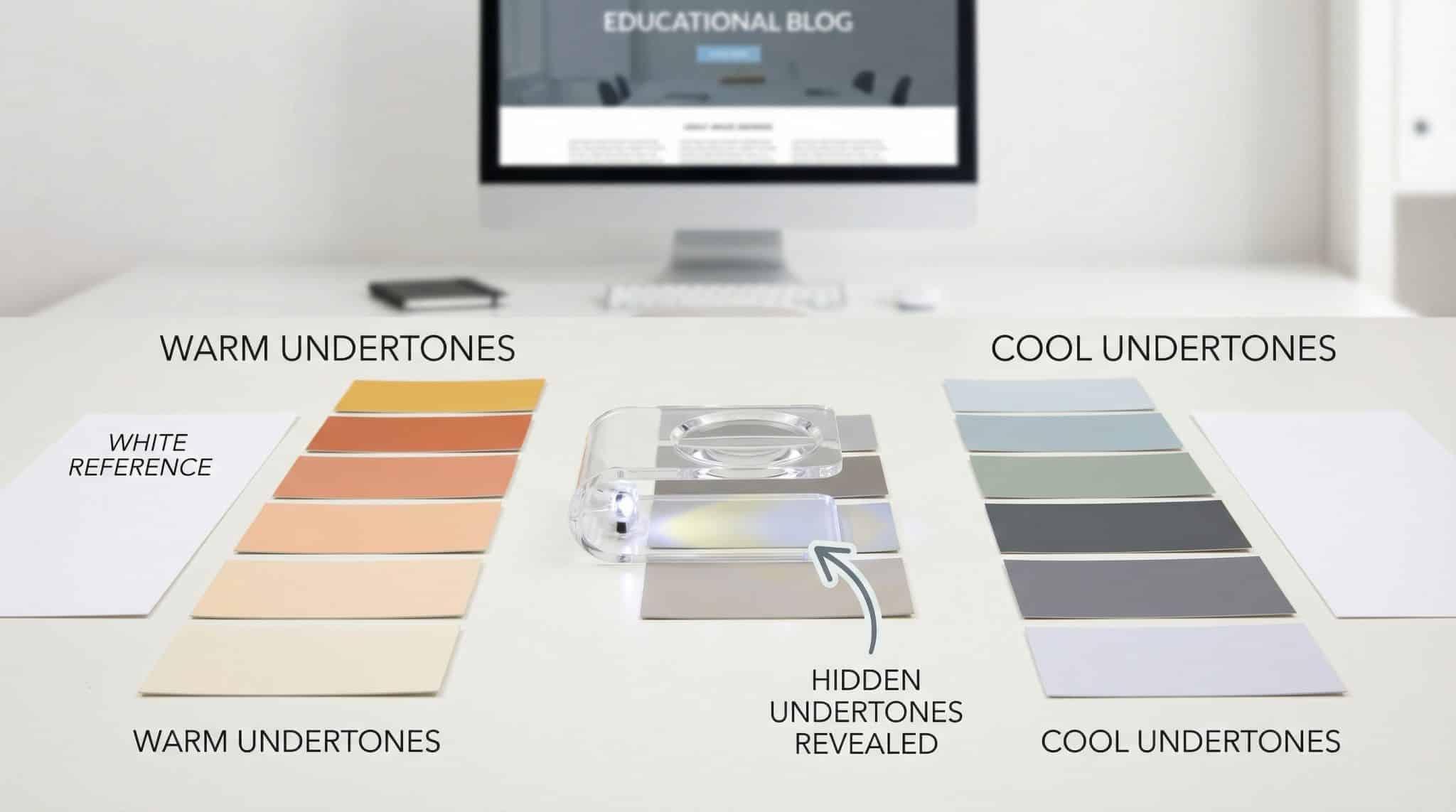
1) The white paper test (my ride or die)
Grab plain bright white printer paper. Hold your paint chip right up against it in steady light.
- If the chip suddenly looks yellow/peach/creamy next to the paper → it’s warm leaning.
- If it looks blue/green/purple/steely next to the paper → it’s cool leaning.
That white edge gives your eyes something honest to compare to. (Unlike the paint chip display wall at the store, which is basically a liar in a blazer.)
2) Compare it to a “known” color
Put the chip next to something you know is warm or cool:
- a true white trim sample
- a beige you trust
- a blue fabric
- a green tile
Your sample will “tilt” toward its undertone when it’s next to something more obvious. It’s like putting a “neutral friend” next to someone loud suddenly you can tell who has the stronger personality.
3) Check it at three times of day (yes, you have to)
This is where the truth comes out.
- Midday (10-2ish): usually the most neutral read. Cool undertones show clearly.
- Late afternoon: warm light starts creeping in. Warm undertones can get richer.
- Night (lamps on): the test everyone skips…and the one you actually live with.
If you only check paint in daylight and then hate it at night, congratulations: you’re extremely normal.
4) RGB numbers (for the slightly nerdy, and I mean that lovingly)
If you can find manufacturer listed RGB values (not pulled from a random photo online), you can get a hint about undertones:
- Higher Red number = warmer lean
- Higher Green or Blue number = cooler lean
- Numbers close together = closer to neutral
Is it perfect? No. But it’s a decent “should I even bother sampling this?” filter.
Lighting: the plot twist you didn’t ask for
Paint doesn’t exist in a vacuum. Your room light is basically an editor, and it will rewrite the color story.
North facing rooms
Cool, indirect light most of the day.
- Cool undertones can look stronger.
- Warm colors can look flatter or a little dull.
South facing rooms
Warm, steady light. (These rooms are paint’s favorite child.)
- Warm colors glow.
- Cool colors usually feel balanced and pleasant.
East facing rooms
Cooler morning light, warmer later.
West facing rooms
Warmer afternoon/evening light can get intense and show color shifting in deep greens.
This is how a “soft greige” becomes “why is my wall orange at 6 PM?”
And don’t forget bulbs:
- Paint stores often have daylight bulbs (4000K-5000K)
- Homes often have warm bulbs (2700K-3000K)
So yes, the store and your house are basically two different planets.
Sample paint like you actually want the truth
If you want to avoid the heartbreak, don’t do the tiny little 6-inch square sample patch and call it a day. Paint needs room to show you who it really is.
Here’s what I do (and what I beg you to do):
- Paint a sample at least 2 ft x 2 ft (bigger is better)
- Do 2 coats (undertones show more when coverage is solid)
- Sample on more than one wall:
- near a window
- across from a window
- under your main evening lighting
- Live with it for at least 48 hours (longer if you can)
Your brain needs time to adjust, and paint needs time to stop screaming “NEW COLOR ALERT!” every time you walk in the room.
The real reason neutrals are such a headache
Neutrals seem safe because they’re quiet. But that’s exactly why they’re tricky.
When you paint a color that’s obviously green like HC-157 green paint, you expect green.
When you paint a “nice light gray,” you’re expecting… nothing. So when the undertone shows up (purple! green! beige!), it feels personal.
Neutrals are basically the introverts of paint: calm on the surface, secretly intense.
How to make undertones play nice with your floors + trim (the stuff you can’t ignore)
Here’s my opinionated but loving advice: pick a direction and make it intentional.
You generally have three good options:
1) Go warm on purpose
Best if you have warm fixed finishes:
honey oak floors, warm stone, brass, creamy tile
Warm whites and warm neutrals will feel cohesive and cozy.
2) Go cool on purpose
Best if you have cool finishes:
gray tile, cool countertops, lots of black/steel, cooler woods
Crisper whites and cooler grays look clean and modern here.
3) Bridge the gap with a balanced neutral (my “mixed finishes” lifesaver)
If your house is a mix of warm and cool (hello, 90% of homes), a balanced greige-ish neutral can keep the peace.
Because sometimes the goal isn’t “perfect.” Sometimes the goal is “nothing looks weird next to anything else.” I support that.
Trim matters more than you want it to
Trim is like the frame on a picture: it changes how everything looks.
My biggest tip: don’t accidentally pit warm walls against cool trim (or vice versa) unless you’re doing it very intentionally. That mismatch is what creates that vague “something feels off” feeling that makes you stare at your walls like they owe you money.
If your wall color is warm, a super crisp icy white trim can make the wall look muddy.
If your wall color is cool, a creamy trim can make everything look dingy.
You don’t have to overcomplicate it just keep the undertone direction friendly.
Quick fixes for common paint heartbreak
“My white looks yellow/dingy.”
You probably chose a warm white for a room with cooler light (north facing, or cool bulbs).
Try:
- slightly warmer bulbs if you want to lean into cozy
- or repaint with a cooler/balanced white if you want crisp
“It looked perfect in the store and terrible at home.”
Yep. Store lighting is not real life.
Next time: sample in your room, with your bulbs, at night. (Night is where the secrets live.)
“It clashes with my trim.”
Your wall and trim undertones are fighting.
Fix = repaint one… or choose a more balanced transition color so nobody has to be the villain.
“It looks different on different walls.”
Normal. Every wall gets different light.
If you want less shifting, pick a more muted color (high chroma colors love drama).
“My cool gray looks purple.”
Classic. Many grays lean purple, especially in certain lighting.
Do the white paper test, sample big, and check it under your evening lamps before you commit.
The little routine that will save you (and your sanity)
Before you buy gallons and commit your weekend to chaos:
- Hold the chip up to bright white paper
- Look at it midday and at night
- Sample it big (and on multiple walls)
- Decide if you’re going warm, cool, or balanced based on your floors/trim
That’s it. No mystical paint reading rituals required.
And if your “perfect gray” still turns purple? Congratulations, you’ve officially joined the time honored tradition of learning undertones the hard way. (I’ve been there. I painted a “neutral” once that looked like a dusty lilac fever dream at sunset. It did not spark joy.)
Go grab the printer paper and start there. Your future self the one not repainting the entire room will be very grateful.
