Deep Green Paint: Why Sheen Matters More Than You Think (Yes, Really)
Deep green paint is gorgeous. It’s moody. It’s cozy. It makes a room feel like it put on a velvet blazer and knows jazz.
And it’s also the color most likely to humble you in the paint aisle, because deep green doesn’t behave like your friendly little greige. It basically eats light for breakfast (most deep greens have a super low LRV—think “this color is basically a black hole with better manners”). Which means your sheen choice matters way more than you think.
Pick the wrong finish and your “rich hunter green” can turn into “why does my living room feel like a cave where dreams go to die?”
Let’s prevent that.
Why deep green is… dramatic
Here’s what makes deep green tricky:
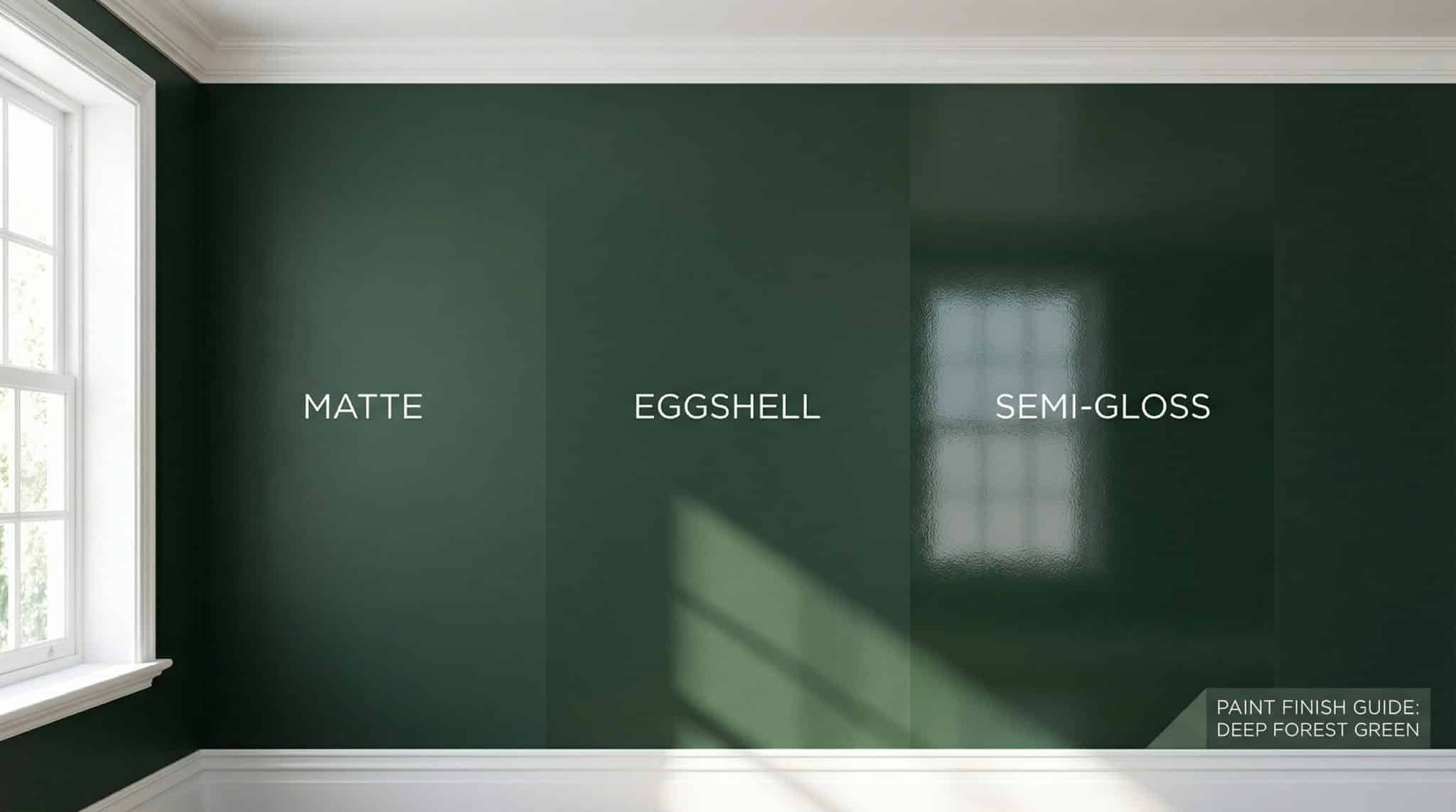
1) The “cave effect” is real
Dark colors absorb a ton of light, so if your finish is too flat, the wall can look weirdly dead—like the color just gave up. A little sheen helps bounce light around so the green looks lush instead of dull.
2) It tattles on your walls
Deep paint is like that friend who zooms in on your face in a photo and goes, “Oh wow, you can really see everything!”
Drywall seams, patches, sanding swirls, random lint you didn’t know existed… dark paint will find it and spotlight it. And the shinier the finish, the more it highlights texture and flaws.
So sheen is basically your “how much do I want to see reality?” setting.
Lighting: the secret villain (or hero)
The exact same deep green can look like:
- sophisticated forest in the morning,
- muddy sadness in the afternoon,
- and almost black at night when you’re trying to find your water glass.
Here’s my quick and dirty take:
- North facing rooms (cool, flat light): Deep green can go very dark. I often lean satin here to keep things from looking like a shadow.
- South facing rooms (bright, direct light): You can usually get away with eggshell, because satin can glare when the sun hits it.
- Small window / interior rooms: A touch more sheen (hello, satin) helps light bounce.
- Bulbs matter: Warm bulbs (around 2700K) make green look richer and cozier. Cool LEDs (4000K+) can push it gray/blue-ish, which is… a choice.
If you’ve ever painted something and then blamed the paint color when it was actually your cold LED lighting? Same. I’ve been there.
The one thing I beg you to do: test the sheen (not just the color)
Don’t just swatch the color. Swatch the sheen.
Do two big sample patches—at least 2′ x 3′—one in eggshell, one in satin. Put them on the wall you’re actually painting (not poster board… which lies to you).
Then look at them:
- morning
- afternoon
- night with lamps on
…and especially in the darkest corner, because that’s where deep greens in tight spaces look wrong first.
My deep green sheen “rules” (the ones I actually follow)
Eggshell: my go to for most walls
Eggshell gives you a soft glow without making your wall look like it’s wearing lip gloss.
I like eggshell for:
- living rooms
- dining rooms
- bedrooms
- offices (bonus: less glare if you’re staring at screens)
Also: eggshell is usually more forgiving on imperfect walls and easier to touch up.
Satin: for real life households (a.k.a. humans live here)
Satin is tougher and more wipeable. It can look slightly more polished… but it will also show fingerprints and wall texture more.
I use satin for:
- hallways and stairways (aka “the scuff zones”)
- kids’ rooms
- kitchens
- bathrooms
- entryways/mudrooms (aka “the chaos portal”)
If you’ve got dogs, kids, or just a habit of grazing the wall while carrying laundry like a wounded soldier… satin might save your sanity.
Semi-gloss: trim only, please and thank you
Trim takes a beating. Semi-gloss is made for that. It’s durable and cleanable, and it helps your trim pop against deep green walls (which is part of what makes the whole look feel intentional).
Use semi-gloss for:
- baseboards
- door and window trim
- doors
But: semi-gloss will highlight every brush stroke and dent, so prep matters (more on that in a sec).
High-gloss: only if you want drama (and you’re willing to earn it)
High-gloss on a front door in deep green can look insanely good—like fancy lacquer vibes.
But it’s not forgiving. At all. It’s the diva of finishes. If your prep is sloppy, it will show. If your application is sloppy, it will show. If you breathe near it wrong… it will show.
If you want high-gloss, commit to prep and consider spraying for the smoothest look.
Finishes I usually skip
- Flat/matte on dark walls: tends to scuff and “burnish” (you wipe it and it gets shiny in weird spots).
Exception: some premium “washable matte” paints do better—just know you’re paying for that privilege. - Semi-gloss on big walls: it can look plasticky and it will spotlight every wave in your drywall. Save it for trim.
Quick room by room cheat sheet
If you want the “just tell me what to do” version:
- Living room / dining room: Eggshell walls, semi-gloss trim
- Bedroom / office: Eggshell walls, semi-gloss trim
- Kitchen / bathroom: Satin walls, semi-gloss trim
- Hallways / entry / kids’ rooms / mudroom: Satin walls, semi-gloss trim
Then adjust based on your light and your life. (A pristine “no shoes” household can do whatever it wants. The rest of us need wipeable paint.)
Prep: the unsexy step that makes deep green look expensive
Higher sheen = more reflection = more “oh look, a drywall patch from 2009.”
If you want your deep green to look like a magazine photo and not like a rushed rental refresh, do this:
- Fill and sand obvious dents and nail holes.
- Sand glossy surfaces so the paint actually sticks (120-150 grit is usually fine).
- Prime where needed (patches, bare wood, stains, glossy trim, etc.).
My favorite little hack: gray tinted primer
Ask for gray tinted primer instead of white. It helps deep green cover faster and prevents that terrifying first coat where your walls look streaky and sickly and you start Googling “how to unpaint a room.”
Often this is the difference between two coats and three coats.
Painting deep green without losing your mind
A few things that actually matter:
- Keep a wet edge when rolling so you don’t get lap lines (dark colors love lap lines).
- Two coats is normal. Deep green is not a “one coat wonder” unless you enjoy lying to yourself.
- Thin coats on trim beat one thick gloopy coat every time.
- Don’t paint in extreme conditions: aim for roughly 50-85°F, and if humidity is high, semi-gloss can stay tacky and annoying.
And yes—paint “dries” fast, but it cures slowly. Be gentle with it for a couple days. Full cure can take a couple weeks, which is why freshly painted doors always feel like they’re trying to glue themselves shut at the worst possible moment.
Touch ups: what nobody tells you about deep green
Deep colors are harder to touch up invisibly, especially as sheen goes up.
- Eggshell: usually the most forgiving for touch ups.
- Satin: touch ups can “flash” a little (a faint halo). Sometimes it blends in after it cures.
- Semi-gloss: touch ups on trim can be obvious—you may end up repainting a whole section.
Pro tip: keep leftover paint sealed tight, and if you can, do touch ups within a few months for the closest match.
A couple common mistakes I see (and have done, unfortunately)
- Same sheen on walls and trim: everything blends together and looks kind of flat. Contrast is your friend.
- Rushing trim: thick paint + dark color = every brush mark forever memorialized.
- Choosing sheen without thinking about light: that perfect satin can turn into glare city in a sunny room.
Taking deep green outside (quick version)
Exterior is a different game, but generally:
- Siding: satin is usually the sweet spot (durable, not too shiny)
- Trim/doors: semi-gloss holds up well and cleans easily
Just make sure you’re using exterior rated paint and you’re not painting in terrible weather. (Mother Nature will win.)
What it’ll cost (so you’re not shocked at checkout)
Deep colors often cover a bit less, so plan roughly ~350 sq ft per gallon as a safe estimate.
A typical room often needs:
- 1.5-2 gallons for walls
- 0.5-1 gallon for trim (depending how trim happy your house is)
Also: semi-gloss can be slightly pricier than eggshell in the same line, but the “upgrade” per room usually isn’t huge—and I’d rather spend a little more than repaint baseboards because they look scuffed after two weeks.
My last “don’t skip this” note
Sheen names aren’t identical across brands. One brand’s eggshell can look like another brand’s satin. If you’re doing multiple rooms and want consistency, stick with one paint line.
And please—paint those sheen test patches. It’s the easiest way to avoid spending your weekend repainting a room while muttering, “Why is it so shiny?” into your roller tray.
If you want, tell me what room you’re painting for HC-157 deep green (and which direction it faces) and I’ll help you pick between eggshell and satin without the emotional rollercoaster.
