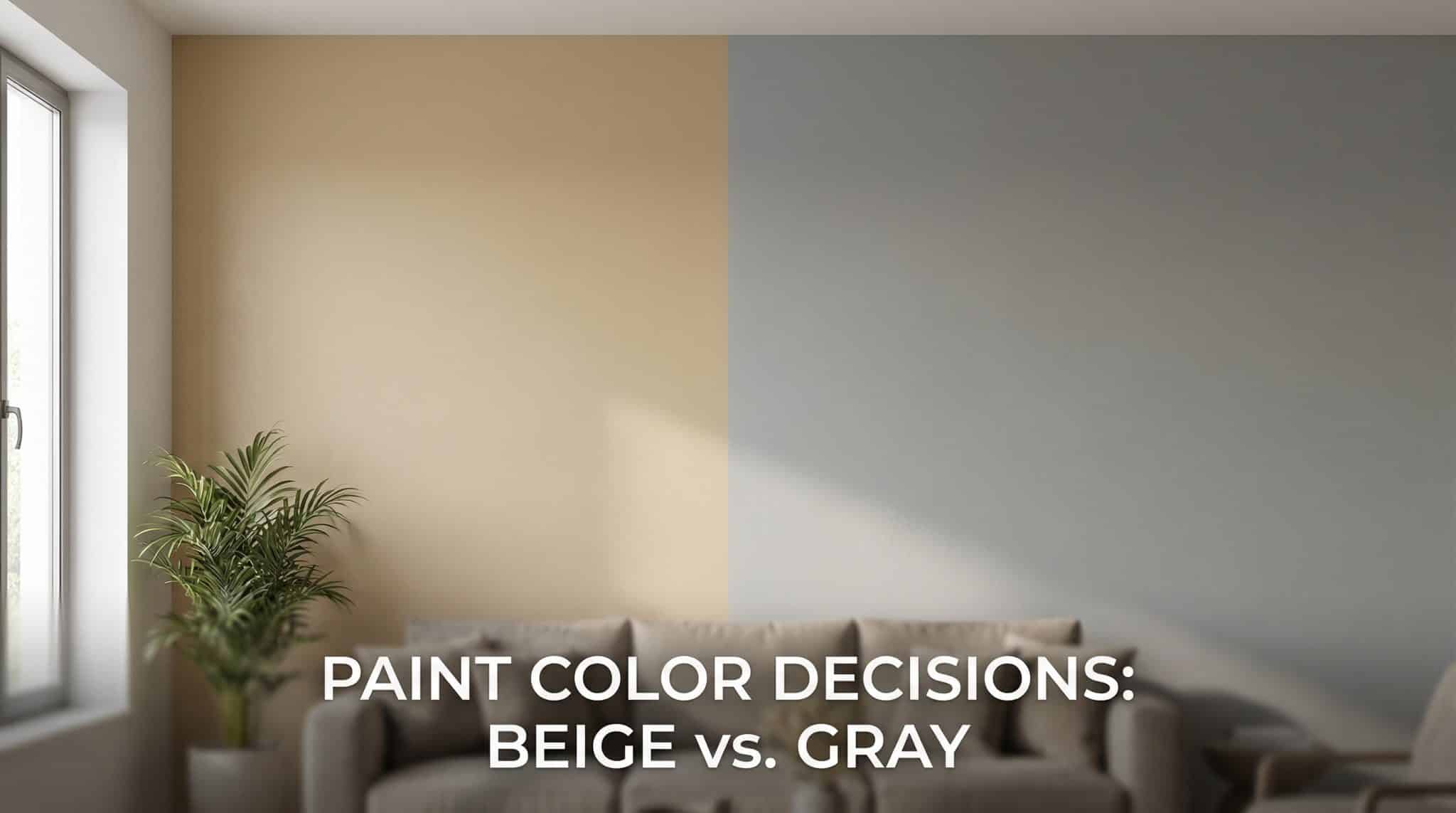
Beige vs Gray: Why Your Paint Color Looks Wrong (and How to Stop the Madness)
You know that moment when you bring home the perfect “warm beige” and it turns your living room faintly Pepto-Bismol? Or you pick a “soft gray” and suddenly your walls are giving… hospital hallway? Yeah. Been there. Stared at it for three days. Questioned my eyesight and every decision I’ve ever made.
Here’s the truth: you’re not bad at paint. You’ve just been personally victimized by undertones the sneaky little hidden pigments that live inside “neutral” colors and come out to party under your lighting.
Let’s fix it so you can stop repainting rooms like it’s your cardio.
The annoying reason beige and gray “change” on your wall
Every neutral has baggage. (Don’t we all.)
- Beige usually has warm undertones: yellow, pink, orange, gold
- Gray usually has cool undertones: blue, green, violet
And here’s the kicker: two paints can be the same “lightness” and still look totally different because one is secretly pink based and the other is blue based. That’s why the paint chip in the store lies to your face with confidence.
Beige is extra tricky because it comes in a million undertone families. Two “beiges” can look identical on the rack and then one goes peachy and the other goes yellow beige on your wall. Gray’s not innocent, but it’s usually a little more predictable.
And then there’s greige
Greige is what happens when beige and gray compromise like adults. It’s basically beige that’s been cooled down and dirtied up a bit (in a good way). If beige feels too warm and gray feels too cold, greige is often your “why didn’t I do this sooner” color.
My favorite 10 second undertone test (aka: the “white paper reality check”)
Grab a sheet of plain white printer paper. Hold it right up against your painted sample (or the wall). Look at the seam where they touch.
- If your paint suddenly looks yellow/pink/orange next to the paper → you’re in beige territory
- If it looks blue/green/purple-ish → you’re in gray territory
It’s wild how fast this works, because your brain stops “adjusting” when it has true white to compare against.
One warning: do not take this test as permission to buy gallons immediately. This is just the first date. You still need to meet the color in real life.
How to test paint samples without wanting to scream into a throw pillow
Paint chips are cute. They are also useless little liars. A 2 inch square under fluorescent store lighting cannot predict what your whole room will do.
Here’s the sampling method that saves sanity:
1) Go bigger than you think you need
At least 12×12. Bigger is better. Undertones hide in tiny samples like they’re playing hide and seek.
Paint a foam board, use peel and stick samples whatever. Just go big.
2) Put the sample where the color will actually live
Not in your hand. Not in the hallway. On the wall you’re painting.
And if you can move it around (foam board is great for this), even better because walls don’t all get the same light.
3) Watch it through the day (yes, like a paint detective)
You don’t need to obsess for a week, but you do need to see it in different lighting. I like a 48 hour minimum.
Check it:
- Morning: tends to pull out cooler undertones
- Midday: shows you the truest “base” color
- Evening: lamplight often warms everything up (sometimes too much)
If you use the room mostly at night, for the love of all things cozy, don’t choose your paint based on a sunny 1 p.m. moment.
4) Look at it under your actual bulbs
Warm bulbs make beiges warmer and can make grays look… weirdly yellow. Cool bulbs can make everything feel sharper and colder.
This is why a gray that looked “soft and serene” at noon can look like “storm cloud with emotional damage” at 8 p.m.
5) Don’t choose with six samples screaming at you
When you’re down to your final two or three, take the extras down and live with one for a day. Your brain gets overwhelmed when multiple undertones are fighting for attention on the same wall.
Your windows are not neutral, either (rude, but true)
Window direction changes everything. If you’ve ever thought, “Why does this look perfect in my friend’s house but terrible in mine?” this is probably why.
Here’s the not too technical cheat sheet:
- North facing rooms: cooler, bluer light → warm beige/greige usually feels better. Cool gray can turn icy
- South facing rooms: warmer, yellower light → gray often looks amazing. Beige can look extra creamy/bright
- East facing rooms: cooler morning, warmer later → greige or a slightly warmer gray handles the mood swings
- West facing rooms: warm late day glow → lighter gray or greige keeps it from going too golden
If your room is already cool (north facing), a warm-ish neutral can make it feel human again. If your room runs warm (south or west), gray can calm it down.
So… beige, gray, or greige? Here’s how I’d choose
Pick beige if you want cozy and forgiving
Beige is like a warm sweater. It makes rooms feel inviting, and it plays nicely with a lot of traditional finishes.
You’ll probably like beige if:
- you want soft and welcoming, not crisp and modern
- you’ve got warm lamps at night and want that glow
- you have lots of warm materials (wood, brass, warm textiles)
Pick gray if you want crisp and modern (but you must test it)
Gray can look super polished. It can also go green/blue depending on the room, so you can’t just grab any “popular gray” and hope for the best.
You’ll probably like gray if:
- you like a cleaner, modern vibe
- you want art and accent colors to pop
- you have cool toned metals or finishes (chrome, black, stainless)
Pick greige if your house can’t commit (same)
Greige is my go to when a home has mixed warm/cool finishes or open floor plans where one room’s light spills into another.
You’ll probably like greige if:
- your light is mixed or changes a lot
- your decor is a blend of warm and cool
- you want flexibility (because you, like me, change your mind)
The “fixed finishes” that get a vote (whether you like it or not)
Paint is the easiest thing to change, so it needs to cooperate with the stuff you’re not replacing tomorrow like floors and trim.
Trim
- Bright/cool white trim often looks best with gray or greige
- Natural wood trim (oak, walnut, cherry) usually loves beige
- Creamy/off white trim can go either way, but beige/greige is usually safest
Big thing: warm beige + cool bright white trim can look like two people arguing at a party. If you have cool white trim and you want warmth, greige is often the peace treaty.
Floors
Floors are the biggest undertone bullies in the room.
- Honey/red/orange toned wood usually plays best with beige/greige
- Cool toned or gray washed floors often look best with gray/cool greige
- Very dark wood can go either way, but watch dark gray sometimes it flattens the contrast and everything feels heavy
If your wood floors are warm and you put a cool gray next to them, the gray can pull blue/green and show a blue green color shift that makes the wood look even more orange. (Ask me how I know. Actually don’t. I’ll start ranting.)
A few neutral paint mistakes I’ve made so you don’t have to
1) “Why does my beige look dirty?”
Because beige needs contrast. If everything is mid tone mid tone beige walls, mid tone sofa, mid tone rug your room becomes one big latte.
Beige looks best with contrast accents for beige: crisp whites, dark woods, charcoal accents, black hardware… give it something to bounce off.
2) Trusting the paint chip like it’s a legally binding document
It is not. Chips are for narrowing down options, not choosing final colors.
3) Deciding too fast
Paint dries, light changes, your eyes adjust. Give it at least a couple days unless you enjoy repainting for sport.
Do this next (so you can finally move on with your life)
- Use the white paper test to identify warm vs cool.
- Pick your top 2-3 options and sample them big.
- Watch them through the day and under your real bulbs.
- Make your final choice with one sample up at a time.
- Double check it against your floors and trim, because they will absolutely rat you out.
And then this is the best part you get to paint with actual confidence instead of that “hope and pray” method we’ve all tried at least once.
If you want, tell me:
- which direction your room faces (north/south/east/west),
- what color your floors are (honey oak? dark walnut? gray LVP?),
- and whether your trim is bright white or creamy,
and I’ll tell you which lane I’d drive in: beige, gray, or greige.
