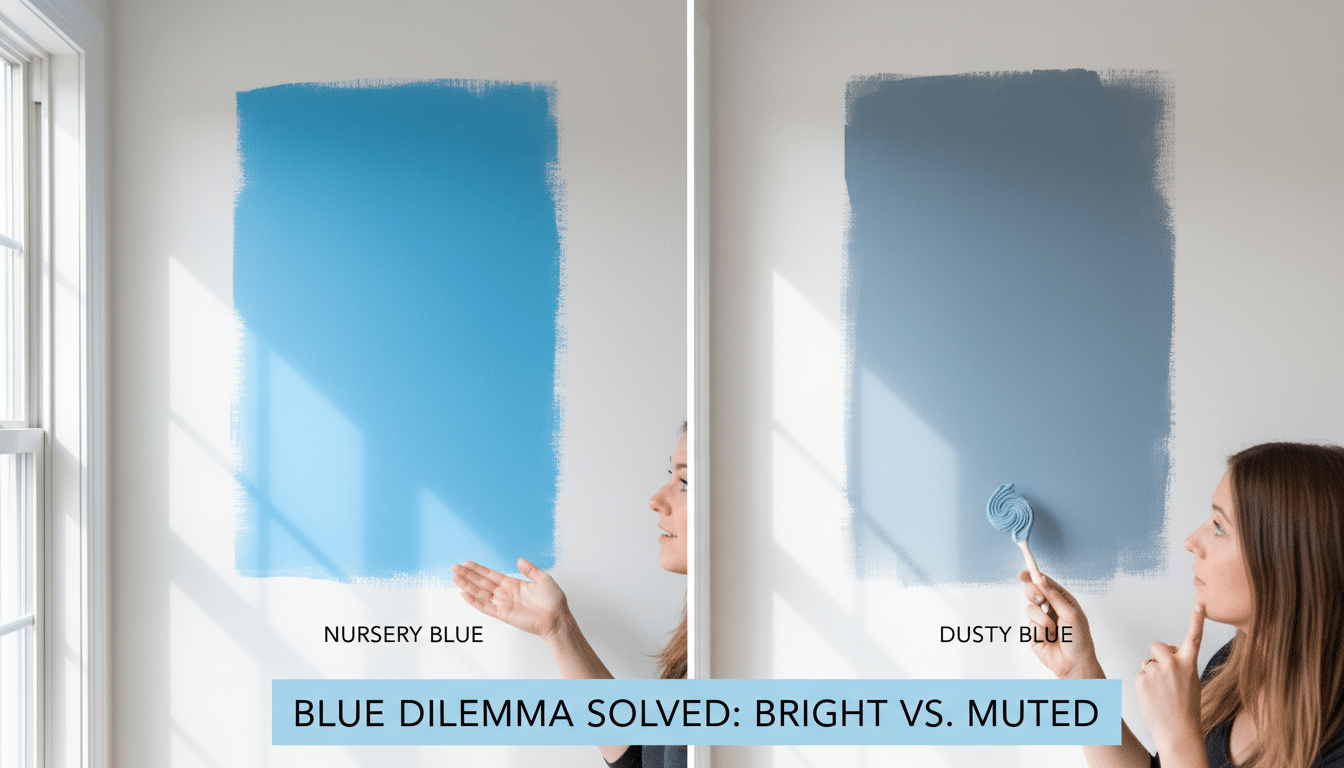
Nursery Blue vs. Dusty Blue: The Difference That’ll Save You From Repainting
You know that moment when you bring home the perfect blue paint chip… and then you put it on the wall and it turns into something that looks like a sad pair of jeans in bad lighting? Yeah. Blues are notorious liars. Especially in nurseries, where the light changes all day and you’re already running on approximately four brain cells and a granola bar.
So let’s talk about the difference between nursery blue and dusty blue because it’s not just “light blue” vs “a little darker blue.” The difference that actually matters is this:
Dusty blue has gray in it. Nursery blue… doesn’t.
And that little dose of gray is the whole personality shift.
Nursery Blue vs. Dusty Blue (AKA: Sparkly vs. Soft Spoken)
Nursery blue is the classic, clean, blue forward color. It’s brighter, fresher, and tends to bounce light around (usually higher LRV think 55-70-ish). This is your “baby blue,” your cheerful sky color, your I want this room to feel sunny even when it’s raining and I’m covered in spit up blue.
Dusty blue is what happens when blue puts on a cozy sweater and speaks in a calmer voice. It’s muted with noticeable gray undertones (often LRV 35-55-ish), which makes it feel a little more grown up and grounded. If nursery blue is “fresh laundry,” dusty blue is “denim + latte + a deep breath.”
Important note: paint cans will not announce this clearly. A color can be called something adorable like “Bluebell Wish” and still dry down looking like “Concrete With Feelings.” Testing is not optional. (Ask me how I know.)
The 3 Tests I Use So I Don’t Lose My Mind (or My Weekend)
1) The “Hold It Up to White” Test
Grab printer paper or hold the chip next to your white trim.
- If it screams “HI I’M BLUE,” it’s probably nursery blue.
- If it suddenly looks softer, grayer, and kind of shy, it’s probably dusty blue.
White is like a spotlight. It snitches on undertones immediately.
2) The “Gray T Shirt” Test
This is my favorite because it’s so unfancy. Find something medium gray cardstock, a swatch, a basic gray tee you don’t mind using as a paint consultant.
- Nursery blue will look cleaner/brighter next to the gray.
- Dusty blue will blend more (because it’s got that gray family DNA).
3) The “Paint It on the Wall and Live With It Like a Normal Person” Test
This is the one that actually counts.
Order real samples if you can screens lie about blue like it’s their full time job. Paint a decent sized sample (I like 12″x12″ minimum, bigger if you can swing it) and put it on two different walls:
- one that gets direct sunlight
- one that gets mostly reflected light
Then leave it up for 3-5 days and look at it morning, midday, and evening.
Also: hold it next to what’s already living in the room crib, rug, curtains, that weird “temporary” chair you’ve had for four years. Undertones don’t show their true chaos until they’re next to other colors.
One more thing: paint always looks more intense on a whole wall than on a tiny swatch. Tiny samples are basically the “Instagram filter” version of paint.
Lighting: Where Good Blues Go to Get Weird
Here’s the deal: your room’s light direction matters almost as much as the paint color itself.
- North facing rooms (cool, indirect light): blues can look flatter or grayer than you expected. If you go dusty here, it can drift into “why does my nursery look like a rainy parking lot?” territory.
- South and east facing rooms (nice strong light): both types can work. This is your easiest lighting, you lucky duck.
- West facing rooms (afternoon blast): colors can get washed out or go strangely bright in the evening sun.
- No natural light rooms (all artificial): super light blues can stop reading blue entirely. Don’t be afraid to go a touch more saturated than you think.
And yes, blues can shift throughout the day:
- nursery blues can lean a little purple in cool morning light, then warmer later
- dusty blues tend to stay steadier but can go extra gray under cool LED bulbs
If you pick dusty blue and then light it with icy “daylight” bulbs… don’t blame the paint. Blame the bulb.
So Which One Should You Pick? (My No Overthinking Cheat Sheet)
If you want quick, real life guidance:
- Small room / not a ton of light?
Go nursery blue, and lean lighter/brighter (higher LRV). It helps the room feel open. - Big room / lots of sunshine / you want calm?
Go dusty blue. It’s easier on the eyes and feels more “designed,” less “theme.” - Sleepy, soothing nursery vibe?
Dusty blue is my pick. It’s like visual white noise. - Playroom energy or you want it to feel crisp and cheerful?
Nursery blue. It’s happy without trying too hard. - You want “gender neutral” and something your kid won’t outgrow in 14 minutes?
Dusty blue tends to age better.
If you’re stuck, pick two nursery blues and two dusty blues, do the white/gray tests, then sample your top two on the walls. That’s it. Don’t turn this into a 37 swatch identity crisis.
A Few Paint Colors I Actually Like (Start Here, Then Sample)
I’m not saying these are “the best” because paint is personal and lighting is a demon, but these are solid jump off points for a tranquil interior blue shade.
If you’re craving a clean nursery blue:
- Sherwin-Williams Lullaby (fresh and classic)
- Benjamin Moore Borrowed Light (soft, airy, sweet without being sugary)
- Clare Sleepy Blue (clean blue with a tiny hint of green so it doesn’t feel icy)
- Farrow & Ball Stiffkey Blue (richer, more statement-y, less pastel)
If you want that dusty, calming blue:
- Benjamin Moore Boothbay Gray (blue gray, very “coastal without being corny”)
- Farrow & Ball Skylight (pale, gentle, slightly vintage)
- Clare Good Jeans (denim vibe, grounded, cozy)
- Benjamin Moore Light Blue (muted, modern, leans gray)
- Benjamin Moore Waterloo (moody and dramatic this one’s a whole vibe)
Again: sample in your room. I have watched a “perfect” blue turn into a weird lavender gray once it met my west facing windows. Humbling.
What to Pair With It (So It Doesn’t Look Accidentally Cold)
Here’s my quick and dirty pairing advice:
Nursery blue looks best with:
- crisp whites or creamy whites
- light woods / white furniture
- cool metals (chrome, nickel)
- warm-ish accents like soft yellow, coral, mint if it starts feeling chilly
Dusty blue looks best with:
- warm whites, greige, taupe
- warm woods (oak, walnut, driftwood tones)
- brass/gold (my favorite combo instant cozy)
- muted accents like rust, blush, ochre (chef’s kiss)
Trim tip from me, the person who has yelled at paint undertones in her own hallway:
Stark bright white trim can make dusty blue feel colder. Warm white trim is usually prettier with dusty tones when you understand undertone temperature in paint.
Accent Wall vs. Whole Room (Don’t Overcommit on Day One)
Personally?
- Nursery blue is amazing as an accent wall because it has more pop. Four walls of it in a tiny room can start to feel like you’re living inside a blue sports drink.
- Dusty blue is often better for all four walls because it wraps the room in that calm, muted blanket effect.
Not a rule. Just a “learned it the hard way” guideline.
The Finish I’d Pick (Because Nurseries Get Touched. A Lot.)
For nursery walls, I’m usually an eggshell person. It’s durable enough to wipe down without being shiny like a bowling ball.
Save semigloss for trim and doors. (Your walls don’t need to be glossy. Your walls are tired.)
If Your Blue Looks “Off,” It’s Probably One of These Things
- Your dusty blue looks straight up gray?
Check your bulbs. Cool LEDs will do that. Try 2700K warm bulbs and see if it comes back to life. - Your nursery blue feels weirdly loud or babyish?
That’s the point of nursery blue sometimes but if it’s too much, try a slightly softer version or use it as an accent instead of four walls. - Your dusty blue feels flat in a dark room?
Go a bit more saturated so it still reads blue under artificial light.
The Only “Secret” Is Testing (Annoying, But True)
I wish I could tell you there’s a magical one and done perfect blue. But the real win is picking your top two, painting big samples, and letting your room tell you who the winner is.
Do the tests. Watch it through the day. Check it at night under the lamp you’ll actually use. Your future self who does not want to repaint while holding a baby will thank you.


