The One Rule That Makes Gray + Beige Accents Actually Work
If your living room is currently a beautiful mashup of gray and beige (aka “greige-ish… but not in a committed relationship”), and every accent color you try looks… fine? Meh? Accidentally sad? You’re not alone.
Most people assume the problem is that they picked the “wrong” blue or the “wrong” green. But nine times out of ten, it’s not the color family. It’s the sneaky stuff underneath: undertones and depth. The invisible little color goblins living under your paint that make your “neutral” wall quietly lean blue, green, purple, pink, yellow… you get it.
So before you buy seventeen throw pillows and then rage-return fourteen of them (been there), let’s talk about the one rule that fixes most gray beige rooms.
The Rule: Cool Accents Need to Be Darker Than Your Warm Neutrals
Here it is, in plain English:
If your room is warm beige + gray and you want to add a cool accent (blue/green/teal), that accent usually needs to be clearly darker than the beige.
Because when you put a light cool color next to a warm neutral, the warm neutral tends to bully it. Beige is like, “Oh cute, you brought a whisper of powder blue. Anyway…” And then the blue looks weak, dusty, or like you didn’t mean it.
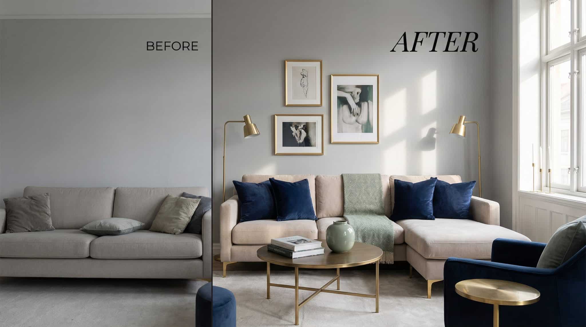
But if you flip the power dynamic? Navy next to cream. Deep teal next to sand. Forest green next to warm linen. Suddenly the whole room looks intentional like you did it on purpose and not because you panic-added things to your cart at 11:47 p.m.
If you only remember one thing from this post, remember this: When in doubt, go darker with the cool accent. You’ll rarely regret it.
A few times the rule can bend (because of course it can homes love to humble us):
- Very light blues: they read like “air” more than “color,” so they can sit closer to beige without looking pathetic.
- Muted greens (sage-ish): they behave like neutrals. They’re the Switzerland of accent colors.
- Plum/purple: it’s got one foot in warm and one in cool, so it can play nicer without needing to go super dark.
But generally? If your beige is warm and cozy and your accent is cool… make that accent deepen its voice.
Undertones: The Part Where Your “Gray” Confesses It’s Not Just Gray
Undertones are why you swear your wall was a normal gray in the store, and now it looks faintly minty and you’re questioning your sanity.
Here’s my favorite quick and dirty method (no fancy tools required):
Hold your paint sample next to a sheet of bright white paper in natural daylight. Not under your warm lamp. Not at night. Daylight, like a responsible adult.
Now ask:
- If your gray looks a little blue/silvery next to white → it’s a cool gray.
- If your gray looks a little beige/taupe next to white → it’s a warm gray (greige’s charming cousin).
- If it stays pretty balanced → you might have a true neutral gray (congratulations, you unicorn).
Do the same with beige. Beige is not innocent either:
- Yellow/orange beige: very warm. Loves richer blues and lots of greens. Terracotta looks natural.
- Peachy/pink beige: softer vibe. Looks great with soft blues, sage, mauves/dusty purples.
- Greenish beige: cooler and pickier. Needs deeper blues (think navy) and deep greens. Warm accents can look… off.
If you do nothing else, just identify these two things:
1) your gray (cool/warm/neutral) and
2) your beige (yellow-ish/peachy/green-ish)
That becomes your filter for everything you buy next. (And yes, it will save you from buying the wrong rug. Rugs are expensive and emotionally damaging.)
Accent Colors That Actually Look Good with Gray + Beige
Let’s talk “most likely to succeed” options first.
1) Blue (aka the safe choice that still looks stylish)
Blue works with gray and beige for the same reason jeans work with basically everything. It’s familiar. It’s outdoorsy. It makes sense to your eyeballs.
My personal favorite move in a gray beige room: navy. Navy has weight. It looks deliberate. And it plays beautifully with warm neutrals without turning your room into an ice palace.
Where blue shines:
- Navy/deep blue: curtains, a rug, an upholstered chair, big art, even an accent wall if you’re feeling brave.
- Soft light blue: pillows, throws, ceramics especially if you want calm without “cold.”
- Teal: the bridge color. It can lean warm or cool depending on what you pair it with, so it’s great when your room is doing that gray beige tug of war thing.
If you’re nervous, start with something you can return without crying: a throw blanket, pillow covers, or a piece of art.
2) Green (the “I want warmth and coolness at the same time” color)
Green is the peacekeeper. It sits between blue and yellow, so it doesn’t pick fights with either gray or beige.
- Sage/muted greens: easy mode. They’re soft enough to hang out near beige without needing a dramatic dark contrast.
- Olive: earthy, cozy, not too precious. (I love olive with warm grays especially.)
- Forest/hunter green: dramatic and gorgeous… but it drinks light. If your room is small and dim, proceed with caution unless you’re actively trying to create a stylish cave.
I once tried a deep green in a room that didn’t get much sun, and it was stunning for about 14 minutes then it looked like the room needed a nap. So: make sure you’ve got decent daylight, reflective surfaces, or lighter textiles nearby if you go deep.
3) Warm Pops (terracotta, rust, mustard) — use with a light hand
Warm accents are fun because they jump forward visually. The downside is… they jump forward visually. A little goes a long way.
My loose rule: keep warm “spicy” colors to about 10-15% of the room pillows, a vase, a piece of art, a smaller accent chair. Not the sofa, not every curtain panel, not your entire personality unless you’re very committed.
Quick pairing notes:
- Terracotta/rust: gorgeous with warm grays and beige. Also a great contrast if your gray is cool.
- Mustard: looks amazing with cool grays (the contrast is chef’s kiss). But beware super cool LED bulbs mustard can look kind of… dingy under icy lighting.
4) Purple/Plum (shockingly good in gray beige rooms)
Purple is a wildcard that often works because it contains both warm (red) and cool (blue). Deep plum can solve that “my room is neutral but also… bland?” problem without screaming for attention.
One caution: some grays have a purple undertone. If your gray already leans purple and you add purple accents, the room can go monotone fast. Do the white paper test seriously, it’s worth it.
5) Metals (because hardware counts, and I will die on this hill)
Metals are like the jewelry of your room. They’re not “a color,” but they absolutely change the vibe.
- Warm metals: brass, gold, copper. They love beige and warm grays.
- Cool metals: chrome, nickel, silver. They behave best with cool grays and modern spaces.
And yes, you can mix metals without the decor police showing up. Just pick a “main” metal and let the second one be the supporting actor.
My Favorite “Put It Somewhere Normal” Formula (Because Placement Matters)
You can absolutely use the 60-30-10 idea without turning your room into a math problem.
Think of it like this:
- Most of the room: your neutrals (walls, big sofa, flooring)
- A solid supporting layer: rugs, curtains, larger furniture
- The fun stuff: pillows, art, lamps, decor, one spicy chair
If your gray and beige feel like they’re in separate friend groups, get a bridge piece that contains both usually a rug or artwork. (This is why patterned rugs are so forgiving. They’re basically relationship counselors for mismatched neutrals.)
Also: texture and contrast tweaks are the secret sauce. If everything is the same finish, even the perfect palette can look flat. Mix in a few different vibes nubby linen, smooth leather, something shiny, something fuzzy. Make your room interesting to your eyeballs and your fingertips.
Light Will Humble You (So Test Before You Commit)
The same color can look lovely at 10 a.m. and absolutely unhinged at 7 p.m. under your overhead lighting. So test like you mean it.
Here’s what I do (and what I recommend if you don’t want to repaint out of spite):
- Paint a real sample: a big one. At least 2′ x 2′. Paint chips are liars.
- Give it 48 hours: look morning/afternoon/night.
- Do a cheap “trial run”: grab a couple pillow covers or a throw in your accent color and live with them for a week.
If something looks off:
- Blue made the room feel cold? Add warmer textiles (cream, warm taupe) or pick a softer, grayer blue.
- Everything feels flat? It’s usually texture, not color. Add shine, add pattern, add something with a little life.
- Your deep jewel tone took over? You need more “bounce”: mirrors, lighter fabrics nearby, or just use the color in smaller doses.
Bring It All Together (Without Losing Your Mind)
If you’ve got gray and beige living together in your room, you’re not doomed. You just need two things:
1) know your undertones, and
2) follow the depth rule (cool accents usually darker than warm neutrals).
Then pick one main accent family of accent colors in neutrals (navy, sage, teal, plum whatever you love), choose one metal, and test it with a few easy items before you commit to anything expensive.
Start small. Let the room tell you the truth. And please, for the love of paint fumes and return policies, don’t buy sixteen random accents and hope they magically form a personality. Your room deserves better than that.
