
Are you dreaming of a home that imparts elegance and invites comfort? data-comment=”80545″>There are plenty of elements that make it happen; however, choosing a suitable paint is the best call in order to achieve it for your home and has a major role to play. Choosing the right paint color can make all the difference, from creating an inviting and luxurious atmosphere to a space full of positive vibes.
So if you are seeking out a color that aligns with your taste and grabs everyone’s attention, creamy Sherwin Williams should be your go-to color. Paint with a perfect combination of warmth and elegance.
A so-called white with a pinch of yellow tone that looks creamy, hence an inviting glow, the variations of such a combination impart a range of undertones from darker to more neutral, providing alternatives to suit your taste. So how does Creamy differentiate itself? How can you use creamy to its full potential? Is creamy a perfect choice for your interiors? Not to worry, we have got everything covered for you in this article.
Let’s explore!
The Actual Color of Creamy Sherwin Williams

Sherwin Williams Creamy is a bright white color with a mild yellow undertone. This creates a fine warmth in the room, making it more welcoming. The shade has a lot of variations with varying undertones. Some are dark, and some are more neutral, and it is always a great choice to look at the colors collection deck for alternatives.
data-comment=”79954″>So what separates creamy from other neutrals? The answer to this definitive query is contained in the section below.
Colors Similar to SW Creamy by Sherwin Williams
To be true, there are many colors similar to creamy, but the most confusing one and how you would differentiate it; we have listed below. All these hues differ with LRV values, undertones, or the kind of feel they add to a space. Therefore, they might appear the same, but once on the wall, you can feel the difference.
1. SW 7013 Ivory Lace

Creamy Sherwin Williams and Ivory Lace are closely similar. What separates them is Ivory has an LRV of 79 and tends to have a dark tone, i.e., an off-white finish. Further, as you paint using a paint roller , you may notice that the latter has a pink undertone that adds a touch of delicacy and pairs well with darker hues. Both shades are popular choices for creating a warm and inviting atmosphere in any space.
2. Dover White
Dover White differs when discussing undertones. It has a stronger yellow undertone than creamy. Also, in certain light conditions, you can expect Dover to exhibit a brighter yellow. Further, they differ in LRV values; Dover has an LRV of 83 and creamy has 81. While Dover White tends to create a warmer and more vibrant atmosphere, Creamy, with its soft tones, creates a gentle atmosphere that calms the mind.
3. Benjamin Moore Marble White
Though both belong to different manufacturers but the two share a great relationship. Benjamin Moore’s (BM) marble white and the former both have a creamy look with an LRV difference of 0.8. So how do they differ? BM has a muted cream tone which gives a conventional and elegant feeling, whereas Creamy is more neutral and exhibits warmth, making the space more attractive and modern. Further, on close comparison, you’ll observe that sw creamy has a more glossy finish than bm marble white, giving the impression that it has been treated with a varnish .
4. Antique White

It’s quite difficult as Antique white and creamy are almost the same. Both have a creamy look with yellow undertones. Also, both express warmth and a perfect balance of yellow with a neutral base. But the noticeable part or the separating factor is the pinch of orange, antique white possess. Also, the LRV value of antique white is 72, and the former has 81.
The Creamy palette belongs to the family of white color and looks like more of it. With so many colors out there with a whitish effect, how creamy is differentiable, and how can you identify them easily?
How to Identify SW Creamy?
To determine easily, different colors have specific codes. The below-listed color values will help you detect the exact resemblance of creamy Sherwin Williams.
- LRV – Light Reflectance Value: Light Reflectance Value of the dye is 81. It comes in different tones, so go with less value if you are looking for a darker one. While for a lighter tone, choose one with a higher LRV.
- RGB Value: The color’s RGB values are as follows: –
- Red= 239
- Green= 232
- Blue= 219
- HEX Codes: Its hex code is #EFE8DB.
Irrespective of which color you choose, there exist factors that either glow it up or worsen its tone. For creamy SW, it’s light that makes the most impact.
Factors Affecting Creamy Williams’s Tone
As previously said, light impacts the tone; the two main points associated with the luminosity of the room that is essentially required to be taken care of with regards to the tone of creamy Sherwin Williams are:
- Light Rooms: If your room receives a good amount of light, the color glows up well, but to make it more attractive, go for a darker shade.
- Dark Rooms: Not to worry if your room is deprived of sufficient light; this can give it a better effect, just like an artificial light source.
It’s nothing new; blending colors changes the whole mood. But with so many options, finding a perfect mix and match is tedious. So for your ease, here are the colors that coordinate well with creamy.
SW Creamy Complementary Colors
Several choices match great with creamy. However, a few are the best compatible with Creamy SW and set the finest ambiance.
1. Pure White
A loveable mixture that everyone loves. It just brightens its effect, minimizing the yellow shade, and if, with natural light, it can outstand every other color. Like a reliable primer, it complements any decor style, from modern to traditional, adding a clean and refined appearance to the space. Further, the hue makes rooms appear airy and larger.
2. Dark Brown

Fresh coat painters quote earthy neutral tones such as brown work wonders with cream, enhancing the overall vibe and look of a space. It is a warm and inviting color that adds nature elegance to a room. The color adds richness and depth to the space and creates a cozy and comforting environment, suitable for living or bedrooms.
3. Black
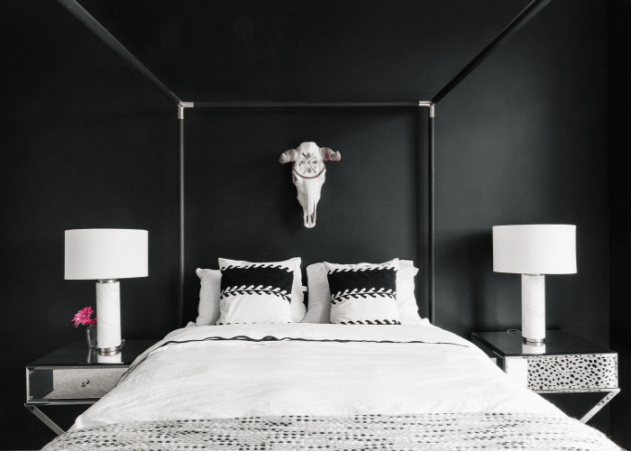
When paired makes spaces more subtle and traditional without being prominent. A bold and sophisticated color that adds elegance and drama to any room. Its bold contrast lets it glow creamy to the utmost. Further, they make amazing styles suitable for traditional and modern homes when paired together.
4. Charcoal Gray
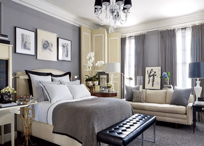
data-comment=”81159″>Light grey and creamy, when used together, balance each other well and helps maintain the cohesiveness of the highest order data-comment=”81159″>. The versatile and neutral color creates a calm and soothing environment. When coordinated with creamy tones, it adds a touch of elegance and sophistication to the room, creating a harmonious and balanced look.
5. Light Blue Greens
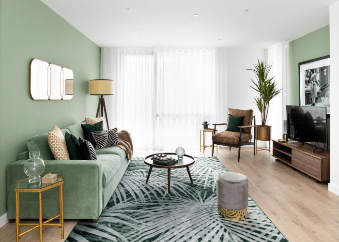
Creamy, when matched with neutral and less contrasting colors like blue and greens, imparts a sense of luxuriousness, making it more elegant. The combination creates a calm, peaceful, and relaxing environment throughout your room. Additionally, the cream tones allow the colors to pop out and shine as if a glittery paint additive is used.
SW Creamy in Different Interiors Setting
Different rooms require different vibes, and wall paints play a crucial role in shaping them. So, what kind of atmosphere does creamy Sherwin-Williams create in the room? Let’s explore!
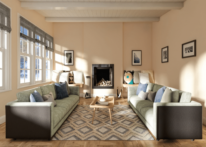
1. Living Room
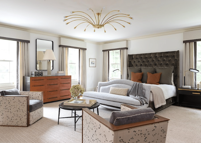
The color protrudes a feeling of warmth and classiness. Therefore it’s a good fit if you want your room to look luxurious with a cozy ambiance. Additionally, the creamy tones create a sense of depth and elegance that enhance the overall look of the space. The neutral tones allow for pairing with different colors, making it a popular choice for traditional and modern interiors.
2. Study Room
Light and neutral tones are just perfect for bedrooms. It creates a more soothing and relaxed environment. The light shade promotes a moderate atmosphere and helps reduce stress and anxiety. Further, the creamier tone encourages closeness and comfort and creates an environment suitable for personal interactions.
3. Bathroom
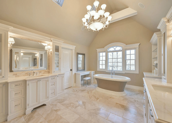
A ‘good choice’ for bathrooms, especially one with wardrobes and cabinets. Also, it will look great if the cabinets are of the same color, just as in the picture above. The northern light will make North facing rooms more attractive, adding coolness, softness, and compassion unless coordinated with a dark color like green. Whereas for the South facing rooms, the warm lights glow it up, making it more prominent and inviting. Take care that in the bathroom, you are using sealers and varnishes; it’ll protect the wall finishes that come in regular contact with water and get rough or fluffy.
Choosing creamy Sherwin Williams for your room will definitely give it a warm look. But is that all? Of course not.
Without proper decor items, it will look like a plant without flowers. Wait, what does proper mean here? Simply the color, texture, and look of elements that aligns well with creamy on the wall. But how do you decide whether darker or lighter decors will be a good fit? Not to worry. Look for elements imparting warmth just to maintain unity.
Essential Decor Element that matches SW Creamy
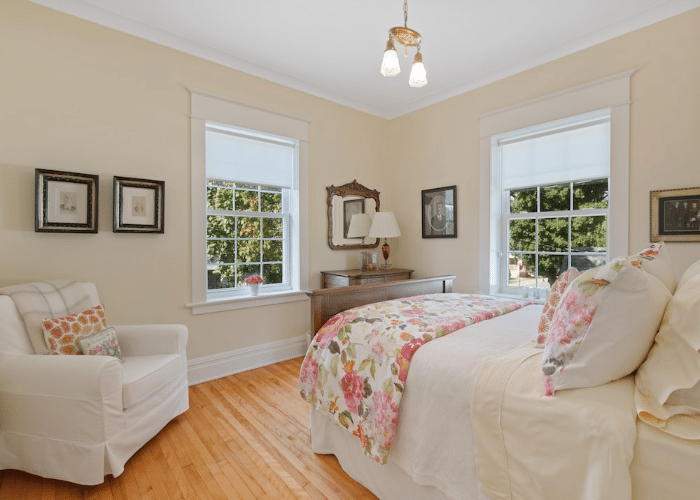
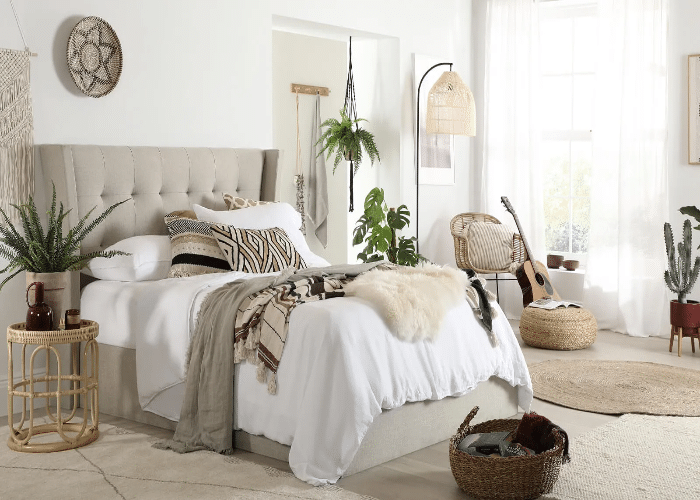
1. For Bedroom Under Warm Tone
Want a similar look; definitely, it will be a great choice. It provides a luxurious and elegant vibe and pairs beautifully with the creamy walls. The soft texture will enhance your space’s overall cozy and inviting atmosphere. Seek out these options for creating a similar look Velvet Upholstered Bed, Cream Glass Shade Chandelier, and Mount Wall Lamps
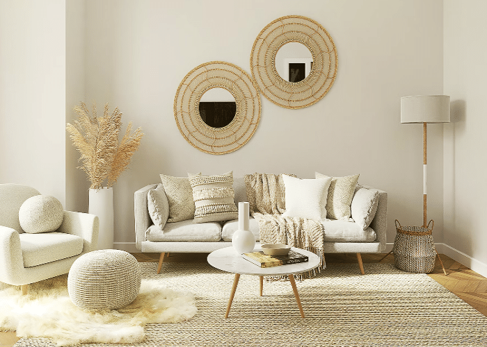
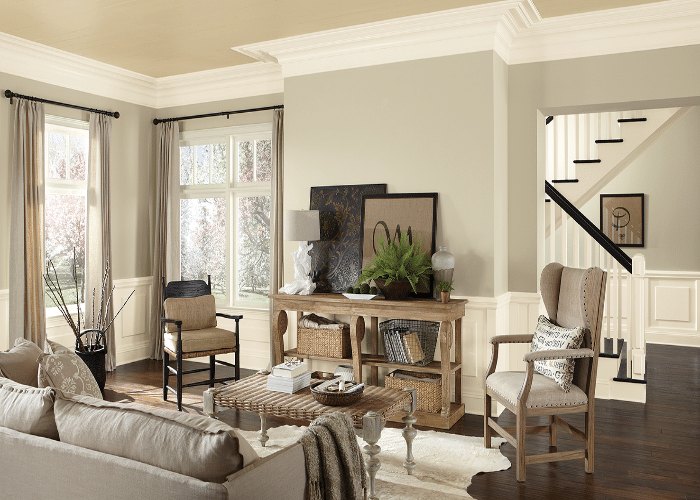
2. For Warm Tone Living Room
Looks perfect with a creamy look and imparts a sense of luxuriousness. The wheatish tone complements the creamy wall finishes and adds a touch of warmth to your space, providing a welcoming look. Further, the creamy rug coordinates well, balancing cohesiveness throughout. The tones and striped pattern would be a great choice to tie the elements together and add a coastal charm to your space. Also, it would add well to the unity of the room. Want something similar? Why not check out these items for the overall finish, Wheatish Sofa, Center Coffee table, and Starfish Striped Rugs?
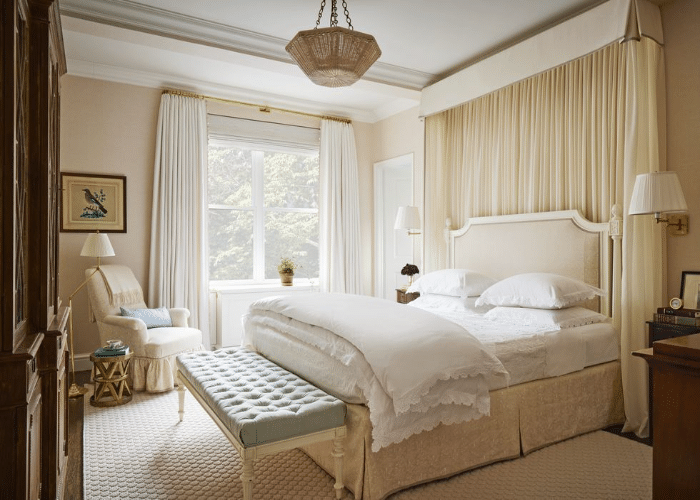
3. For a Cool Tone Enabled Bedroom
The overall look, with its soft and luxurious texture, complements the creamy walls and adds a gentle touch to your space, creating an elegant and comfortable atmosphere. Further, this makes your space look comfortable and cozy. Some items that can help create a similar look include Fabric upholstered beds, Floor lamps, and Hand-woven side tables.
4. For a Cool Living Room Setup

A perfect example of neutral with bold. Even a deep green couch will look amazing. The deep green tone adds a pop of color, creating an amazing contrast with the creamy walls. Further, the creamy rug coordinates well with a creamy wall. It will add an elegant and lively touch to the room, creating a soothing and comfortable atmosphere. Some of the must-seek-out items to create a similar look include Velvet Deep Green Couch, Hanging Ceiling Lights, and Antep Rugs Floral.
Conclusion
Creamy Sherwin Williams is a premium, versatile paint that adds warmth and elegance to spaces. Its creamy look with yellow undertones provides spaces with an inviting glow. However, there are several other tones, and creamy stands out with its warm and neutral look. To identify creamily, look for its specific value, like LRV of 81, RGB values 239/232/219, and Hex code of #EFE8DB. Above all, lighting plays an important role in enhancing the color tone.
Therefore it’s better to use dark spaces for brightening up and in well-lit spaces to make it more attractive. Further, creamy coordinates well with various colors, pure white, grey, deep blue, and greens, providing you with multiple looks. Just be extra careful when you choose decor items. Overall, Sherwin Williams Creamy is a premium high-quality paint with excellent hiding and retention qualities, maintaining the look, warmth, and ambiance of your interiors.
Frequently Asked Questions
Is Creamy Sherwin Williams Suitable for Exteriors?
A big ‘YES’ as Sherwin LRV (81) is just perfect. It wouldn’t make your house shine like a pearl but with an attractive, classy, and welcoming contrast. Additionally, SW Creamy is known for its durability and resistance to different weather conditions, making it an excellent choice for exterior surfaces.
Where Creamy Suits Best: Cabinet or a Trim?
We wouldn’t suggest it either because it just can’t pair off with creamy warmth on walls. Rather a dark color like black will give a more luxurious and traditional look. However, if you want a cohesive and harmonious look, using creamy as a trim color can create an elegant contrast with walls.
Which Color Best Coordinates with SW Creamy?
Yellow suits well because it sets its tone from neutral to brighter. Some of the colors that give amazing outcomes include Pure White, Earthy tones like brown and rust, Black, Beige, and Dark Blue greens.