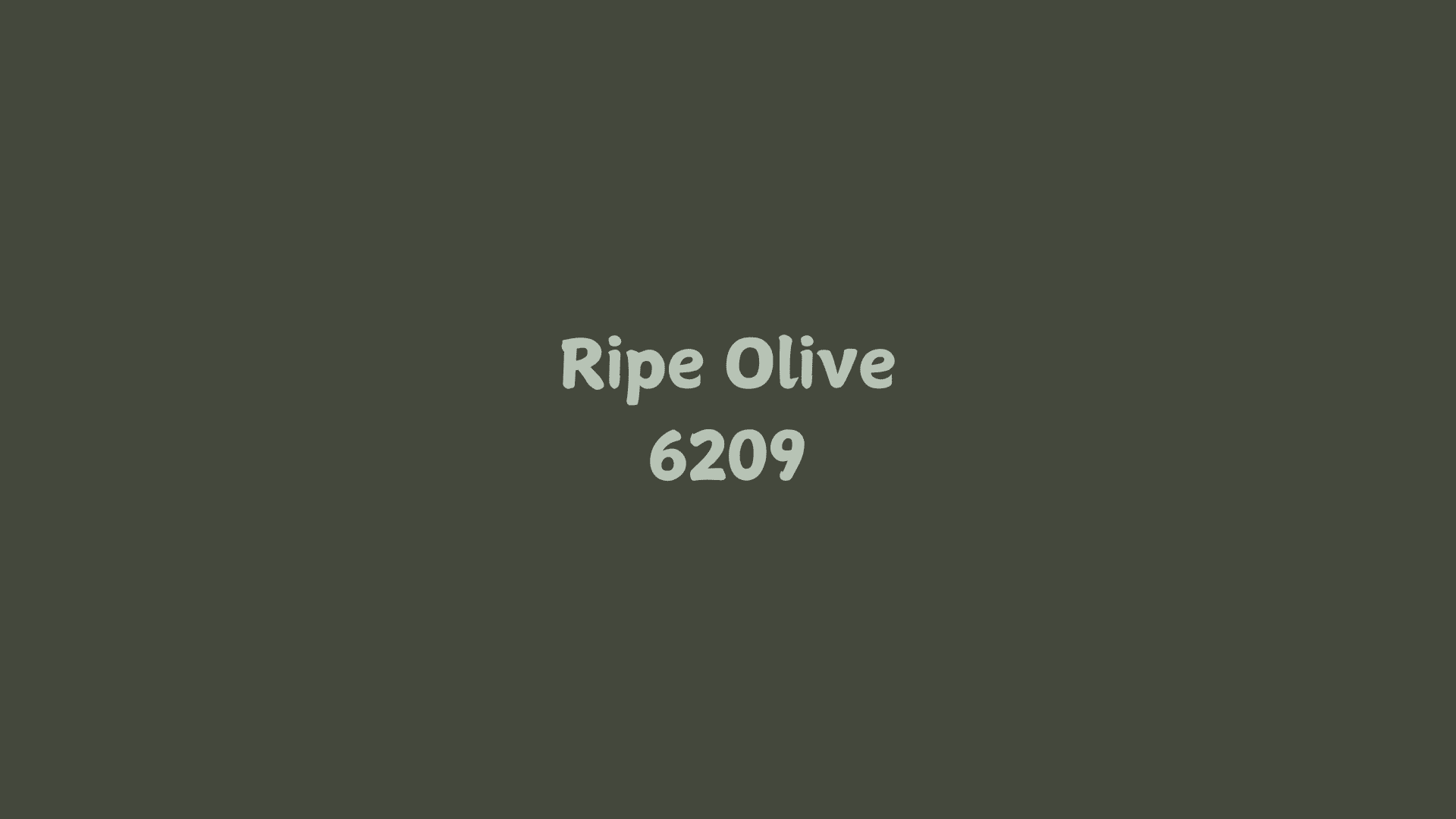
A timeless neutral that walks the line between sophistication and comfort, Ripe Olive (SW 6209) brings the calming essence of Mediterranean groves into modern spaces.
This deep, muted green-gray tone offers a fresh take on traditional earth tones while maintaining versatility across various design styles.
This guide will explore how Ripe Olive can transform your space, from creating cozy reading nooks to elevating open-concept living areas.
You’ll find perfect color pairings, lighting considerations, and real-world examples that showcase this shade’s remarkable adaptability.
Step into the world of Ripe Olive, where natural elegance meets contemporary design, and learn why this Sherwin-Williams hue captures the attention of designers and homeowners alike.
Ripe Olive by Sherwin-Williams: A Quick Overview
Ripe Olive brings the timeless essence of Mediterranean landscapes into contemporary spaces.
This deep, sophisticated green carries subtle gray undertones, making it a versatile choice for modern and traditional designs alike.
With its Light Reflectance Value (LRV) of 8, RGB values of 67 (Red), 70 (Green), and 63 (Blue), this shade creates striking depth while maintaining an inviting atmosphere in any room. The color code helps ensure accurate color matching across different applications.
The color reveals its true character throughout the day – morning light highlights its natural green undertones, while evening illumination emphasizes its refined gray qualities.
This adaptability makes it particularly effective across various spaces, from statement walls to kitchen cabinetry.
Available in flat, matte, satin, semi-gloss, and gloss finishes, Sherwin Williams Ripe Olive performs exceptionally well under natural daylight, warm LED lighting, and incandescent illumination.
Ripe Olive in Interior Design
Ripe Olive brings depth and sophistication to any room. This rich, dark green shade from Sherwin Williams creates grounded and refined spaces.
It works with natural and artificial light, maintaining warmth throughout the day.
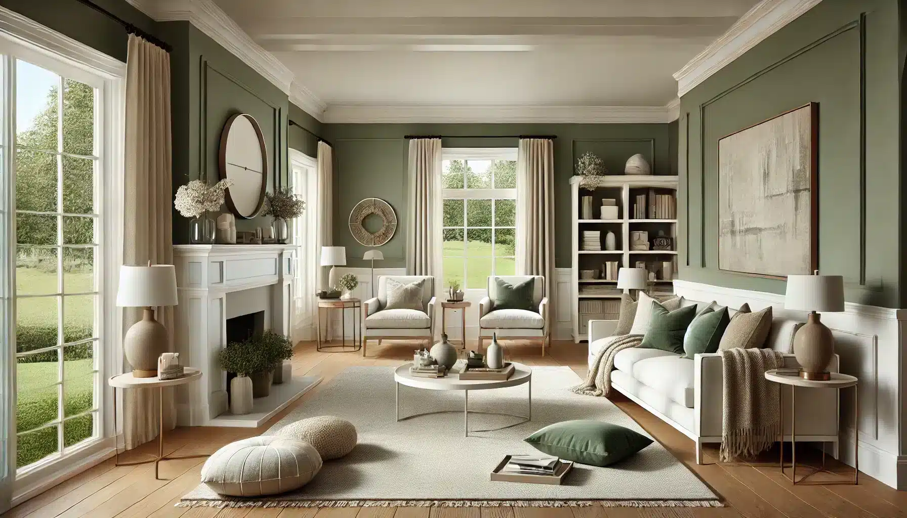
1. Living Rooms with Ripe Olive
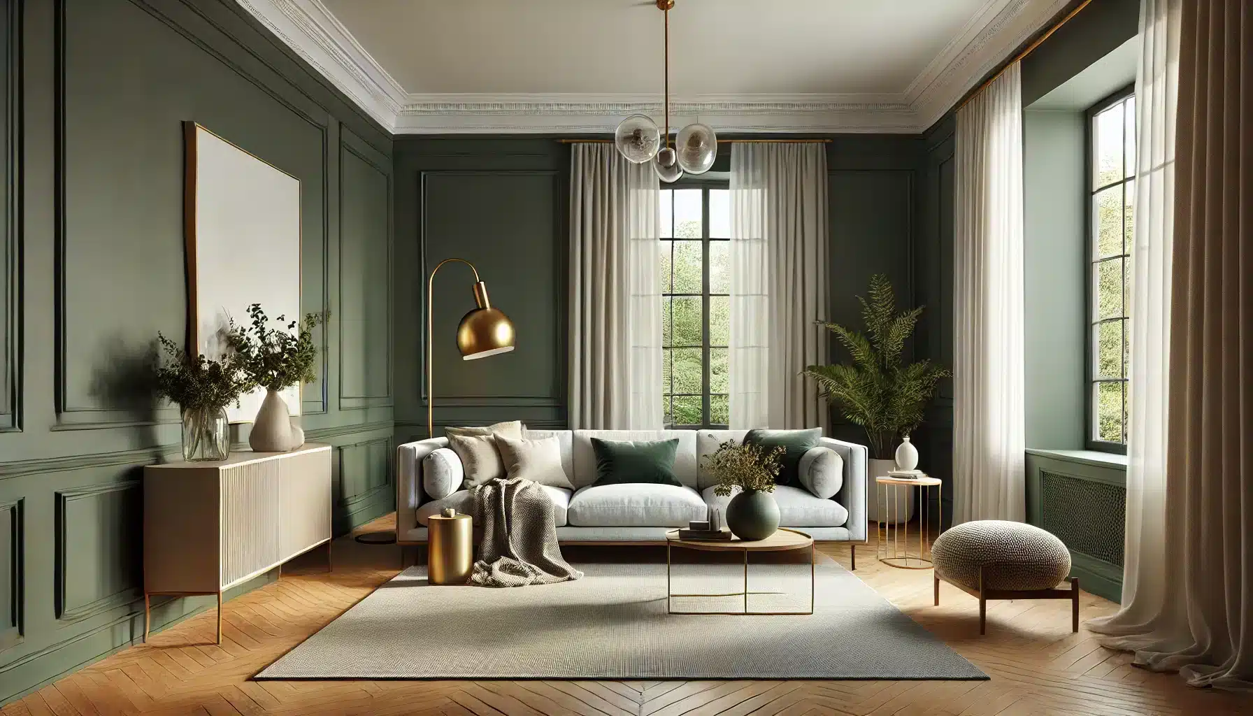
Living rooms painted in Ripe Olive make strong statements without feeling heavy. A full wall in this shade creates a perfect backdrop for light-colored furniture.
The Sherwin-Williams color responds well to natural daylight, becoming softer in bright conditions and cozier as evening falls.
Light gray or cream sofas stand out beautifully against Ripe Olive walls. Add brass light fixtures and natural wood elements to create warmth. White trim and ceiling help balance the depth of the color.
2. Kitchens Styled with Ripe Olive
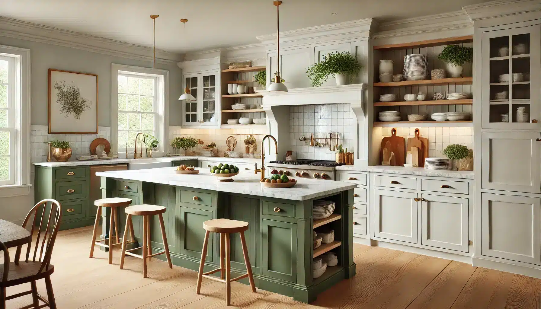
Williams Ripe Olive makes kitchen cabinets look high-end and distinctive. The shade pairs well with marble countertops and brass hardware.
Lower cabinets in Ripe Olive with white upper cabinets create visual interest without overwhelming the space.
Wood elements like open shelving or butcher block counters complement this green beautifully. The color maintains its richness under kitchen task lighting and creates a welcoming atmosphere for gathering and cooking.
3. Bedrooms That Embrace the Shade
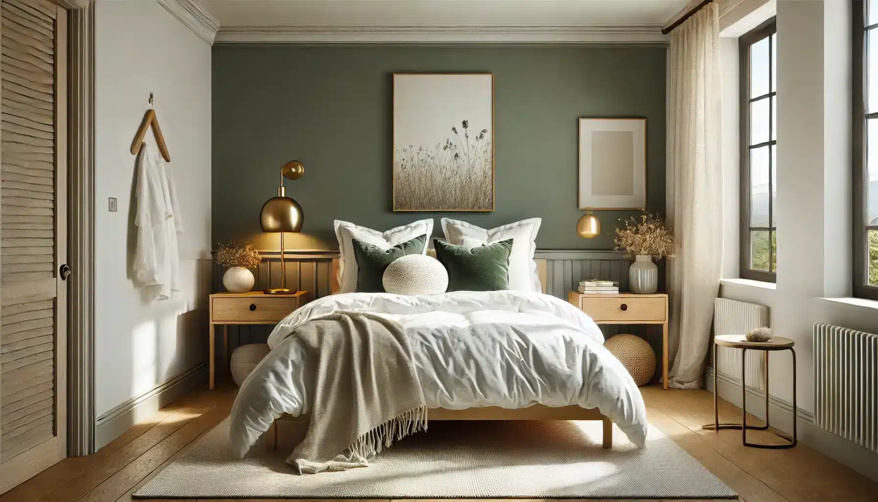
Bedrooms benefit from Ripe Olive’s calming qualities. An accent wall behind the bed creates a focal point without dominating the space. White bedding looks crisp and clean against this backdrop.
Natural textiles like linen and cotton in neutral tones work well with this shade. Keep other walls light to maintain brightness. Small touches of gold or brass in lighting fixtures add warmth and sparkle.
4. Bathrooms with a Touch of Ripe Olive
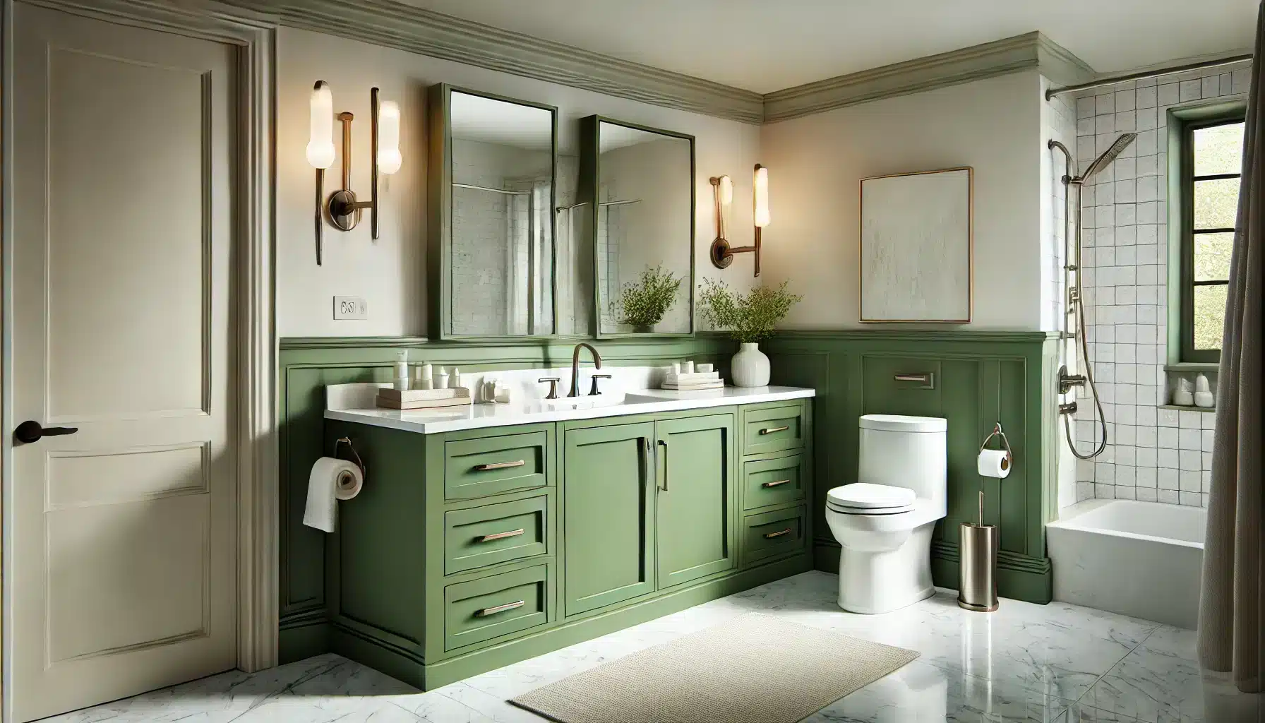
Ripe Olive adds character to vanity cabinets or creates striking accent walls in bathrooms. The color pairs well with white fixtures and marble surfaces. Consider using it on a single wall or the vanity to avoid overwhelming smaller spaces.
Chrome or nickel fixtures pop against this rich green. Good lighting is key – include both task and ambient options to show off the color’s depth.
Ripe Olive in Exterior Design
Sherwin-Williams Ripe brings sophistication to home exteriors. This rich green shade by Sherwin Williams creates lasting impressions on any architectural style. Its deep tones work in both sunny and shaded areas.
Curb Appeal with Ripe Olive
A front door painted in Ripe Olive creates a welcoming entrance. The color stands strong against white, beige, or gray siding. It holds its color well in direct sunlight and resists fading.
On shutters, Ripe Olive adds classic charm to light-colored homes. The shade looks particularly good on craftsman and colonial-style houses. It maintains its rich tone through different weather conditions.
For trim work, this green shade highlights architectural details without overpowering them. It defines windows and eaves while keeping the home’s overall look balanced and refined.
Pairing Ripe Olive with Exterior Accents
White trim creates sharp, clean lines against Ripe Olive surfaces. Natural stone elements complement the green’s earthy quality. Brick in warm reds or cool grays works well with this shade.
Metal accents in black or oil-rubbed bronze enhance the color’s depth. Copper light fixtures age beautifully next to Ripe Olive. Window boxes with green plants create natural harmony.
Hardscape materials like slate or concrete provide neutral bases that let Ripe Olive stand out. Wood elements in natural or weathered finishes blend smoothly with this green shade.
Complementary Colors for Ripe Olive
Ripe Olive creates successful color combinations in both simple and complex schemes. This deep green works as a reliable base for many color pairings. Let’s look at effective ways to mix this shade.
Neutral Shades to Pair with Ripe Olive
White pairs perfectly with Ripe Olive, creating clean contrasts and bright spaces. Soft cream tones add warmth while keeping rooms light and open. Light gray offers subtle definition without competing for attention.
Beige brings out the earthy qualities in Ripe Olive. Warm whites make comfortable combinations for living spaces. Taupe creates smooth transitions between different room elements.
Natural wood tones complement this green shade well. Light oak adds brightness, while walnut creates rich depth. Stone colors like slate gray build sophisticated color schemes.
Using Yellow with Ripe Olive
Ripe Olive paired with yellow creates spaces that feel fresh and welcoming. Light yellow elements like pillows and curtains make rooms feel bright and open.
Small touches, such as vases or picture frames in pale yellow, add spots of light without being too strong.
Deeper yellow tones like gold and amber work well with this green shade. A rug in warm yellow makes floors feel cozy, while wall art with honey-colored tones draws the eye naturally.
Try adding yellow through table lamps, framed prints, small bowls, or fresh flowers. Keep yellow touches spread evenly through the space, using white as a bridge between the colors.
Tips for Using Ripe Olive in Your Space
Being thoughtful about using Olive Sherwin-Williams in your rooms creates successful results. This deep green shade needs proper planning to maintain visual comfort. Here’s how to make it work well.
1. Use Ripe Olive as an Accent or Statement Wall: Paint one wall in Ripe Olive to create a focal point. This approach adds character while keeping the room open. A single wall makes the color feel special without taking over the space.
2. Balance with Lighter Neutrals: Mix in warm whites and soft grays to brighten the room. Light beige tones create smooth visual flow. Keep ceilings and trim work in bright white for crisp contrast.
3. Incorporate Natural Materials for Warmth: Add wood furniture to bring out the color’s natural qualities and earthy undertones. Include woven baskets and textured fabrics. Natural stone elements create pleasing combinations with the green shade.
4. Consider the Lighting Conditions: Install layered lighting to show off the color’s depth. Place lamps at different heights for even light distribution. Use warm bulbs in spaces with less natural light.
5. Pair with Brass or Gold Accents: Add brass light fixtures to create subtle shine. Include gold-framed mirrors to reflect light. Small copper accessories make attractive accent pieces.
6. Choose the Right Sheen for the Look You Want: Select matte finish for modern, subtle walls. Use satin sheen in busy areas for easy cleaning. Pick semi-gloss for trim to create contrast with wall surfaces.
Working with Olive Sherwin-Williams Green Paint
When painting with Williams Ripe Olive, proper preparation ensures the best results. This green paint requires careful application to achieve its full depth and richness. Understanding paint colors and their behavior helps create professional-looking finishes.
Start by testing the color in your space before committing to the full project. Apply sample patches on different walls to see how light affects the shade throughout the day. The painting process benefits from using quality brushes and rollers designed for the specific sheen you’ve chosen.
For color matching between rooms or touch-ups, keep detailed records of your paint purchases. Different batches can vary slightly, so buying enough paint for your entire project ensures consistency. Professional painters often recommend adding 10% extra for future matching needs.
Conclusion
A well-chosen paint color sets the mood in your home, and Ripe Olive proves its value in both interior and exterior spaces.
This rich green shade has shown its strength in various room settings, from cozy bedrooms to welcoming entryways. Its ability to work with multiple design styles and color combinations makes it a reliable choice for homeowners.
When used thoughtfully with proper lighting and balanced with light furnishings, Ripe Olive creates spaces that feel both grounded and fresh.
The color maintains its appeal throughout the day, adapting beautifully to changing light conditions.
As you consider this shade for your home, remember that success lies in the details – from sheen selection to accent colors.
Take time to test the color in your space and observe how it responds to your specific lighting conditions.