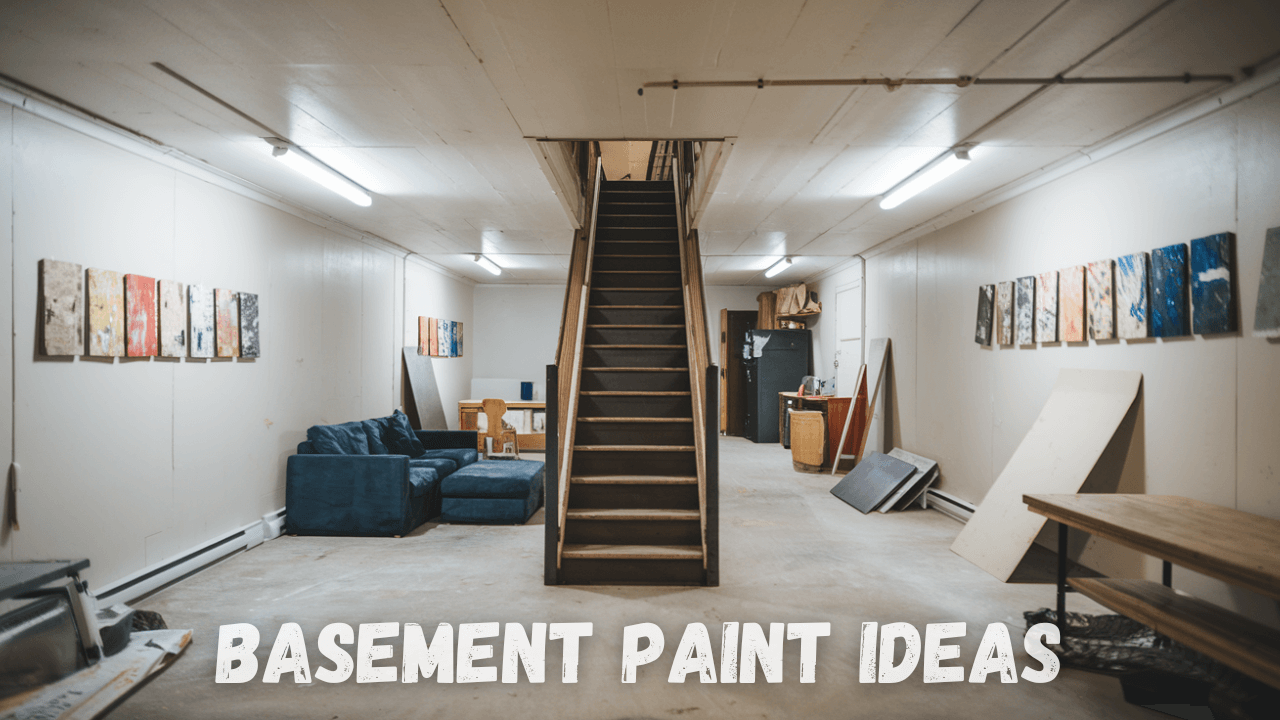
Basements no longer need to be dark, forgotten spaces.
With the right paint choices, you can change this underutilized area into a stylish extension of your home.
Modern basement paint ideas have evolved dramatically, moving beyond basic beige to embrace bold colors, creative techniques, and designer-inspired approaches that maximize both space and light.
From dramatic accent walls to subtle, neutral palettes that open up tight quarters, today’s basement paint trends offer countless possibilities.
Ready to change your downstairs space from afterthought to showstopper?
These basement paint ideas will help you create a contemporary look that’s both functional and Instagram-worthy.
Preparing Your Basement for Painting
Proper preparation is crucial for a lasting, professional finish before bringing modern color to your basement.
Basements present different challenges that require thorough assessment and treatment to ensure that paint adheres properly and stays beautiful for years.
1. Begin by thoroughly checking for moisture issues, which can quickly ruin even the best paint job:
- Look for water stains, white powdery deposits (efflorescence), or mold growth.
- Conduct simple moisture tests with plastic sheeting taped to walls.
- Repair cracks and apply waterproofing sealants where needed.
2. Surface preparation makes all the difference in your final results:
- Clean walls with TSP solution to eliminate oils and residues.
- Patch holes with appropriate fillers for your wall material.
- Sand rough areas and existing paint for smooth adhesion.
3. Selecting the right primer is essential in basement environments:
- Use mold and mildew-resistant formulations.
- Apply masonry primers for concrete or brick surfaces.
- Consider oil-based options for stubborn stains or odors.
4. Finally, lighting significantly impacts how colors appear in basement spaces:
- Evaluate existing natural and artificial light sources.
- Test paint samples in multiple locations.
- Consider higher light reflectance values to brighten the space.
These preparation steps may require extra time upfront but will prevent expensive repairs and disappointment later, ensuring your modern basement paint ideas achieve their full potential.
Basement Paint Ideas
1. White Dove
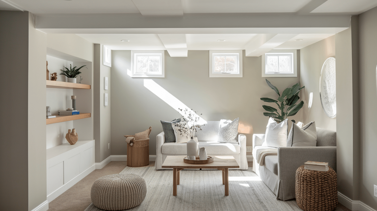
Appearance and Texture: White Dove is a soft, warm white with subtle gray undertones that create a clean and airy appearance. It has a smooth, matte finish that diffuses light beautifully throughout a space.
Properties:
| Property | Description |
|---|---|
| Lightness | High – Brightens dark basement spaces |
| Undertone | Warm Gray – prevents sterile feeling |
| Reflectivity | Excellent – maximizes natural and artificial light |
| Versatility | Pairs well with virtually any accent color |
| Visual Space | Creates an illusion of larger, more open areas |
Why Consider for Basement:
- Counteracts the naturally dark environment of basements by reflecting available light.
- Provides a neutral backdrop that works with any furniture or décor style.
- Creates a timeless foundation that won’t need frequent repainting.
Recommended Color– Benjamin Moore White Dove OC-17
2. Agreeable Gray
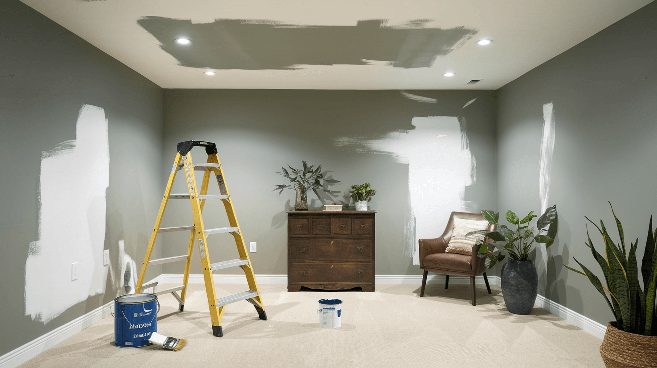
Appearance and Texture: Agreeable Gray is a versatile light-to-medium warm gray with subtle beige undertones. It has a velvety appearance that changes subtly throughout the day as lighting conditions shift.
Properties:
| Property | Description |
|---|---|
| Warmth | Medium – balances coolness of basement |
| Adaptability | Chameleon-Like – Shifts with Lighting |
| Neutrality | High – Works with cool and warm accents |
| Depth | Medium – adds dimension without darkening |
| Calmness | Creates serene, relaxed atmosphere |
Why Consider for Basement:
- Provides warmth in typically cool basement environments.
- Offers enough color to prevent the sterile feeling of pure white.
- Works well in both natural and artificial lighting conditions.
Recommended Color- Sherwin Williams Agreeable Gray SW 7029
3. Light Drizzle
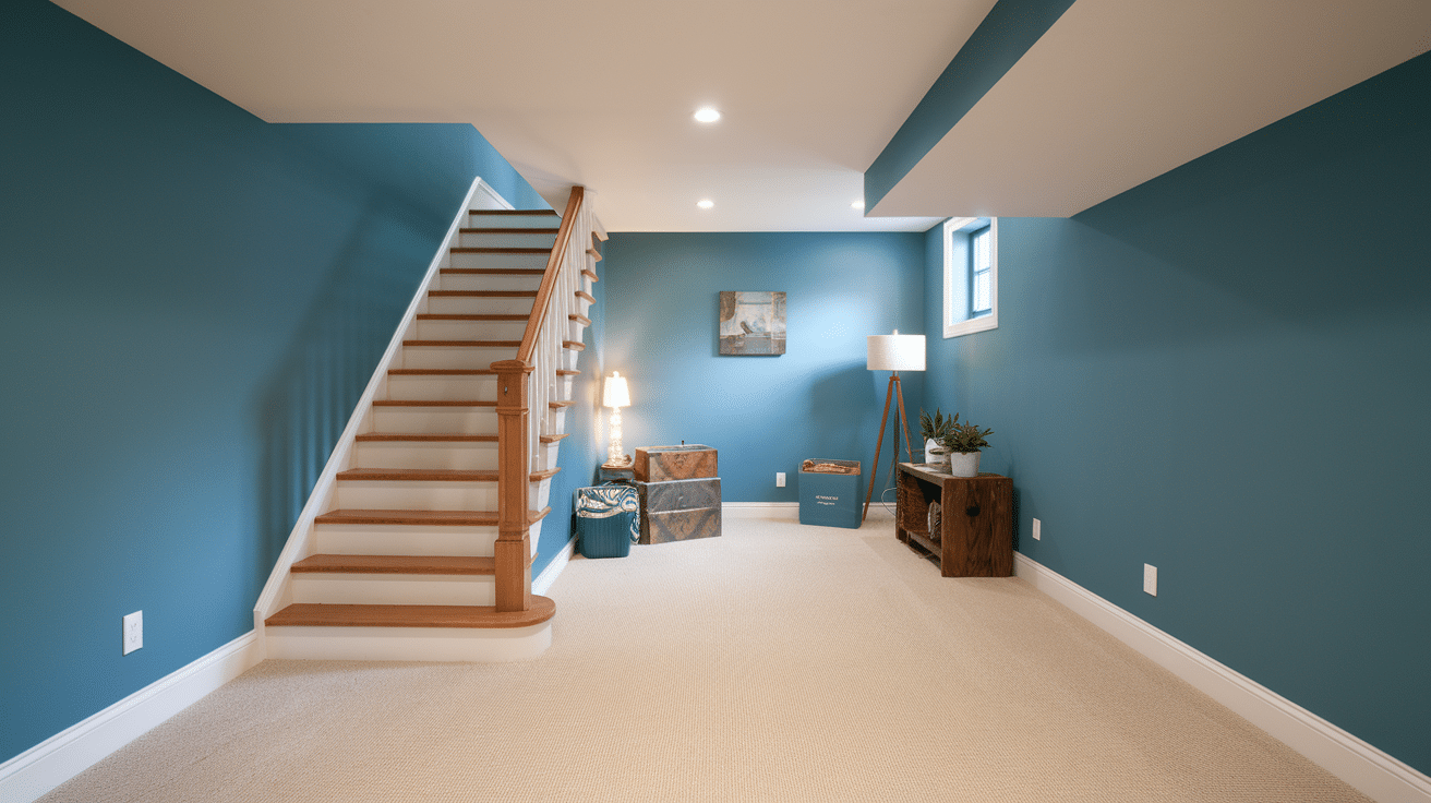
Appearance and Texture: The Light Drizzle is pale blue-gray with a misty, atmospheric quality. It has a soft, matte finish that evokes the feeling of a gentle rain shower.
Properties:
| Property | Description |
|---|---|
| Coolness | Medium – creates refreshing atmosphere |
| Subtlety | High – adds color without overwhelming |
| Tranquility | Promotes calm, peaceful environment |
| Expansion | Visually expands smaller spaces |
| Versatility | Works with both modern and traditional décor |
Why Consider for Basement:
- Creates a cool, airy feeling in potentially stuffy basement spaces.
- Provides subtle color without making the space feel smaller.
- Pairs beautifully with wood tones to create balance.
Recommended Color- Behr Light Dizzle N480
4. Night Watch
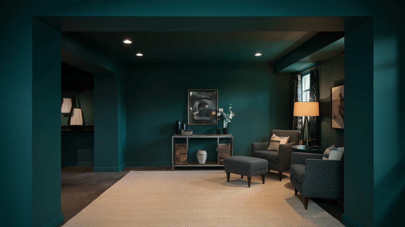
Appearance and Texture: Night Watch is a deep, moody green-black with a rich, velvety appearance. It has a luxurious depth that can appear either green or almost black, depending on the lighting.
Properties:
| Property | Description |
|---|---|
| Richness | High – creates luxurious atmosphere |
| Drama | Bold statement color for accent walls |
| Coziness | Creates intimate, enveloping spaces |
| Sophistication | Adds upscale, designed feeling |
| Adaptability | Works with metallics, woods, and neutrals |
Why Consider for Basement:
- Creates a cozy, cocoon-like environment perfect for media rooms.
- Adds refined drama that changes utilitarian basements.
- Conceals imperfections in basement walls or ceilings.
Recommended Color- JSW Night Watch 5218
5. Cromarty
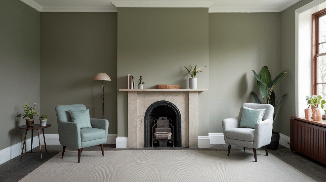
Appearance and Texture: Cromarty is a Nuanced, misty gray-green with a subtle, chalky finish. It shifts between gray and green depending on surrounding colors and lighting conditions.
Properties:
| Property | Description |
|---|---|
| Subtlety | High – complex color that reveals itself slowly |
| Naturality | Brings outdoor elements inside |
| Harmony | Balances other colors in a space |
| Mutability | Changes character throughout the day |
| Softness | Creates gentle, welcoming atmosphere |
Why Consider for Basement:
- Introduces natural elements that connect basement spaces to the outdoors.
- Provides complexity and interest without overwhelming the space.
- Creates a refined backdrop that enhances basement functions.
Recommended Color- Farrows & Ball Cromarty 285
6. Hale Navy
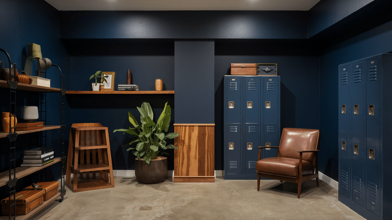
Appearance and Texture: Hale Navy is a rich, deep navy blue with a timeless, maritime quality. It has a smooth, velvety appearance with surprising depth and complexity.
Properties:
| Property | Description |
|---|---|
| Depth | Rich, complex color with hidden undertones |
| Timelessness | Classic color that never goes out of style |
| Versatility | Works equally well as accent or main color |
| Grounding | Anchors a space with visual weight |
| Contrast | Creates dramatic backdrop for lighter elements |
Why Consider for Basement:
- Creates a cozy, intimate atmosphere perfect for entertainment areas.
- Provides refined alternative to black for media room walls.
- Pairs beautifully with brass or gold accents for an upscale basement bar.
Recommended Color- Benjamin Moore Hale Navy HC-154
7. Accessible Beige
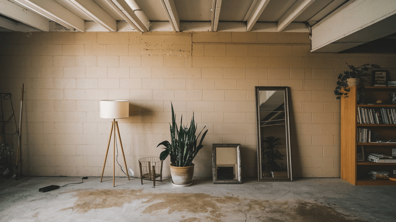
Appearance and Texture: Accessible Beige is a warm, light neutral with subtle gray undertones. It has a smooth, even finish with a soft, welcoming quality.
Properties:
| Property | Description |
|---|---|
| Warmth | Medium – counteracts coolness of basements |
| Neutrality | High – works with virtually any color scheme |
| Adaptability | Shifts appearance based on lighting conditions |
| Softness | Creates gentle, welcoming environment |
| Background | Recedes to highlight furniture and décor |
Why Consider for Basement:
- Warms up typically cool basement environments without darkening the space.
- Creates a flexible foundation for changing basement functions over time.
- Provides gentle transition between aboveground and belowground spaces.
Recommended Color- Sherlin Williams Accessible Beige SW7036
8. Deep Matte Black
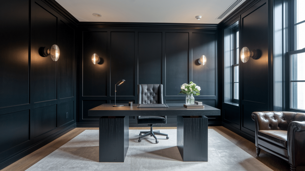
Appearance and Texture: Deep Matte Black is an almost-black dark charcoal with subtle warm undertones. It has a rich, matte finish that absorbs light, adding depth and refinement to any space.
Properties:
| Property | Description |
|---|---|
| Coolness | Low – Creates a cozy, intimate atmosphere |
| Clarity | Dense, solid color with exceptional depth |
| Energy | Grounding and dramatic, commands attention |
| Versatility | Works as both accent and anchor in various design schemes |
| Expansion | Makes spaces feel more defined and intentional |
Why Consider for Basement:
- Creates a refined, theater-like atmosphere perfect for entertainment spaces.
- Conceals ceiling infrastructure and ductwork common in basement areas.
- Pairs beautifully with strategic lighting to create dramatic, defined zones.
Recommended Color- Sherwin Williams Tricorn Black SW 6258
9. Graphite
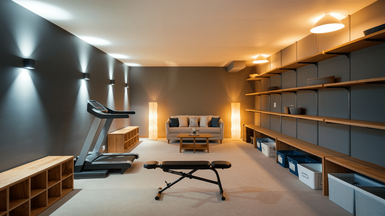
Appearance and Texture: Graphite is a bold dark gray with neutral undertones. It has a refined, mineral-like appearance that evokes the look of polished stone or pencil lead.
Properties:
| Property | Description |
|---|---|
| Coolness | Medium – Balances warmth and coolness effectively |
| Clarity | Rich, solid color with excellent definition |
| Energy | Calming yet substantial, provides quiet confidence |
| Versatility | Works exceptionally well with both cool and warm accent colors |
| Expansion | Creates defined boundaries while maintaining spatial flow |
Why Consider for Basement:
- Provides a neutral foundation that pairs well with virtually any accent color or finish.
- Camouflages common basement imperfections while adding architectural interest.
- Creates a warm yet refined atmosphere, perfect for a variety of basement functions..
Recommended Color- Benjamin Moore Graphite 1603
10. Cavern Clay
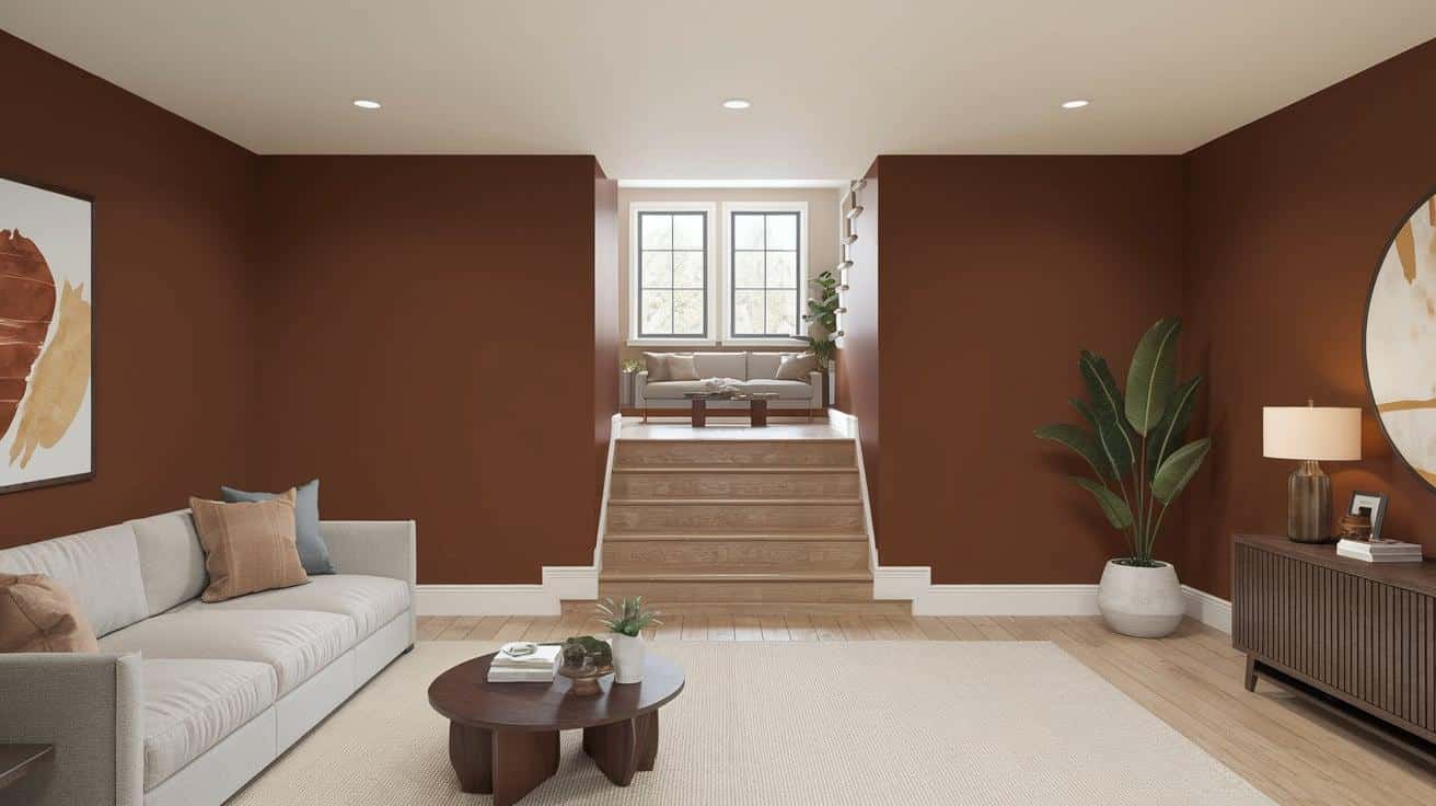
Appearance and Texture: Cavern clay is a warm, earthy terracotta with rich depth. Its natural, slightly textured appearance resembles adobe structures.
Properties:
| Property | Description |
|---|---|
| Warmth | High – Brings immediate coziness to spaces |
| Earthiness | Creates grounded, natural environment |
| Richness | Complex color that reveals depth over time |
| Energy | Brings vibrant yet calming presence |
| Timelessness | Connects to ancient building traditions |
Why Consider for Basement:
- Counteracts the cool, damp feeling often associated with basements.
- Creates immediate coziness in underground spaces.
- It pairs beautifully with concrete floors for a balanced industrial-organic feel.
Recommended Color- SherWin Williams Cavern Clay SW 7701
11. First Light
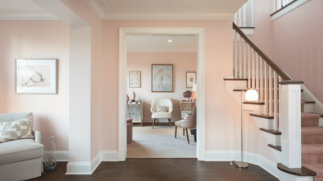
Appearance and Texture: First light is a delicate, rosy pink with subtle beige undertones. It has a soft, glowing quality that creates a gentle luminosity in spaces.
Properties:
| Property | Description |
|---|---|
| Warmth | Soft, gentle warmth without intensity |
| Subtlety | Barely-there color that reads as refined neutral |
| Reflectivity | Good light reflection for brightening spaces |
| Flattering | Creates complimentary environment for skin tones |
| Versatility | Works with both cool and warm color schemes |
Why Consider for Basement:
- Brings unexpected warmth and refiness to basement spaces.
- Creates a subtle glow that brightens typically dark environments.
- Offers more personality than standard neutrals overwhelming.
Recommended Color- Benjamin Moore First Light 2102-70
12. Bancha
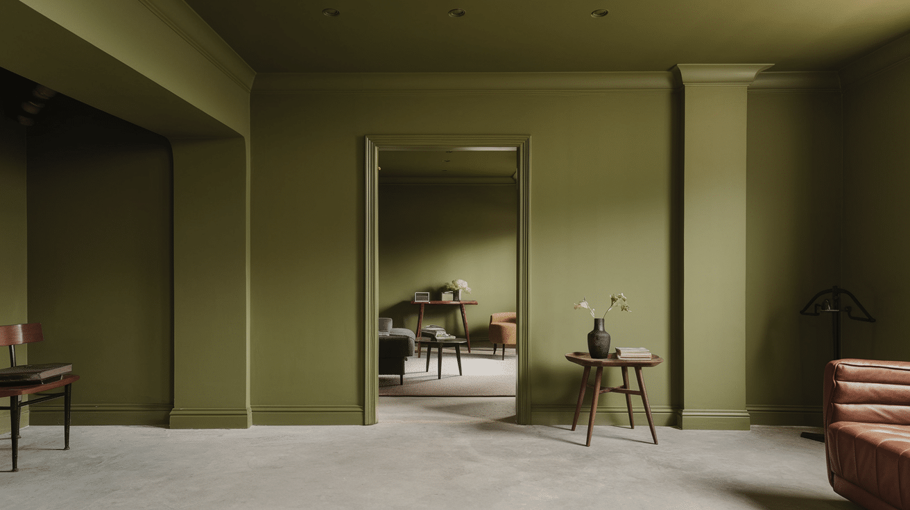
Appearance and Texture: Bancha is a muted olive-green with gray undertones. It has an earthy, organic quality with a smooth, matte finish.
Properties:
| Property | Description |
|---|---|
| Naturality | Strong connection to outdoor environments |
| Calmness | Creates serene, restful atmosphere |
| Sophistication | Complex color with designer appeal |
| Neutrality | Functions as a refined neutral |
| Depth | Rich color that changes with lighting |
Why Consider for Basement:
- Brings natural elements into underground spaces that lack windows.
- Creates a refined atmosphere that enhances the functionality of basement spaces.
- Works beautifully with both natural materials and industrial elements.
Recommended Color- Farrows & Ball Bancha No. 298
13. Antique White
Appearance and Texture: Antique White is a warm off-white with subtle yellow and beige undertones. It has a soft, mellow quality that creates a timeless, inviting atmosphere reminiscent of aged parchment or vintage linens.
Properties:
| Property | Description |
|---|---|
| Coolness | Low – Creates a warm, welcoming atmosphere |
| Clarity | Soft but defined with a classic, timeless quality |
| Energy | Calm and soothing, promotes relaxation |
| Versatility | Works beautifully with virtually any color or style |
| Expansion | Brightens and opens spaces without harsh starkness |
Why Consider for Basement:
- Brightens dark basement areas while maintaining a cozy, comfortable feel.
- Prevents the clinical appearance of pure white in underground spaces.
- Creates a neutral canvas that works with existing basement elements.
Recommended Color- Sherwin Williams Antique White SW 6119
14. Pewter Mug
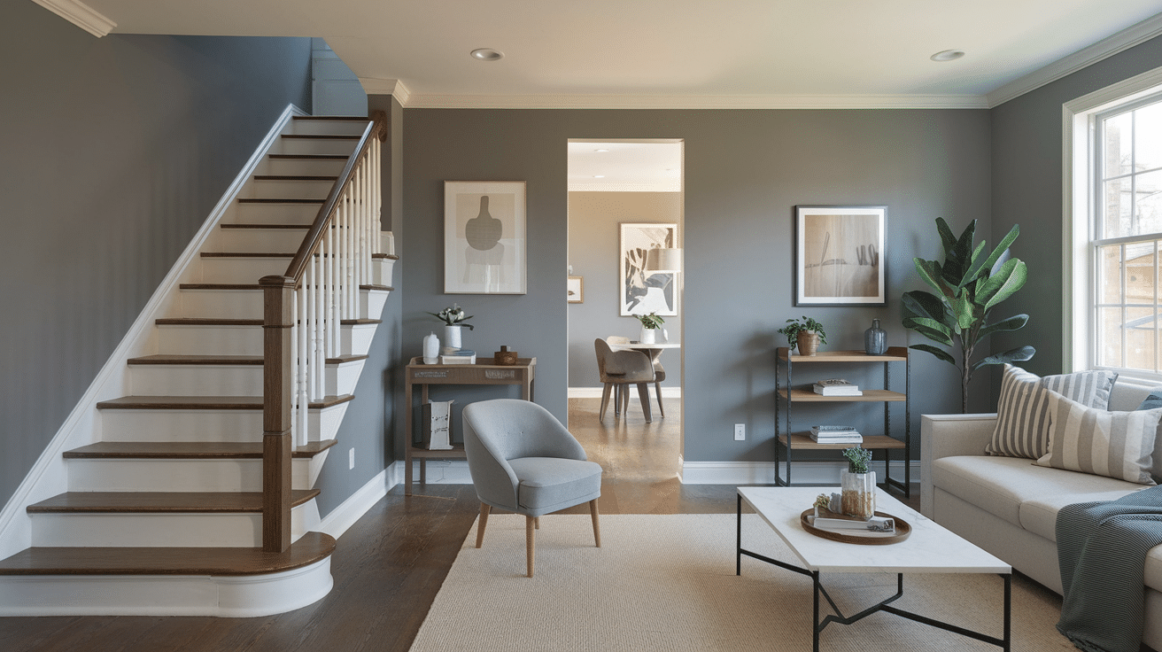
Appearance and Texture: Pewter Mug is a mid-toned gray with subtle warm undertones. It has a metallic-inspired quality with a smooth, even finish.
Properties:
| Property | Description |
|---|---|
| Neutrality | True neutral that works with all color schemes |
| Sophistication | Enhance basic with designer appeal |
| Adaptability | Changes appearance with lighting conditions |
| Grounding | Provides solid foundation for design schemes |
| Concealment | Hides marks and imperfections well |
Why Consider for Basement:
- Provides a refined neutral that re bfineasement spaces.
- Creates a solid foundation for changing basement functions over time.
- Bridges industrial elements with more refined furnishings.
Recommended Color- Behr Pewter Mug 770E-3
15. Blue Danube
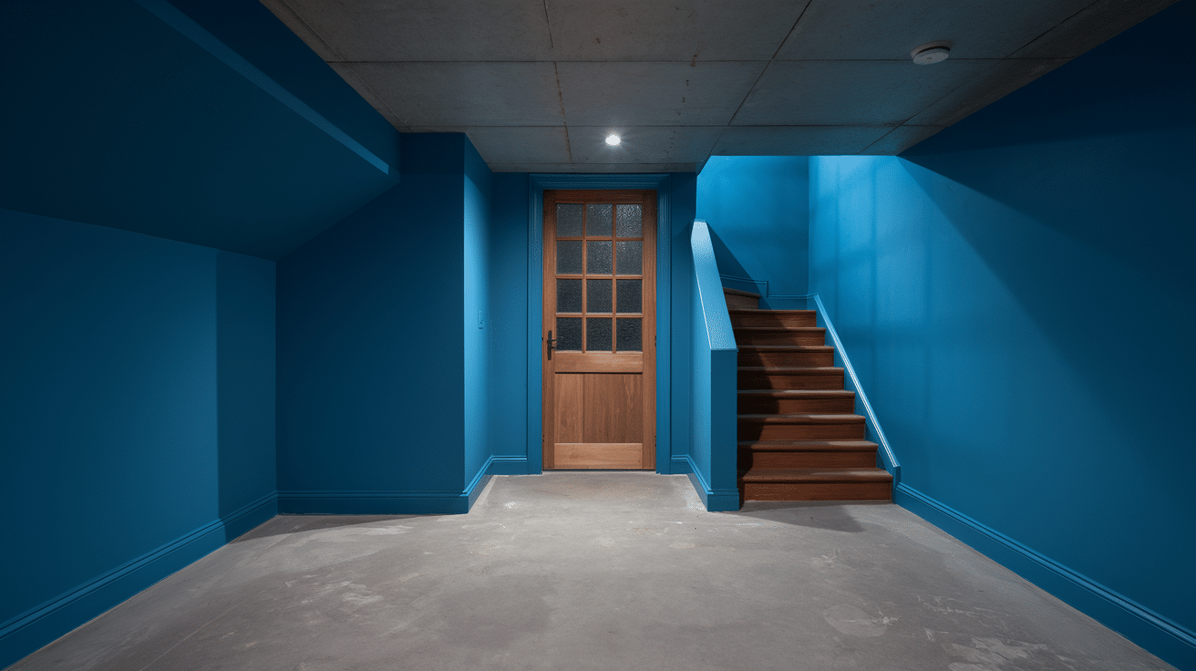
Appearance and Texture: Blue Danube is a clear, medium-toned blue with slight gray undertones. It has a smooth, watery quality reminiscent of deep river waters.
Properties:
| Property | Description |
|---|---|
| Clarity | Clean, defined color without muddiness |
| Coolness | Refreshing tone that creates airy feeling |
| Depth | Rich color that reveals complexity over time |
| Calmness | Creates serene, tranquil environment |
| Flexibility | Works with many design styles |
Why Consider for Basement:
- Creates refreshing atmosphere in underground spaces.
- Provides clear color definition without darkening the space.
- Evokes water elements that counteract basement dryness.
Recommended Color- Benjamin Moore Blue Danube 2062-30
16. Foggy Morning
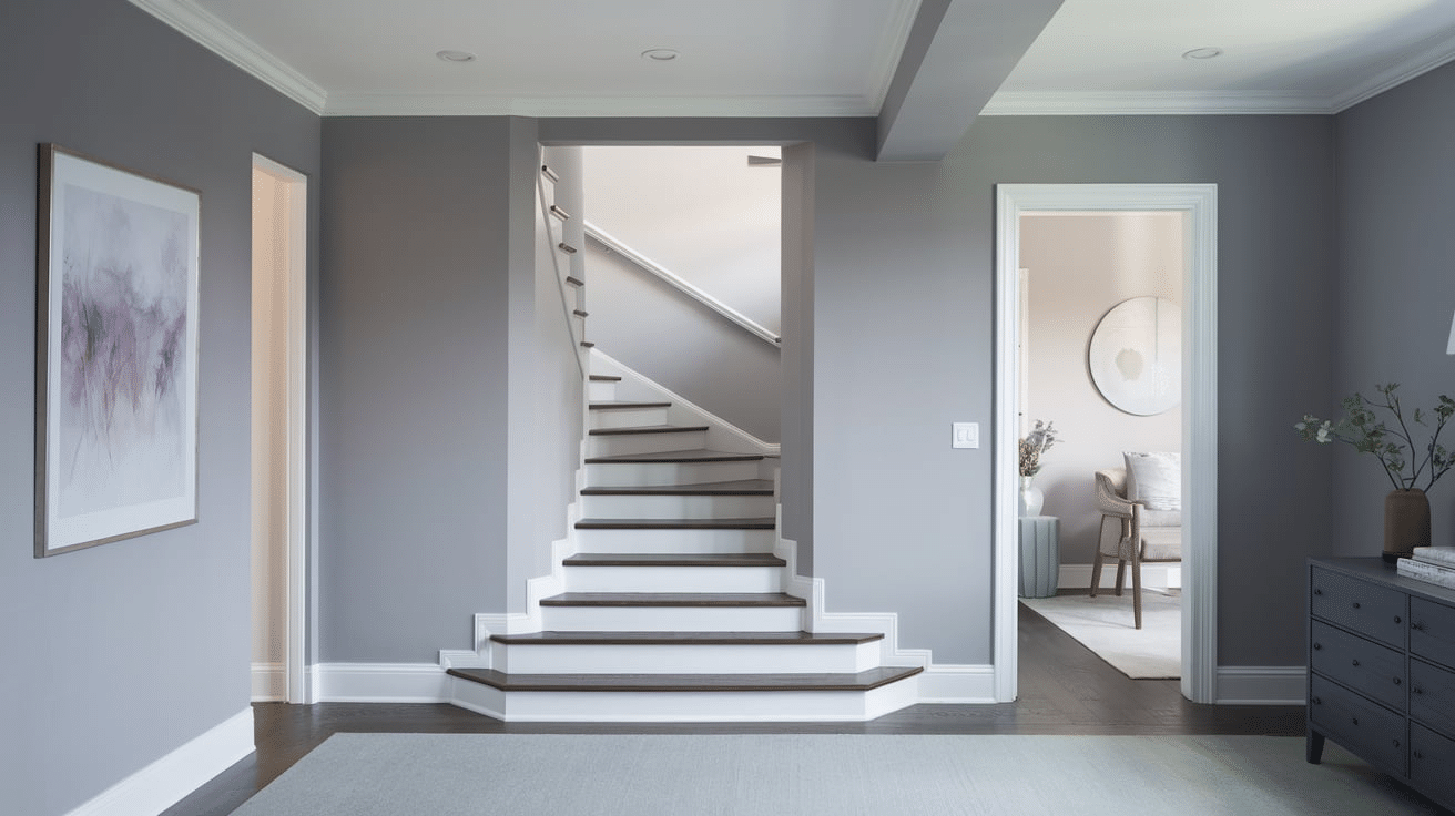
Appearance and Texture: Foggy Morning is a cool light gray-blue with misty undertones. It has a soft, diffused quality that evokes the gentle haze of dawn, creating a serene and contemplative atmosphere.
Properties:
| Property | Description |
|---|---|
| Coolness | High – Creates a refreshing, calming atmosphere |
| Clarity | Subtle and nuanced with a slightly veiled quality |
| Energy | Quiet and meditative, promotes thoughtfulness |
| Versatility | Harmonizes with both warm woods and cool metals |
| Expansion | Makes spaces feel more open and atmospheric |
Why Consider for Basement:
- Creates an airy, light-filled feeling in underground spaces.
- Softens harsh angles and typical basement architectural elements.
- Provides a neutral yet interesting backdrop for various basement functions.
Recommended Color- Benjamin Moore Foggy Morning 2106-70
17. Stormy Teal
Appearance and Texture: Stormy Teal is a rich dark teal with prominent gray undertones. It has a moody, refined quality that evokes the deepening color of ocean waters during an approaching storm.
Properties:
| Property | Description |
|---|---|
| Coolness | High – Creates a dramatic, immersive atmosphere |
| Clarity | Deep and complex with excellent dimension |
| Energy | Contemplative and enveloping, promotes focus |
| Versatility | Works beautifully with metallics, woods, and neutral accents |
| Expansion | Creates a sense of depth and intentional design |
Why Consider for Basement:
- Transforms basement spaces into cozy, intimate retreats.
- Conceals typical basement structural elements while adding architectural interest.
- Creates a refined backdrop that changes the entire space.
Recommended Color- Dunnedwards Encore Teal DEA 182
18. Devine Lilac
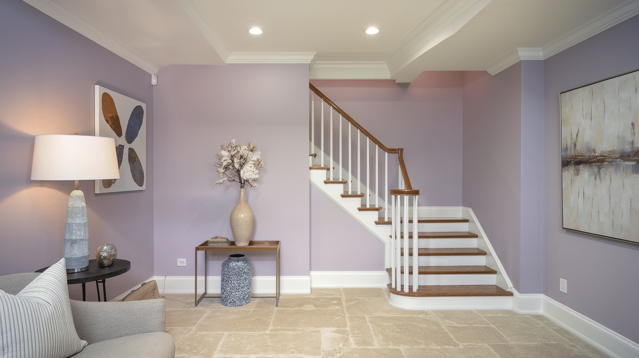
Appearance and Texture: Devine Lilac is a soft, muted purple with gray undertones. It has a dreamy, ethereal quality with a smooth, velvety finish.
Properties:
| Property | Description |
|---|---|
| Subtlety | Soft color that doesn’t overwhelm |
| Uniqueness | Unexpected choice with designer appeal |
| Versatility | Works with both cool and warm accents |
| Calmness | Creates serene, peaceful environment |
| Sophistication | Enhance basic with complex undertones |
Why Consider for Basement:
- Introduces unexpected charm to basement spaces.
- Creates a serene environment perfect for yoga studios or reading nooks.
- Offers more personality than standard neutrals without being overwhelming.
Recommended Color- DutchBoy Devine Lilac 144-2DB
19. Dinner Party
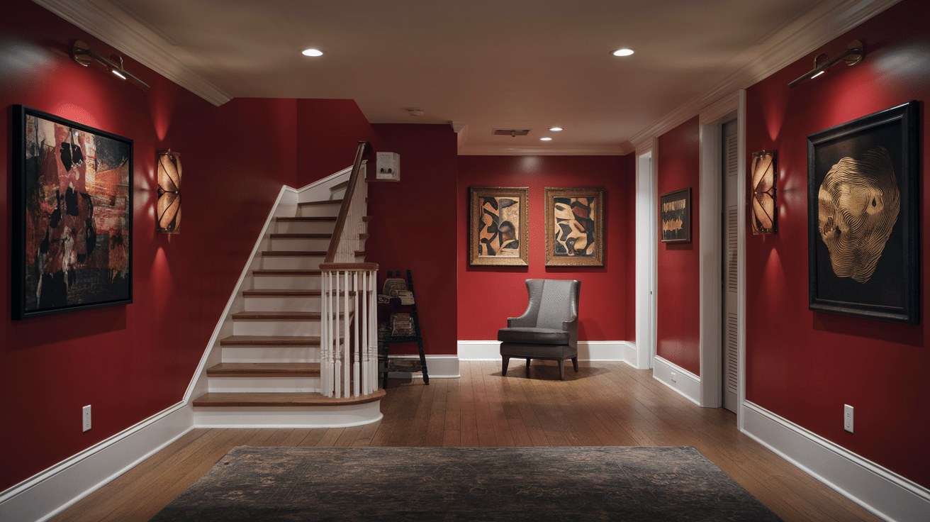
Appearance and Texture: Dinner Party is a rich, Deep Burgundy with subtle brown undertones. It has a luxurious, velvety appearance with significant depth and complexity.
Properties:
| Property | Description |
|---|---|
| Richness | Deep, complex color with hidden dimensions |
| Warmth | Creates an immediately cozy, inviting atmosphere |
| Sophistication | Classic color with timeless appeal |
| Drama | Makes strong statements without harshness |
| Coziness | Creates intimate, enveloping environment |
Why Consider for Basement:
- Creates the perfect ambiance for basement wine cellars or tasting rooms.
- Provides immediate warmth in typically cool basement environments.
- Changes utilitarian spaces into refined entertaining areas.
Recommended Color- Benjamin Moore Dinner Party AF-300
20. Seafoam Green
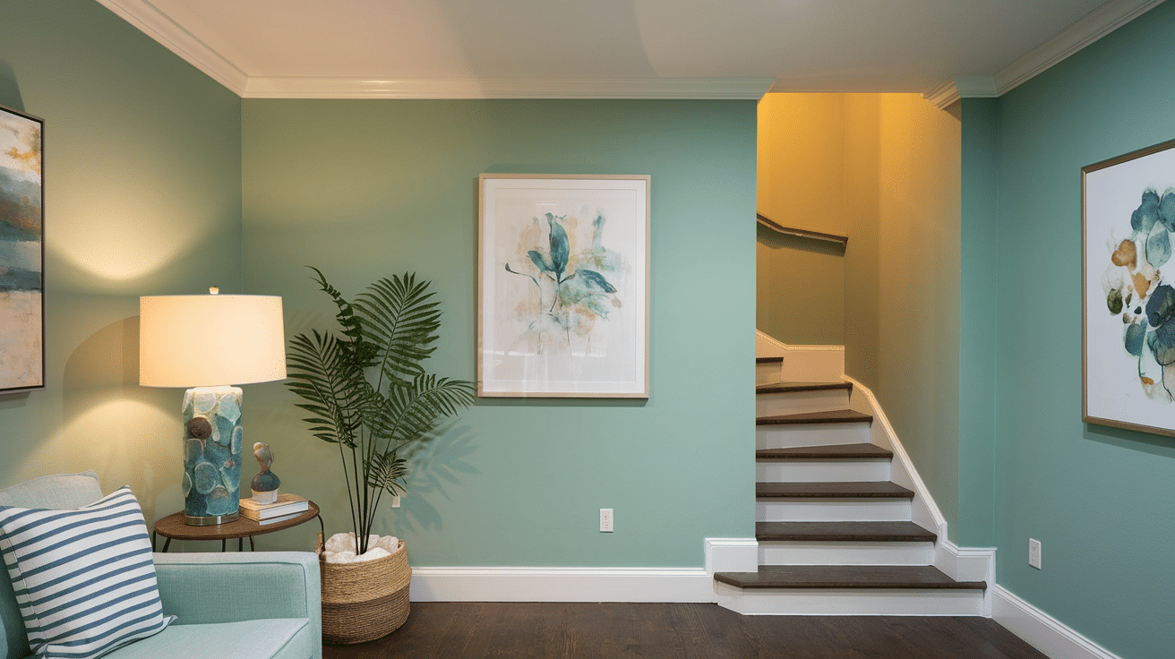
Appearance and Texture: Seafoam Green is a fresh, light green with subtle blue undertones. It has a crisp, airy quality that evokes coastal environments and creates a rejuvenating, nature-inspired atmosphere.
Properties:
| Property | Description |
|---|---|
| Coolness | Medium-High – Creates a refreshing, revitalizing atmosphere |
| Clarity | Clear and bright with a gentle luminosity |
| Energy | Uplifting and peaceful, promotes renewal |
| Versatility | Pairs beautifully with whites, woods, and coastal accents |
| Expansion | Makes spaces feel more open and connected to nature |
Why Consider for Basement:
- Brightens underground spaces with a natural, outdoor-inspired freshness.
- Counteracts the disconnection from nature common in basement environments.
- Creates a clean, revitalizing atmosphere in typically dark spaces.
Recommended Color- JSW Paints Seafoam Green 3483
21. Ripe Olive
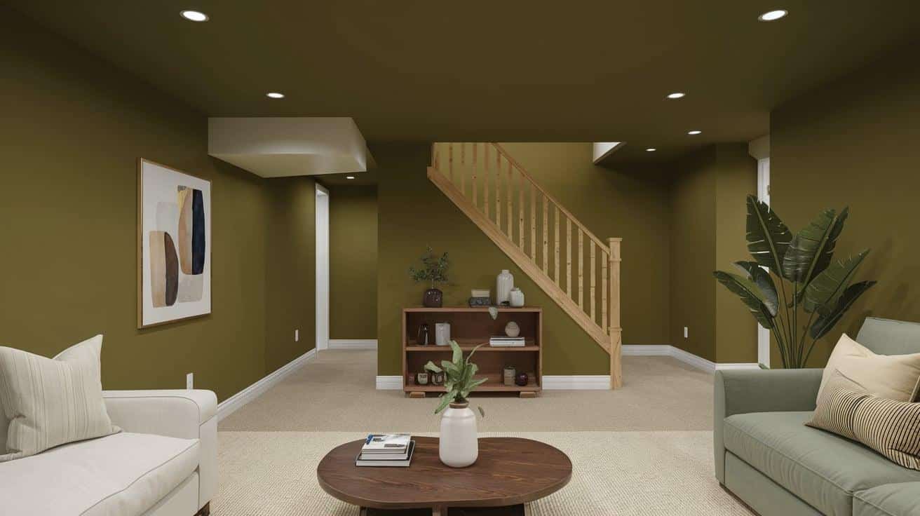
Appearance and Texture: Ripe Olive is a deep, Muted Green with brown undertones. It has an organic, earthy quality with a smooth, matte finish.
Properties:
| Property | Description |
|---|---|
| Richness | Complex color with hidden depths |
| Naturality | Strong connection to organic elements |
| Coziness | Creates warm, enveloping environment |
| Sophistication | Enhance basic with designer appeal |
| Grounding | Provides solid visual foundation |
Why Consider for Basement:
- Brings natural elements into windowless basement spaces.
- Creates a cozy environment perfect for conversation areas.
- Pairs beautifully with wood tones for a balanced organic feel.
Recommended Color- Sherwin Williams Ripe Olive SW 6209
22. Dustblu
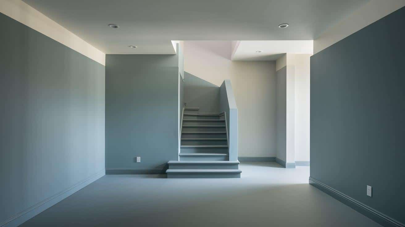
Appearance and Texture: Dustblu is a muted blue with gray undertones and a subtle dusty quality.
It has a soft, weathered appearance reminiscent of faded denim or distant horizons, creating a tranquil, lived-in atmosphere.
Properties:
| Property | Description |
|---|---|
| Coolness | Medium – Creates a balanced, soothing atmosphere |
| Clarity | Softly diffused with a gentle haziness |
| Energy | Calm and contemplative, promotes relaxation |
| Versatility | Works well with neutrals, warm woods, and industrial elements |
| Expansion | Provides subtle depth without overwhelming the space |
Why Consider for Basement:
- Creates a serene, peaceful environment that feels both cozy and spacious.
- Complements typical basement materials like concrete and exposed beams.
- Provides enough color interest without making the space feel closed-in or dark.
Recommended Color- Sherwin Williams Dustblu SW 9161
23. Clear Skies
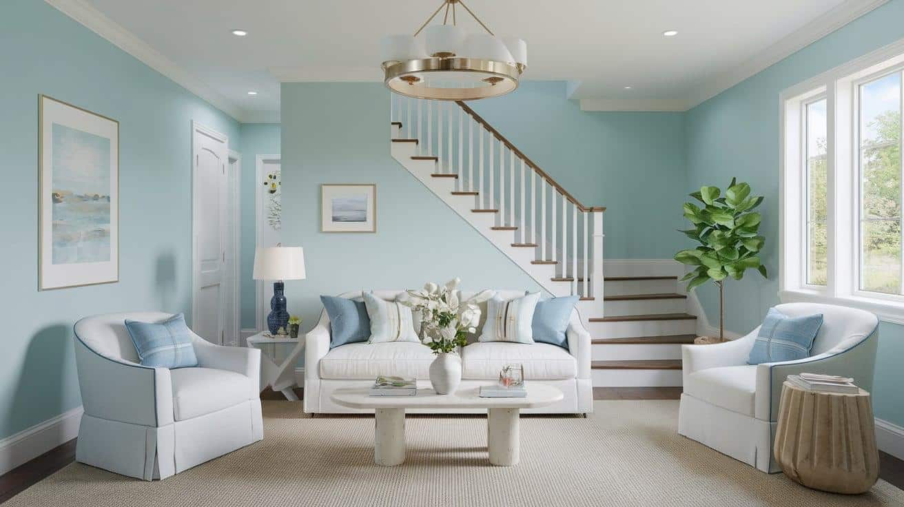
Appearance and Texture: Clear Skies is a bright, clean blue with slight gray undertones. it has a fresh, airy quality with a smooth, even finish.
Properties:
| Property | Description |
|---|---|
| Brightness | Creates uplifting, energetic atmosphere |
| Freshness | Brings outdoor feeling to indoor spaces |
| Expansion | Makes spaces feel more open and airy |
| Coolness | Creates refreshing environment |
| Versatility | Works with many design styles |
Why Consider for Basement:
- Creates a perception of light and air in enclosed basement spaces.
- Counteracts the underground feeling with sky references.
- Provides energetic backdrop for playrooms or exercise areas.
Recommended Color- Benjamin Moore Clear Skies 2054-70
24. India Yellow
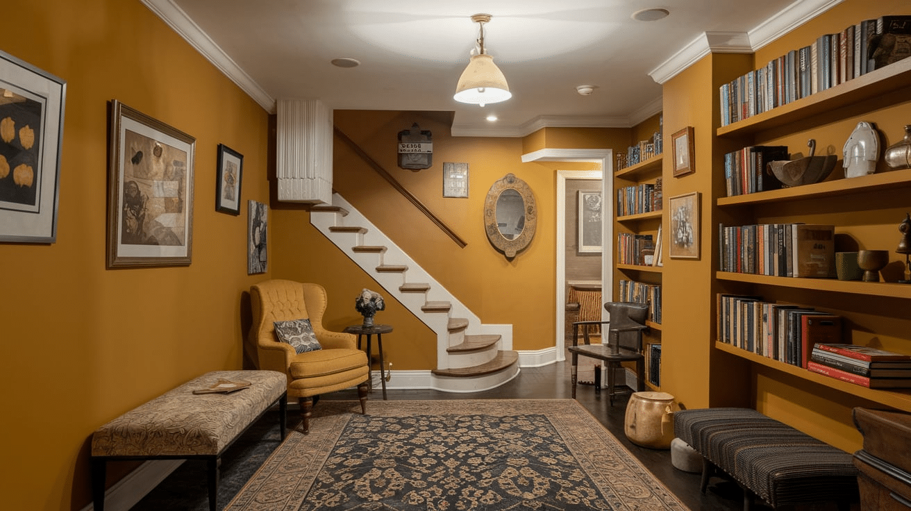
Appearance and Texture: India Yellow is a rich, warm yellow with orange and ochre undertones. It has a spice-inspired depth with a smooth, velvety finish.
Properties:
| Property | Description |
|---|---|
| Warmth | High – Creates immediate coziness |
| Energy | Brings vibrant yet grounding presence |
| Richness | Complex color with hidden depths |
| Uniqueness | Unexpected choice with historical roots |
| Presence | Creates Immediate Impact and Focus |
Why Consider for Basement:
- Brings warmth and light to typically cool, dark basements.
- Creates energetic environment perfect for creative spaces.
- Offers refined Alternative to Basic Bright Yellows.
Recommended Color- Farrows & Ball India Yellow No. 66
25. Naval
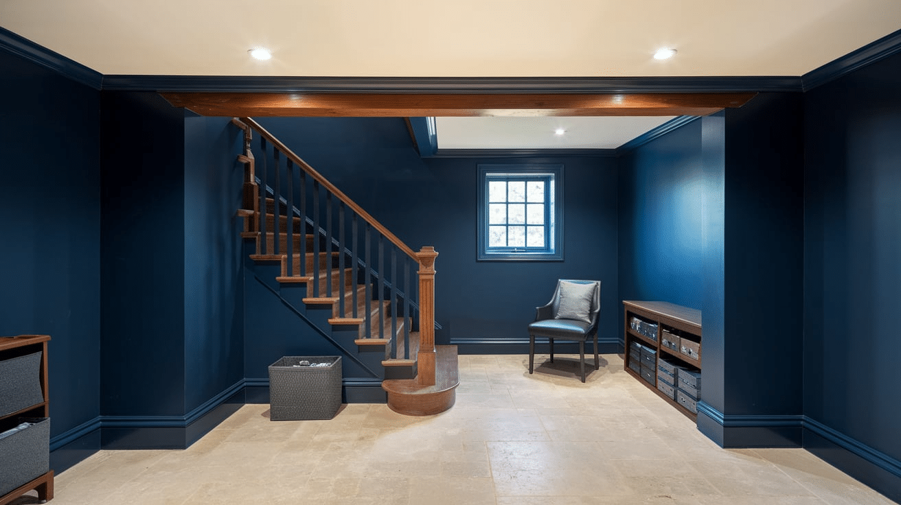
Appearance and Texture: Naval is a deep, classic navy blue with subtle black undertones, offering a rich, velvety appearance and impressive depth.
Properties:
| Property | Description |
|---|---|
| Depth | Rich, complex color with hidden dimensions |
| Timelessness | Classic color that never goes out of style |
| Sophistication | Immediate designer credibility |
| Drama | Creates bold statements without harshness |
| Versatility | Works with many accent colors |
Why Consider for Basement:
- Creates perfect environment for basement home theaters or media rooms.
- Provides a backdrop for basement bars or entertaining areas.
- Conceals ceiling elements while creating an intentional design statement.
Recommended Color- Sherwin Williams Naval SW 6244
26. Warm Sand
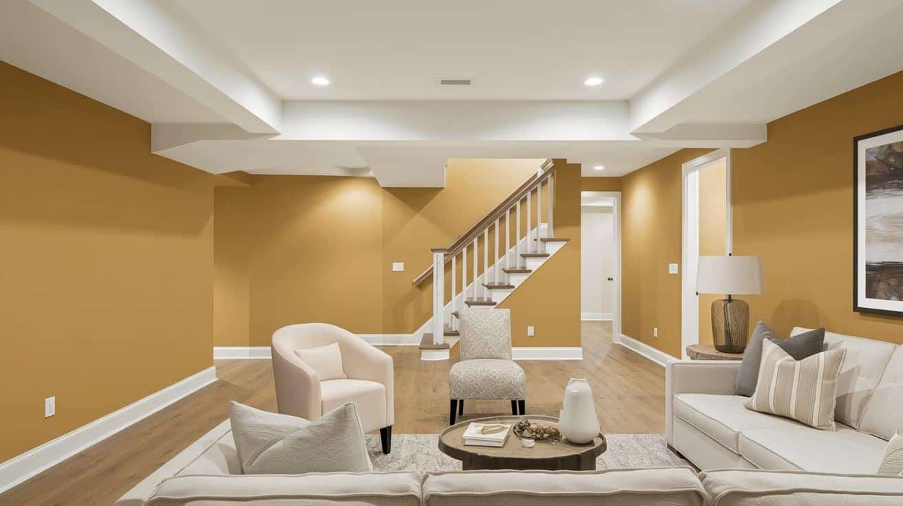
Appearance and Texture: Warm Sand is a rich beige with subtle golden undertones. It has a soft, inviting quality that evokes sun-kissed beaches and natural desert landscapes, creating a cozy and grounded atmosphere.
Properties:
| Property | Description |
|---|---|
| Coolness | Low – Creates a warm, embracing atmosphere |
| Clarity | Soft and natural with a gentle luminosity |
| Energy | Comforting and nurturing, promotes relaxation |
| Versatility | Works harmoniously with most colors and design styles |
| Expansion | Brightens spaces while maintaining warmth and comfort |
Why Consider for Basement:
- Creates a welcoming, cozy environment that counteracts basement coolness
- Provides natural warmth that mimics sunlight in underground spaces
- Establishes a neutral foundation that works with virtually any decor style
Recommended Color- Benjamin Moore Warm Sand CSP-280
27. Warm Terra Cotta
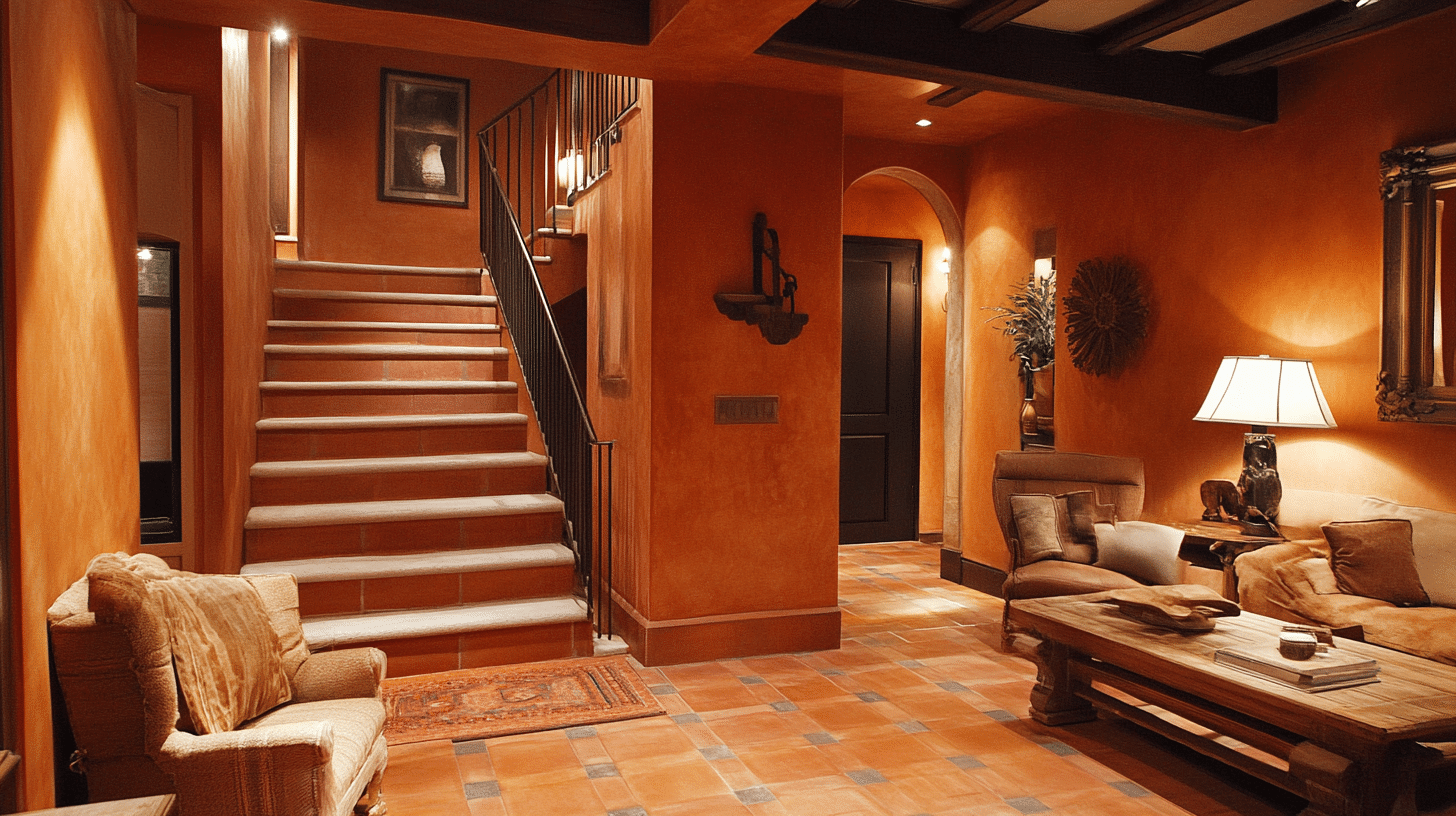
Appearance and Texture: Warm Terra Cotta is a rich, earthy orange-red with brown undertones. Its natural, clay-like quality evokes Mediterranean pottery and desert landscapes, creating a vibrant yet grounded atmosphere.
Properties:
| Property | Description |
|---|---|
| Coolness | Very Low – Creates a deeply warm, energetic atmosphere |
| Clarity | Rich and defined with excellent earthiness |
| Energy | Vibrant and inviting, promotes conversation and activity |
| Versatility | Pairs beautifully with neutrals, blues, and natural elements |
| Expansion | Creates defined, intentional spaces with strong character |
Why Consider for Basement:
- Infuses basement spaces with warmth that counteracts underground coolness
- Creates a cozy, inviting atmosphere that feels connected to earth elements
- Provides rich color depth that transforms utilitarian spaces into designed environments
Recommended Color- Behr Warm Terra Cotta PMD 11
28. Spring Green
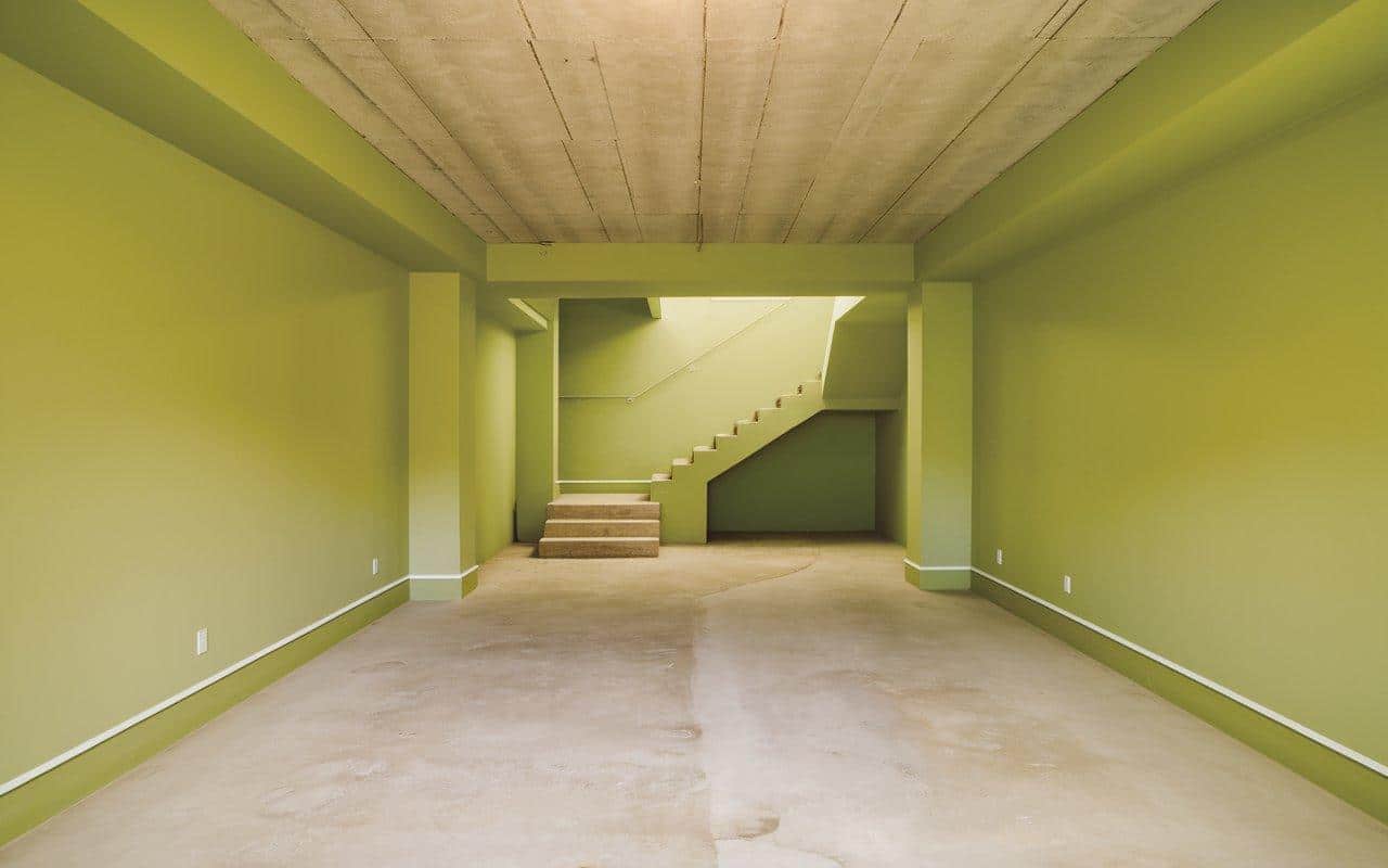
Appearance and Texture: Spring Green is a vibrant, fresh green with yellow undertones. It has a lively, crisp quality that evokes new foliage and early spring gardens, creating an energetic and revitalizing atmosphere.
Properties:
| Property | Description |
|---|---|
| Coolness | Medium – Creates a balanced, refreshing atmosphere |
| Clarity | Bright and clear with excellent definition |
| Energy | Lively and rejuvenating, promotes optimism |
| Versatility | Works well with whites, woods, and botanical accents |
| Expansion | Makes spaces feel more connected to nature and outdoors |
Why Consider for Basement:
- Brings natural vitality to underground spaces lacking outdoor connection.
- Counteracts the typical basement heaviness with fresh, lively energy.
- Creates a bright, positive environment in typically darker spaces.
Recommended Color- Sherlin Williams SpringTime SW 6708
29. Pale Peach
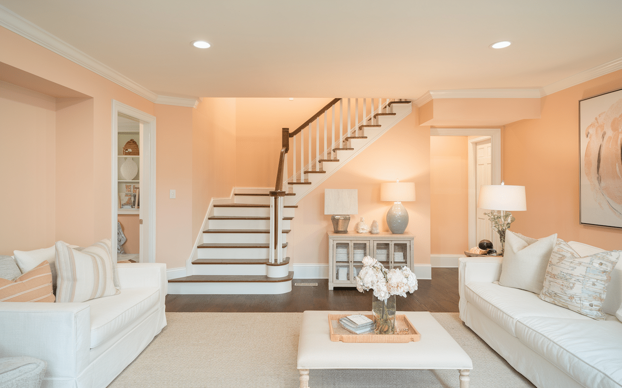
Appearance and Texture: Pale Peach is a delicate, soft peachy nude with subtle warm undertones. It has a gentle, luminous quality that evokes the first light of dawn and creates a nurturing, flattering atmosphere.
Properties:
| Property | Description |
|---|---|
| Coolness | Low – Creates a warm, welcoming atmosphere |
| Clarity | Soft and diffused with a gentle radiance |
| Energy | Soothing and nurturing, promotes comfort |
| Versatility | Pairs beautifully with neutrals, greens, and blues |
| Expansion | Brightens spaces while maintaining warmth and intimacy |
Why Consider for Basement:
- Adds subtle warmth that counteracts the inherent coolness of basement spaces.
- Creates a flattering glow that enhances artificial lighting conditions.
- Establishes an inviting atmosphere that transforms utilitarian spaces into lived-in areas.
Recommended Color- Sherlin Williams Palish Perach SW 7114
30. Arctic Blue
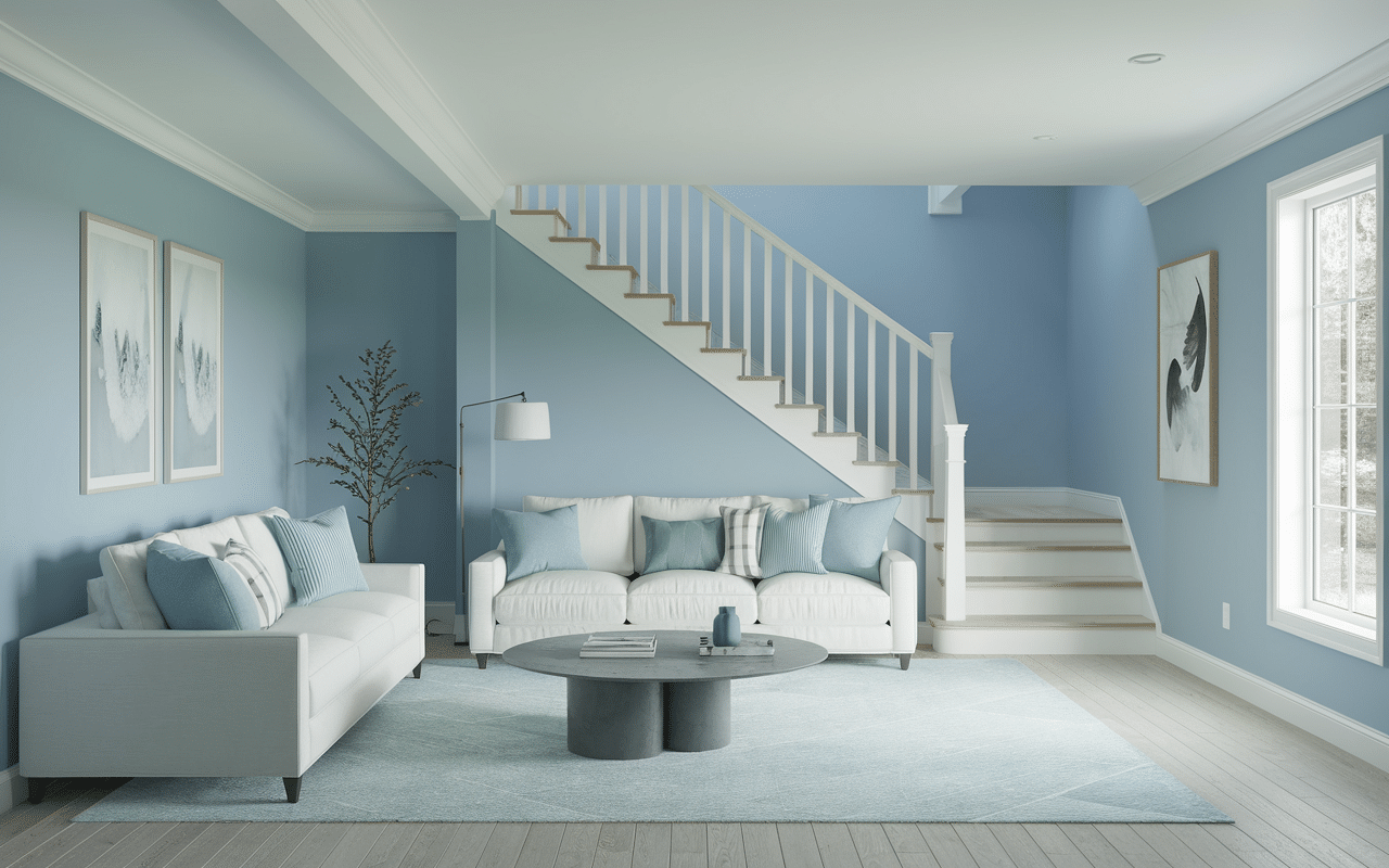
Appearance and Texture: Arctic Blue is a cool, crisp icy blue with subtle silver undertones. Its clean, refreshing quality evokes glacial landscapes and winter skies, creating a serene and invigorating atmosphere.
Properties:
| Property | Description |
|---|---|
| Coolness | Very High – Creates a refreshing, pristine atmosphere |
| Clarity | Crystalline and sharp with excellent definition |
| Energy | Brisk and clarifying, promotes focus and alertness |
| Versatility | Works beautifully with whites, grays, and silver accents |
| Expansion | Makes spaces feel more open, airy, and expansive |
Why Consider for Basement:
- Creates a bright, open feeling that counteracts basement confinement.
- Provides a clean, contemporary backdrop for various basement functions.
- Reflects available light to maximize brightness in typically dark spaces.
Recommended Color- Benjamin Boore Arctic Blue 2050-60
Wrapping Up
The perfect basement paint job balances aesthetic appeal with practical considerations, creating a space that feels intentionally designed rather than merely finished.
By implementing any of these ideas, you’ll turn your basement from neglected square footage into a vibrant part of your home that family and guests will gravitate toward.
Remember that lighting plays a crucial role in how colors appear, so test samples in different areas before committing.
What basement makeover are you planning?
Share your before-and-after photos in the comments below!
Have questions about specific paint techniques or color combinations?
Drop us a line – we love seeing your projects take shape and helping you troubleshoot any painting challenges.

