
Alabaster stands as a timeless choice in the world of interior design, with its light reflectance value (LRV) playing a crucial role in its popularity.
This pristine white shade creates bright, airy spaces while maintaining subtle warmth that pure whites often lack.
Understanding alabaster’s specific LRV unlocks its true potential, allowing you to make informed decisions about lighting, room size, and complementary colors.
In this comprehensive guide, we break down everything you need to know about alabaster’s light properties, how it performs in different environments, and why professionals consistently choose it for both modern and traditional spaces.
Ready for the insider knowledge that will make your next painting project a success?
Let’s get straight to the essential facts about alabaster’s LRV
Understanding LRV (Light Reflectance Value)
Light Reflectance Value (LRV) is a key metric in interior design that measures how much light a paint color reflects into a room.
- Think of LRV as your paint’s “brightness quotient.”
- The higher the LRV, the more light the color reflects, making the room feel brighter.
LRV directly impacts the atmosphere of a room, influencing the perception of space.
- In smaller rooms, colors with higher LRV can create the illusion of more space by reflecting light.
- Lower LRV colors can make larger rooms feel more intimate and grounded.
The LRV scale runs from 0 to 100, providing a clear measurement system for light reflection.
- 0 represents pure black, absorbing all light.
- 100 represents pure white, reflecting all light.
Most paint colors, including neutrals and whites, range between 20 to 90 on the scale.
Understanding LRV helps you select colors that will perform well in your unique space,
Alabaster’s LRV and Characteristics
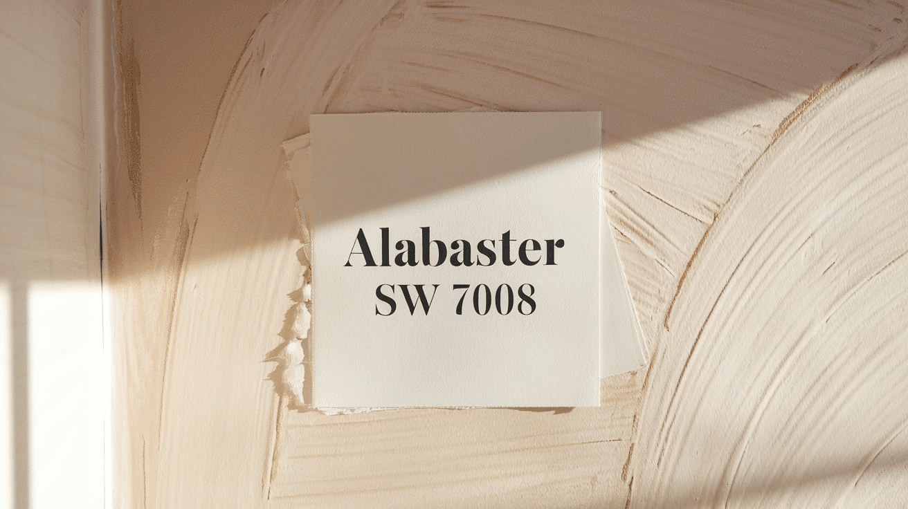
Alabaster(SW 7008) stands out in the world of white paints with its remarkable balance of brightness and warmth.
Its LRV of 82 puts it firmly in the category of high-reflectance whites, making it a go-to choice for homeowners who want to brighten their spaces without creating a stark environment.
What sets Alabaster apart is its special ability to reflect light while maintaining a soft, welcoming presence.
| Feature | Detail |
|---|---|
| LRV Rating | 82 |
| Category | Light/High Reflectance |
| Undertone | Warm Beige |
| Best For | Living spaces, bedrooms, hallways |
Light Properties:
- High Reflectance: With an LRV of 82, Alabaster sits comfortably in the brighter spectrum of whites
- Light Distribution: Reflects light evenly throughout spaces without creating harsh glare
- Versatility: Works well in both natural and artificial lighting conditions
Color Profile:
- Base: Soft, clean white.
- Undertone: Subtle beige warmth.
- Overall Effect: Creates an inviting atmosphere without feeling clinical.
Room Impact:
- Brightens spaces without appearing stark or hospital-like.
- Adds warmth while maintaining a clean environment.
- Creates a cozy envelope effect in well-lit rooms.
- Balances modern and traditional design elements.
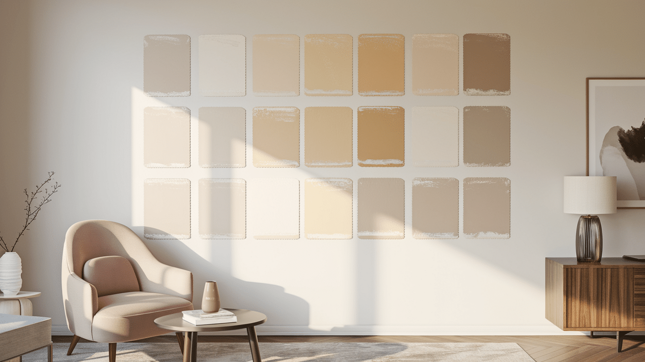
Comparison of Alabaster to Other Whites
While Alabaster provides a warm, inviting tone, not all whites are created equal.
Each white has its special qualities, from cool undertones to neutral bases, and these differences can dramatically influence the atmosphere of a room.
Now, let’s examine how Alabaster’s Light Reflectance Value and overall impact compare to other whites, helping you make an informed decision for your interior design needs.
| White Paint | LRV | Undertones | Room Effect | Best Use Cases |
|---|---|---|---|---|
| Extra White (SW 7006) | 86 | Cool | Stark, crisp, modern | Contemporary spaces, art galleries, spaces needing maximum brightness |
| High Reflective White (SW 7757) | 93 | Neutral | Extremely bright, can appear harsh | Spaces with minimal natural light, modern minimalist designs |
| Alabaster (SW 7008) | 82 | Warm | Soft, versatile, balanced | Most rooms, transitional styles, rooms with varied lighting conditions |
| Greek Villa (SW 7551) | 79 | Warm | Slightly cozier than Alabaster | Traditional spaces, rooms with abundant natural light |
| Swiss Coffee (BM OC-45) | 76 | Warm, creamy | Cozy, intimate, traditional | Living rooms, bedrooms, spaces where warmth is desired |
Lighting Impact Summary
The lighting in a room plays a crucial role in how Alabaster, or any paint color, will appear.
Natural light can enhance its warmth, making it feel cozy and inviting, while artificial lighting may bring out its creamy undertones or soften its appearance.
The direction your room faces and the amount of natural light it receives can change how Alabaster looks throughout the day.
This warm white will help brighten darker, less sunny spaces, while in well-lit rooms, it can feel more neutral and balanced.
Understanding how Alabaster interacts with your lighting can ensure you choose the right paint for your space’s atmosphere.
| Lighting Condition | Higher LRV Whites (85+) | Alabaster (82) | Lower LRV Off-Whites (81-) |
|---|---|---|---|
| Bright Natural Light | Can appear stark or glaring | Softens brightness while staying bright | Absorbs more light, appears creamier |
| North-Facing Rooms | Helps brighten space | Adds warmth without darkening | May appear too muted or gray |
| Evening/Artificial Light | Maintains brightness | Retains warmth, slightly dims | Becomes noticeably darker, very warm |
| Small Spaces | Makes room feel larger | Opens space while adding warmth | Can make space feel smaller but cozier |
| Large Spaces | It can feel cold or impersonal | Adds subtle warmth without closing in | Creates more intimate feeling in large rooms |
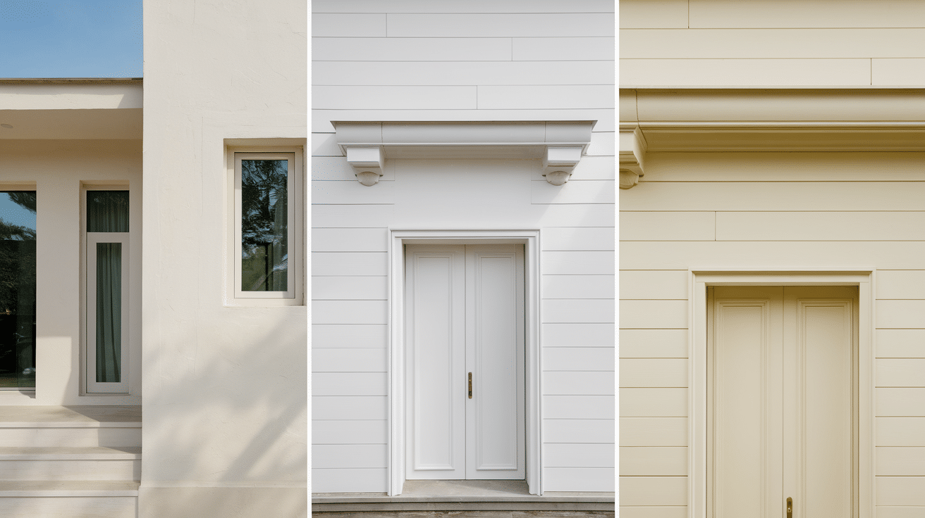
Suitable Applications for Alabaster
- Living Rooms: Creates an inviting atmosphere while keeping spaces feeling open; complements both cool and warm furnishings. Provides an excellent backdrop for artwork without competing for attention.
- Bedrooms: Promotes tranquility while maintaining brightness; creates a cozy evening ambiance under lamp light. Alabaster’s gentle luminosity enhances restful environments while avoiding the stark feel of brighter whites.
- Kitchens: Offers clean appearance without feeling clinical; pairs well with various cabinet finishes. Creates a timeless backdrop that accommodates changing kitchen trends and appliance updates.
- Well-lit Spaces: Softens harsh natural light without absorbing too much brightness; prevents glare common with pure whites. Creates balanced illumination throughout the day as natural light shifts.
- Low-light Areas: Helps maximize available light in north-facing rooms or spaces with minimal windows; adds warmth without darkening. Prevents the shadowy, grayish cast that pure whites often develop in limited light.
Versatile Across Styles:
- Modern: Provides softer alternative to stark whites.
- Transitional: Bridges traditional and contemporary elements.
- Farmhouse: Complements rustic textures without yellowing.
- Traditional: Creates elegant backdrop for classic elements.
- Coastal: Evokes sunlit spaces while pairing beautifully with blues.
Coordinating Colors and Design Elements with Alabaster

Alabaster pairs beautifully with warm taupes like Sherwin-Williams Accessible Beige, soft grays such as Repose Gray, and muted blues like Sea Salt.
For deeper accents, consider Naval (navy) or Rockwood Dark Brown to create an elegant contrast.
For trim and ceilings, pair Alabaster walls with Pure White or Extra White trim for subtle definition, or use Alabaster itself on both walls and trim for a modern monochromatic look.
For ceilings, either continue with Alabaster or choose a brighter white, like High Reflective White. Matte black hardware provides a striking contrast, while marble with subtle veining adds complementary elegance.
Is Alabaster Right for Your Walls?
Alabaster offers a warm, inviting white that avoids the clinical feel of brighter whites while maintaining enough brightness to keep spaces open.
It excels in rooms with cooler northern light and complements both traditional and modern styles.
However, it may appear too creamy in spaces with abundant warm light or alongside warm-toned elements. In rooms seeking a crisp, contemporary look, Alabaster’s subtle warmth might feel too soft.
Before committing, test a large sample on multiple walls and observe it throughout the day, as Alabaster responds dramatically to changing light conditions and surrounding colors.
Considerations Before Choosing Alabaster
- Test in your specific lighting conditions: Alabaster can appear differently depending on your home’s natural and artificial lighting.
- Be aware of warm undertones: In north-facing rooms, Alabaster’s warm undertones become more pronounced and may appear slightly peachy or pink.
- Sample properly before committing: Rather than relying on small paint chips, purchase sample pots and paint large swatches (at least 2’×2′) on multiple walls of your space.
- Observe throughout the day: Check your Alabaster samples during morning, afternoon, and evening hours to understand how the color shifts.
- Under both natural and artificial lighting: LED, incandescent, and fluorescent lighting will each reveal different qualities of the paint.
- Check in different weather conditions: Cloudy versus sunny days can dramatically affect how Alabaster appears, especially in rooms with significant natural light.
Conclusion
Now you’ve got the full scoop on Alabaster’s LRV – the key to making an informed choice for your walls.
This isn’t just about picking a trendy white; it’s about choosing the right white that works with your space’s unique lighting and atmosphere.
The numbers don’t lie, and Alabaster’s light-reflecting properties could be exactly what you’re looking for.
But we’re curious – what’s your take on Alabaster?
Drop a comment below and tell us about your experience with this shade, or share photos if you’ve already made it part of your home. Your insights could help others make their perfect choice!
