
Are you tired of predictable paint colors that lack personality? Feeling stuck choosing between whites that look too stark and grays that feel too cold? We understand the challenge completely.
Let me share my experience with Cromwell Gray SW 6232, a color that has become my trusted companion for home makeovers.Why does this particular shade stand out?
It’s the remarkable way it shifts throughout the day.Have you noticed how morning sunshine brings out different qualities in paint?
With Cromwell Gray, you’ll see subtle blue notes appear when light floods your room, while evening creates a comforting, grounded feeling that guests will notice.
From white trim to dark wood finishes – what works with this color? Almost everything! Want to see how it could change your home?
Understanding Paint Color Basics
Before going into the specific qualities of Cromwell Gray SW 6232, let’s examine what makes this shade technically impressive.
The following specifications help explain why this color performs so well in various lighting conditions and complements such a wide range of design elements.
Color Terminology
When evaluating paint colors, specific measurements and values provide objective information about how a color will perform in your space.
For Cromwell Gray SW 6232, these technical aspects explain its notable adaptability and appeal in different environments:
| PROPERTY | VALUE |
|---|---|
| LRV (Light Reflectance Value) | 32 |
| Color Category | Considered a mid-to-dark tone color (LRV |
| Comparison | Pure white: ~90 LRV, Black: ~0 LRV |
| RGB Value | Red: 150 Green: 152 Blue: 157 |
| Hex Code | #96989D |
Undertones
- Cromwell Gray has cool blue-gray undertones
- It’s a balanced neutral with subtle blue and slate hints
- Not a warm or taupe gray, but a versatile cool-toned gray
Psychology of Gray Colors
- Sophisticated grays like Cromwell Gray create a sense of elegance and composure
- Cool-toned grays: Offer serenity and contemporary appeal
- Medium-depth grays: Evoke stability, subtlety, and timelessness
- Benefits: More substance than lighter grays, provides visual depth while remaining neutral, and creates a sophisticated backdrop for other design elements.
Why Choose Cromwell Gray SW 6232?
Sherwin Williams Cromwell Gray SW 6232 creates a polished, cool-toned, neutral atmosphere that balances current appeal with lasting refinement. It works wonderfully for creating tasteful yet welcoming spaces.
Versatility & Design Integration
Cromwell Gray SW 6232 offers exceptional compatibility with fixed elements like marble countertops and engineered flooring, creating seamless transitions between spaces.
It provides enough depth to feel substantial while maintaining a neutral, timeless quality that won’t quickly date your interior design choices.
Durability & Performance
Sherwin Williams Cromwell Gray, particularly in premium finishes like Duration or Emerald, delivers exceptional durability with excellent washability in high-traffic areas.
Its medium depth and blue undertones help disguise minor wall imperfections better than lighter neutrals while maintaining its sophisticated appearance.
Texture & Dimension
Cromwell Gray creates a rich, dimensional texture that adds depth to walls without dominating the space.
Its blue-gray undertones produce elegant shadow play that enhances artificial and natural lighting and adds visual interest to architectural details.
It can accentuate moldings and trim when applied to different finishes while maintaining a consistent, cohesive appearance throughout connected rooms.
Balance & Adaptability
Cromwell Gray works because it perfectly balances coolness and neutrality, providing enough color to feel substantial without overpowering a space.
Its blue undertones complement warm wooden features and cool marble elements, while its moderate LRV (Light Reflectance Value) ensures rooms feel balanced yet grounded.
This versatile gray adapts beautifully to changing light conditions, maintaining its sophisticated character from morning to evening.
Cromwell Gray SW 6232 in Interior Design
Cromwell Gray brings smart coolness and steadiness to rooms. Its polished blue-gray shade forms tasteful spaces that feel stable yet current.
This practical color works easily with both cool and warm shades for a lasting, refined look.
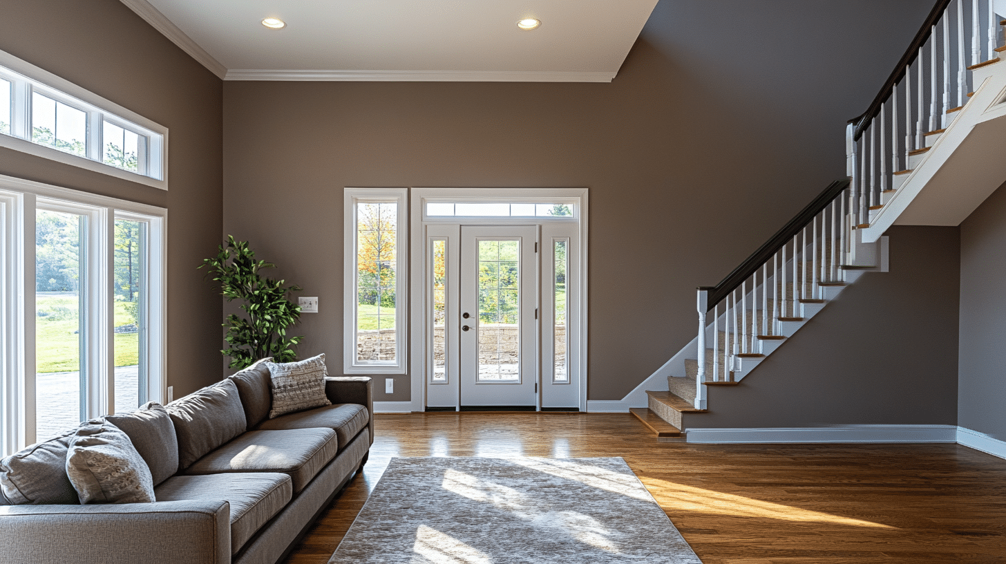
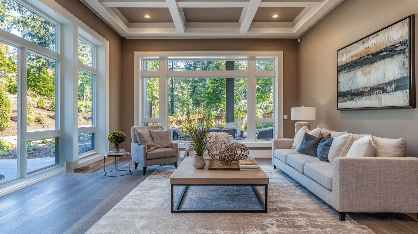
Living Room
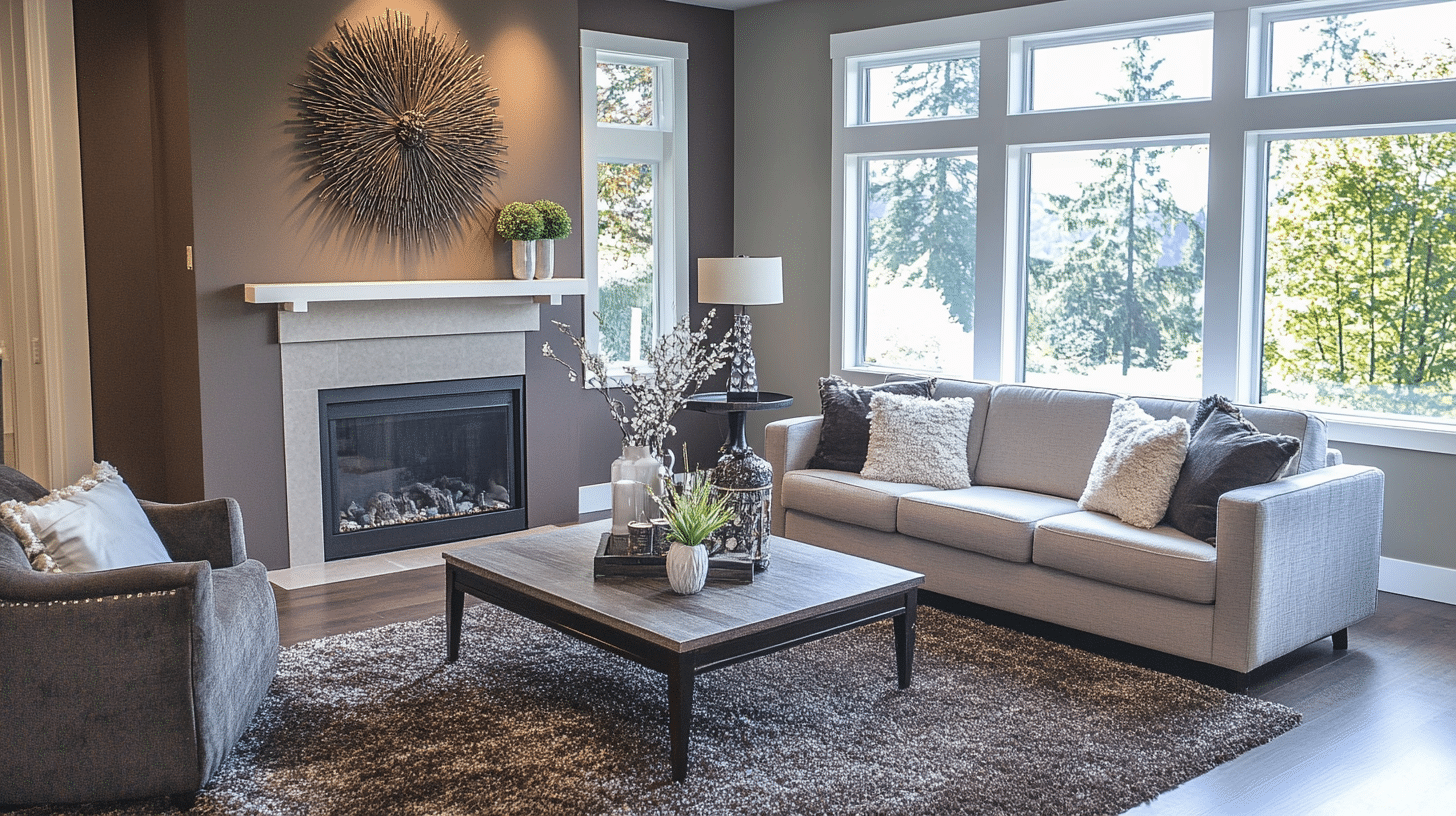
In living areas, Cromwell Gray establishes a sophisticated foundation that enhances both formal and casual furniture arrangements while maintaining visual interest throughout the day.
- Creates welcoming, thoughtful spaces
- Highlights wall moldings and built-ins
- Pairs with various fabrics and surfaces
- Fits many home styles from classic to current
Bedroom
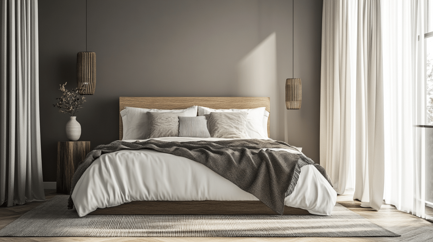
When used in bedrooms, this versatile gray creates a restful retreat that transitions beautifully from day to night while supporting various decorative approaches.
- Promotes a serene, tranquil atmosphere
- Evening light enhances its depth
- Creates a sophisticated retreat space
- Adapts to any bedroom size
Kitchen & Dining
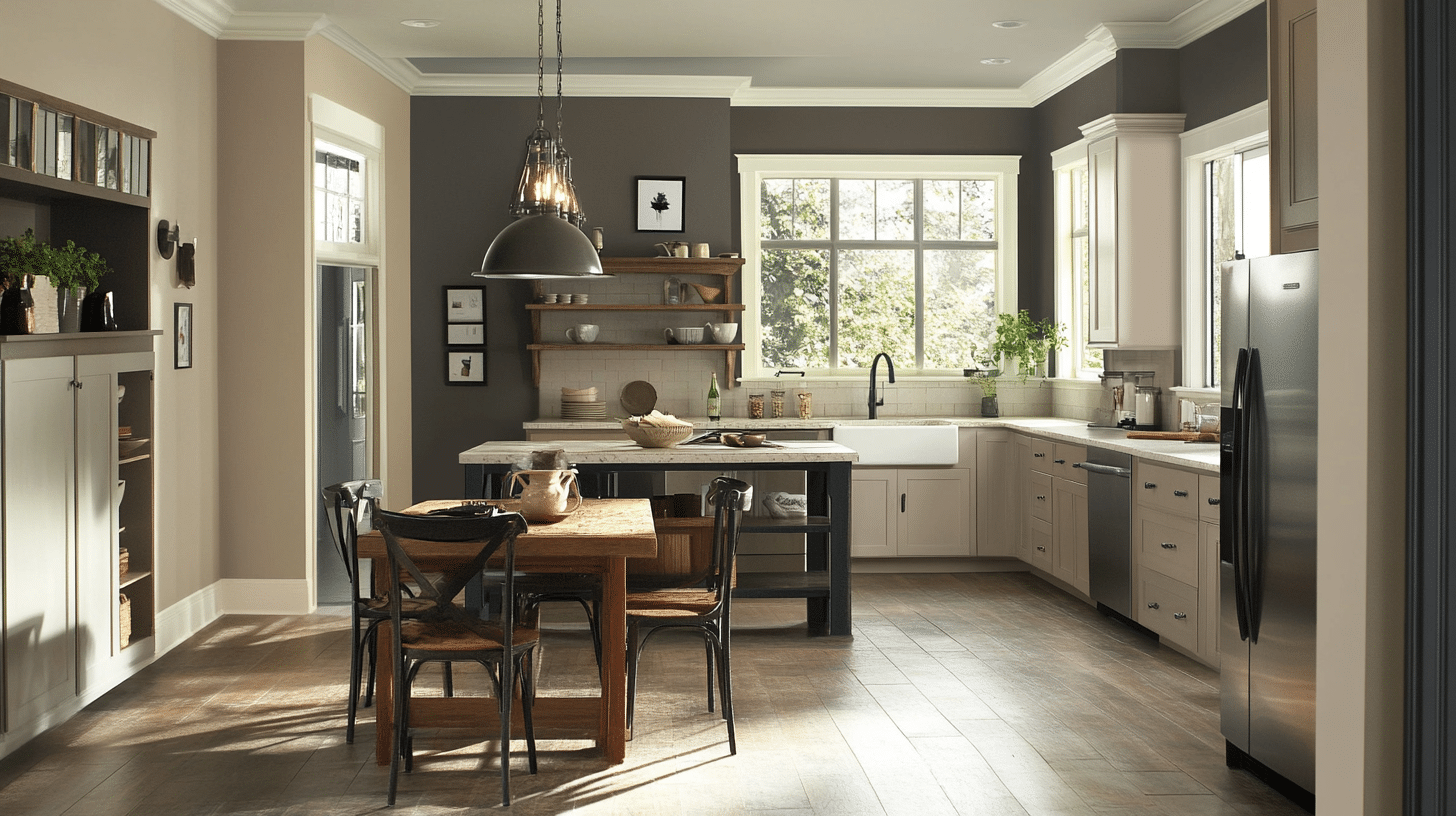
For food preparation and dining spaces, Cromwell Gray provides a neutral yet distinctive backdrop that coordinates with multiple materials and fixtures.
- Offers a refined, elegant appeal
- Complements stainless steel appliances perfectly
- Provides visual continuity
- Maintains its sophisticated appearance
Bathroom
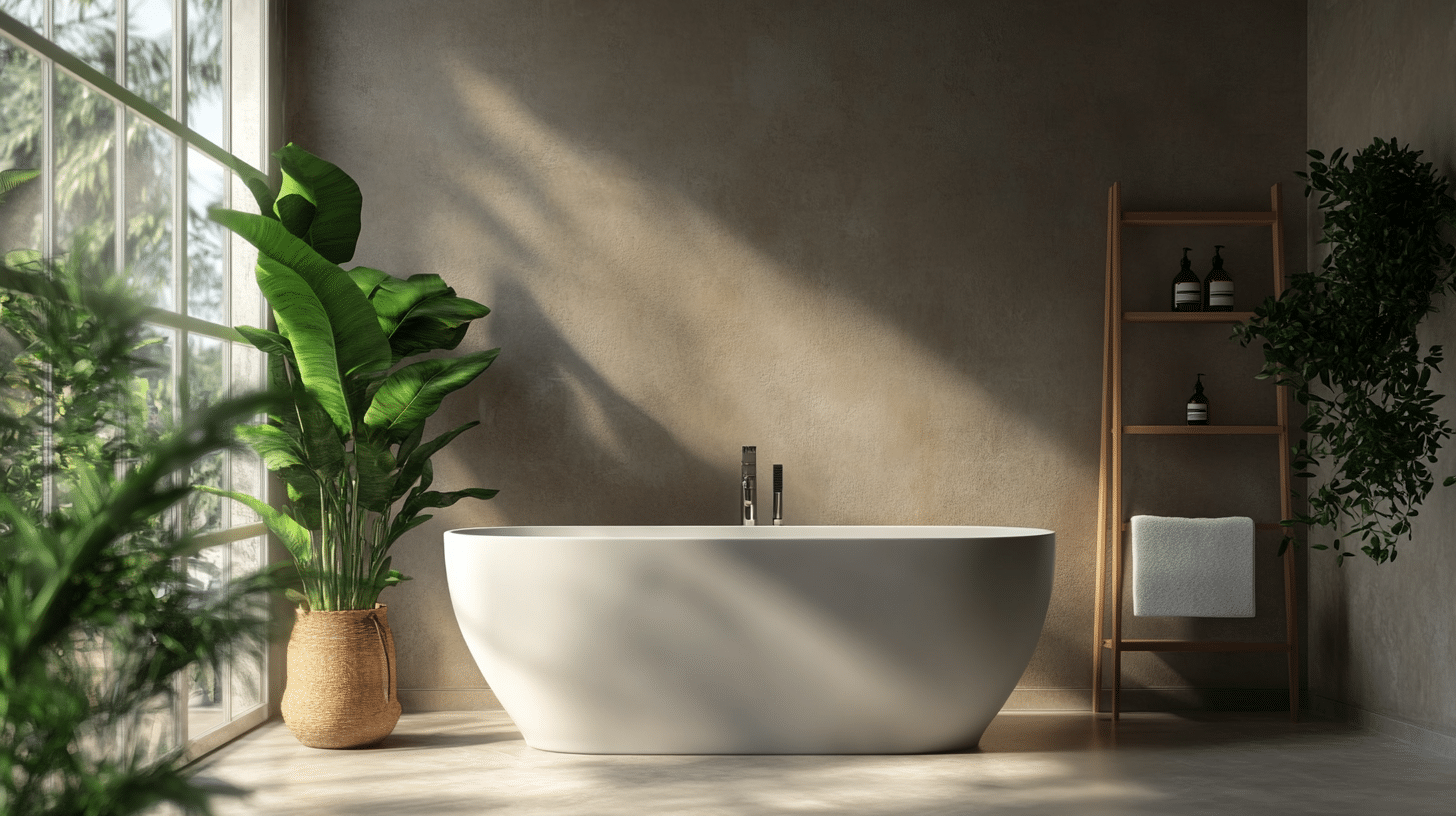
In bathroom environments, this durable gray performs exceptionally well even with fluctuating moisture levels and varied lighting conditions.
- Creates a refined spa-like atmosphere
- Adds depth to complement bright fixtures
- Complements porcelain, marble, and chrome surfaces
- Maintains color integrity in high-humidity environments
Color Pairings and Combinations for Cromwell Gray SW 6232

Cromwell Gray’s versatile nature allows it to coordinate effectively with a variety of complementary colors.
The following selections offer tested combinations that enhance this paint’s inherent qualities while creating cohesive design schemes:
- White Dove BM OC-17 – A soft, warm-leaning white that offers gentle definition and works with Cromwell Gray’s blue-gray undertones without creating harsh transitions.
- Chantilly Lace BM 2121-70 – A bright, clean white that creates clear contrast with Cromwell Gray while highlighting its cool undertones and refined appearance.
- Hale Navy BM HC-154 – A rich navy blue that brings depth and interest while working nicely with Cromwell Gray’s cool base, forming a balanced and polished color scheme.
These thoughtful combinations demonstrate how Cromwell Gray can serve as both a foundational neutral and a sophisticated accent within multiple color stories, providing flexibility as your design preferences evolve over time.
Creating Cohesive Color Schemes
Cromwell Gray SW 6232 is a cool blue-gray with slate undertones, creating a refined neutral feel perfect for sophisticated, contemporary spaces.
Monochromatic Scheme:
- Cromwell Gray (SW 6232) for main walls
- Simply White (BM OC-117) for trim
- White Heron (BM OC-57) for ceilings
- Kendall Charcoal (BM HC-166) for accent pieces or adjoining rooms
Cool Color Scheme:
- Cromwell Gray (SW 6232) for main living areas
- Coventry Gray (BM HC-169) for the dining room
- Wickham Gray (BM HC-171) for hallways
- Chelsea Gray (BM HC-168) for bedrooms
Warm-Cool Balance Scheme:
- Cromwell Gray (SW 6232) for main walls
- Cloud White (BM OC-130) for trim and ceilings
- Iron Mountain (BM 2134-30) for accent walls
- Edgecomb Gray (BM HC-173) for connecting spaces
These colors maintain a cohesive, sophisticated palette that works beautifully with Cromwell Gray as the foundation. They give you options for lighter and deeper coordinating colors while maintaining an elegant, balanced atmosphere throughout your home.
Paint Colors: Perfect Alternative to Cromwell Gray

While Cromwell Gray stands as an exceptional choice, certain spaces might benefit from slight variations in tone or depth.
These carefully selected alternatives maintain the essential character of Cromwell Gray while offering subtle shifts to address specific lighting conditions or design preferences:
- Alaskan Husky 1479 – A lighter gray with similar cool undertones that offers a softer, airier version of Cromwell Gray while keeping its balanced coolness
- BM 1603 Stormy Monday – A deeper, more complex gray that enhances Cromwell Gray’s cool tones while adding richness and depth to spaces
- BM 2124-10 Wrought Iron – A fine charcoal-gray with blue undertones that presents a striking progression from Cromwell Gray while matching its neutral character
- BM 1619 Silver Mist – A balanced neutral with slightly more blue undertones that boosts the coolness of Cromwell Gray while keeping its practical, lasting appeal
These alternatives provide thoughtful options when you appreciate Cromwell Gray’s fundamental qualities but need slight adjustments for particular rooms, lighting situations, or coordinating with existing elements in your home.
Wrapping It up!
What color have I lived with for five years without a hint of regret? Cromwell Gray in every main room of my home.
Have you ever painted a room only to wish you’d chosen differently within months? That won’t happen here. Isn’t it remarkable how some colors feel dated quickly while others remain fresh?
What makes this shade work so well? It’s the careful balance—cool but never cold, present but never pushy. Don’t you want walls that support your furniture choices rather than compete with them?
When friends visit, they often ask about my paint color. Have you considered how the right walls can quietly pull a room together?
Want my advice? Test Cromwell Gray in your space. Watch how it changes from morning to night. Could this be the color that finally feels right?
