Cinnamon Slate by Benjamin Moore isn’t just another paint color—it’s the secret weapon in countless designers’ arsenals.
This rich, complex hue strikes the perfect balance between warmth and depth, making it an ideal choice for those seeking character without heaviness.
Unlike trendy colors that quickly feel dated, Cinnamon Slate offers timeless appeal with its subtle earthy undertones and remarkable versatility.
This color completely revitalizes tired spaces and creates striking focal points in new builds.
This blog will reveal exactly why interior designers consistently reach for this shade, how to pair it with complementary colors, and which rooms truly shine when dressed in Cinnamon Slate.
Ready to find the potential of this exceptional Benjamin Moore creation? Let’s get started.
What is Benjamin Moore Cinnamon Slate?
Benjamin Moore’s Cinnamon Slate (1221) is a medium-depth, earthy red-brown with subtle gray undertones.
It has an LRV (Light Reflectance Value) of approximately 14-15, placing it in the medium-dark range of the color spectrum.
This means it absorbs more light than it reflects, giving spaces a cozy, grounded feeling. The color is available in multiple finish options, including:
- Matte
- Eggshell
- Pearl
- Satin
- Semi-gloss
- High-gloss
Warm or cool Undertone?
Cinnamon Slate is decidedly warm with mauve and brown undertones. The warmth comes from its red-brown base, while the mauve undertones add complexity and depth.
These warm characteristics make it particularly inviting in spaces where you want to create comfort and intimacy.
In What Rooms Does Cinnamon Slate Work Best?
Cinnamon Slate works beautifully in living rooms, bedrooms, kitchens, and bathrooms, thanks to its warm, earthy tone.
It creates a cozy, grounded atmosphere while adding depth to any space.
Living Rooms: Cozy and Grounding
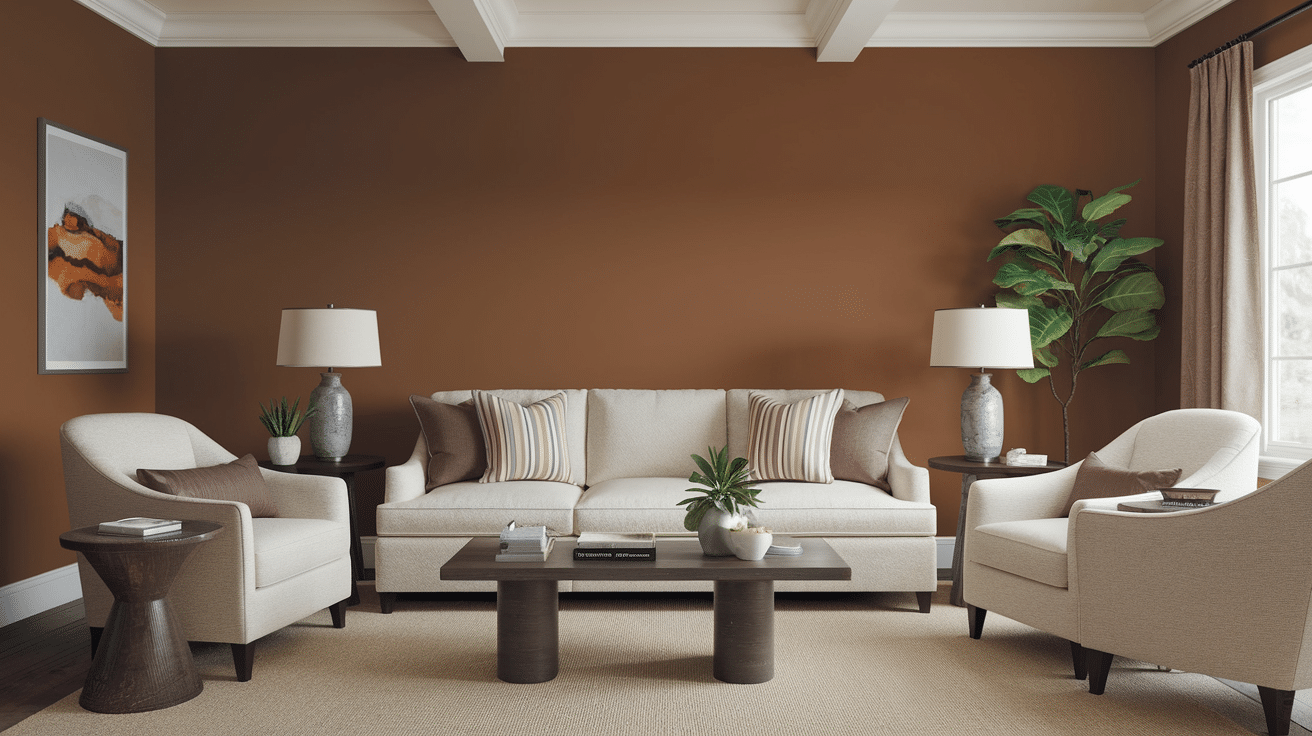
Cinnamon Slate creates an exceptionally cozy atmosphere in living spaces, making it ideal for areas where family and guests gather.
Its depth provides a grounding effect that makes large rooms feel more intimate without closing them in.
The color’s warmth radiates particularly well in living rooms with natural light, creating a space that feels both beautiful and comfortable.
It pairs beautifully with natural wood tones, brass accents, and textured fabrics for a layered, lived-in appeal.
Bedrooms: Calm and Romantic
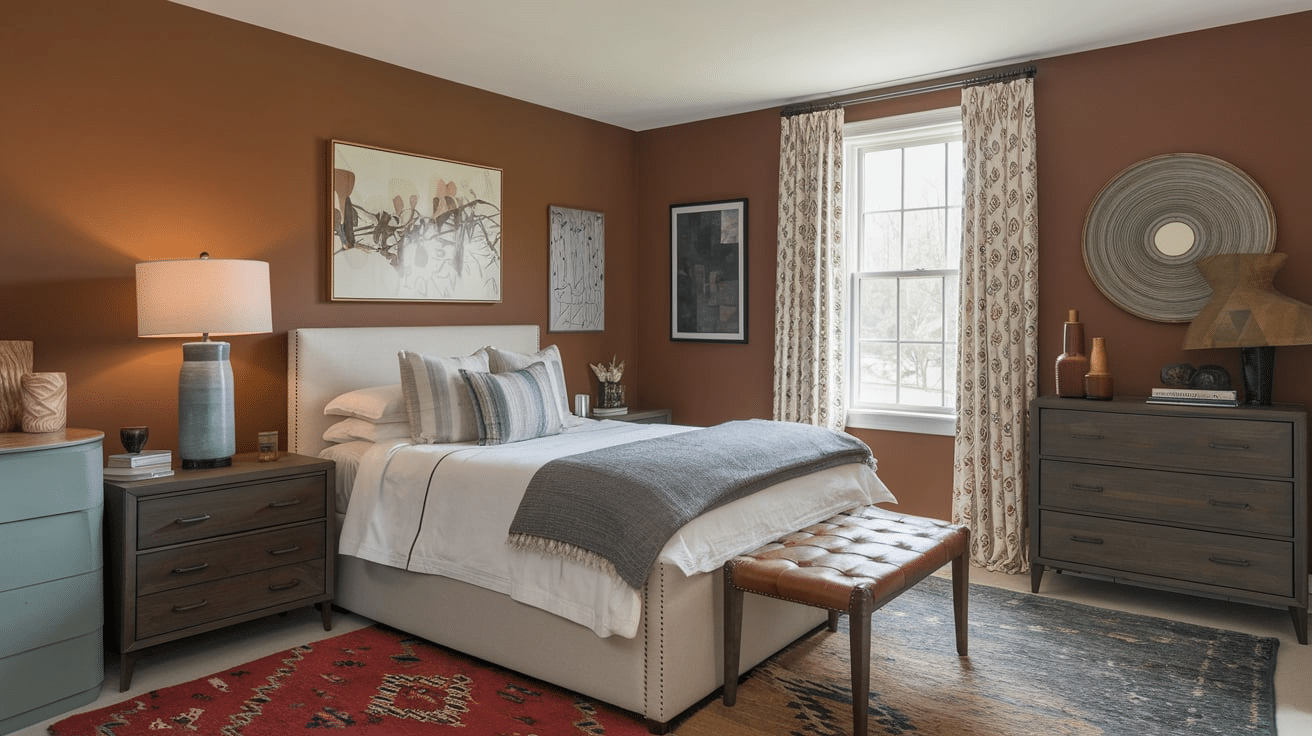
In bedrooms, Cinnamon Slate establishes a serene yet romantic atmosphere.
The color’s muted quality supports restful sleep, while its warmth adds an element of subtle romance.
The earthy undertones create a cocoon-like effect, especially beautiful in master bedrooms or guest rooms where an elevated, retreat-like quality is desired.
The color shifts gracefully from day to night, appearing more animated in morning light and more subdued and intimate during evening hours.
Kitchens: Modern yet Inviting
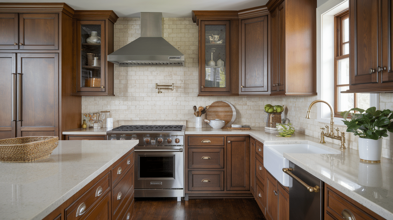
Cinnamon Slate creates a perfect balance between contemporary design and welcoming warmth in kitchen spaces.
It serves as an excellent choice for cabinetry, creating a rich foundation that pairs beautifully with marble or quartz countertops.
The color complements brushed metals and stainless steel appliances beautifully, adding necessary warmth to utilitarian spaces while maintaining a modern edge.
Its depth and complexity prevent kitchens from feeling sterile or cold without ever appearing dated or overly traditional.
Bathrooms: Spa-Like with Style
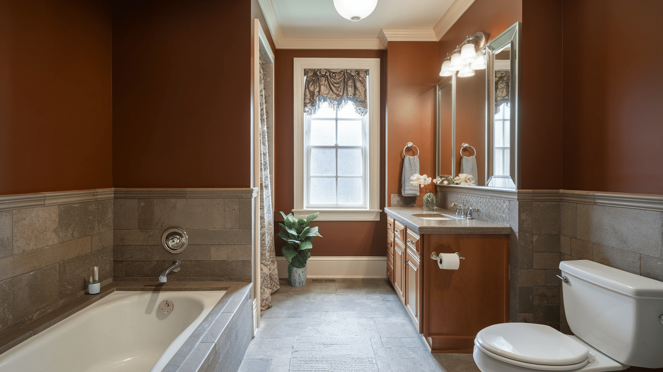
Cinnamon Slate changes ordinary bathrooms into luxurious spa-like retreats, creating a rich backdrop that elevates white fixtures and natural stone elements.
The color adds surprising depth and interest to smaller powder rooms, making them feel more intentional and designed.
It pairs exceptionally well with gold or brass fixtures for a beautiful, upscale look that references high-end hotels and spas.
Even in bathrooms with limited natural light, Cinnamon Slate maintains its bold appeal, creating warmth without appearing dark or heavy.
Accent Walls and Trim Pairings
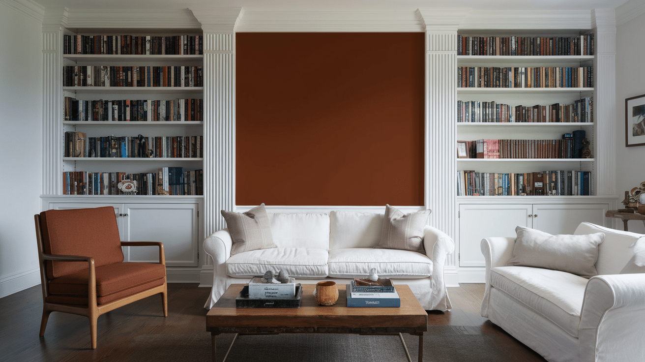
Cinnamon Slate makes a stunning accent wall in nearly any room, creating a focal point without overwhelming the space.
Its depth draws the eye while its neutral qualities keep it from dominating the room’s design scheme.
For trim pairings, the color works beautifully with crisp whites for contrast or deeper browns for a monochromatic look.
When used on trim against lighter walls, it creates an unexpected reverse accent that frames the room in refined warmth.
Lighting Effects on Cinnamon Slate
| Lighting Type | Effect on Cinnamon Slate | Notes |
|---|---|---|
| Natural Daylight | Reveals true color depth and undertones | Color appears most balanced and authentic |
| Direct Sunlight | Brightens the color and enhances warm tones | Can make mauve undertones more prominent |
| Overcast Day | Mutes the color, bringing forward gray undertones | Creates a more subdued, refined appearance. |
| Warm Artificial Light (2700-3000K) | Enhances warmth and red-brown base | Makes the color appear richer and cozier |
| Cool Artificial Light (4000K+) | Emphasizes gray undertones | Can make the color appear flatter and more muted |
| LED Lighting | Varies based on color temperature | Choose warmer LEDs to maintain color richness |
| Incandescent Lighting | Enhances the red-brown warmth significantly | Creates intimate, dramatic effect in evening settings |
What Colors Pair Well With Cinnamon Slate?

Cinnamon Slate harmonizes with a range of colors to create balanced and wide spaces.
Its warm undertones and rich depth allow it to serve as both an anchor and complementary shade in various design palettes.
1. Cloud Cover (OC-25): A soft, muted gray with gentle blue undertones that evokes an overcast sky, creating a soothing atmosphere with subtle depth.
2. Porcelain (2113-60): A delicate, luminous off-white with the faintest hint of cream, offering brightness with warmth that feels sophisticated yet approachable.
3. Calm (OC-2): A serene, barely-there neutral with subtle warm undertones, creating a peaceful backdrop that feels both grounding and ethereal.
4. Chambourd (AF-645): A rich, sophisticated burgundy with complex depth, delivering dramatic elegance with hints of both berry and brown undertones.
Tips for Using Cinnamon Slate Successfully
-
Choose a matte or eggshell finish for low-traffic areas to highlight Cinnamon Slate’s soft, rich tone.
-
Use satin or semi-gloss finishes in kitchens and bathrooms for durability and moisture resistance.
-
Test large swatches on multiple walls to see how lighting affects the color throughout the day.
-
Pair with medium to dark wood tones or light flooring for a beautiful contrast and balance.
-
Complement with neutral or earthy furnishings and metallic accents like brass or gold.
-
Always allow swatches to dry completely before deciding, and compare different finishes if unsure.
Wrapping Up
Benjamin Moore’s Cinnamon Slate proves that the right color choice can elevate your entire home. Its balance of warmth and subtlety creates spaces that feel grounded and refined—never overwhelming.
Remember, lighting dramatically affects how this color presents itself, so testing samples in your specific space remains crucial.
The versatility of Cinnamon Slate makes it an investment that adapts beautifully to changing décor trends while maintaining its distinctive character.
Have you used Cinnamon Slate in your home? Which room did you paint, and what colors did you pair with it?
Drop your thoughts in the comments below, and your insights might be exactly what another reader needs to make their decision.