
Is your home ready for a fresh start this season? Many homeowners feel stuck with dull walls that no longer fit their style.
March Wind by Sherwin-Williams offers a light blue-gray tone that brings a calm, airy feel to any room. This shade works with both warm and cool color schemes, making it a top pick for spring makeovers.
With this color, you’ll get a space that feels open, bright, and peaceful – exactly what you need after the heavy tones of winter.
Read on to learn how March Wind can change your home, which rooms it works best in, and tips to pair it with other colors for a look that stays fresh year-round.
Overview of March Wind: A Cool, Refreshing Neutral
March Wind (SW 7668) is a soft, cool gray with subtle purple notes that brings a sense of calm to any space. This Sherwin-Williams shade firmly belongs to the neutral family, offering more character than plain gray. Its balanced tone works well in many settings, from quiet bedrooms to busy kitchens.
| Technical Details | Value | Additional Information |
|---|---|---|
| Color Number | SW 7668 | Location: 282-C3 |
| Light Reflectance Value (LRV) | 49 | Medium light tone that balances brightness and depth |
| RGB Values | 186 / 185 / 182 | Very balanced RGB shows its true neutral nature |
| Hex Value | #BAB9B6 | For digital color matching and web design |
| Available For | Interior/Exterior | Versatile for both inside and outside applications |
| Color Collections | Timeless Colors, Warm Scheme | Part of Sherwin-Williams’ classic palette |
| Color Family | Neutral | With cool undertones and slight purple hints |
The LRV of 49 places March Wind in the middle range – not too dark and not too light. This makes it useful in rooms with various lighting conditions. The balanced RGB values show how truly neutral this color is, with just a tiny shift toward the cooler side.
March Wind: A Color That Brings the Breeze Right Into Your Home
March Wind is a soft blue-gray paint color from Sherwin Williams. It has a gentle, light tone that captures the feel of a mild spring day. The color sits on the cooler side of the palette with subtle gray hints that keep it from feeling too bold.
When sunlight hits walls painted with March Wind, the color seems to shift slightly. This gives rooms a sense of movement throughout the day. The shade has enough depth to show up clearly but stays light enough to make spaces feel bigger.
The blue aspects of this paint bring a sense of calm to any room. Many people feel more relaxed in spaces with blue tones. The gray notes in March Wind add a modern touch that helps it fit well in today’s homes.
This color works well in rooms where you want to feel at ease. The soft tone can lower stress and create a peaceful mood. It’s like having a clear spring sky right inside your house, even on cloudy days.
March Wind strikes a good balance – not too dark and not too light. It avoids looking washed out while still keeping spaces bright. This makes it useful in rooms with both lots of natural light and in spaces that need some brightening.
Why March Wind Is the Ultimate Spring Hue for Your Space
March Wind stands out as a top pick for spring home updates. This Sherwin Williams color brings a fresh feel to any room without being too loud or showy.
What makes March Wind work so well for spring? The color has the perfect mix of blue and gray that mimics clear spring skies. It’s light without being pale, and rich without being too dark.
Many folks find blue tones help create calm spaces. March Wind does this while still adding some life to your walls. It’s not flat or boring like some plain grays can be.
Here’s why March Wind shines during spring months:
- It reflects more natural light, making rooms feel brighter as days get longer
- The color pairs well with both white trim and wood tones
- It works in any room from bedrooms to living areas
- The shade stays true in different lighting throughout the day
Unlike stark whites or heavy darks, March Wind brings a middle-ground option that feels just right for the changing season. It’s not too cold and not too warm.
This color can make small rooms feel more open. The light but clear tone pushes walls outward visually, which helps during spring cleaning and rearranging.
Where to Use March Wind: Perfect Spaces for a Fresh Look
March Wind’s calming, versatile hue works beautifully in any room, from living rooms to bathrooms, creating a fresh, peaceful vibe throughout your home.
Living Room: Create a Calm & Inviting Space for Family Gatherings
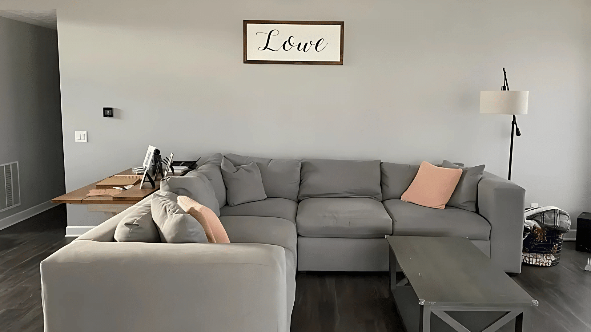
March Wind turns living rooms into welcoming spaces for family and guests. The color creates a calm background that makes furniture stand out without competing for attention. It works well with both modern and classic styles. The soft blue-gray helps people feel at ease while chatting or relaxing.
- Perfect with white trim and lighter wood furniture
- Creates a good base for colorful pillows and throws
Bedroom: Relax and Unwind with a Restful Sleep Sanctuary
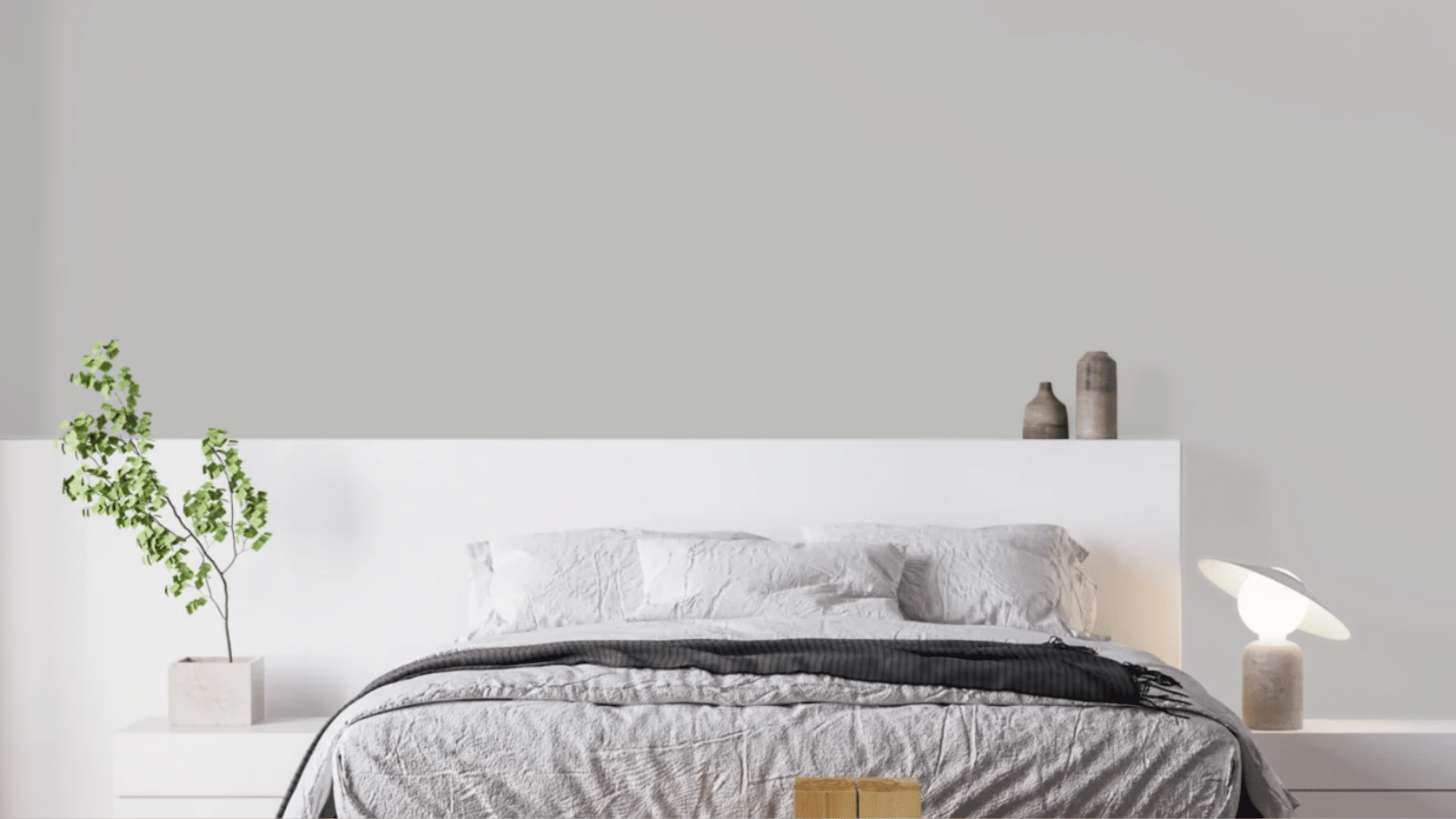
In bedrooms, March Wind helps create a restful space for sleep. The blue tones can lower blood pressure and slow breathing. This makes it a smart choice for a room where relaxation matters most. The color stays peaceful both morning and night, unlike some blues that can look too cold.
- Pairs well with white bedding for a clean look
- Makes small bedrooms feel more open and airy
Kitchen: A Fresh, Clean Vibe for Your Cooking Space

Kitchens benefit from March Wind’s clean, fresh look. The color stands up well to the heat and moisture found in cooking spaces. It provides a nice contrast with white cabinets or stainless steel appliances. The shade also hides small marks better than pure white walls.
- Looks great with marble or quartz countertops
- Helps balance warm wood tones in cabinets or floors
Bathroom: Turn Your Bathroom into a Spa-Like Escape
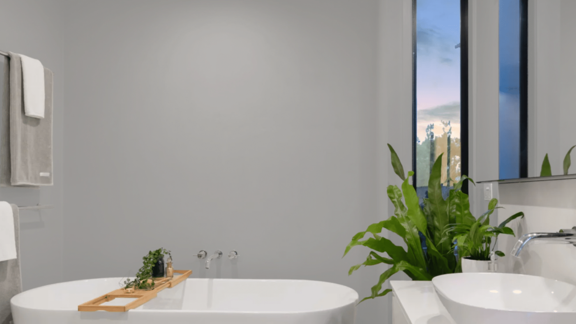
Bathrooms painted with March Wind feel clean and spa-like. The color handles humidity well without showing water spots easily. It makes these often small spaces look bigger and more open. The shade also works with most fixture finishes from chrome to brass.
- Complements white tiles and porcelain fixtures
- Adds a fresh feel that matches the room’s purpose
Pairing March Wind: Colors That Make It Pop
March Wind pairs effortlessly with both soft neutrals and bold accents, creating a harmonious and dynamic look in any space.
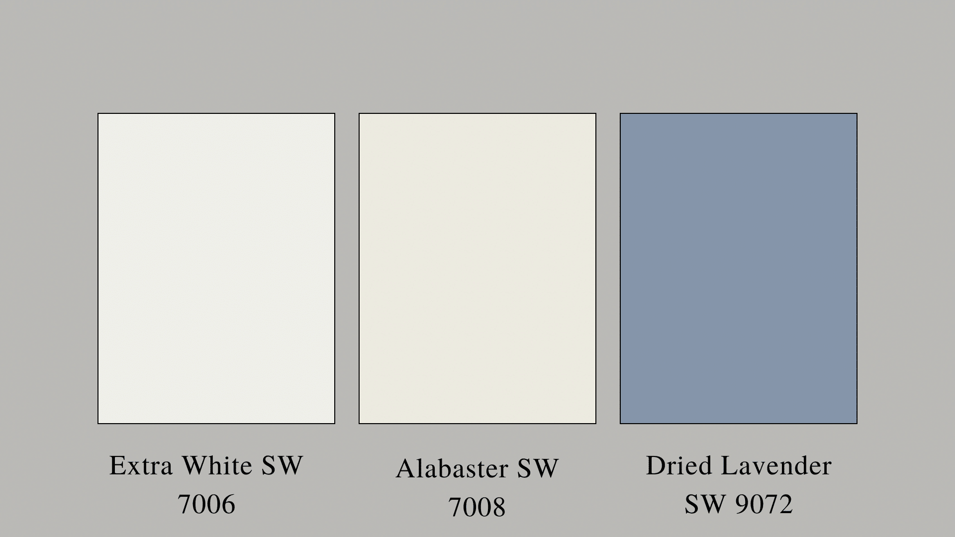
1. Extra White SW 7006
Extra White creates a clean, crisp contrast with March Wind. This pure white trim color makes the soft blue-gray stand out more clearly on the walls. When used together, these colors form a fresh, bright space that feels open and airy. Extra White works well on the ceiling, crown molding, baseboards, and door frames while March Wind covers the walls.
- The stark white makes March Wind appear slightly bluer
- Creates a classic, timeless look that never goes out of style
- Reflects more light, making rooms feel bigger
2. Alabaster SW 7008
Alabaster offers a softer option than pure white. This warm off-white has just enough cream to feel cozy next to March Wind’s cool tones. The pair creates a balanced look that feels both fresh and welcoming. Alabaster works on cabinets, furniture, or as an accent wall paired with March Wind.
- Softens the overall look for a more lived-in feel
- Reduces the contrast while still keeping spaces bright
- Works well in rooms that face north with cooler light
3. Dried Lavender SW 9072
Dried Lavender adds a gentle purple accent that brings out the blue in March Wind. This soft purple creates a pretty color scheme that feels calm and put together. The two colors share a similar lightness but differ enough to create visual interest in the room.
- Great for accent pillows, art, or small furniture pieces
- Creates a spring-like color story that feels current
- Adds a hint of color without overwhelming the space
These three Sherwin-Williams colors each bring something different to March Wind while staying in the same light, fresh family. They help create rooms that feel bright, clean, and well-planned without trying too hard.
Common Mistakes with March Wind and How to Avoid Them
| Mistake | Problem | Solution |
|---|---|---|
| Using warm yellow lighting | Can make March Wind look muddy or dull | Use cooler light bulbs (4000K or higher) to keep its true blue-gray tone visible |
| Pairing with cream or beige trim | Creates a clash between cool and warm tones | Stick with pure white or very light gray trim for cleaner lines |
| Using in north-facing rooms without enough light | Can look too cold or flat in rooms without adequate light | Add extra lighting fixtures or use in rooms with better natural light exposure |
| Applying too thin a coat | May show patchy coverage or inconsistent color | Apply 2-3 even coats and use quality primer underneath |
| Choosing furnishings that compete | Bold patterns or colors can fight with the subtle tone | Select furniture in complementary neutrals with one or two accent colors |
| Ignoring how it looks throughout the day | The color can shift from morning to evening | Test a sample on multiple walls and check at different times before committing |
| Using in very small rooms with no natural light | May make tiny spaces feel closed in | Use in rooms with at least one window or pair with mirrors to create depth |
| Matching exactly with fabrics | Hard to find perfect matches which makes near-matches look off | Choose fabrics that complement rather than match exactly |
Conclusion
March Wind brings a fresh feel to your home with its cool gray tones. We’ve looked at its features, where it works best, and colors that pair well with it.
This shade sits in the sweet spot between too light and too dark, with just enough color to make a statement without shouting. It works in many rooms and fits nicely with both modern and classic styles.
Remember to test this color in your space before making a final choice. Paint a small section on different walls to see how it looks throughout the day.
March Wind’s staying power comes from its balance. Not too blue, not too gray – just right for creating spaces that feel calm and clean for years to come.
Frequently Asked Questions (FAQs)
1. What Undertones Does March Wind Have?
March Wind features subtle purple undertones with a cool, gray-blue base. These cool undertones become more visible in natural daylight while appearing more neutral in artificial lighting.
2. What is the March Wind?
March Wind (SW 7668) is a Sherwin-Williams paint color. It’s a medium-light neutral with cool gray tones and slight purple hints that create a fresh, airy feel in interior and exterior spaces.
3. What is the New Color for 2025 Sherwin-Williams?
While March Wind is popular for 2025, Sherwin-Williams hasn’t officially named it their Color of the Year. It’s gaining attention for its versatility and alignment with current design trends toward calming neutrals.RetryClaude can make mistakes. Please double-check responses.