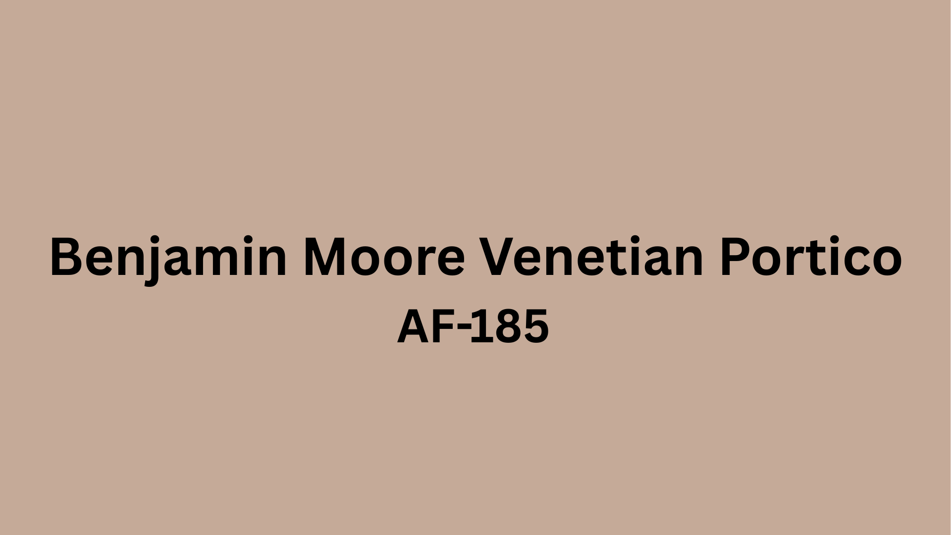
Have you been staring at your walls, wishing they had that perfect touch of warmth without going too bold? I was in the same spot until I found Benjamin Moore Venetian Portico.
This soft, sophisticated neutral caught my eye with its subtle warmth, which works in any room, regardless of the lighting.
What makes this shade so special? Unlike typical beige tones that can fall flat, Venetian Portico brings a rich depth that makes spaces feel both calm and luxurious. I’ve seen it completely change the way rooms feel, making small spaces appear larger and cold rooms instantly cozier.
Ready to see what this color can do for your home? I’ll show you how this remarkable neutral can work in your space, with real examples and practical tips for making it shine.
What Color Is Benjamin Moore Venetian Portico?
| Aspect | Details |
|---|---|
| Color Name | Benjamin Moore Venetian Portico |
| Description | Soft, warm beige with subtle pink and yellow undertones |
| Tone | Between cream and tan, neither too dark nor too light |
| Natural Light Appearance | Warm, cozy ambiance with a slight sunny glow |
| Artificial Light Appearance | Warm bulbs: pink undertones more visible, cozier feel Cool LEDs: neutral and balanced |
| Comparison to Other Colors | Lighter than Manchester Tan Warmer than Classic Gray Similar to Accessible Beige but slightly warmer |
| Best Qualities | Works as a neutral or standalone color; adds character without overpowering |
| Light Reflectance Value (LRV) | 41.94 |
| RGB Value | (196, 167, 150) |
Why Homeowners and Designers Love Venetian Portico
-
Works with any design style – Venetian Portico adapts beautifully to any home, whether it’s modern, traditional, farmhouse, or coastal. The warm beige tone creates a perfect backdrop for any décor choices.
-
Changes with the light – Many homeowners appreciate how this color subtly shifts throughout the day, remaining warm and inviting from morning to evening without becoming too yellow or pink.
-
Creates a calm atmosphere – Rooms painted in Venetian Portico often feel instantly more relaxing and welcoming, making it perfect for living areas, bedrooms, and spaces where you want to unwind.
-
Plays well with other colors – Designers appreciate how this neutral pairs easily with both bold accents and other subtle tones, making it versatile for whole-home color schemes.
-
Buyer-friendly choice – Real estate professionals recommend Venetian Portico for homes going on the market because potential buyers can easily imagine their furniture and lives fitting into the space.
-
Perfect for open-concept homes- The color flows seamlessly between connected spaces while maintaining interest through subtle light variations.
Where to Use a Venetian Portico in Your Home
Find out how Venetian Portico can transform every corner of your home from cozy living rooms to serene bathrooms with its warm, versatile charm and timeless elegance.
1. Living Room: The Heart of Connection
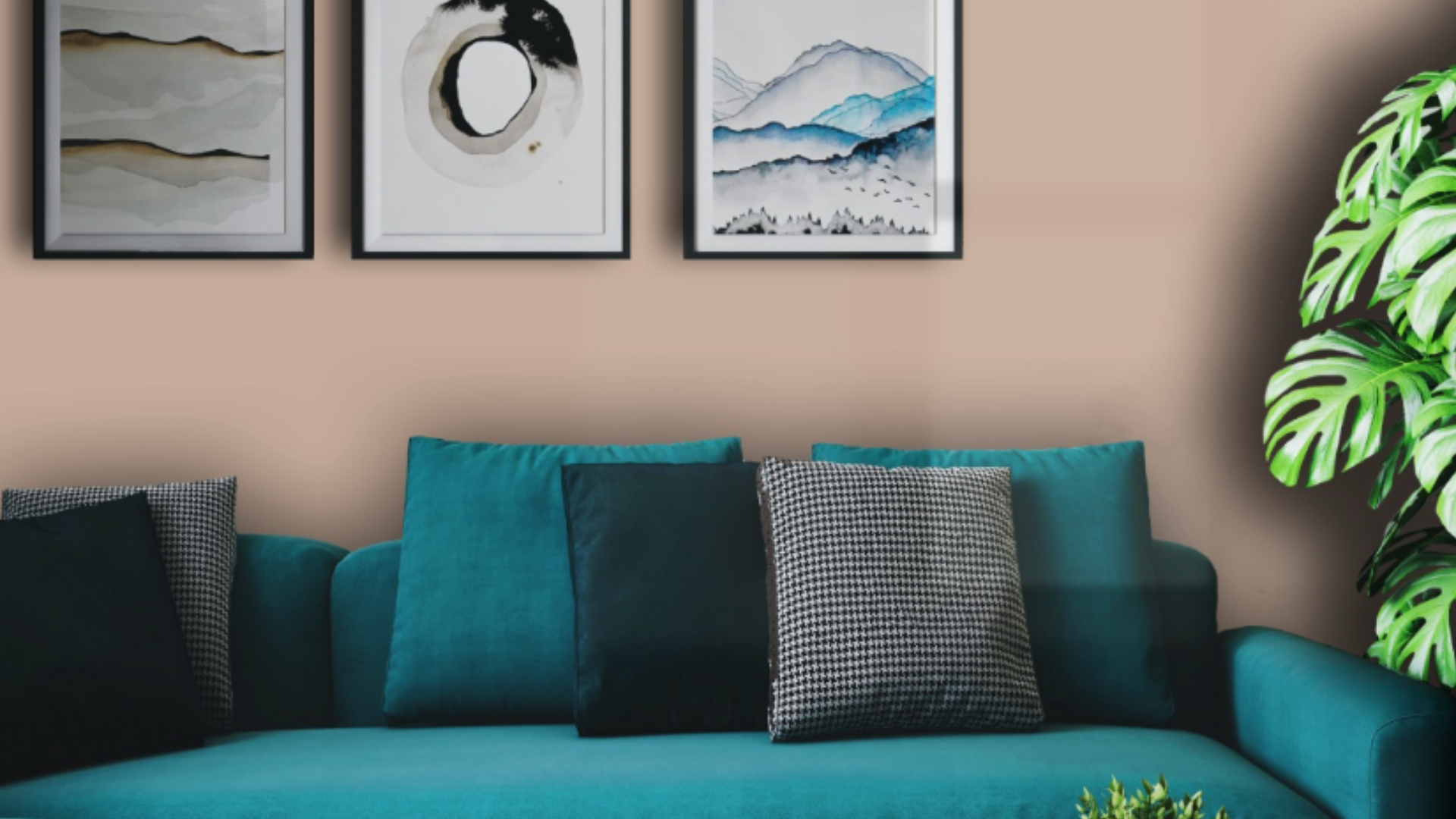
Venetian Portico is an ideal paint color for living rooms and gathering spaces, thanks to its warm and welcoming tone. It adds a cozy feel to larger rooms, making them feel more intimate, while also giving smaller spaces a sense of openness and airiness.
Its balanced undertones work wonderfully with natural light, enhancing the overall mood of the room. This versatile neutral pairs effortlessly with a wide range of furniture styles and materials, from soft fabrics to rich leather, without clashing with your existing décor.
It creates a harmonious, comfortable environment perfect for relaxing or entertaining guests.
2. Bedroom: Your Retreat
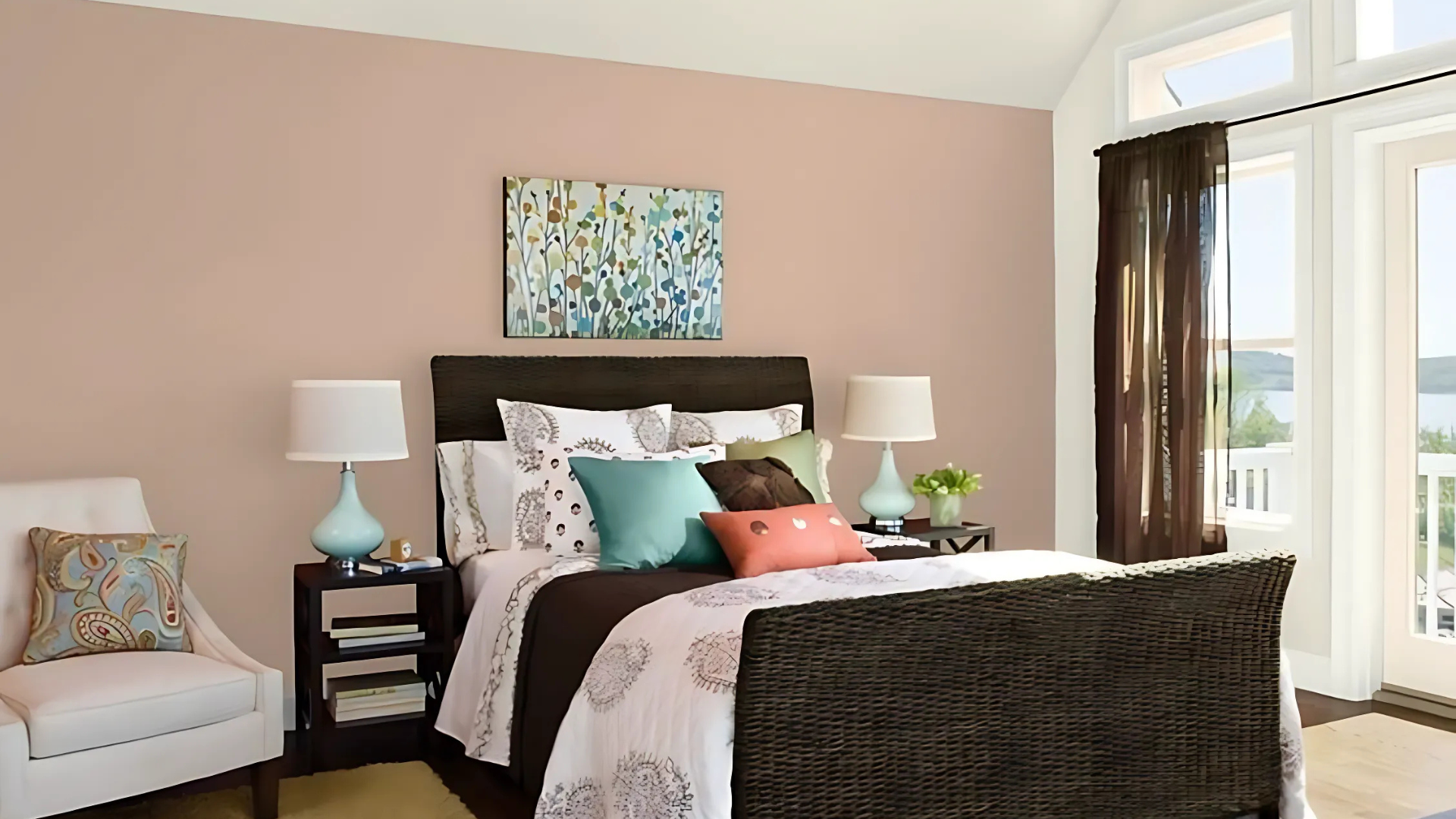
The naturally soothing quality of this color makes it an ideal choice for bedrooms where relaxation is a priority. Its warm undertones promote a sense of calm while being neutral enough not to interfere with sleep or feel too stimulating.
Pairs beautifully with white bedding for a crisp, hotel-like feel that retains warmth and comfort throughout the seasons.
3. Kitchen: The Busy Hub
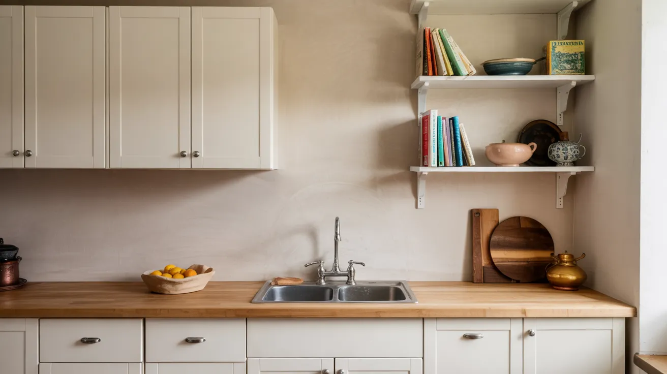
In the kitchen, Benjamin Moore’s Venetian Portico provides a soft, elegant backdrop that complements the beauty of white cabinetry and pairs seamlessly with natural wood elements. Its warm undertones prevent the space from feeling too stark or sterile, adding a welcoming and balanced touch.
For those looking to make a bolder design statement, using Venetian Portico on kitchen cabinets themselves creates a cozy, modern aesthetic.
Unlike bright whites or deep colors, it helps conceal everyday splatters and fingerprints, making it both stylish and practical. This versatile neutral truly elevates the heart of the home with warmth and sophistication.
4. Bathroom: A Spa-Like Experience
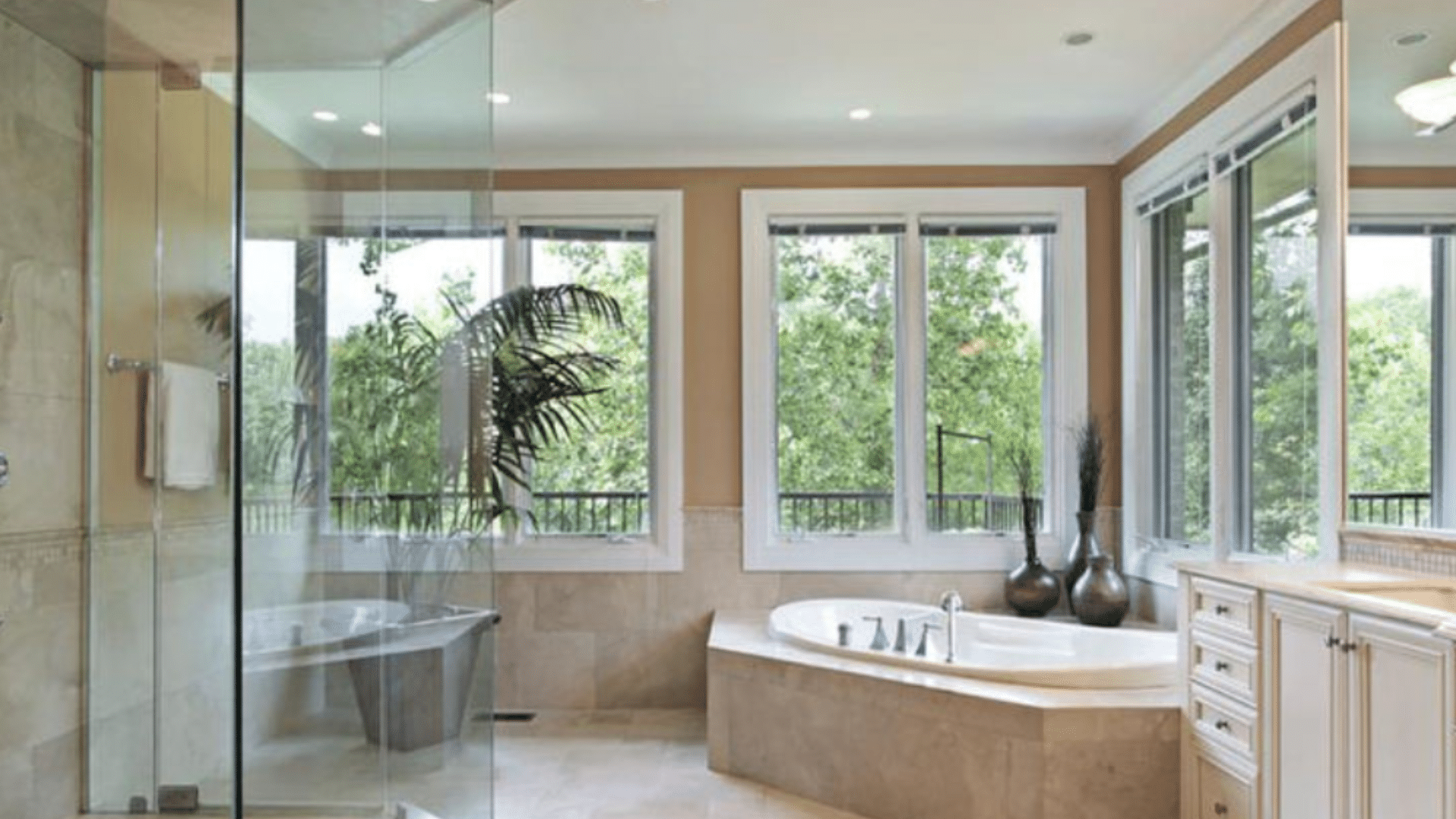
Benjamin Moore’s Venetian Portico is an exceptional choice for bathrooms, offering the perfect balance between warmth and elegance. Unlike stark whites or cool grays that can make a space feel sterile, this soft neutral brings a gentle, inviting glow that enhances the bathroom’s ambiance without overwhelming it.
One of the standout features of Venetian Portico is its subtle pink and beige undertones, which contribute to a flattering, almost radiant effect on skin tones. This makes it an especially smart choice for powder rooms, where guests often freshen up and check their reflection.
The wall color actually complements natural skin hues, making people look and feel their best. In master bathrooms, this warm tone creates a soothing environment ideal for both energizing mornings and calming evening routines.
5. Hallways and Entryways: First Impressions Matter
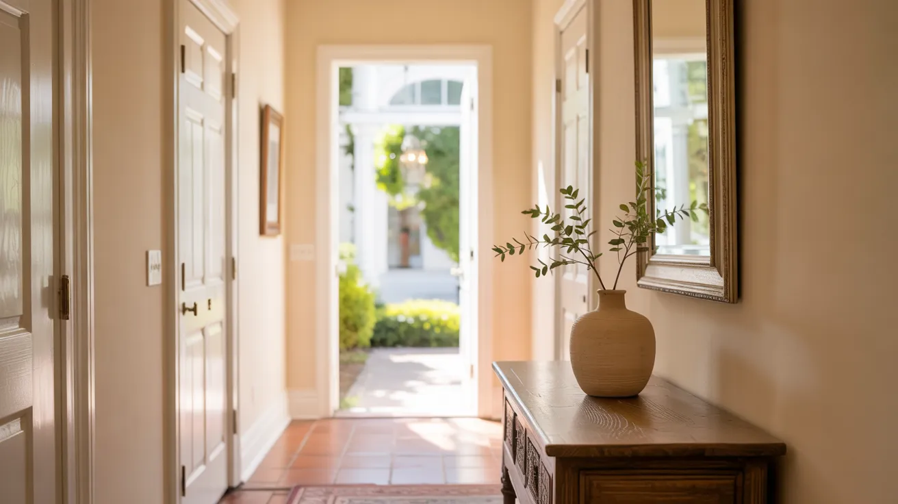
Venetian Portico works beautifully in connecting spaces such as hallways, stairwells, and entryways, areas often overlooked in home design. Its warm, neutral tone helps unify different rooms, creating a smooth, seamless flow from one space to the next.
In typically narrow or dimly lit passages, this color adds a sense of depth and warmth without overwhelming the space. Its soft undertones reflect available light, brightening up darker corners and making the area feel more welcoming and intentional.
Rather than serving as just a transition, these spaces become an elegant extension of the home’s overall aesthetic with Venetian Portico.
Best Coordinating Colors for Venetian Portico
-
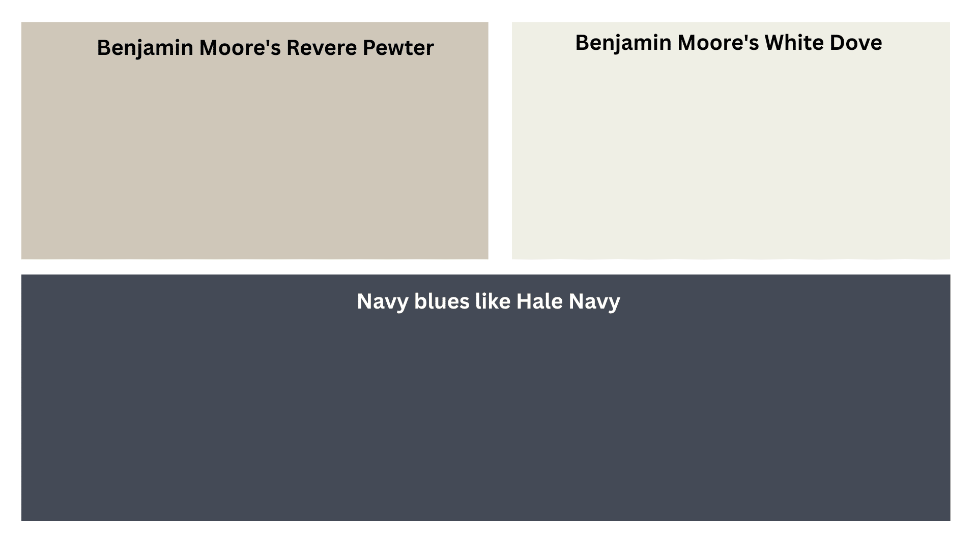
Perfect White Companions – Benjamin Moore’s White Dove (OC-17) pairs beautifully with Venetian Portico for trim and ceilings, offering a soft white that complements without harsh contrast. For a crisper look, try Simply White (OC-117), which creates more definition while maintaining a harmonious feel.
-
Coordinating Neutrals for Layering – Create depth by pairing Venetian Portico with Benjamin Moore’s Revere Pewter (HC-172) for a sophisticated beige connection, or Manchester Tan (HC-81) for a slightly deeper version of the same color family.
-
Bold Accent Colors That Pop – Navy blues, such as Hale Navy (HC-154), create classic contrast that feels both timeless and fresh against Venetian Portico. For a more unexpected pairing, try Caldwell Green (HC-124) for a nature-inspired palette, or Passionate Plum (2073-30) for a rich accent that brings out the subtle pink undertones.
Pro Tips for Painting With Benjamin Moore Venetian Portico
1. Test Before Committing
Paint at least two coats of Venetian Portico on a large poster board (minimum 2 ‘ x2’) and move it around different walls in your room. Check how it looks in morning, afternoon, and evening light before making your final decision.
2. Consider Your Existing Elements
Take stock of the fixed features, such as flooring, countertops, and large furniture pieces, that will remain in the space. Venetian Portico works best with warm-toned elements rather than cool grays or blues.
3. Proper Wall Preparation
For the truest color representation, start with clean, smooth surfaces. Fill holes, sand rough spots, and apply a quality primer, especially when covering darker colors or stains. Benjamin Moore’s Fresh Start primer creates an ideal base.
4. Lighting Makes a Difference
The Venetian Portico can appear slightly different depending on your light bulbs. Warm bulbs (2700-3000K) enhance its cozy undertones, while cooler bulbs (3500-4000K) might make it appear more neutral.
5. The Right Formula
Benjamin Moore offers Venetian Portico in several formulations. Regal Select is ideal for most living spaces due to its washable finish, while Aura offers superior coverage and color depth for high-traffic areas.
You can also check out the official site for Benjamin Moore Venetian Portico-
https://www.benjaminmoore.com/en-us/paint-colors/color/af-185/venetian-portico
Wrapping It Up
Benjamin Moore Venetian Portico stands out as a truly flexible neutral that works hard in any home. This warm beige with slight pink and yellow hints brings comfort to rooms without overwhelming them.
From living rooms to bathrooms, this color shines in various settings and lighting conditions. It pairs well with crisp whites, such as White Dove, deeper neutrals like Revere Pewter, and bold accents like Hale Navy.
Remember to thoroughly test the color in your space before making a commitment. Check it in morning, afternoon, and evening light on different walls to see how it shifts throughout the day.
With proper prep work and quality tools, Venetian Portico can give your home that pulled-together look that feels both fresh and timeless. This friendly neutral might be the perfect shade you’ve been searching for.
