
Have you ever walked into a room and felt an instant sense of calm?
That’s the power of the perfect paint color. Breathless by Sherwin-Williams caught my eye when I was searching for a shade that could recast my chaotic home office into a peaceful retreat.
This soft blue-gray doesn’t just coat walls, it creates an atmosphere. I’ve seen it shift subtly throughout the day, from cool morning tones to warm evening hues, adapting to natural light in ways that still amaze me.
What makes Breathless truly special is its versatility. It pairs beautifully with both warm and cool accents, making it an ideal choice for any space that needs a touch of tranquility.
Ready to find out how Breathless can change your space? Let me show you how.
What Is Breathless by Sherwin-Williams?
| Aspect | Details |
|---|---|
| Color Name | Breathless |
| Code | SW 6022 |
| Description | Soft blue-gray with subtle lilac undertones; evokes a peaceful, airy feeling. |
| Tone on Color Wheel | Cool spectrum between blue and gray |
| Type | Muted Lilac-Pink |
| Designer Notes | A “chameleon color” that pairs with both warm and cool tones |
| Homeowner Appeal | Calm and characterful; not cold or sterile |
| Light Reflectance Value (LRV) | 57 |
| RGB Value | 214 / 194 / 190 |
How Breathless Sets the Mood: The Psychology Behind This Hue
Colors affect us more than we realize, and Breathless has a way of working its magic on our emotions without us even noticing. When guests walk into a room painted in this hue, they often comment on feeling instantly relaxed without understanding exactly why.
That’s because blues like Breathless tap into our brain’s natural response to the colors of twilight and early dawn, when our bodies naturally begin to unwind. The subtle lilac undertones add a touch of warmth that prevents the coolness from feeling too stark or clinical.
This balance makes Breathless perfect for spaces where both calm and inspiration are desired. In bedrooms, it promotes restful sleep while still conveying a sense of grown-up sophistication. For nurseries, it creates a gentle and soothing environment without screaming “baby room.”
And in creative spaces? The color seems to open up mental space for new ideas while keeping distractions at bay.
Rooms painted in Breathless often become the ones where people linger longer, curling up with a book, having deeper conversations, or simply taking a moment to breathe. It’s subtle enough to be a background player but has just enough personality to make a space feel thoughtfully designed.
Where to Use Breathless? Room by Room Inspiration
Breathless works beautifully throughout the home, but each space can showcase this versatile color in different ways. Here’s how to make the most of this soft blue-gray in every room.
1. Living Rooms: Creating Subtle Sophistication
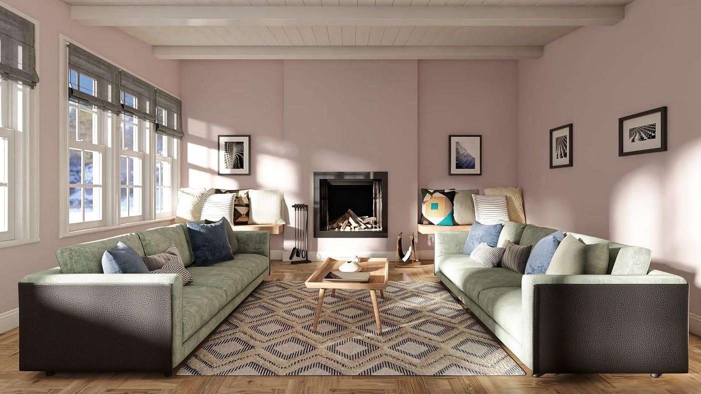
In living spaces, Breathless shines as an accent wall behind a gallery display or bookshelf. The color recedes slightly, making artwork and decorative objects stand out without competing for attention. For a cohesive look, carry small touches of the color through accessories like throw pillows or vases.
Pair with natural wood tones and cream upholstery for a timeless, welcoming atmosphere that never feels too trendy or dated.
2. Bedrooms: The Ultimate Sleep Sanctuary
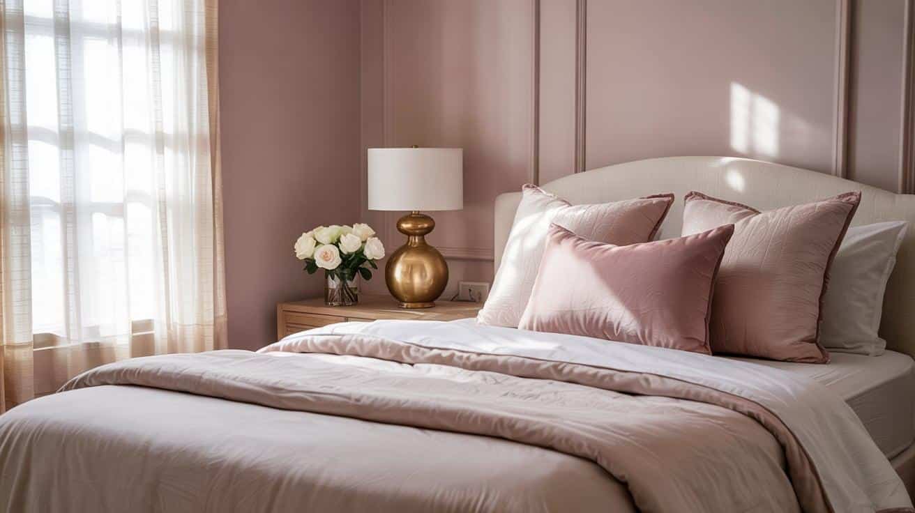
Covering all four walls in Breathless transforms bedrooms into tranquil retreats. The color seems to shift throughout the day, cooler in morning light and warmer as evening approaches, creating a space that always feels right.
For the most restful environment, combine with soft whites in bedding and window treatments. Add texture through knitted throws, velvet pillows, or a jute rug to prevent the room from feeling flat.
3. Bathrooms: Your Home Spa Experience
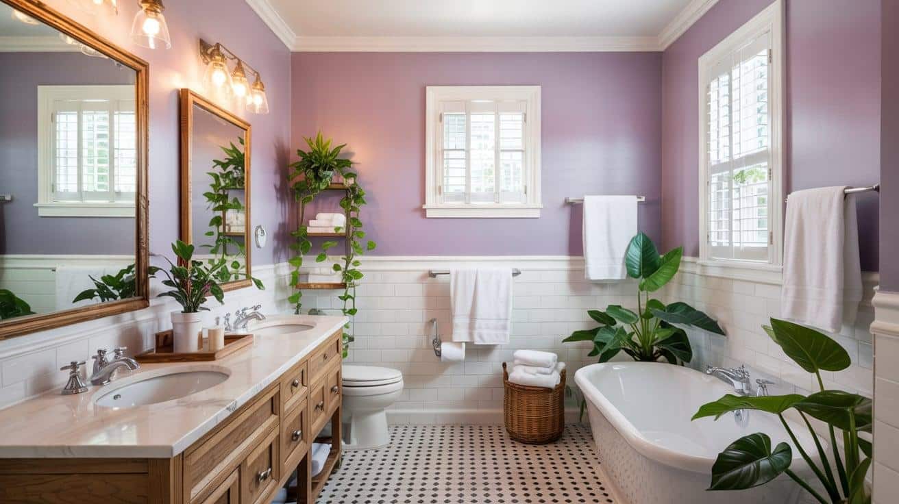
Bathrooms painted in Breathless instantly feel more spacious and serene. The color reflects light beautifully, especially when paired with white fixtures and plenty of mirror surfaces.
For a truly spa-like atmosphere, incorporate natural elements such as wooden bath accessories, stone countertops, and lush green plants that thrive in humid environments.
4. Nurseries and Kids’ Rooms Growing Up Gracefully
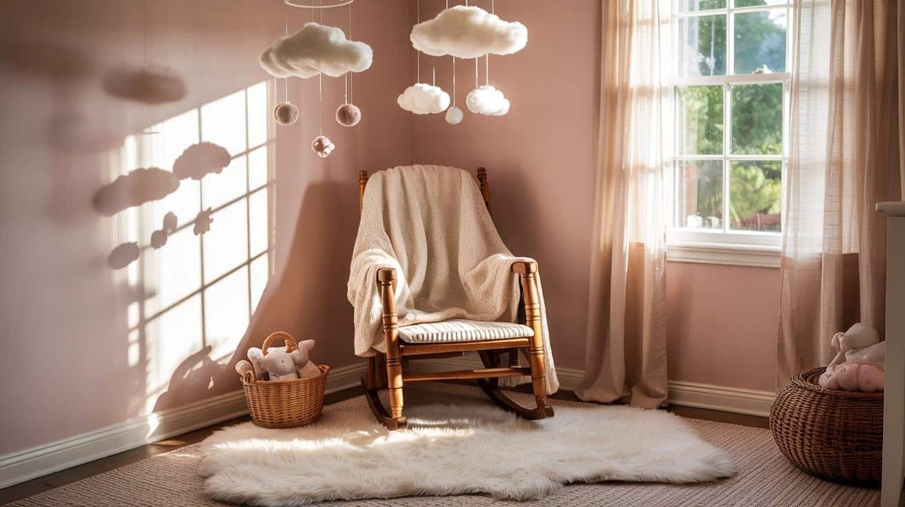
Unlike typical baby blues or pinks, Breathless offers a sense of longevity in children’s spaces. It creates a calm background for infants while being sophisticated enough to grow with children through their teen years.
For nurseries, pair with soft whites and natural wood furniture. As children grow, the color adapts beautifully to changing interests and decor styles, eliminating the need for a complete room makeover.
Pairing Breathless: Color Combinations That Truly Shine
Breathless creates a beautiful foundation, but its true magic appears when paired with complementary colors. Here are some tested combinations that make this subtle hue truly stand out.
1. Complementary Sherwin-Williams Shades
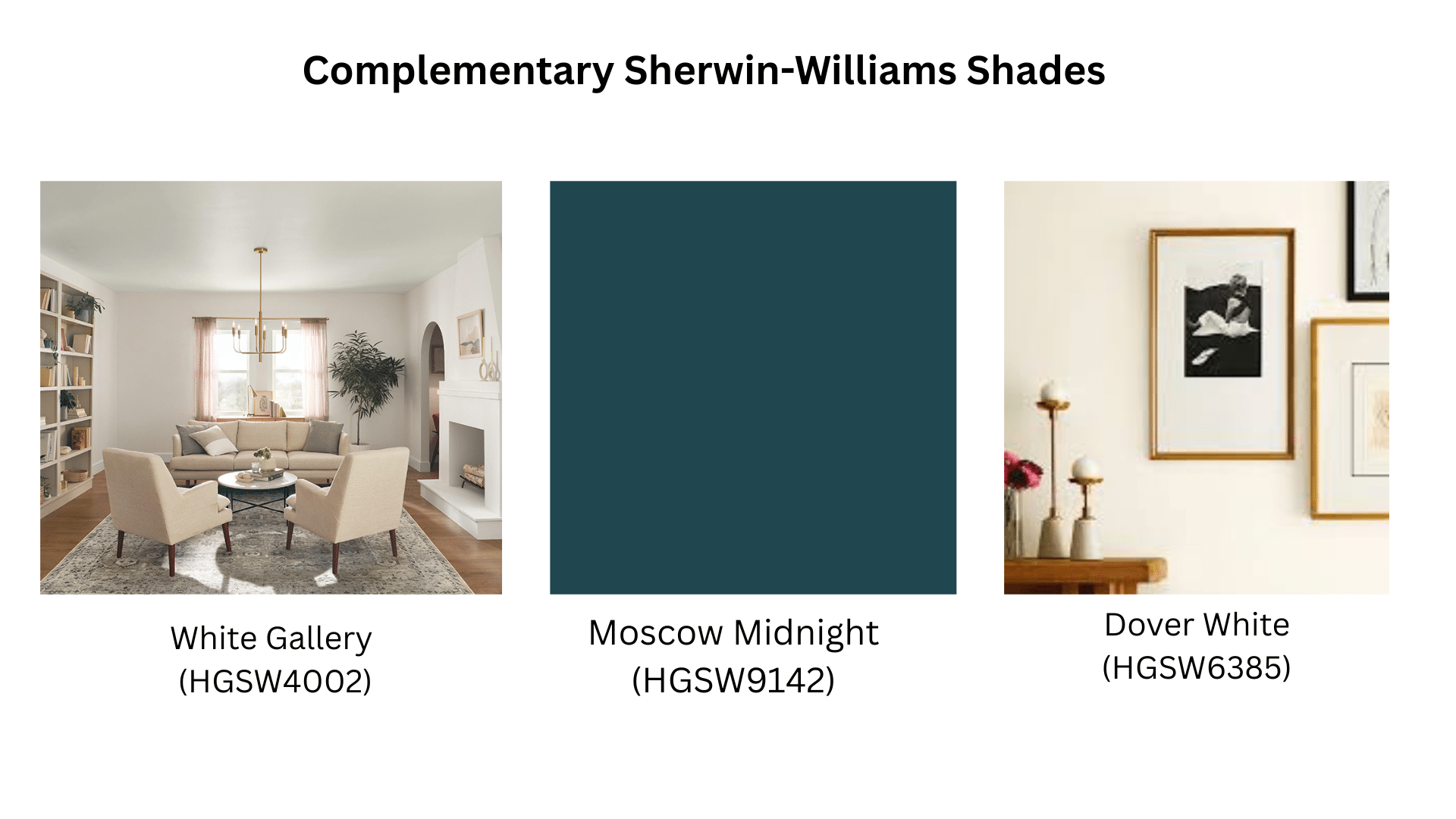
The perfect companions to Breathless include
White Gallery (HGSW4002): This clean, crisp white creates a fresh contrast against Breathless without feeling stark or clinical. Perfect for trim, ceilings, and cabinetry.
Dover White (HGSW6385): With its warmer, creamier undertones, Dover White softens the palette, creating a cohesive look that feels both elegant and welcoming. Works beautifully on adjacent walls or built-ins.
Moscow Midnight (HGSW9142): This deep, saturated navy creates dramatic contrast when used as an accent color with Breathless. Try it on a single accent wall, furniture pieces, or decorative elements.
2. Neutral Pairings
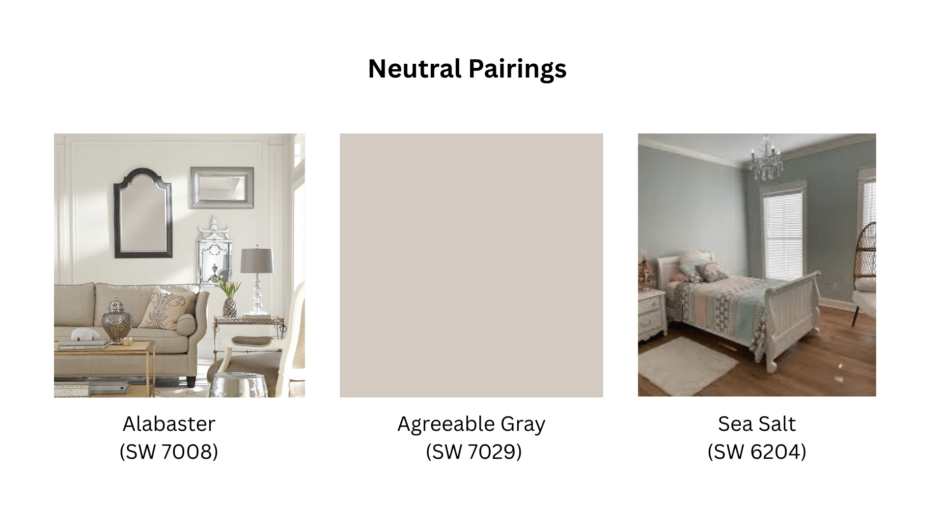
For a serene, harmonious space
- Alabaster (SW 7008): A versatile off-white that enhances Breathless’s subtle undertones
- Agreeable Gray (SW 7029): Creates a sophisticated neutral backdrop
- Sea Salt (SW 6204): Adds a touch of green-gray that complements without competing
3. Bold Pairings
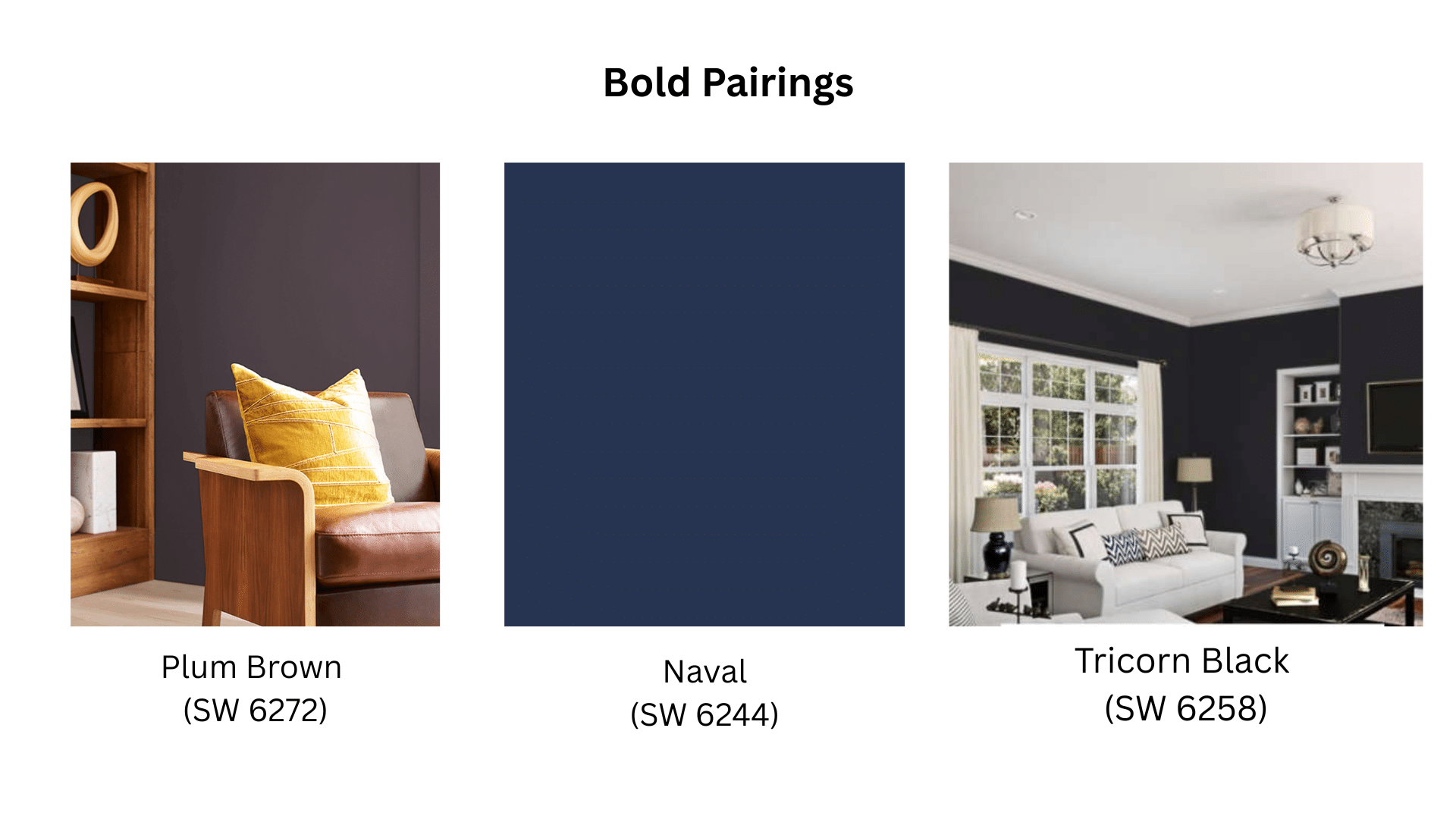
For spaces with more personality
- Plum Brown (SW 6272): A deep mauve that brings out the lilac undertones in Breathless
- Naval (SW 6244): Creates a striking contrast that feels both modern and timeless
- Tricorn Black (SW 6258): Adds definition and drama while letting Breathless remain the star.
Designer Tips for Decorating with Breathless Like a Pro
Breathless is a forgiving color, but a few expert techniques can elevate it from simply pretty to truly stunning. Here’s how design professionals make the most of this versatile hue.
1. Selecting the Perfect Finish
The finish you choose dramatically affects how Breathless appears on your walls.
| Finish Type | Look & Feel | Best For |
|---|---|---|
| Matte | Soft, velvety texture; hides imperfections; adds depth | Bedrooms, living rooms, serene spaces |
| Eggshell / Satin | Slight sheen; easier to clean; balances softness and durability | Kitchens, bathrooms, kids’ rooms |
| Semi-Gloss | High durability, reflects light, more vibrant | Trim, doors, and accent furniture pieces |
2. Lighting: The Game-Changer
Breathless remakes are dramatically different under different lighting conditions.
| Lighting Condition | How Breathless Appears | Design Tips |
|---|---|---|
| North-Facing Rooms | Cooler, slightly blue-toned | Use warm metals (brass) and wood to add warmth |
| South-Facing Rooms | More balanced, subtle gray undertones in bright sunlight | Keep decor neutral to maintain softness |
| Artificial Lighting | Warm bulbs (2700–3000K) enhance softness; cool bulbs sharpen it | Choose bulb warmth based on desired mood (cozy vs. crisp) |
3. Texture: Adding Dimension
Because Breathless is subtle, texture becomes essential for creating interest.
| Element | Suggestions | Effect |
|---|---|---|
| Hard Surfaces | Honed marble, brushed metals, natural woods | Adds visual depth while keeping the space refined |
| Textiles | Linen curtains, wool throws, velvet pillows, natural fiber rugs | Creates warmth and a layered, cozy feel |
| Wall Treatments | Flat paint for main walls, or try textured wallpaper or faux finishes as accents | Enhances visual interest without overpowering the softness |
You can also check out the official site for Breathless Sherwin-William:
https://www.sherwin-williams.com/en-us/color/color-family/red-paint-colors/sw6022-breathless
Wrapping It Up
Breathless by Sherwin-Williams offers more than color it creates mood, shapes spaces, and brings peace to your home. This soft blue-gray works in any room, from bedrooms to bathrooms, with its rare ability to complement both warm and cool tones.
Remember to test samples in your space at different times of day. The right finish matters too, matte for low-traffic areas and satin where durability counts. Add texture through fabrics and natural materials to make the color truly shine.
Ready to try Breathless in your home? Begin with a small project, such as a bathroom or accent wall. Take photos of your space before and then compare after painting to see the remarkable difference this subtle color makes.
Share your Breathless makeover photos in the comments. I’d love to see how this color works in your home!
