

Finding the perfect red paint for your home can feel hard. Many reds seem too bright or clash with other colors in your rooms. I know this struggle well.
I can help you bring true warmth to your home with Sherwin-Williams Rustic Red, a soft, dark red that looks great on exteriors and accent walls. This color adds depth without being loud.
In this post, I’ll show you what makes Rustic Red special with real home examples. You’ll learn where this color fits best (and where to skip it), which trim colors work well with it, and how to test it in your own space.
Let’s find out if this lasting red is the right choice for your home.
Why Choose Rustic Red for Your Home?
Rustic Red brings real warmth to any home. When applied to walls, this color creates a cozy atmosphere that encourages people to stay longer. It’s not a passing trend but a color with staying power.
I’ve seen this rich, red look work well year after year in many homes. It suits both traditional and modern homes, making it a versatile choice for most design plans. What stands out most is how well it works in natural settings.
If your home sits among trees or has stone features, Rustic Red looks right at home.
The color seems to connect with nature while still making your house stand out in a good way. It works with the outdoors rather than fighting against it, which is why so many homes in wooded areas look so good with this color.
Perfect Uses of Rustic Red in Your Home
1. Exterior Application
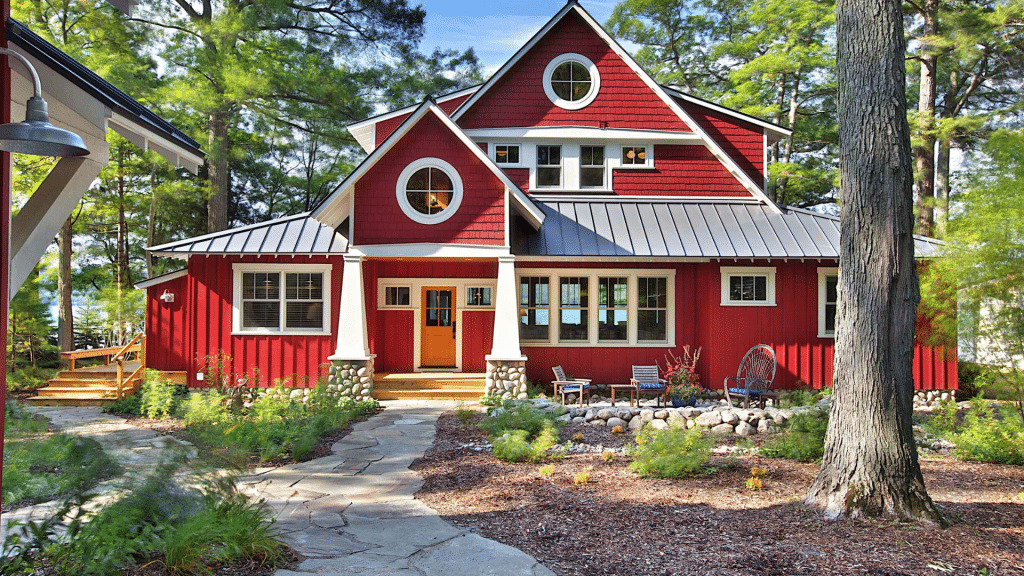
Rustic Red shines most on home exteriors. One striking example is a house that locals once called “the Mushroom House” due to its stark white color against the woods.
Once painted Rustic Red, the home blended more seamlessly with its surroundings while still standing out in a pleasing way.
The darker color made the house outline less harsh. What makes this color work so well outside is how it appears much brighter in natural light than on a paint chip.
2. Living Room
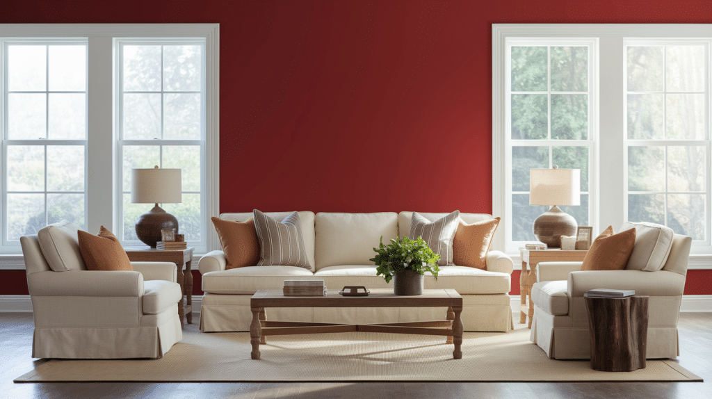
In bedrooms, Rustic Red offers a calm, restful feeling when used with care. Paint just the wall behind your headboard for a touch of warmth without making the space feel closed in.
This works best in rooms that get good morning or afternoon sun. For a complete look, pair with soft, cream-colored bedding and warm, wood-finished furniture. Avoid using this color in small bedrooms or ones with little natural light.
3. Kitchen
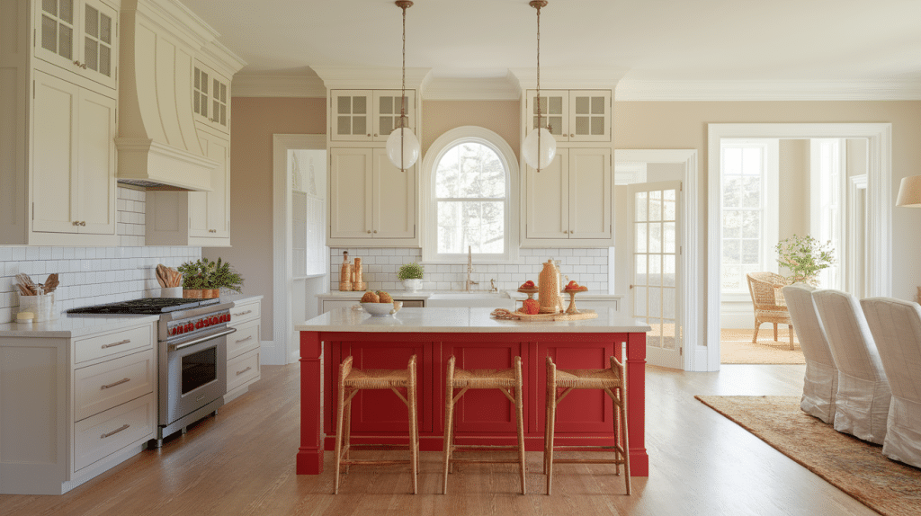
Rustic Red adds charm to kitchens without taking over the space. Try painting lower cabinets or just a kitchen island in this color while keeping upper cabinets light. This creates a grounded, warm feel without making the kitchen feel dark.
The red looks great against white stone counters and light wall colors. In open floor plans, this splash of color helps define the kitchen area while keeping the flow between spaces.
4. Bathroom
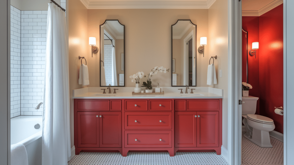
For bathrooms, Rustic Red works as a subtle accent rather than a main color. A small powder room can handle one red wall paired with white fixtures for a bold but classic look. In larger bathrooms, try a red vanity against neutral walls.
Make sure you have good lighting, as this color will seem darker in small spaces with few lights. Add plenty of white through towels and shower curtains to keep the space feeling fresh.
Rustic Red vs. The Rest: A Color Comparison
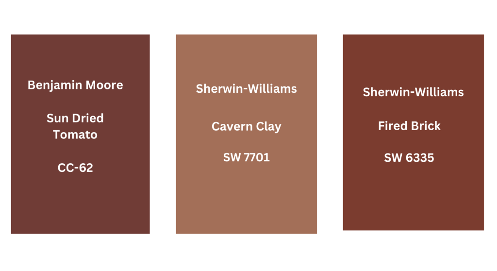
1. Rustic Red vs. Benjamin Moore Sundried Tomato
Rustic Red by Sherwin-Williams appears as a dark, muted red with brown undertones, creating a warm, earthy ambiance when used outdoors. Benjamin Moore’s Sundried Tomato appears slightly brighter with a subtle orange tint.
While both colors add warmth, Rustic Red stays quieter and fits well in natural or wooded settings. Sundried tomatoes stand out more and work well in spaces that need a splash of color or a more lively mood.
2. Rustic Red vs. Sherwin-Williams Cavern Clay
Sherwin-Williams Cavern Clay is a warm color with hints of orange and terracotta, evoking a southwestern feel. Rustic Red has a deeper red hue with subtle brown undertones, making it rich and vibrant.
Cavern Clay brings a sun-baked warmth, good for homes in dry climates. Rustic Red adds a cozy quality to homes situated near trees or in natural surroundings. Both colors work well with stone and wood, but create different feels based on their depth and hints.
3. Rustic Red vs. Sherwin-Williams Fired Brick
Sherwin-Williams Fired Brick is a classic red with a bright, slightly orange hint that makes it seem more lively and old-school. Unlike Rustic Red’s subdued brown tone, Fired Brick draws the eye and stands out.
This makes it good for focus walls in a room. Rustic Red blends more with natural settings, while Fired Brick makes a clear contrast when used in old-style spaces.
Pro Tips for Choosing the Right Red
Choose warm tones that complement Rustic Red, ensure smooth transitions, and trust your instincts over paint labels.
| Tip | Description |
|---|---|
| Consider the Feeling You Want to Create | When picking warm tones to go with Rustic Red, think about the feeling you want to create. |
| Choose Warm Light Beiges or Greiges for Trim | For trim colors, warm light beiges or greiges with LRVs between 60-70 work best. Pure whites can look too stark against this rich red. |
| Pay Attention to the Flow Between Rooms | For a full color scheme, consider the flow between rooms. Will your Rustic Red space connect to other colored rooms? Make sure the transition feels natural. |
| Reds Tend to Intensify in Large Areas | Reds tend to intensify in large areas, so what looks subtle on a sample might feel stronger on an entire wall. |
| Trust Your Eyes More Than the Paint Name | Trust your eyes more than the paint name or description when making your final choice. |
Conclusion
Choosing the right red for your home matters. Rustic Red offers a warm, lasting color that works well in many settings. This rich tone brings comfort to spaces when used correctly.
Remember these key points: test this color in your specific lighting, use it on exteriors or as accent walls, pair with warm whites like Grecian Ivory, and balance with light neutrals.
Is Rustic Red right for you? Consider your home’s setting, the light in your rooms, and how this color makes you feel. The perfect red should feel like it belongs.
What will you do with this information? Perhaps buy a sample to test on your walls? Or start planning that accent wall?
Whatever you choose, take your time finding the red that feels just right for your home.