Living with pink walls used to make me nervous. Like many of my clients, I thought pink paint belonged in nurseries or little girls’ rooms.
But Farrow & Ball’s Sulking Room Pink changed my entire perspective on using this shade in my home.
Here’s the good news: This sophisticated pink shade moves beyond the usual associations, offering a refined option for every room in your house.
Its muted tones carry hints of brown and gray, making it a surprisingly versatile choice for modern and traditional spaces.
In this post, I’ll share honest insights about decorating with Sulking Room Pink, including the best lighting conditions for this color, foolproof color combinations, and real examples from my own projects and client homes.
The Evolution of Pink in Design
I often tell clients about a pivotal day in my design career – when I realized pink had completely transformed. Gone were the candy-bright shades that once dominated.
In their place, I found sophisticated pinks with depth and complexity.
Today, I’m adding pink to unexpected places. The kitchen islands I’ve painted in Sulking Room Pink always spark joy in my clients’ faces.
Living rooms draped in this shade feel both fresh and familiar. Even office spaces benefit from its calming presence.
The most fascinating part? This isn’t new at all.
Looking back at old Victorian homes, I spot these muted pinks everywhere. They graced the walls of quiet reading rooms and intimate social spaces. It’s not a trend – it’s a return to something that always worked beautifully.
Why Pink for a Sulking Room?
When I first suggested pink paint to my clients, they often raised eyebrows. But times have changed.
Pink has moved beyond the usual sweet and delicate looks we associate with children’s rooms. Today’s pinks, particularly Farrow & Ball’s Sulking Room Pink, bring a subtle sophistication to any space.
The color takes its name from French boudoirs – those quiet rooms where people would step away for a moment of peace.
This historical connection makes sense when you see how Sulking Room Pink works in a space – it’s a muted rose shade that feels grown-up and refined, not sugary or bright.
I’ve noticed something interesting in rooms painted with this color – people tend to linger longer and settle more comfortably into conversations.
The warmth in this pink creates a gentle, calming atmosphere that makes sense for spaces where you want to unwind.
How Sulking Room Pink Fits in Modern Interiors
I’ve watched this color adapt beautifully from historical homes to city apartments.
It nods to the building’s heritage in Victorian properties – these homes often featured similar shades. In modern spaces, it adds character without overwhelming the room.
This shade’s ability to shift through the day makes it stand out. Morning light might show its warmer tones, while evening light brings out its subtle gray undertones.
This quality helps it work like a neutral while still adding interest to your walls.
I’ve used this pink in rooms with mid-century furniture, paired it with vintage finds, and watched it complement modern minimalist pieces.
Its depth allows it to hold its own with dark woods, while its softness works beautifully with lighter finishes and natural materials.
Sulking Room Pink’s Unique Aesthetic Qualities
The magic of this color lies in its changeability. In my own home, I’ve watched it shift from a soft rose in morning light to a deeper mauve by evening.
The mix of undertones – that subtle blend of pink, brown, and gray – makes it fascinating to live with.
From countless client projects, I’ve found this shade pairs perfectly with specific colors:
- Rich navy blues add depth
- Muted greens create balance
- Warm whites keep things fresh
- Dark woods bring sophistication
The texture choices matter just as much as color. I love seeing this pink with:
- Natural linen curtains
- Warm wooden furniture
- Woven rattan pieces
- Aged brass hardware
- Crisp white trim
Best Ways to Incorporate Sulking Room Pink
Let me tell you what I’ve learned after painting countless rooms in this shade. For full walls, I find it shines brightest in spaces where you spend time relaxing – think living rooms and bedrooms.
The color creates a soft backdrop that you’ll want to sink into your sofa at day’s end.
For subtle touches, I often suggest painting built-in shelves or window frames. My recent favorite? A client’s kitchen island in Sulking Room Pink against white cabinets became the perfect focal point without taking over the space.
Regarding lighting, here’s what I’ve noticed in my home: morning sun brings out the warmth, while afternoon light shows off its muted side.
Position your lighting thoughtfully – I prefer soft, warm bulbs that highlight the color’s cozy qualities.
Styling Tips for Different Pink Sulking Rooms
1. Living Room
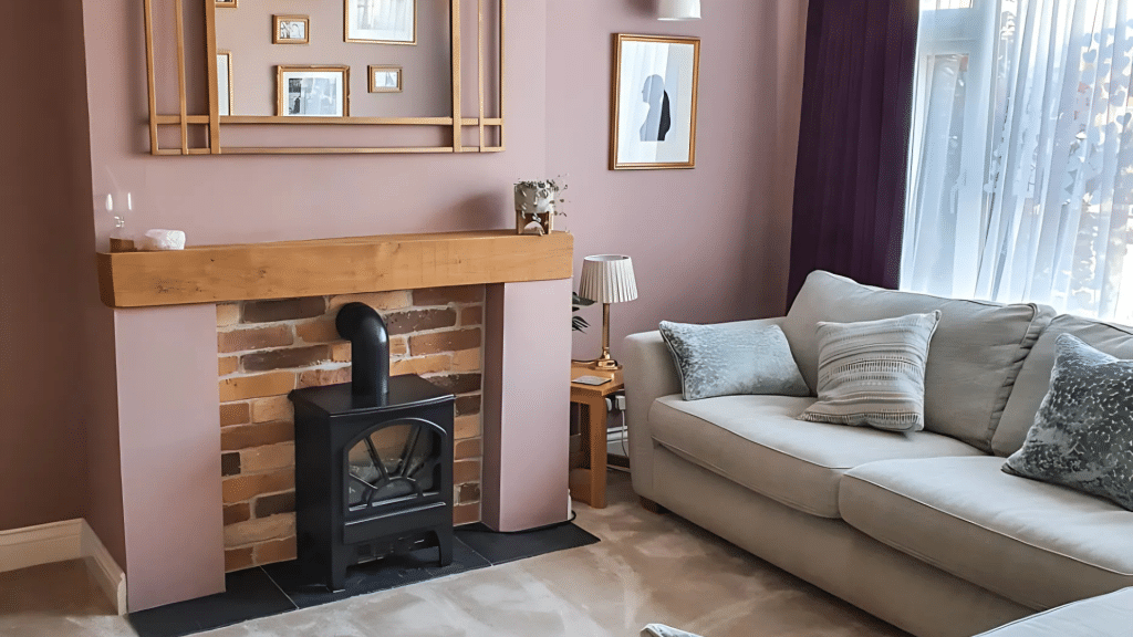
I love pairing deep blue beige chairs with pink walls in the Sulking Room.
Add brass floor lamps, textured cushions, and maybe an old oil painting – the mix feels collected and personal. The key? Keep larger furniture pieces in neutral tones.
2. Bedroom
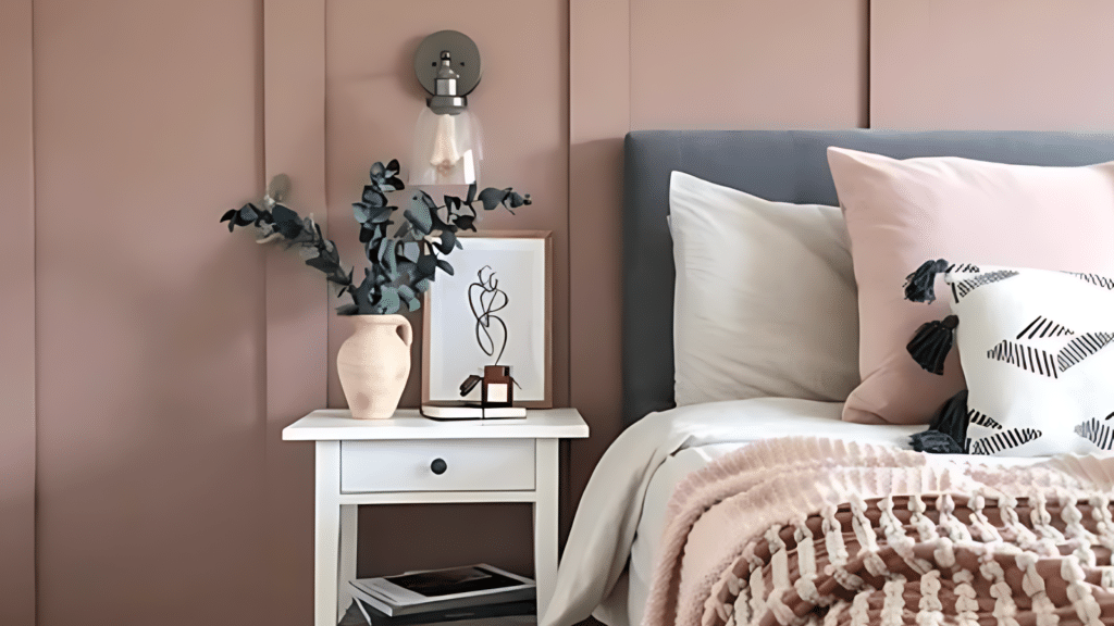
Here’s a tip from my bedroom makeover: layer white linens with natural textures like linen and wool. I added vintage brass sconces and a woven rattan headboard – the mix feels both fresh and timeless.
3. Bathroom
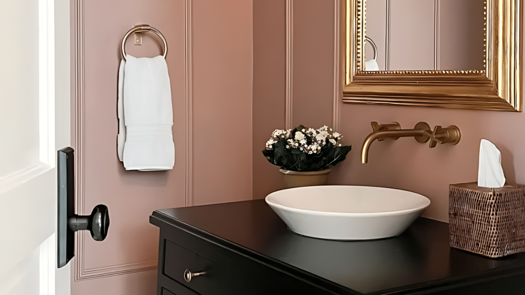
In smaller bathrooms, this color makes the space feel larger and warmer. I pair it with:
- White porcelain fixtures
- Brushed brass taps
- Simple pink tiles
- Natural stone accents
4. Kitchen
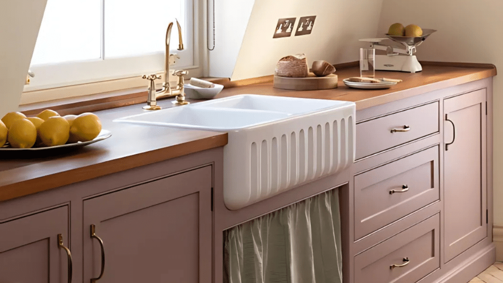
The most striking kitchen I designed featured Sulking Room Pink lower cabinets with:
- Light wooden countertops
- White upper cabinets
- Golden iron hardware
- Cream backsplash tiles
5. Entryway
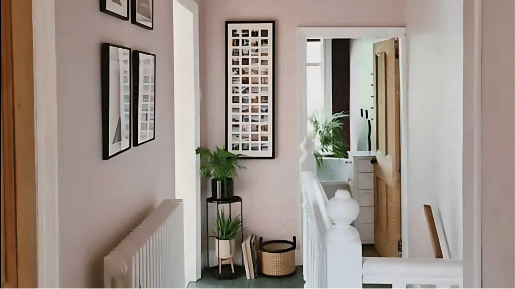
For welcoming spaces, I suggest:
- A large mirror to reflect light
- Simple pendant lighting
- Natural fiber rugs
- Black and white photographs
- A wooden console table
Breaking the Misconceptions About Pink
I remember a client’s hesitation when I suggested Sulking Room Pink for his home office. “Won’t it feel too soft?” he asked.
Six months later, he told me it was the most productive room in his house. The color created the perfect balance – structured yet calming.
Let me share what changed his mind: this pink has enough gray and brown undertones to feel substantial.
Think of it like a warm neutral with a rosy glow. It felt as serious as any traditional office color in his space, paired with leather chairs and dark wood shelving.
From experience, I can tell you that this shade stands strong years after application. Unlike brighter pinks that might feel dated, this muted tone ages gracefully.
I painted my dining room five years ago, and it still draws compliments from first-time visitors.
Designer-Approved Combinations and Alternatives
When clients ask about creating impact, I often suggest painting everything – walls, trim, even the ceiling – in Sulking Room Pink. I used this technique in my reading nook, and the result feels like being wrapped in a cozy blanket.
Here are my tested color combinations:
- Deep charcoal for contrast
- Sage green for nature-inspired harmony
- Warm whites to brighten
- Dark navy for sophistication
Looking for similar options? I’ve found these alternatives work beautifully:
- Setting Plaster (warmer, with more terracotta undertones)
- Peignoir (cooler, with a hint of gray)
- Cocoa Berry (deeper, with more mauve notes)
The key? Test samples in your space. I always tell clients to watch how the colors change throughout the day before making their final choice.
Why Sulking Room Pink Is a Worthy Choice
After painting hundreds of rooms, I can tell you that finding a color that balances comfort with style isn’t easy.
Yet Sulking Room Pink manages this beautifully. In my kitchen, I’ve noticed how it creates a welcoming atmosphere during morning coffee and still maintains its sophistication during dinner parties.
The color changes personality throughout the day – a quality I find fascinating.
At sunrise, it feels fresh and optimistic. By evening, it turns moodier, creating an intimate setting for gatherings. Unlike flat, one-dimensional colors, this shade keeps revealing new sides of itself.
What do I love most? It makes a statement while staying livable. I’ve yet to have a client tell me they’ve tired of it – if anything, they often end up painting more rooms in this shade.
Tips for Sampling and Testing
Here’s my tried-and-true method for testing this color:
Paint large sample boards (at least 2 feet square) instead of small patches. I learned this the hard way – tiny swatches don’t tell the whole story. Move these boards around different walls throughout the day.
Consider your lighting:
- North-facing rooms: The color appears cooler
- South-facing rooms: Brings out warmer undertones
- Artificial lighting: Use warm bulbs to enhance the rosy glow
Test it against your existing items:
- Hold up your fabrics
- Place artwork nearby
- Check how it looks with your furniture
Taking this step has saved my clients from second-guessing their choices. Yes, it takes extra time, but I’ve found it’s the surest way to be confident in your color decision.
Conclusion
After living with Sulking Room Pink in my own home and using it in countless client projects, I appreciate how this shade offers something rare – a color that feels both bold and livable.
Its subtle mix of rosy warmth and muted undertones creates spaces in which people genuinely want to spend time.
The key lies in understanding your space and testing thoroughly before committing.
Start with a sample board, watch how the color shifts through different times of day, and consider how it works with your existing furnishings.
Ready to make your decision? Remember: the right color isn’t just about trends or rules – it’s about creating a space that feels true to you.