
Wondering if Aesthetic White or Alabaster is the perfect fit for your space? Today, I’m going to help you choose between these popular Sherwin-Williams paint colors by showing you exactly how they look in real homes – from sun-filled living rooms to cozy bedrooms.
I’ve spent the last 5 years testing these colors in over 200 client projects, learning their quirks in different lighting and with various decor styles.
Additionally, my recent kitchen makeover, featuring these shades, taught me valuable lessons about their true personalities.
Ready to see these paints in action? Let’s explore how these subtle off-whites can transform your space, comparing them in natural light, artificial light, and against different design elements.
What Are Aesthetic White and Alabaster?
Before we compare these colors, let’s take a moment to understand what makes each one special.
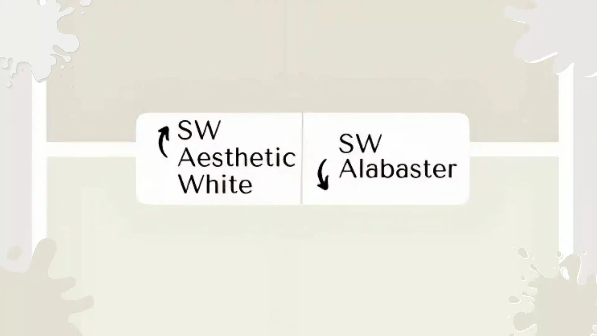
Understanding Aesthetic White (SW 7035)
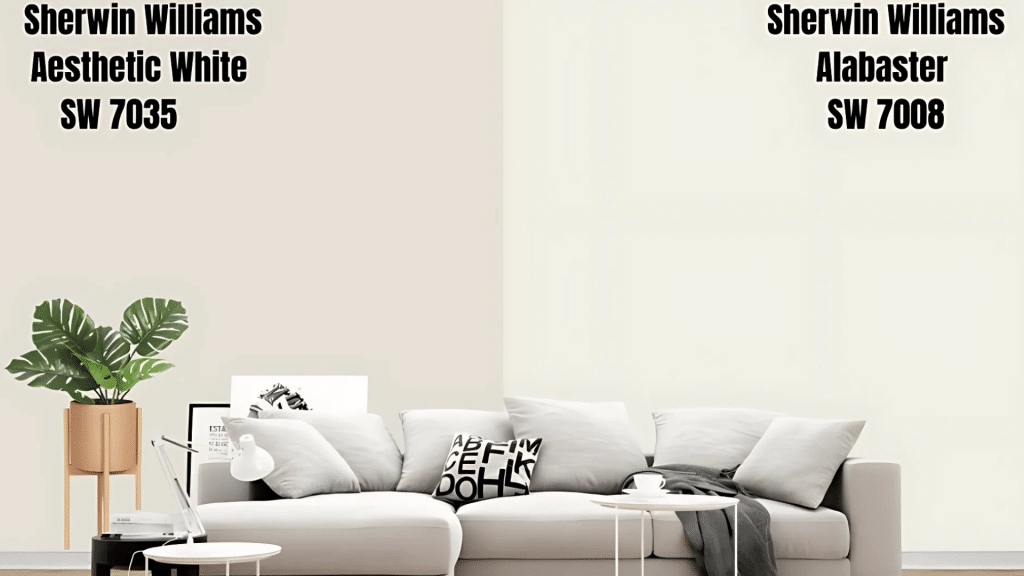
Aesthetic White is a soft, warm white with subtle beige undertones. With an LRV (Light Reflectance Value) of 73, it absorbs more light than brighter whites, creating a cozy atmosphere in any room.
This paint color has pink and violet undertones that add warmth without making spaces feel cold or clinical. Think of Aesthetic White as the gentle option that brings a lived-in feeling to your home.
It works especially well in spaces with abundant natural light, where its subtle undertones can shine.
The lower LRV means this color won’t create harsh reflections or glare, making it perfect for rooms where you want comfort and relaxation. Many homeowners choose Aesthetic White when they want their spaces to feel welcoming rather than stark.
Getting to Know Alabaster (SW 7008)
Alabaster is a classic warm white with creamy undertones and hints of yellow. With an LRV of 82, it reflects significantly more light than Aesthetic White, making rooms appear brighter and more spacious.
This color acts like a reliable friend in your paint palette. It brightens rooms without feeling harsh or institutional, maintaining its consistency across different lighting conditions. Alabaster works beautifully in both traditional and modern spaces, which explains its popularity among designers.
The warm, creamy undertones prevent Alabaster from looking cold or sterile. Instead, it strikes that perfect balance between brightness and warmth, making spaces feel both clean and inviting.
How Aesthetic White vs Alabaster Looks in Different Spaces
Living Rooms & Entryways
I painted my client’s south-facing living room in Aesthetic White last spring. I learned that its pink-violet undertones created a soft, lived-in feel against natural wood furniture. The color stayed true even as sunlight shifted throughout the day.
In contrast, when I used Alabaster in a client’s entryway, its brighter LRV made the narrow space feel more open. The warm, creamy undertone paired beautifully with brass light fixtures and natural fiber rugs.
Kitchens & Bathrooms
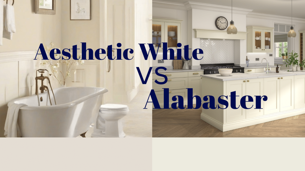
Picture a crisp, classic kitchen. That’s what Alabaster delivers. I’ve used it countless times on cabinets – its higher LRV creates that clean, bright look most homeowners want.
The finish stays true even near cooking areas and doesn’t turn dingy.
Aesthetic White brings a unique touch to bathrooms. Its lower LRV means it won’t feel stark under artificial lighting. I recently painted a master bath – the beige undertones complemented the marble tiles perfectly while still feeling fresh.
Bedroom Considerations
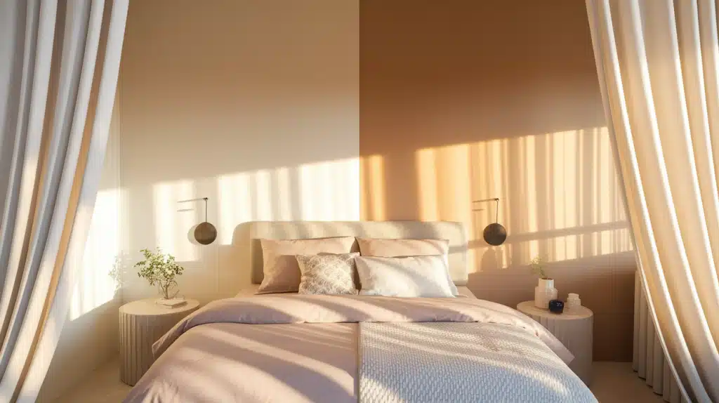
Aesthetic White creates the perfect peaceful environment for bedrooms. Its softer nature reduces harsh reflections that might interfere with sleep.
The warm undertones create a hotel-like luxury feeling. I often recommend this color for master bedrooms where relaxation is key.
The subtle warmth complements bedding in any color palette. It works with crisp whites, deep blues, and rich earth tones.
Alabaster works better in bedrooms that double as workspaces. Its brightness helps you feel more alert and positive as you start your day.
Perfect Pairings for Trim and Cabinets
Getting your trim color right can make or break your paint choice.
Recommended Color Combinations
| Wall Color | Best Trim Colors | Cabinet Colors That Work | Metal Finishes |
|---|---|---|---|
| Aesthetic White | White Dove (lightened 25%), Natural wood, Pure White | Navy blue, Warm wood tones, Soft sage green, Charcoal gray | Brass, Oil-rubbed bronze, Warm gold |
| Alabaster | Pure White, Extra White, Natural wood | Bright white, Black, Dark navy, Natural wood stains | Chrome, Brushed nickel, Matte black |
1. Trim Options with Aesthetic White
White Dove lightened by 25% creates a perfect soft contrast with Aesthetic White walls. This combination feels sophisticated without being stark.
Natural wood trim pairs naturally with the greige undertones. I’ve used this combination in several craftsman-style homes.
Pure White trim works when you want a cleaner contrast. Keep proportions in mind to avoid making Aesthetic White look muddy.
2. Alabaster Trim Combinations
Pure White trim with Alabaster walls creates that classic, fresh combination. This pairing works in everything from colonial homes to modern farmhouses.
Extra White provides a more modern, crisp contrast. The difference is subtle but creates a cleaner, architectural look.
Natural wood trim adds warmth to balance the brightness of Alabaster. This works especially well in homes with lots of natural light.
3. Cabinet Color Success
Aesthetic White walls pair beautifully with navy blue cabinets. This creates depth without feeling heavy.
Warm wood tones work wonderfully with Aesthetic White. Soft sage green cabinets look sophisticated against these walls.
Alabaster walls work perfectly with bright white cabinets. This creates that crisp, clean look most homeowners want in kitchens.
Black or dark navy cabinets create a stunning contrast with Alabaster. Natural wood stains add warmth and texture.
Mistakes to Avoid While Choosing Aesthetic White vs Alabaster
- Many homeowners opt for Aesthetic White in rooms with limited natural light. They expect it to brighten the space.
- Instead, the lower LRV can make these rooms feel darker than expected. This creates a closed-in feeling.
- Another mistake is pairing Aesthetic White with cool-toned elements exclusively. The warm undertones clash with stark blues or cool grays.
- With Alabaster, the biggest mistake is using it where you want intimate, cozy feelings. The brightness can make bedrooms feel less restful.
- Some homeowners choose Alabaster for rooms with harsh overhead lighting. This creates an institutional feeling rather than a welcoming atmosphere.
Your Decision-Making Process
Start by honestly assessing your lighting situation. Rooms with abundant natural light can handle either color. Spaces with limited light generally benefit from Alabaster’s higher light reflection. This makes a noticeable difference.
Decision Matrix: Which Color to Choose
| Your Situation | Choose Aesthetic White If | Choose Alabaster If |
|---|---|---|
| Lighting | Abundant natural light, warm artificial lighting | Limited natural light, cool LED lighting |
| Room Size | Any size, especially cozy spaces | Small rooms need brightness |
| Style Goal | Cozy, lived-in, intimate | Clean, fresh, energizing |
| Existing Elements | Warm wood, natural textures | White trim, modern fixtures |
| Personal Preference | Love soft, comfortable spaces | Prefer bright, crisp environments |
| Room Function | Relaxation, sleeping, reading | Working, cooking, entertaining |
Conclusion
After exploring these popular Sherwin-Williams colors in depth, your choice comes down to the feeling you want in your space. Think of Alabaster as the perfect white T-shirt in your closet—classic, versatile, and always looking fresh.
Meanwhile, Aesthetic White is like your favorite cashmere sweater – soft, sophisticated, and naturally welcoming.
Remember to test your chosen color in small areas first, watching how it changes from morning to night. Paint samples on multiple walls, as each surface might tell a different story based on lighting and shadows.
Need one final tip? Order peel-and-stick samples of both colors. They’ll help you visualize how these whites bring your space to life.