
Tired of paint colors that look perfect in the store but are terrible on your walls?
You’re not alone, and that’s precisely why Agreeable Gray has become one of the most trusted paint colors in the interior design world.
This flexible neutral works beautifully in almost any space, offering the perfect balance between gray and beige tones that homeowners love.
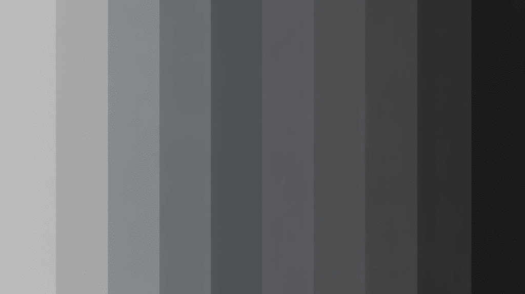
Understanding Light Reflectance Value (LRV) is crucial when selecting paint colors for your home. LRV measures how much light a color reflects, ranging from 0 (absolute black) to 100 (pure white).
This number helps you predict how a color will appear in various lighting conditions and room sizes, eliminating the guesswork from paint selection.
What’s the Agreeable Gray LRV?
Agreeable Gray has an LRV of 60, putting it right in the sweet spot for most homes. But what does this mean for your walls?
Think of LRV like a brightness meter.
Higher numbers mean more light bounces back into your room, making spaces feel larger and brighter. Lower numbers absorb more light, creating cozy but potentially darker spaces.
| LRV Range | What You Get | Where It Works Best |
|---|---|---|
| 0-30 | Dark, moody colors | Accent walls, cozy dens |
| 30-50 | Medium tones | Dining rooms, bedrooms |
| 50-70 | Light-medium (Agreeable Gray lives here!) | Most living spaces |
| 70-100 | Very light colors | Small rooms, basements |
With an LRV of 60, Agreeable Gray gives you the best of both worlds. It’s light enough to brighten up a room without being stark white, yet substantial enough to add character and warmth.
How This Affects Your Space
Your morning coffee will look different than your evening wine when you’re surrounded by Agreeable Gray.
The color adapts throughout the day, appearing fresh and crisp in morning light, then settling into warm, cozy tones as the sun sets.
This flexibility makes it ideal for open floor plans that require a flawless flow between rooms.
Does Agreeable Gray Look More Gray or Beige?
Here’s where things get interesting! Agreeable Gray is like a chameleon – it changes depending on its surroundings.
In cool, northern light: Expect to see more gray. Under warm incandescent bulbs, the beige undertones come alive.
Next to pure white trim, the gray side paired with warm woods: Those beige qualities shine.
This isn’t a bug – it’s a feature! Most homeowners love this adaptability because it means one paint color can work with different moods and seasons.
|
Real-World Example: Imagine your living room faces north (cooler light) but your kitchen faces south (warmer light). Agreeable Gray will look slightly more gray in the living room and more beige in the kitchen, creating a natural flow that feels intentional rather than mismatched. |
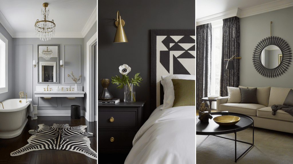
Pairing Colors with Agreeable Gray
The beauty of Agreeable Gray lies in its ability to play well with others. It’s like that friend who gets along with everyone at the party.
1. The Safe Bets
Crisp whites make Agreeable Gray look more suave. Warm creams bring out their coziness. Soft taupes create a monochromatic, spa-like feel.
2. The Bold Choices
Want to add some personality? Try these combinations:
- Navy + Agreeable Gray = Classic coastal vibes
- Forest green + Agreeable Gray = Earthy, grounded feeling
- Mustard yellow + Agreeable Gray = Warm, welcoming energy
- Deep plum + Agreeable Gray = suave drama
3. Metals That Work Magic
| Metal Finish | Vibe It Creates | Best Rooms |
|---|---|---|
| Brushed nickel | Clean, modern | Bathrooms, kitchens |
| Warm brass | Luxurious, traditional | Living rooms, bedrooms |
| Matte black | Bold, contemporary | Any room for contrast |
See Agreeable Gray Work in Any Room
If you’re planning a complete makeover or a simple refresh, understanding how this color performs in different spaces helps you make confident decisions.
From busy family areas to quiet retreats, Agreeable Gray adapts to your lifestyle while maintaining its suave appeal.
Get practical. Where does this color work in real homes?
1. Living Rooms: The Social Hub
Agreeable Gray creates the perfect backdrop for life to happen. It won’t compete with your grandmother’s antique chest or your modern sectional sofa.
Kids’ artwork looks great against it, and it photographs beautifully for those family holiday cards.
Pro tip: Use it on three walls and paint the fourth wall a few shades darker for instant suaveness.
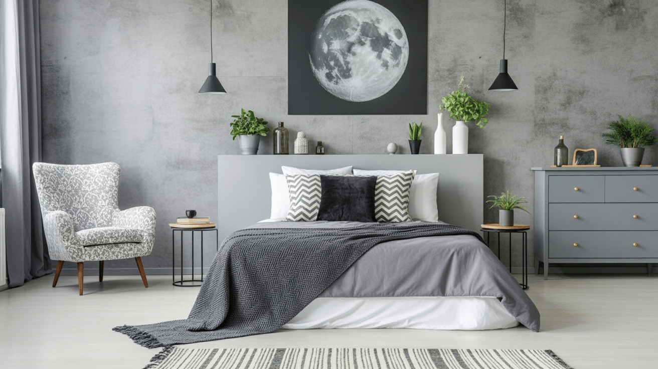
2. Bedrooms: Your Retreat
Nothing says “good night’s sleep” like a calming, neutral tone. Agreeable Gray works if you prefer white bedding (crisp and clean) or jewel-toned sheets (rich and cozy).
3. Kitchens: The Heart of the Home
Kitchen walls take a beating from cooking splatters and the daily wear and tear of life. Agreeable Gray conceals minor imperfections while maintaining a fresh and clean appearance.
It complements both white cabinets and natural wood, plus it won’t clash with your changing seasonal decor.
4. Bathrooms: Spa-Like Serenity
Modify your bathroom into a mini spa retreat. Agreeable Gray pairs beautifully with white fixtures and adds more visual interest than plain white walls.
Add some plants and fluffy towels, and you’ve got an instant upgrade.
Trending Colors and Styles with Agreeable Gray
Current design trends love Agreeable Gray because it’s adaptable enough to work with whatever’s popular now and flexible enough to evolve with future trends.
1. Style Personalities
Minimalist lovers appreciate its clean simplicity. Farmhouse fans adore how it complements shiplap and barn doors.
Coastal enthusiasts use it as a base for blues and whites. Modern traditionalists pair it with both antiques and contemporary pieces.
2. Color Trends That Click
The design world is welcoming:
- Warm earth tones (terracotta, rust, sage)
- Deep jewel colors (emerald, sapphire, amethyst)
- Soft pastels (blush pink, powder blue, sage green)
3. Mix and Match Ideas
Try these trending combinations:
- Agreeable Gray walls + white cabinets + black hardware = classic kitchen
- Agreeable Gray + sage green + natural wood = organic modern living room
- Agreeable Gray + navy + brass accents = suave bedroom
Is Agreeable Gray Right for Your Home?
Understanding Agreeable Gray’s LRV of 60 explains why this flexible neutral works so well in real homes.
Its balanced light reflectance creates spaces that feel bright yet cozy, adapting beautifully to changing light throughout the day.
If you are planning a whole-house makeover or refreshing one room, this LRV makes Agreeable Gray work with various design styles and color combinations.
The key to success lies in testing samples in your specific lighting conditions, as every home’s natural light is different.
While Agreeable Gray offers a warm, flexible neutral for your space, pairing it with a bold accent like Sherwin-Williams Bracing Blue (SW 6242) can create a striking contrast, adding depth to your design.