

Have you ever walked into a room and been instantly drawn to a floral arrangement that seemed to speak to you? Or perhaps you’ve noticed how some displays feel perfectly “right” while others seem off somehow?
The answer lies in balance, the hidden foundation that makes flower arrangements either captivating or forgettable. Balance creates the visual stability that makes viewers pause, appreciate, and remember your floral work.
Most people believe achieving perfect balance requires years of formal training or expensive designer flowers.
The truth is much simpler: balance comes from understanding how visual elements work together to create harmony and flow.
You’ll learn about the essential principles that guide balanced design and learn why balance matters so much in creating memorable floral arrangements.
What Is Balance in Floral Design?
Balance in floral design refers to the visual and physical equilibrium achieved when all elements feel properly distributed throughout an arrangement. This concept ensures no single component dominates while others appear neglected or weak.
These are the main types of balance:
Symmetrical Balance: It creates formal arrangements where elements mirror each other across a central axis. Picture a traditional church altar arrangement – both sides feature identical or nearly identical components. This style projects elegance and order.
Asymmetrical Balance: This approach achieves equilibrium through different elements that carry equal visual weight. One side might showcase a large bloom while the opposite features several smaller flowers. The result feels more natural and relaxed.
Radial Balance: It distributes elements evenly around a central focal point, creating circular movement that guides the eye in smooth rotations. Think of how sunflower petals radiate from the center.
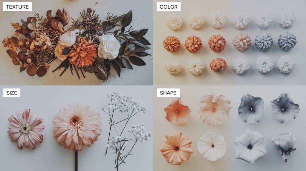
Visual Weight: This concept determines the amount of attention each element commands. Bright colors, large sizes, and rough textures carry more visual weight than pale hues, small forms, and smooth surfaces.
Physical Stability: It ensures arrangements remain upright and secure. Heavy blooms need adequate support, while top-heavy designs require stable bases to prevent tipping.
Key Design Elements that Influence Floral Balance
Understanding how different elements affect visual weight helps create stable, appealing arrangements that hold the viewer’s attention.
Color Impact
Color intensity directly affects how heavy elements appear to the eye. Deep burgundy roses command more attention than pale pink ones of identical size. Bold colors advance toward viewers while soft colors recede into the background.
Warm colors (reds, oranges, yellows) feel heavier and more prominent than cool colors (blues, greens, purples). A single orange marigold can balance multiple blue delphiniums because of this color temperature difference.
Texture Effect
Surface qualities significantly impact visual weight distribution. Velvety petals appear heavier than glossy surfaces, while fuzzy foliage carries more weight than smooth leaves.
Coarse textures demand attention and feel substantial, while fine textures seem lighter and more delicate. Mixing textures strategically prevents arrangements from feeling flat or dull.
Form and Size Considerations
Large blooms naturally dominate arrangements and require careful placement to maintain balance. Small flowers work effectively in clusters to counterbalance single large specimens.
Round shapes create a different visual impact than spiky or cascading forms. Dense, compact flowers feel heavier than open, airy blooms of similar size.
Line and Space Dynamics
Vertical lines create height and formality, horizontal lines suggest stability and calm, while diagonal lines add energy and movement to designs.
Negative space around flowers affects their apparent weight – crowded elements feel heavier than those with breathing room. Strategic spacing prevents arrangements from appearing cluttered or overwhelming.
Principles of Floral Design
Seven fundamental principles guide professional floral designers in creating cohesive, impactful arrangements that connect with viewers emotionally.
1. Balance
Balance ensures that a floral arrangement feels visually stable and grounded. It guides the distribution of visual and actual weight, helping the eye navigate the design without strain.
Rather than relying on rigid symmetry, balance can be created using varied elements that work together harmoniously, whether through equal distribution, strategic asymmetry, or a circular radial flow.
2. Scale
Scale addresses size relationships between arrangements and their intended environments. The external scale considers room size, ceiling height, and viewing distance.
Internal scale focuses on proportional relationships between different flowers within the same arrangement. Large venues need substantial displays, while intimate spaces require smaller, more delicate compositions.
3. Dominance
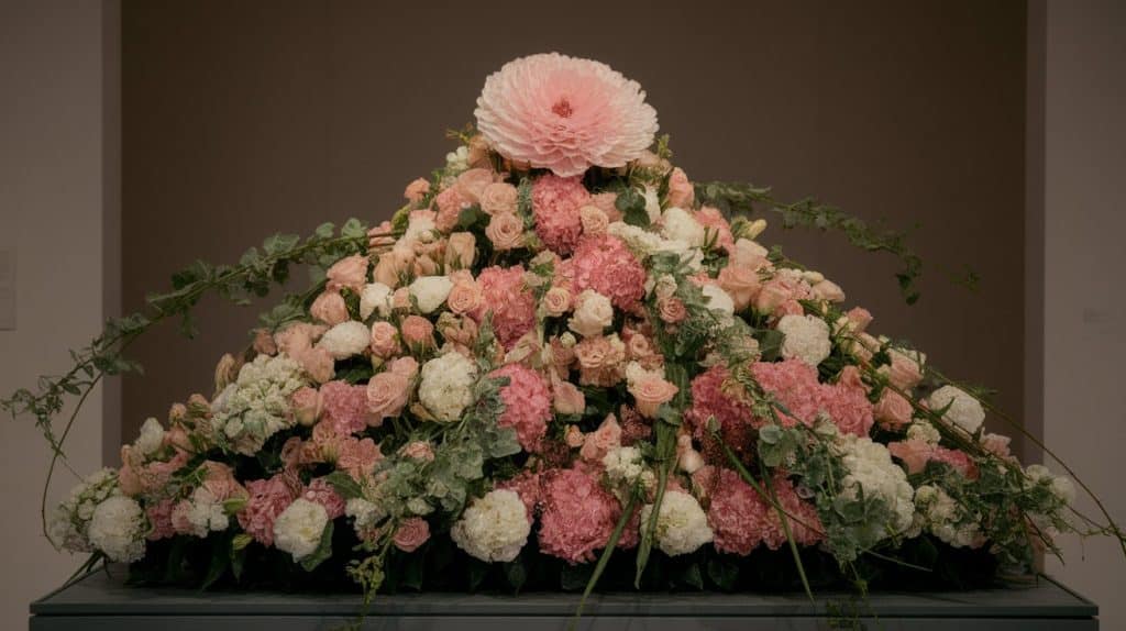
Every successful arrangement needs a clear focal point that anchors the entire design. This dominant element typically features the largest, most colorful, or most unusual component.
Supporting flowers should complement rather than compete with the focal point. Off-center placement often creates more natural, appealing compositions than centered arrangements.
4. Proportion
Proper proportion ensures all components relate harmoniously to each other and the container. Container height should complement arrangement height, while flower sizes should feel appropriate together.
The golden ratio often guides proportion decisions, creating naturally pleasing relationships that feel comfortable to viewers.
5. Rhythm
Rhythm guides the eye through arrangements in smooth, planned movements that create visual flow. Repetition of colors or shapes placed strategically throughout designs maintains viewer interest.
Gradual transitions between elements prevent jarring visual jumps, while varied heights add natural movement that mimics organic growth patterns.
6. Contrast
Contrast creates visual interest through intentional differences that make elements stand out appropriately. Color contrast can involve warm versus cool tones or bright versus muted intensities.
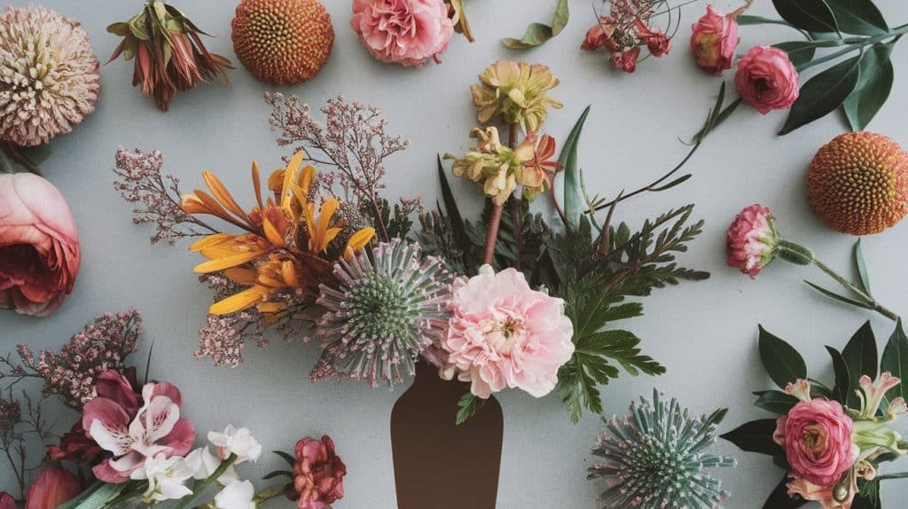
Texture contrast pairs smooth petals with rough foliage, while size contrast combines large statement flowers with delicate filler blooms.
7. Harmony
Harmony unites all elements into cohesive compositions that feel complete and emotionally satisfying. Color harmony uses consistent palettes throughout arrangements.
Texture harmony involves thoughtful mixing of surface qualities, while form harmony relates to how different flower shapes complement each other.
Importance of Balanced Floral Design
Balanced floral design serves multiple critical functions that separate professional work from amateur attempts.
1. Creates Lasting Visual Impact
Well-balanced arrangements capture attention immediately and maintain interest over time. The eye moves comfortably through properly distributed elements, creating pleasurable viewing experiences that encourage closer examination.
Unbalanced designs feel uncomfortable to view and often get ignored or quickly dismissed by observers.
2. Communicates Professional Competence
Clients instinctively recognize quality work, even without technical knowledge. Balanced arrangements demonstrate skill, intentionality, and attention to detail that build trust and credibility.
This professional appearance justifies higher prices and generates referrals from satisfied customers.
3. Ensures Physical Longevity
Proper weight distribution prevents structural problems like tipping, leaning, or collapse. Arrangements remain stable throughout their display period without requiring constant adjustment.
This reliability is especially important for event work where arrangements must maintain their appearance for hours without supervision.
4. Improves Emotional Connection
Balanced designs create psychological comfort and harmony that resonates with viewers on an emotional level. This connection makes arrangements more memorable and impactful for special occasions.
The sense of order and completeness appeals to fundamental human preferences for stability and coherence.
Common Mistakes to Avoid
These frequent errors disrupt balance and diminish the overall impact of otherwise well-executed arrangements.
- Concentrating bright colors in single areas draws excessive attention and disrupts the eye’s natural movement through the arrangement.
- Ignoring container weight when planning flower placement can result in top-heavy designs that tip over or appear unstable.
- Creating identical mirror images in symmetrical arrangements looks artificial and rigid rather than naturally balanced.
- Overlooking texture variety results in flat, monotonous appearances that fail to engage viewers or create visual interest.
- Placing the tallest elements in the exact center creates awkward, unnatural-looking focal points that dominate everything else inappropriately.
- Forgetting to check arrangements from multiple viewing angles leads to designs that only look good from one specific position.
- Using too many competing focal points confuses viewers and prevents a clear visual hierarchy from developing within the arrangement.
Conclusion
Mastering balance in floral design opens doors to creating arrangements that truly connect with viewers and improve any environment they grace.
The principles we’ve explored provide the foundation for professional-quality work that lasts longer, photographs better, and creates stronger emotional responses than unbalanced alternatives.
Balance doesn’t demand perfection or rigid adherence to rules. It requires developing sensitivity to how different elements interact and affect each other within compositions.
These skills develop through practice and experimentation. Start with simple combinations and gradually explore more complex designs as your understanding deepens.
I encourage you to apply these concepts in your next floral project and share your experiences in the comments below. Your insights could help other readers in their own design endeavors!
Frequently Asked Questions
What Is the 3-5-8 Rule in Floristry?
This guideline suggests using three focal flowers, five greenery stems, and eight filler flowers to create well-proportioned arrangements with good visual balance.
What Flowers Should Not Be Mixed Together?
Avoid mixing flowers with different vase lives, like short-lasting anemones with long-lasting chrysanthemums. Also, avoid daffodils as they can be toxic to other flowers.
What Two Things Help Achieve Rhythm in Floral Design?
Repetition of similar colors, sizes, or shapes creates rhythm. Consistency in design elements also builds rhythm by forming smooth visual connections throughout arrangements.