

Looking for a soft neutral that isn’t boring, stark, or yellow? Benjamin Moore Seapearl OC-19 might be the one.
This creamy greige walks the perfect line between off-white and beige, delivering warmth without turning yellow and brightness without feeling sterile.
What makes Seapearl stand out? Its subtle green undertones. They keep it looking clean and consistent in every kind of light; no surprise shifts, no weird tones.
That’s why it’s a favorite among designers and homeowners alike who want a dependable, adaptable neutral that works across various styles and rooms.
If you’re updating a cozy living room, brightening a bathroom, or painting your whole exterior, Seapearl brings effortless elegance without trying too hard. Let’s learn what makes this color a go-to favorite.
What Is Benjamin Moore Seapearl OC-19?

Benjamin Moore Seapearl OC-19 stands out as a light, warm greige paint color that borders on cream. This neutral features subtle green undertones that prevent the yellow cast common in many cream colors.
With an LRV of 76.43, Seapearl provides enough brightness to open up spaces while offering sufficient pigment to avoid looking stark or clinical.
The green undertones make this color special; it looks like creamy off-white on walls but maintains a fresh, clean appearance throughout the day.
Unlike typical warm whites that can appear yellow in certain lighting conditions, Seapearl stays consistent. This reliability makes it a favorite among color professionals who need dependable neutrals.
The color works as both an interior and exterior choice, adapting well to different lighting conditions. Its warmth helps balance cool northern light while remaining crisp in brighter southern exposures.
Best Places to Use Seapearl OC-19
This adaptable neutral excels in various settings thanks to its warm undertones and reliable performance across different lighting conditions.
From intimate bedrooms to expansive exteriors, Seapearl provides consistent results that intensify any space.
Living Rooms
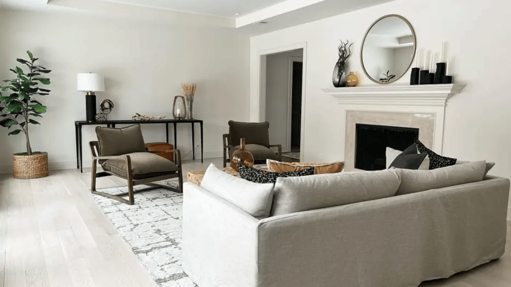
Seapearl creates a calm backdrop that lets furniture and artwork take center stage. The warm undertones make it especially effective in north-facing rooms that receive cooler light throughout the day.
This color complements both traditional and modern furniture styles.
Bedrooms
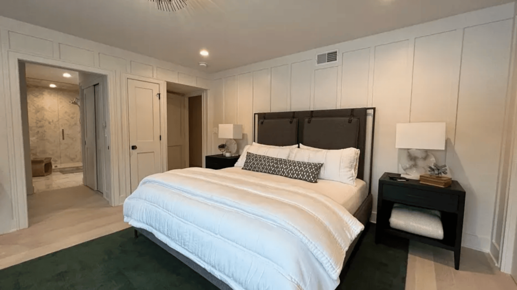
The peaceful qualities of Seapearl create a restful environment that is neither cold nor clinical. Its subtle warmth helps create a cozy atmosphere that promotes relaxation. The neutral tone works with any bedding color or style.
Kitchens
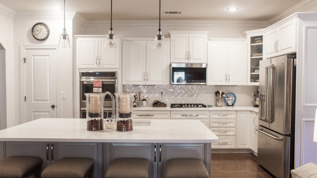
Kitchen applications work beautifully, particularly for cabinets. If you love traditional white kitchen cabinets but want something less stark, Seapearl offers the perfect middle ground.
The color complements both light and dark countertops while maintaining a fresh, clean appearance.
Bathrooms
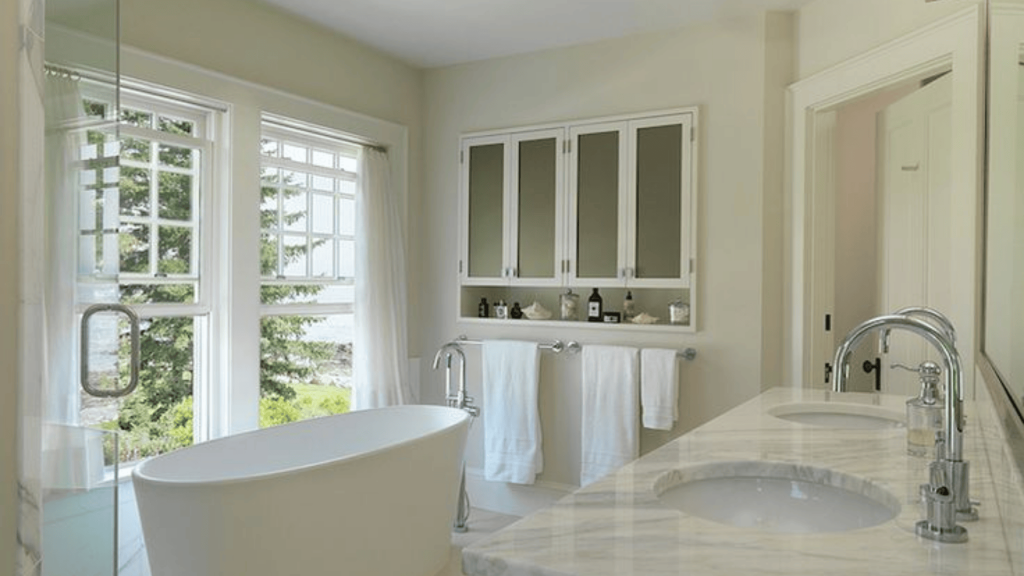
Seapearl reflects light well in smaller bathroom spaces while maintaining its warm character. The color works with white fixtures and various tile colors.
Its moisture-resistant qualities make it practical for use in humid environments when paired with suitable finishes.
Exterior Applications

Seapearl excels as an alternative to pure white for home exteriors. Since paint colors appear 4-5 times brighter outside, this light greige prevents the harsh appearance of stark white while maintaining curb appeal.
The color pairs exceptionally well with natural brick, creating timeless combinations that feel both classic and contemporary.
Reviews and Expert Opinions on Seapearl OC-19
Understanding what design professionals and homeowners actually think about Seapearl helps reveal its real-world performance and suitability for different projects.
1. Interior Designer Perspectives
Professional designers consistently praise Seapearl for its reliability across a wide range of lighting conditions.
Many note that, unlike other warm neutrals, it doesn’t shift dramatically from morning to evening light, making it a safe choice for clients who worry about color consistency.
Design professionals particularly appreciate how Seapearl photographs well, which matters for portfolios and social media showcases.
The color maintains its integrity in both natural and artificial lighting, avoiding the washed-out appearance that plagues many light neutrals in photos.
2. Homeowner Experiences
Real users frequently mention Seapearl’s ability to make spaces feel larger without the sterile quality of pure white. Many homeowners report that guests often ask about the paint color, noting how fresh and clean their spaces feel.
Common praise points include its versatility with various décor styles and its ability to serve as an excellent backdrop for colorful artwork and furnishings.
Several users mention successfully using it throughout entire homes without it feeling monotonous.
3. Professional Color Consultants’ Take
Color experts often recommend Seapearl as a “safe bet” for clients who want to move away from stark white but fear committing to color. They note its forgiving nature – it works with both warm and cool accent colors, making decorating decisions easier for homeowners.
Consultants also highlight its performance in open floor plans, where consistent color flow between spaces is crucial. The subtle green undertones help tie together different areas without creating jarring transitions.
4. Common Concerns and Solutions
Some users initially worry about the green undertones, fearing the color might look too green on their walls. However, most report that these undertones read as freshness rather than obvious green once applied to larger surfaces.
A few homeowners mention it can feel slightly cool in rooms with limited natural light. Design professionals typically recommend testing with proper lighting and considering slightly warmer alternatives like Dove Wing in such situations.
Paint Colors That Pair Well with Benjamin Moore Seapearl
Seapearl’s green undertones open up numerous pairing possibilities, creating harmonious schemes.
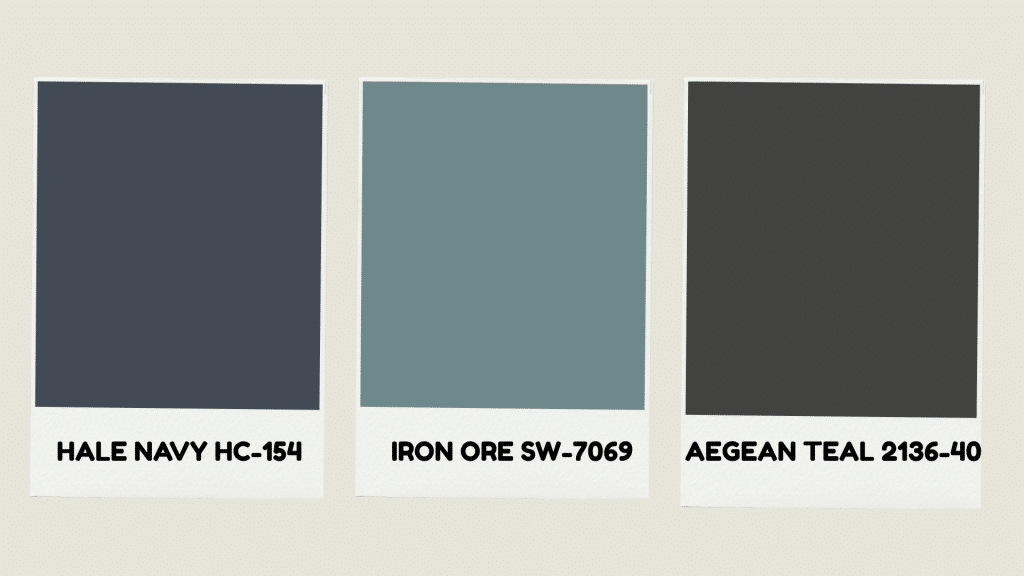
Benjamin Moore Hale Navy HC-154– This deep navy blue creates a stunning contrast with Seapearl while maintaining the cool undertone harmony. The combination works beautifully for accent walls or cabinetry, offering smoothness without overwhelming the space.
Sherwin-Williams Iron Ore SW-7069– This soft black paint color pairs exceptionally well with Seapearl for exterior applications. The warm undertones in Iron Ore complement Seapearl’s green base, creating classic schemes that feel both timeless and current.
Benjamin Moore Aegean Teal 2136-40– The blue-green tones in Aegean Teal lift Seapearl’s natural green undertones beautifully. This combination creates spa-like environments that feel calm and refreshing, perfect for bathrooms or bedrooms.
Comparing Seapearl OC-19 with Other Popular Neutrals
Understanding how Seapearl relates to other popular neutrals helps ensure you choose the right color for your space.
| COLOR | COLOR CODE | LRV | UNDERTONES | BEST USE |
|---|---|---|---|---|
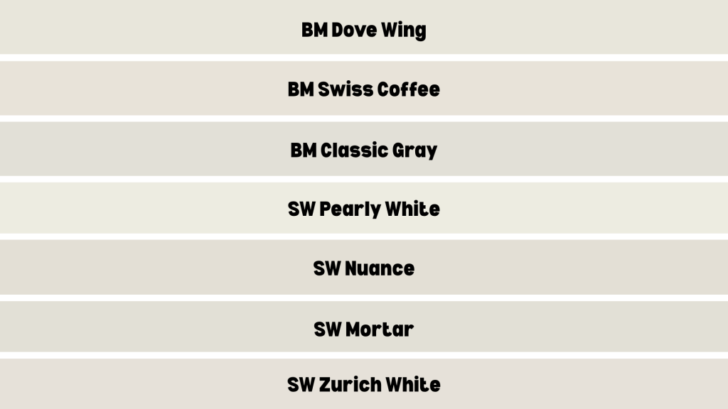
| BM Dove Wing | OC-18 | 77.52 | Warmer green | If Seapearl feels too cool |
| BM Swiss Coffee | OC-45 | 81.91 | Green | Brighter spaces |
| BM Classic Gray | OC-23 | 73.67 | Green/violet | Cooler modern looks |
| SW Pearly White | SW 7009 | 77 | Green | Sherwin alternative |
| SW Nuance | SW 7049 | 74 | Green | Light gray with warmth |
| SW Mortar | SW 9584 | 74 | Warm green | Light warm greige, whole-house color |
| SW Zurich White | SW 7626 | 76 | Gray/yellow | Soft white, for various spaces |
Dove Wing offers a slightly lighter, warmer alternative if Seapearl feels too cool in your space. Swiss Coffee provides more brightness with similar green undertones but appears more vibrant overall.
For those who prefer Sherwin-Williams products, Pearly White serves as the closest match, although it appears warmer and less crisp than Seapearl.
Avoid color matching between brands, as results often look greener than expected.
Application Tips for Using Seapearl Paint
- Always test paint colors before committing to full rooms, as lighting significantly affects how colors appear.
- Use high-quality primer, particularly over darker existing colors, for proper coverage.
- Apply two coats for even coverage and accurate color representation in most applications.
- Consider the room’s lighting when selecting complementary colors to achieve the best harmony.
- Choose green-toned grays as companions, avoiding violet or blue grays that clash with warm undertones.
- Avoid using Seapearl itself as trim since it’s too dark and creamy for that purpose.
Professional Insights
Color experts consistently recommend Seapearl for clients wanting cream without yellow undertones. The reliability in various lighting conditions makes it a go-to choice for whole-house applications.
The color’s versatility suits multiple design styles, from modern farmhouse to contemporary schemes. Its ability to work in both cool and warm lighting conditions provides confidence for any room orientation.
Final Verdict
Benjamin Moore Seapearl OC-19 is the perfect solution for anyone who wants a soft, warm paint color without the yellow undertones that can make creams feel dated.
Its subtle green base and high LRV keep spaces looking clean, fresh, and consistent in all lighting. From cozy bedrooms to modern exteriors, Seapearl offers dependable beauty and quiet sophistication that fits any style.
If you’re tired of white walls that feel too stark or creams that turn yellow, Seapearl might be exactly what your home needs.
Ready to see it for yourself? Grab a sample, test it in your space, and experience why so many designers trust Seapearl OC-19.