
Why Your Paint Turns Gray in North Facing Rooms (and How to Stop the Madness)
If you’ve ever painted a “warm creamy neutral” and then watched it dry into a sad bowl of dishwater… welcome. North facing rooms will humble you. They don’t do golden hour glow. They do consistent, cool, slightly blue gray light all day long like your room is permanently under a cloudy day filter.
The good news is: nothing is “wrong” with your paint. North light just has opinions. Once you understand what it does, you can pick colors that don’t immediately betray you.
Let’s talk about why it happens, what actually works, and how to test paint without rage crying in the paint aisle.
North light isn’t “bad” it’s just… cold
North facing rooms get cooler light most of the day (roughly that 5000K-6500K daylight range). East and west rooms swing warm and cool depending on the time. North rooms? They just sit there being consistent and chilly.
Here’s what that does to paint:
- Warm colors lose their magic. Creams and beiges can go muddy/gray because the cool light strips the warmth right out.
- Cool colors go full “dental office.” That soft gray blue you loved on Pinterest can suddenly look sterile and sharp.
Artists love north light because it’s steady and honest. Homeowners love it… once they stop trying to force it to be a sunny southern exposure.
The two things I check before I fall in love with a color
Before you pick a paint color based on a cute little square on a screen (no judgment, I’ve done it too), check these two things:
1) LRV (Light Reflectance Value)
LRV is basically how much light a color reflects. Higher LRV = brighter.
In north facing rooms, LRV matters a lot because you’re not getting that warm sunlight boost. Here’s the LRV range cheat sheet I use:
- Dim north room (small windows, trees, overhangs): LRV 72+
- Normal/average north room: LRV 65-72
- Bright north room (big windows, open exposure): LRV 55-65 can work, depending on undertones
And yes, it feels backward that a bright room can handle a lower LRV. But in a bright north room, you actually have enough light to support a deeper color without it turning into a cave.
2) Undertones (aka the secret personality of the paint)
Undertones are the part of the color that shows up when the light gets weird. And north light is weird.
- Warm undertones (yellow, cream, peach, soft orange, warm taupe) help fight the blue cast.
- Cool undertones (blue, violet, steely gray) stack with the north light and can go icy fast.
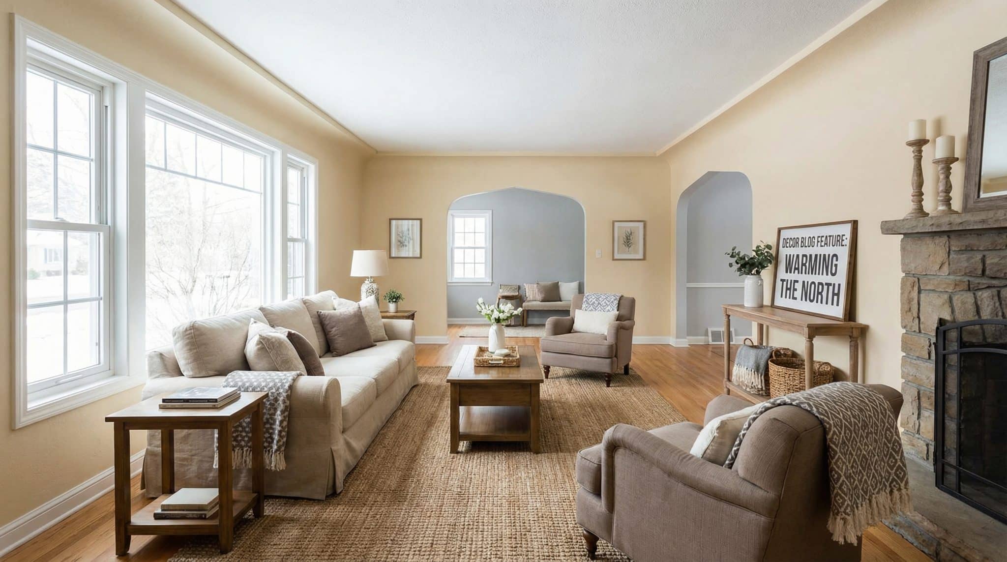
This is why something like Benjamin Moore Edgecomb Gray can look amazing in one north facing space and depressing in another. It’s not the paint being inconsistent. It’s the room.
My no spiral method for choosing paint in a north facing room
If you want the simple path (the one that doesn’t involve 47 samples and a mild identity crisis), do this:
- Be honest about your light. Is it bright north or dim north? Don’t flatter your room. Your room will not return the favor.
- Decide the vibe:
- Want it brighter? Start with warm whites.
- Want cozy but still “neutral”? Warm greiges/taupes are your friends.
- Want color? Choose warm leaning blues/greens/pinks (yes, they exist).
- Want moody? Go dark on purpose and make it a vibe, not a failure.
- Pick 3 contenders max. More than that and you’ll start seeing colors that aren’t even there (ask me how I know).
- Test properly. Not a tiny dab. Not a hopeful glance. A real test.
Now, the fun part: actual color ideas that don’t instantly gray out.
Paint colors that behave in north facing rooms
I’m not saying these are the only options. I am saying these are the kinds of undertones that tend to survive the north facing “cool light curse.”
Warm whites that don’t look like a sad refrigerator
If a white is described as “crisp,” “clean,” or “bright,” I get suspicious in north light. Those whites mostly reflect the cool light they’re given, so the room can go flat and gray around the edges.
Better: whites with a gentle cream/yellow warmth.
- Benjamin Moore Navajo White (OC-95) (LRV ~78): warm, creamy, but not banana pudding.
- Benjamin Moore White Dove (OC-17): soft and classic, not icy.
- Benjamin Moore Simply White (OC-117) (LRV ~89): brighter and warmer can show more “yellow” in north light, which might be exactly what you need.
Personally? I’d skip Chantilly Lace and similar “bright white” legends in a north room unless you like the vibe of “winter morning in a lab.”
Warm neutrals (the safest choice when you’re tired)
Warm neutrals are my go to for pairing colors with greige when someone wants cozy but doesn’t want to commit to “a color.”
- Benjamin Moore Pale Oak (OC-20) (LRV ~68): warm greige with a soft taupe/pink warmth (it usually reads like “cozy,” not “nursery”).
- Sherwin-Williams Moderate White (LRV ~74): quietly warm without looking peachy.
- Benjamin Moore Balboa Mist (LRV ~67): this one has a bit of a violet lean and can work surprisingly well in cool light (north light can actually make violet based neutrals feel softer).
One note: if you’re chasing a “true gray” in a north facing room… you are playing on hard mode.
About “true gray” (aka why it keeps going concrete on you)
North light loves pulling blue and purple forward. So many grays that look “perfect” on a swatch end up looking like a raincloud moved in permanently.
If you want gray-ish, I’d aim for greige or taupe leaning warm gray something with visible warmth. “Warm gray” on the label isn’t enough. You need warmth you can actually see.
Blues that stay cozy (yes, really)
Blue sounds like the last thing you’d want in a cool room, but blue with green undertones can read richer and less icy.
- Farrow & Ball Hague Blue (No. 30): deep and moody with green undertones that help it feel warmer than you’d expect.
- Benjamin Moore Atmospheric: lighter, softer, and not scream-y.
Avoid “icy,” “sky,” or “pale” blues in north light unless you’re aiming for “Arctic spa.”
Greens that don’t turn minty and weird
Green can be gorgeous in north facing rooms as long as it has some earthiness.
- Sherwin-Williams Grassland (SW 6163): warm, grounded green that doesn’t go toothpaste.
In general, I look for greens with a yellow/earthy base. Blue based greens + blue north light is how you end up wondering why your living room feels like mouthwash.
Warm pinks/terracottas (the “secret weapon” category)
North light can tone down warm colors in a really flattering way. Terracotta, peach, and coral can end up looking sophisticated instead of loud.
- Little Greene Castell Pink: peach coral warmth that’s less likely to flip purple.
Cool leaning mauves are riskier. They can drift lilac fast.
And if your room is dim… go dark on purpose
Sometimes the best thing you can do is stop fighting the room and make it cozy.
Deep colors with warm undertones can look incredible in north facing rooms. Think rich greens, warm navies, deep taupes. The trick is choosing something saturated enough that it feels intentional not like the lights are off.
Just know: in very low light, some dark colors can read almost black. (Test first. Always.)
How I test paint so I don’t regret my life choices
Paint chips lie. Store lighting lies. Your phone screen lies. Your walls will tell the truth.
Here’s what I do:
Paint BIG samples
Get sample pots (usually $5-10) and paint at least a 2×3 foot rectangle. I know. It feels excessive. It’s not. Tiny patches don’t show you what the color really does.
Do at least two spots:
- one wall that gets more window light
- one wall that lives in shadow and sadness
Check it at a few times (not just once)
North light shifts less than other exposures, but it still changes enough to matter. I peek at:
- morning
- midday
- late afternoon
- evening with lamps on
If it turns purple, gray, or ghostly at any of those times… it’s not “moody.” It’s wrong.
Live with it for a few days
Give it 3-5 days and make sure at least one of those days is overcast. Cloudy days are where north facing rooms really show their true colors (literally).
If you hate it on a gray day, don’t talk yourself into it because it looked okay once at noon.
Quick extras that make north facing rooms feel warmer
A few small things that help more than people think:
- Sheen matters. Matte can make borderline colors look dull. Eggshell is my usual wall pick. Satin can add a little life if your room needs help.
- Trim: I like White Dove in semi-gloss for north rooms because it reads clean without looking icy.
- Ceiling: A stark bright white ceiling can look like a cold lid. Matching the wall color (or going slightly lighter in the same undertone family) often feels softer.
- Bulbs: Go warmer at night 2700K-3000K is the cozy zone. And please keep your bulb temperature consistent while testing paint, or you’ll drive yourself nuts.
Also: paint is not the only thing making your room feel cold. Chrome, gray flooring, and icy textiles can sabotage you even if the wall color is great. Brass, wood, warm rugs, and creamy linens help a ton.
If your paint already looks gray… here’s what’s probably happening
- It looks muddy/gray: your paint doesn’t have enough warmth (or the LRV is too low for your light). More coats won’t fix undertones.
- It looks different on every wall: totally normal shadow walls go cooler. Add lighting in darker corners so the room feels more even.
- The room still feels cold: check the rest of the finishes (floors, furniture, metals). Sometimes the wall color is innocent and your cool toned everything else is the real culprit.
If you take nothing else from this: north facing rooms can be beautiful, soft, and cozy… but you have to pick paint like you’re dressing for the weather you actually have. Not the vacation you wish you were on.