
The Purple Mixing Problem Most Artists Miss (And Yes, I’ve Yelled at My Paint About It)
If you’ve ever mixed “red + blue” like you were doing a kindergarten science experiment and ended up with… sad, murky grape brown? Welcome. You’re not bad at painting. Your brush isn’t cursed. Your technique probably isn’t the problem.
The real villain is sneakier: yellow undertones hiding inside your “red” or “blue.” They slide into your mix like an uninvited guest, and suddenly your “vibrant purple” is giving wet sidewalk.
Once you know what to look for, mixing clean purples goes from frustrating guesswork to “ohhh okay, I get it now.”
The not so sexy secret: undertones are running the show
Here’s the quick translation of what matters when you’re trying to get a purple that actually looks like purple:
- You want a cool red: think magenta-ish, pink-ish, not tomato, not brick, not “fire engine.”
(Those warmer reds are basically red plus a whisper of yellow… and yellow is what turns your purple into mud.) - You want a warm blue: a blue that leans toward violet, not toward green.
(Greener blues are basically blue with a side of yellow energy. Again: mud.) - You want to pay attention to pigment codes: because paint names are chaos. One brand’s “Permanent Rose” can be another brand’s “Surprise! This one’s warmer.”
The tiny code on the tube is the honest part.
I used to think I just “couldn’t mix purple.” Then I realized I was trying to make a jewel tone violet using a warm red that was practically wearing a yellow sweater underneath. Once I swapped a single tube? The heavens opened. The angels sang. My purple stopped looking like old eggplant.
Do this before you blame yourself: check your tubes
If your mix keeps going grayish or brownish, a dull purple troubleshooting step is that you’re using something like:
- Warm reds (often the culprits): Cadmium Red, Vermilion-ish reds, anything that screams “orange undertone”
- Green leaning blues (also frequent culprits): Phthalo Blue Green Shade, Cerulean-ish blues, blues that feel “turquoise adjacent”
You can mix purple with lots of things, sure. But if your goal is a clean, vibrant violet, start with pigments that aren’t secretly dragging yellow into the party.
My go to mixing method (so you don’t overshoot into darkness)
This is the part that saves paint and sanity:
- Start with your red. Always.
- Add blue slowly like you’re seasoning soup, not dumping salt with confidence.
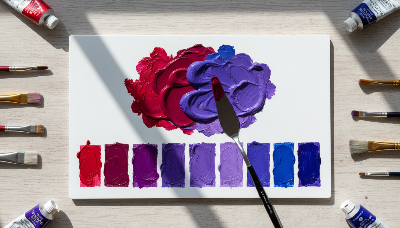
- Swatch it on white paper. Not your palette, not your canvas in progress where everything is already chaos.
- If it looks nearly black (been there): add a tiny touch of white to reveal what’s actually happening. Sometimes the “almost black” mix is actually a gorgeous deep violet hiding in there.
Pigment pairs that actually give you pretty purples
I’m not going to pretend every brand behaves exactly the same, but these combos are consistently solid. If you want a “start here and stop suffering” option, pick the first one.
1) Bright, true purple (the reliable starter)
- Red: Quinacridone Magenta (PR122)
- Blue: Ultramarine Blue (PB29)
This is my “if you only try one thing, try this” mix. It’s forgiving, it’s gorgeous, and it doesn’t require a PhD in ratios.
2) Deep royal purple (rich and dramatic)
- Red: Quinacridone Red (PR209)
- Blue: Ultramarine Blue (PB29)
This gets you closer to that tube purple vibe bold, deep, and slightly moody (in a good way).
3) Soft lavender (gentle, floral, not neon)
- Red: Permanent Rose (PV19)
- Blue: Ultramarine Blue (PB29)
Add white and you’ll get those pretty lilac/lavender tones that make everything feel romantic and expensive.
4) Maximum punch (high chroma, easy to overdo)
- Red: Quinacridone Magenta (PR122)
- Blue: Phthalo Blue Red Shade (PB15:1)
This mix is strong. Like “why is my purple suddenly screaming at me” strong. Add the blue in tiny amounts and keep swatching.
The one habit that’ll make you better at this fast (without overthinking it)
Keep a tiny swatch journal. Nothing fancy. Just little squares with notes like:
- PR122 + PB29 (more red) = warmer violet
- PR122 + PB29 (more blue) = cooler violet
- + white = lavender
- “Accidentally added warm red, got sad mud” (a classic entry)
Because future you will absolutely forget the ratio that made the perfect purple last time. Future you is busy.
Bottom line: your purple isn’t broken you just need better “parents”
Grab a cool red, grab a violet leaning blue, swatch on white, and adjust like a calm, powerful color wizard with a practical blue and red guide. Your vibrant purple is in there. You just have to stop letting sneaky yellow crash the mix.