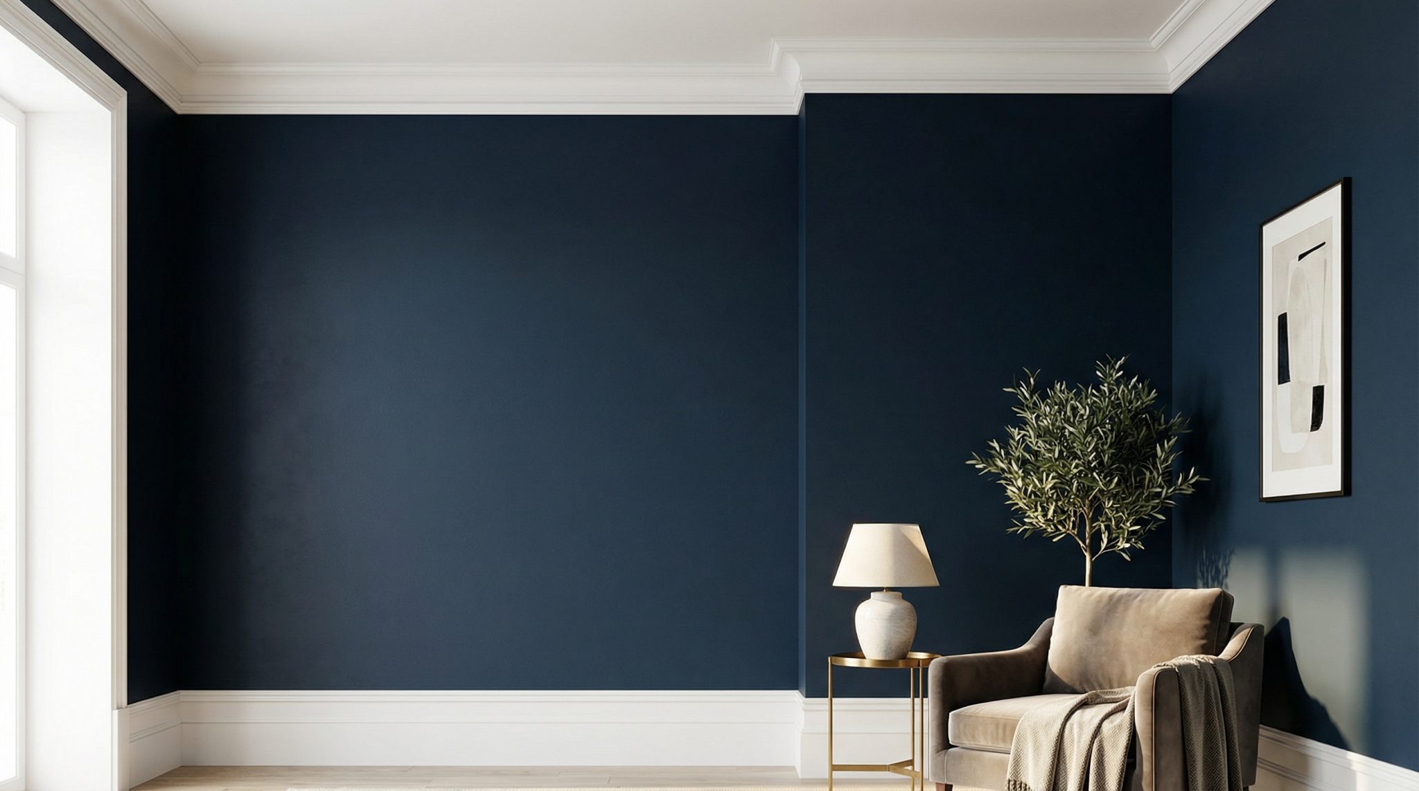

White trim on navy walls sounds like the easiest design decision on earth. Navy is moody! White is classic! Done!
Except… it’s not done. Because “white” is not a single color. It’s an entire extended family with opinions, grudges, and secret undertones that come out at night under your warm light bulbs like a tiny paint gremlin.
If you’ve ever painted a gorgeous deep blue, slapped on “a nice white,” and then spent the next week walking past your baseboards like, “Why does this feel… slightly wrong?” welcome. You’re among friends. This post is how to avoid the classic navy wall/white trim regret spiral (the one that starts at 9 PM and ends with you googling “best white trim with navy” like it’s a medical condition).
The only paint words you actually need (I promise)
Paint people love jargon. I love paint. I still roll my eyes at most of it. But these four things matter with navy + white:
- Undertone: The sneaky color hiding underneath. Navy can lean gray, green/teal, or purple. Whites do this too (yep).
- Lighting (including bulb color): Your house has filters. Morning light is honest. Evening light is a liar.
- LRV: A number that basically tells you how much light a color bounces. Navy is low LRV, meaning it eats light like it’s its job.
- Sheen: The shine level. Higher sheen = more light bounce + more “wow, my trim line is crisp.”
Memorable truth: Undertones don’t shout. They whisper… and then they haunt you at 7 PM.
Why your trim feels “off” (even when the colors are technically pretty)
Here’s what’s happening when white trim looks dirty, icy, yellow, or vaguely unsettling next to navy:
- Cool, crisp whites can make a teal leaning navy look more green (and not in a cute coastal way—more in a “why is my room trying to become a fishtank?” way).
- Creamy warm whites can look straight up dingy next to a gray based navy. Like your trim needs a bath. (It doesn’t. It’s the undertone drama.)
Your brain is very good at noticing “almost right.” That’s why it bugs you even if you can’t explain it.
My quick and dirty undertone test
Grab your navy sample and hold it next to plain white printer paper in natural daylight for an undertone temperature test.
- If your navy suddenly looks teal/green-ish, you’ll usually be happier with a slightly warmer white trim.
- If your navy reads stormy/gray based or true deep blue, you can usually pull off a cleaner, crisper white.
This one tiny test saves you a lot of “why does this look weird?” pacing.
The white trim colors I actually reach for with navy (by undertone)
Let’s not overcomplicate this. Navy usually falls into three buckets: gray based, teal/green leaning, or purple leaning. Pick your bucket, then test 2-3 whites.
1) If your navy is gray based (moody, inky, “storm cloud” vibes)
These tend to play nicest with neutral to cool whites.
- Benjamin Moore Chantilly Lace – very crisp, high contrast, modern
- Sherwin-Williams Pure White – neutral, safe, doesn’t get weird fast
- Benjamin Moore Decorator’s White – slightly cool, works with gray undertones
If you’re painting something like BM Hale Navy, these are usually a great starting point. Hale Navy is popular for a reason: it behaves. (Unlike certain other blues I could name.)
2) If your navy has teal/green undertones (the shapeshifter category)
Teal leaning navies are the ones that wait until the paint dries to reveal their true form. It’s rude, honestly.
A slightly warmer white usually acts like a peace treaty here.
- Benjamin Moore White Dove – soft, forgiving, works in a ton of lighting
- Benjamin Moore Simply White – warm but still bright (my personal “I can’t decide” favorite)
- Sherwin-Williams Alabaster – creamier and calmer, lower contrast
If your trim keeps looking a little blue from reflected light (it happens), warming up your white is often the fix.
3) If your navy leans purple (dramatic, luxe, “evening gown” energy)
These can get harsh with super icy whites. I like a warmer or more relaxed white so the trim frames the room instead of screaming for attention.
- Benjamin Moore Simply White – again, she’s a workhorse
- Benjamin Moore Oyster White – softer/greige leaning, less punch
- Sherwin-Williams Natural Choice – clean, calm, not too gray
Something like SW Naval is gorgeous, but it’s DARK dark and a SW 6242 color review is worth comparing. (LRV 4 = basically a black hole with personality.) Test your whites carefully so your trim doesn’t go from “crisp” to “blinding.”
Lighting: the part you can’t ignore, even if you want to
Lighting is the Instagram filter of your home, except you can’t turn it off and it impacts your mood.
A few quick truths:
- North facing rooms: cool light, less brightness. Navy can go almost black. I usually lean a touch warmer on trim (White Dove, Alabaster) so it doesn’t feel sterile.
- South/west facing rooms: warmer light, especially late afternoon. Crisp whites can look amazing here. Very creamy whites can tip yellow if the sun is intense.
- Blue bounce is real: White trim next to navy picks up reflected blue light. If your trim starts looking bluish, don’t panic—you’re not imagining it. Often, a slightly warmer white brings it back to “white.”
If you only check your paint in daytime, you’re basically making decisions with half the information. (Ask me how I learned that. Actually, don’t. I’m still tired.)
Sheen: the secret weapon for making navy feel expensive
Sheen isn’t just about durability—it’s how you get that satisfying “clean edge” between dark walls and trim.
My simple rule:
- Matte/eggshell walls + satin or semi gloss trim = classic, crisp contrast
And yes, semi gloss can feel a little “shiny” in the can. On trim next to navy? It’s usually perfect. It bounces light and makes everything look sharper (and it wipes clean, which matters if you live with kids, pets, or a partner who treats baseboards like they’re optional).
Bathrooms/high moisture: I’d do semi gloss trim without overthinking it.
The only sample testing system that saves you from regret
Testing is annoying. I know. You know. But repainting trim because your “white” turned into butter or freezer burned ice is more annoying.
Here’s what I do:
- Pick 3 whites
Two from your undertone “bucket,” plus one that’s one step warmer or cleaner as a wildcard. - Paint big sample boards
Poster board or foam board. At least 12″ squares. (Do not paint tiny swatches on the wall and call it science.) - Move them around
Put one right next to the navy, then step it a couple feet away. The “next to” view shows undertones. The “farther away” view shows the overall vibe. - Look at them at night
This is where the truth lives. Check them under your actual lamps. If you use warm bulbs (2700K), that matters. If you use neutral/white bulbs (around 4000K), that also matters.
The winner: the white that stays looking like “clean trim” in multiple lighting situations—not the one that looks amazing for 20 minutes at noon.
Quick fixes for the most common navy + white issues
- “My white trim looks dirty.”
Your white is probably too creamy for a gray based navy. Test something cleaner (Pure White, Decorator’s White). - “My navy room feels like a cave.”
Bump trim sheen up (satin or semi gloss). Also consider whether your trim is narrow—thin trim next to dark walls can disappear. - “My trim looks kinda blue.”
Reflected light. Try a slightly warmer white (White Dove, Simply White, Alabaster).
No need to burn it all down. This is usually a one variable tweak.
One last thing: do yourself a favor and standardize your trim white
If you want your house to feel quietly “pulled together” (instead of “I panicked at the paint counter”), using one trim white throughout is magic. It creates flow and makes doorways and sightlines feel intentional.
I also love matching the ceiling white to the trim white in a lot of spaces—especially hallways and open areas—because it’s clean and simple and doesn’t create a bunch of random white rectangles overhead.
The takeaway (so you can stop thinking about this)
Navy walls + white trim is a forever classic… when the undertones and lighting aren’t fighting like toddlers in a backseat.
Do this:
- Figure out if your navy leans gray, teal/green, or purple
- Pick 3 whites that make sense for that undertone
- Test them big, and look at them at night
- Choose a trim sheen that gives you that crisp separation (satin/semi gloss is usually the move)
Then paint your trim with confidence and go enjoy your moody, gorgeous navy room like the capable DIY legend you are.