
Blue bedrooms are my forever favorite. They’re calm without trying too hard, they make your brain go “ahhh,” and they look good with basically every bedding vibe from crisp hotel white to “I own 47 throw pillows and I regret nothing.”
And yet… every time someone says they want a blue bedroom, I can feel the hesitation through the screen. Because blue can also go full moody cave if your room’s light is doing you dirty.
So let’s talk about the one thing that decides whether blue feels dreamy or depressing: your lighting. Not your Pinterest board. Not the paint chip (paint chips are adorable liars). Your actual, real life, cranky little bedroom light.
Why Blue Works So Well in Bedrooms (AKA: Your Walls Whisper “Go to Sleep”)
Blue is one of those colors that just naturally reads “rest.” There’s a reason spas, coastal hotels, and that one friend who always has their life together all lean blue green. It tends to feel cooler, quieter, and less shouty than warm colors.
What I love most, though, is how blue changes with the day:
- Morning light: crisp, fresh, “new sheets” energy
- Afternoon: true and steady
- Night: cozy, cocoon-y, “don’t talk to me, I’m nesting”
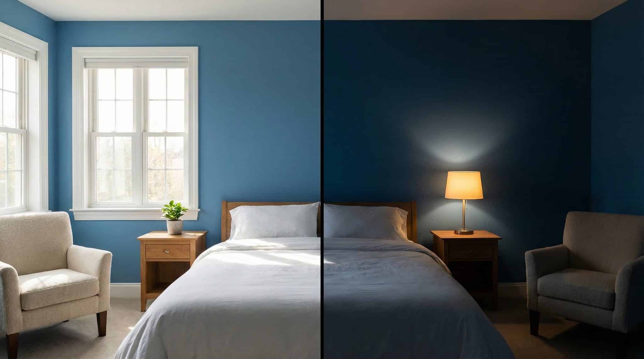
But to get that version of blue, you’ve got to pick one that actually likes your room’s light. Because if your room is dim, the wrong “medium blue” will turn into “surprise navy” faster than you can say, “Why does this look darker than my coffee?”
First: What “Medium Blue” Actually Means (and When It Goes Rogue)
Medium blues sit between baby/pastel blue and full-on navy. Think denim, stormy sky, that perfect vintage-y blue dresser you saw on Facebook Marketplace at 11pm and almost drove across town for.
In a bedroom with decent light, medium blue feels relaxed and enveloping in the best way. In a bedroom with sad light? It can feel heavy, flat, and kind of… underwater.
The laziest (but most accurate) way to tell if your room can handle it
Here’s my favorite quick test, because it’s simple and slightly dramatic:
At midday, lights off: can you comfortably read a book in most of the room?
- If yes: medium blue is probably safe.
- If you immediately start hunting for a lamp: go lighter, or pick a blue with more gray/softness.
Read the room. Literally.
Your Window Direction Is Running the Show
Paint doesn’t exist in a vacuum. It exists in whatever weird lighting situation your house was born with. Here’s the quick and dirty breakdown:
South facing rooms (bright, warm, lots of sun)
These rooms are basically paint’s favorite child. Blues tend to look lighter and happier here, and you can get away with clearer, truer blues without the room feeling cold.
One caution: strong warm sun can pull out undertones—sometimes a blue suddenly looks a little green-ish or purple-ish depending on the shade. (Paint loves a plot twist.)
North facing rooms (cool, indirect, “is it 3pm or 7pm?”)
North light is steady but cooler and dimmer, and it can make blues look deeper and grayer. This is where people paint “medium blue” and wake up in what feels like a denim cave.
If you’ve got north light, look for blues that are softened (gray blue) or have a whisper of warmth so they don’t go icy while remembering why north light cools blue.
The Bulb Situation Matters More Than You Think
If you take one thing from this post, let it be this: your light bulbs can save (or sabotage) your blue bedroom.
- Warm bulbs (around 2700K) = softer, cozier blue at night
- Cool/daylight bulbs (around 5000K) = bluer, sharper, sometimes harsher
So if your blue already feels a little intense, switching to warmer bulbs can genuinely make it feel calmer without repainting. (Which is great, because repainting is… a whole thing.)
Why Paint Looks Darker on Walls (Yes, You’re Not Imagining It)
Paint chips are the highlight reel. Your walls are the full documentary.
Three reasons blues especially like to mess with people:
- Undertones don’t fully show up until you paint a big area. A “simple blue” might suddenly read gray, green, or purple once it’s spread out.
- Large areas intensify color. That tiny chip? Not even close. On four walls, the color can feel 2-3x stronger.
- Your stuff changes everything. Warm wood furniture makes blue feel bolder. Lots of white/gray tones can make it feel quieter (or colder, depending on the shade).
So if your room has warm wood floors and a walnut bed, your blue is going to look different than it would in a white and chrome minimalist room. Paint is needy like that.
Blue Paint Picks Based on Your Light (The Shortlist You Actually Need)
I’m going to keep this focused, because nobody needs a list of 47 blues. Here are solid, bedroom friendly picks that don’t usually go screaming cartoon blue and include a versatile blue for any mood.
If your room is smaller or darker (or north facing)
These tend to have that calming gray blue softness that behaves better in lower light:
- Benjamin Moore Mount Saint Anne (a steady, flexible gray blue)
- Benjamin Moore Colorado Gray (dusty, muted, less icy)
- Sherwin-Williams Distance (soft blue gray that stays calm on big walls)
- Sherwin-Williams Aleutian (blue with a warm-ish gray undertone)
- Farrow & Ball Oval Room Blue (gorgeous, deeper—needs decent ambient light to shine)
If your room gets a lot of daylight (lucky you)
You can handle richer, truer medium blues without them going cave mode:
- Sherwin-Williams Waterloo (medium blue softened with gray)
- Farrow & Ball De Nimes (richer and deeper—best with strong daylight)
- Benjamin Moore Franklin Lakes (cleaner blue with subtle shifts)
If Your Room Is Dark: Do This Instead of Forcing Medium Blue Everywhere
Sometimes the room just… votes no. And honestly? I respect it.
If your bedroom is small, north facing, and not exactly window rich, you’ve got a few options that still get you the calm blue vibe without the storm cloud effect:
Option 1: Go lighter (still blue, just not broody)
These are the “I want blue but I also want to see my socks” choices:
- Benjamin Moore Woodlawn Blue
- Sherwin-Williams Rainwashed
- Farrow & Ball Borrowed Light
Option 2: Do an accent wall behind the bed
This is my go to for rooms that want the drama without committing to four walls of it. Paint the wall behind your headboard medium blue, keep the rest light. You get that cozy backdrop (and it looks amazing with art and bedding), but the room stays airy.
Option 3: Know when to bail on blue
If your room is north facing, small, low window, and you’ve got dark furniture… medium blue might be a constant fight. In that case, muted soft greens, warm grays, or even gentle terracotta can look incredible and feel warmer in low light.
No shame. Your bedroom isn’t a paint battle arena.
Don’t Skip This: How to Test Paint Like You Actually Want to Be Happy
This is the part people skip because they’re impatient (been there), and then they repaint two days later while muttering to themselves.
Here’s how to test without losing your mind:
- Paint a sample on more than one wall. The wall by the window and the wall across from it can look like two different colors. Because they basically are.
- Look at it morning / afternoon / night. Nighttime matters most in a bedroom. That’s when you’ll either feel cozy or like you’re sleeping in a thunderstorm.
- Live with it for 48 hours. Your first reaction is always dramatic. Give your brain time to settle.
- Check it in the darkest corner. If the color dies in the dark corner, it’ll annoy you forever. Ask me how I know.
(And yes, those big peel and stick samples are great if you hate painting swatches. I support lazy efficiency.)
The Bottom Line: Pick a Blue That Loves Your Light Back
Blue bedrooms are magical when you match the shade to the light you actually have—not the light you wish you had.
So this weekend: grab 2–3 samples from the list that fits your room, slap them on the walls (multiple walls, please), and watch them through the day. The right blue will feel obvious. The wrong one will feel like it’s judging you at night.
Now go paint a swatch and let your lighting tell you the truth.