
Blue or Teal With Orange? Here’s the Trick So You Stop Overthinking It
If choosing between blue and teal to go with orange has you staring at paint chips like they’re going to whisper the answer… hi, welcome, you’re my people.
This is one of those color pairing debates that feels way bigger than it should. Like, it’s just a throw pillow, why am I spiraling? But also fair because blue + orange can look stunning or it can look like you decorated your living room for a minor league sports team. There’s not always a middle ground.
So let me save you a little decision fatigue (and maybe a return trip to HomeGoods).
First: Blue and Orange Are Actual Opposites (Like, Science)
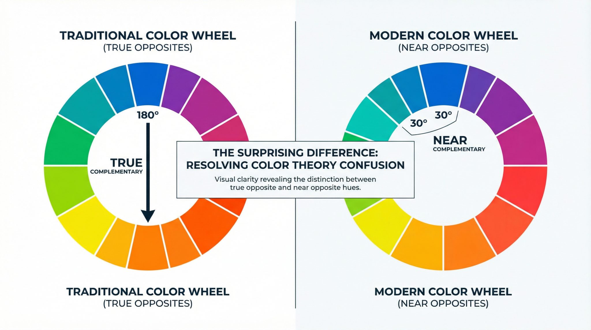
Remember the color wheel from art class? Blue sits directly across from orange, which makes them complementary colors aka the “maximum contrast, maximum drama” combo.
Your eyeballs even agree. Stare at something blue long enough and look at a white wall your brain tries to balance it out and you’ll see an orangey afterimage. (Fun party trick. Extremely useful at exactly zero parties.)
So if blue is the “true opposite,” why does everyone and their mother keep suggesting teal?
Teal Is Blue… With a Softer Personality
Teal is basically blue that took a deep breath and decided to be approachable. It’s blue with a little green mixed in, so it still plays beautifully with orange, but it’s not shouting about it.
And honestly, this is why designers love teal with orange:
- People don’t look weird next to it. Most skin tones live in the orange family (peachy to deep brown). Pure blue nearby can sometimes make faces look a bit… cold. Teal keeps things lively without giving anyone a “fluorescent office lighting” vibe.
- It feels like golden hour. Warm sunlight + cool sky. Your brain goes, “Ah yes, nature. Lovely. I trust this.”
- Shadows look more natural. Real life shadows often lean blue greenish. Teal just reads more believable in a room than a very pure, intense blue.
This is also why that teal and orange look has been all over movies, photography, and basically every “cool” brand that wants to feel energetic but not chaotic. (You’ve seen it even if you didn’t notice it.)
So… Which One Should You Pick?
Here’s my not fancy, very practical rule: pick based on the mood you want, not what the color wheel says in RGB vs RYB vs CMYK you “should” do.
Go pure blue if you want bold, crisp contrast
Blue + orange is the choice when you want the room to have a backbone.
Use blue when:
- You want high contrast and clean separation
- You want the space to feel energized (home office, game room, workout space)
- You like that classic, primary color wheel punch
- You’re not afraid of a look that’s a little graphic
Blue is the “statement eyeliner” of this pairing.
Go teal if you want cozy but still interesting
Teal + orange is easier to live with day to day. It’s the combo that makes people walk in and go, “Oooh, this feels nice in here,” without knowing why.
Use teal when:
- There are photos/portraits in the room (or just… humans you care about looking good)
- You want modern and relaxed, not loud
- You want contrast but also want to keep the vibe soft
- It’s a room where you’ll hang out for a while (living room, bedroom)
Teal is the “cool girl sweater” of this pairing still stylish, but not trying so hard.
Quick warning label (because yes, this happens)
- Too much pure blue + orange can slide into “corporate” or “dated” real fast in a casual space.
- The wrong teal can look muddy like you tried to commit to a color and then got nervous halfway through.
If you’re stuck, teal is usually the safer first move. (I said what I said.)
Don’t Split It 50/50 Unless You Want Chaos
If you use equal amounts orange and blue/teal color wheel opposites, the room can start to feel like it’s arguing with itself.
I like the classic 60-30-10 rule, because it’s simple and it works:
- 60%: your main cool tone (blue or teal)
- 30%: warm neutrals (cream, beige, wood, tan anything that keeps the peace)
- 10%: orange accents (the spicy little exclamation points)
Orange is powerful. Treat it like hot sauce, not soup.
Match the Type of Orange to the Right Blue (This Is the Secret Sauce)
This is where most people get tripped up: it’s not just “orange.” Orange has moods too.
Here’s my quick and dirty pairing cheat sheet:
- Bright orange (traffic cone, tangerine, “look at me!”) → rich teal
High energy meets high energy. This is fun in small doses art, pillows, an accent chair. - Brassy, warm orange (leans a bit red, like amber) → teal/turquoise
The green in teal helps cool it down so it doesn’t feel too fiery. - Terracotta / muted earthy orange → navy or dusty/sky blue
Earthy oranges love depth. Navy + terracotta is one of those combos that feels expensive even when it’s not. (My favorite kind of expensive.) - Peach / soft orange → soft sky blue
Sweet, airy, and great for bathrooms, nurseries, anywhere you want “calm and clean.”
If you’re ever unsure, match intensity with intensity: loud with loud, muted with muted.
My Favorite “Stop Overthinking” Test
Before you commit to painting an entire room or buying the world’s most aggressive orange rug, do this:
- Pick one orange item you already own (pillow, vase, art anything).
- Grab two swatches: one blue, one teal.
- Look at them next to the orange in your actual room in the morning, afternoon, and at night.
Light changes everything. A color that looks perfect at 11am can look like swamp water at 7pm. (Ask me how I know.)
And then? Trust your gut. The right combo won’t feel like it’s competing for attention it’ll feel like it’s doing that satisfying “click” into place.
Orange is such a good accent because it brings instant warmth and life. You just have to decide if you want it paired with blue’s bold contrast or teal’s easy charm.
And if you still can’t decide? Pick teal. It’s the friendliest.