Finding the perfect color match is often harder than it seems. I’ve seen many designers struggle with colors that look great on screen but clash in real life. Small differences in shade can make or break a design project.
I can help you master color comparison with methods that work in real-world situations. This guide covers everything from basic visual techniques to advanced measurement tools, plus practical tips for different surfaces and lighting conditions.
In this blog, I’ll walk you through visual comparison methods, explain Delta E measurements, review useful digital tools, and show how surface types and lighting affect what you see.
By the end, you’ll have a complete toolkit for confident color selection in any design situation.
What Does It Mean to Compare Colors and Why Does It Matter?
Looking at two colors side by side to see if they match is color comparison at its most basic. In more exact terms, it means checking if colors are the same in tone, brightness, and depth. This helps when picking paint, making logos, or planning room designs.
Most people need to compare colors when choosing between paint options, picking brand colors, or making sure all parts of a design look right together. Getting these choices wrong can lead to odd-looking results and wasted time and money.
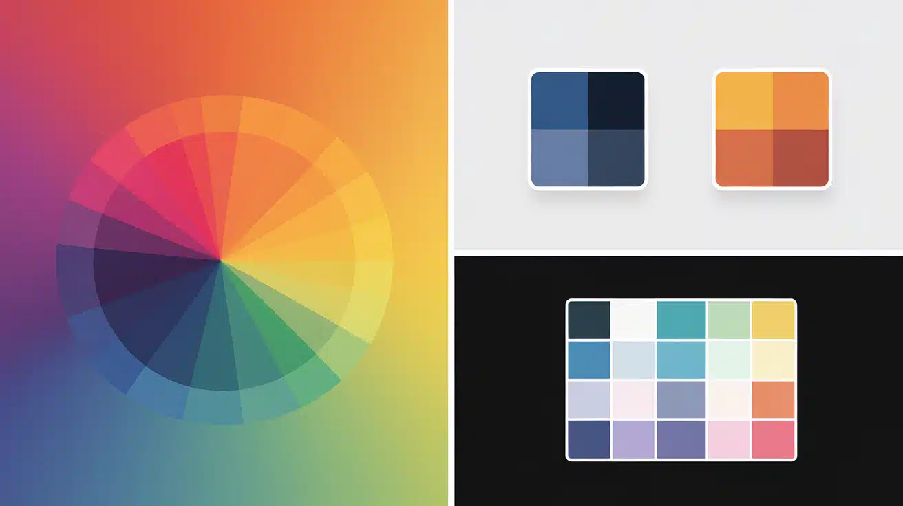
Delta E (ΔE) helps quantify what our eyes see. It measures the gap between two colors based on how humans notice differences. A low Delta E means colors look almost the same to most people.
Both numbers and what we see matter when picking colors. While tools give exact readings, our eyes make the final call on what looks good. The best results come from using both methods together.
How to Compare Colors Accurately?
Checking colors side by side is one of the best ways to see if they work together. Place your samples next to each other in good light. The human eye can catch small changes that tools might miss.

1. Visual Comparison Methods
When you need to match colors, trust what you see first. For the best results, place samples on a white background. Look at them in daylight since indoor lights can change how colors appear.
Several tools can help with visual checks. ColorCompare shows colors next to each other on the screen. Calman helps check screen colors. Color checker cards offer standard colors to test against.
Human eyes are still the most useful tool. We can spot tiny changes in tone that numbers might not show. For the most complete check, look at the colors at different times of day.
2. Using Delta E for Color Measurement
Delta E (ΔE) gives a number to show how far apart two colors are. Smaller numbers mean the colors are closer.
- Less than 1: Not visible to most people.
- 1 to 2: Slight change, barely seen.
- More than 3: Clear difference to most eyes.
Many online tools and design apps can check Delta E. Enter the two color codes. This is helpful when you need a clear answer about whether two colors match.
3. Brand Comparison Tools
Paint companies offer tools to help match their colors. Behr has a tool that lets you see how colors look together. Sherwin-Williams shows you how colors appear in rooms. Farrow & Ball helps match their paints to other items.
Remember that screens show colors differently than paint. Your phone screen, laptop, and tablet might all show the same color in slightly different ways. Always check real paint samples before making final choices.
Visual vs. Numerical Comparison – Which One Is Better?
Delta E gives us a number to say how close colors are, but our eyes still make the final call. Numbers can’t always tell the whole story of what we see.
Looking with our eyes works best for soft, in-between colors like off-whites and light grays. These can look the same by the numbers but different to our eyes. Our eyes also pick up on how colors feel together in a room.
Numbers can miss the mark when lighting is strange or when texture changes how colors look. But they shine when we need to be very exact or when we need to talk about color with someone far away.
Tools, Techniques, and Software to Compare Colors

Finding the right way to compare colors can save time and help you make better choices. Whether you’re working on a design or picking paint, there are simple and advanced tools that can help.
1. Digital Tools
Color Palette Builders suggest combinations that complement your first color. Gradient Generators make smooth blends, and they are often used for backgrounds.
Adobe Color works through a free account and follows standard color rules. Coolors creates ready-to-use palettes with one click.
Color Oracle shows how your colors may appear to people with color blindness.
2. Professional Instruments
Colorimeters and spectrophotometers are common tools for precise work. Colorimeters check color using filters, while spectrophotometers scan the full light range.
Calman helps align colors on screens.
EasyRGB changes color values between systems like RGB and CMYK.
Color checker charts use fixed color patches for consistent results.
3. Mobile and Web Apps
Many phone apps can compare or capture colors using your camera.
Calman Color Comparator shows easy-to-read charts that highlight where two colors are most different, making it simple to spot mismatches.
Color Comparison Missteps You Should Avoid
| Mistake | Why It’s a Problem |
|---|---|
| Using too many colors in one scheme | Overwhelms the viewer and creates a chaotic, non-cohesive design. |
| Relying only on HEX codes without context | HEX codes don’t account for material, lighting, or environmental influences. |
| Ignoring color contrast and accessibility | It can make text unreadable and the design unusable, especially for users with low vision. |
| Not testing colors in real environments. | Colors can shift drastically under different lighting conditions or surface types. |
| Depending solely on ΔE without visuals | Numbers don’t always align with human perception—visual confirmation is essential. |
Searching for New Ideas? Here Are Some Alternatives
- Compare Finishes Instead of Colors – Matte and satin versions of the same color can look very different when applied to a wall.
- Use Grayscale Conversion to Judge Contrast – Turn your color choices to black and white to see if they have enough contrast for text and graphics.
- Explore Layering Techniques – Try placing see-through color layers on top of each other to create depth in your design work.
- Create Analog vs. Complementary Palette Tests—Test similar and opposite colors side by side to find what works best for your needs.
- Combine Texture Swatches for Fuller Impact – Add texture samples to your color tests to see how rough or smooth surfaces change the color’s look.
Conclusion
We’ve examined many methods for comparing colors, from simple side-by-side checks to high-tech tools. The method you choose should match your needs and budget.
So what? Color comparison matters because it helps create spaces and designs that feel right. Good color choices make your work look planned and professional.
What next? Start with basic visual tests, then try some of the digital tools we mentioned. For important projects, consider getting color samples to test in your actual space. Remember that lighting, surfaces, and human eyes all affect how we see color.
Leave a comment below about which color comparison method works best for you. Have you tried any of the tools we mentioned? Your input helps other readers guide the color maze.
Frequently Asked Questions
1. What’s the Easiest Way to Compare Two Colors?
Place samples side by side on a white background in natural daylight for the most accurate visual comparison.
2. How important is Delta E in Color Matching?
Delta E gives you a number to measure color differences when your eyes aren’t enough – lower numbers mean colors are more alike.
3. Do I Need Special Tools to Compare Colors Properly?
While tools help with exact matches, you can start with simple side-by-side tests and free online color tools.
4. How does Lighting Affect My Color Choices?
Colors look different under various light sources, so always check samples in the same lighting where the colors will be used.
