
Picking a paint color should be fun. Like, “new haircut” fun. But somehow it turns into “defusing a bomb in aisle nine while an employee asks if you need help” stress.
And I get it. Sherwin-Williams has roughly one zillion whites that look identical until you put them on a wall and suddenly one is baby pink at night and the other is… vaguely swamp. Paint is rude like that.
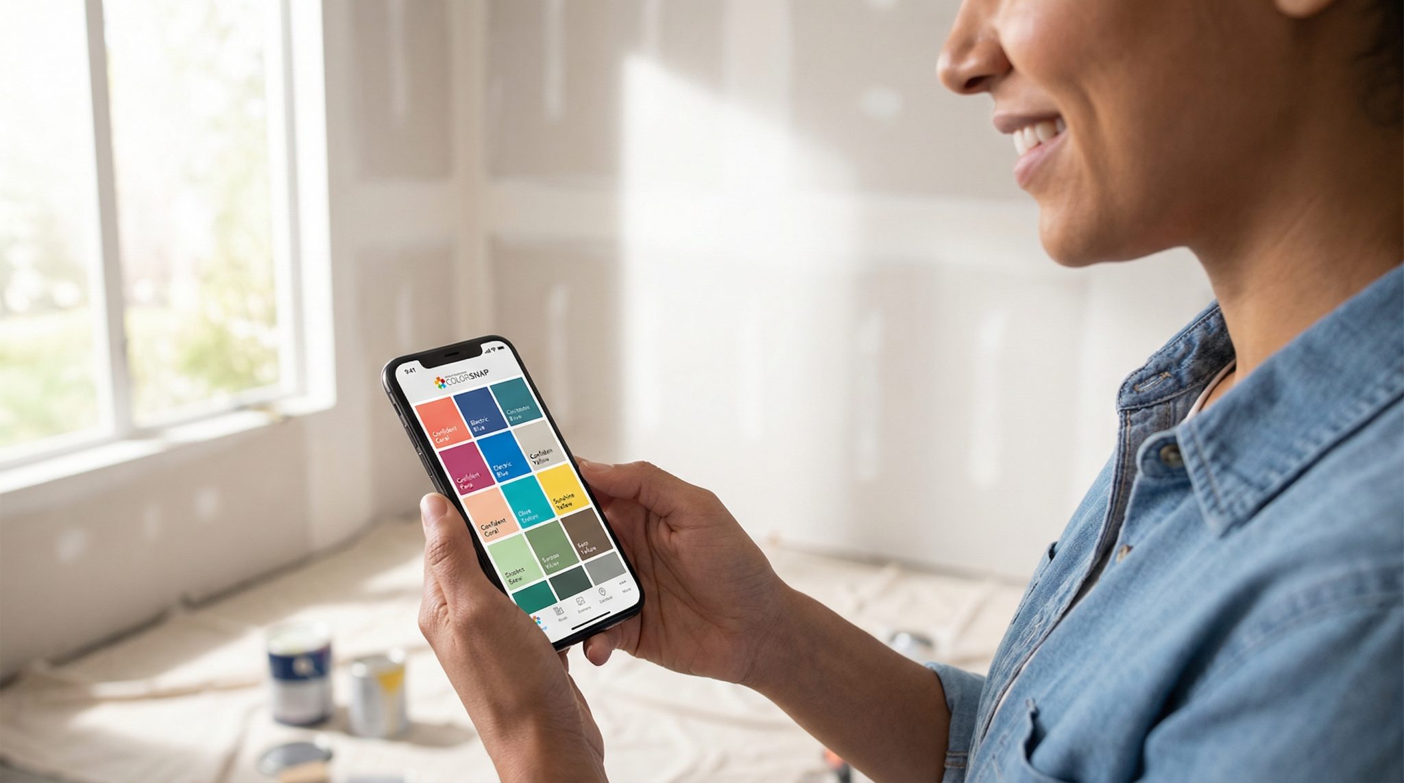
Here’s what actually helps: the free Sherwin-Williams ColorSnap app. It won’t magically make you a person who enjoys comparing undertones (some people do, and I both admire and fear them), but it will get you from “I’m spiraling” to “Okay, I have three solid contenders” without losing your entire weekend.
It does three things really well:
- matches Sherwin-Williams colors from a photo,
- lets you preview colors on your wall with AR,
- and saves/share palettes so you’re not standing in the store saying, “It was… kind of a warm-ish gray-ish thing??” like a lost Victorian child.
Let me walk you through how I use it plus the couple spots where you still have to act like a responsible adult and test samples in real life. (I know. I’m sorry.)
Why choosing paint feels impossible (and why it’s not your fault)
Your brain is not designed to calmly choose one perfect off white out of 1,700 options that are all named things like “Snowbound” and “Incredible White” (which sounds like a whitening toothpaste, but okay).
Decision fatigue hits hard with paint because:
- lighting changes everything,
- your floors/counters/brick/fireplace are loud opinions you can’t return,
- and every chip looks cute under store lighting, then turns weird at home.
ColorSnap helps because it gets you to a shortlist fast. Not a final answer just a sane starting point. And that’s huge.
Also: guessing wrong is expensive. Repainting costs real money, real time, and at least one minor identity crisis. Spending a little time upfront is cheaper than buying gallons you later hate with the passion of a thousand suns.
First, use the app on your phone (trust me)
You can use ColorSnap on a phone, tablet, or desktop, but if you want the magic especially the AR wall preview use your phone.
My personal ranking:
- Phone: best for actually picking colors in the room you’re painting.
- iPad: nice if you want a bigger screen to compare families.
- Desktop: fine for looking at saved palettes, not great for choosing.
If you make a free mySW account, your palettes save and sync, which is handy when you’re at the store and your brain turns into a goldfish.
Paint lingo you actually need (the short, non-annoying version)
I’m not here to send you back to design school. But these three terms will save you from so much nonsense:
- Undertone: the sneaky color hiding underneath (a “gray” that reads blue/green/purple/brown depending on lighting). Undertones are the reason paint has betrayed you before.
- Sheen: how shiny it is (matte to semi gloss). Shinier = reflects more light = can look brighter and more intense.
- LRV: Light Reflectance Value (0-100). Higher LRV = lighter/brighter. It doesn’t tell undertone, but it helps you avoid painting a cave by accident.
That’s enough to sound confident at the paint counter without wearing a beret.
The 3 ways I use ColorSnap to find a color (without losing my mind)
Think of the app like three different paths depending on what you already have: inspiration, a wall, or a paint chip.
1) Match a color from a photo (my favorite starting point)
This is the “I saw a moody navy paint color I can’t stop thinking about” method. Or the “my throw pillow is the only thing in this room I trust” method. Or the “I’ve been staring at this brick fireplace for eight years and I’m ready to evolve” method.
You upload/take a photo, the app drops little dots on it, and it suggests Sherwin-Williams colors that coordinate.
My best tips so the app doesn’t go rogue:
- Take the photo in natural light if you can.
- Get context: include trim, flooring, nearby furniture don’t just zoom into one tiny square.
- If it’s a mixed surface (brick, stone, patterned tile), tap a few spots. Mortar and brick are not the same vibe.
Use this to pull a shortlist, not to declare a winner immediately. It’s like online dating you still need to meet in person.
2) Use the AR “paint my wall” preview (the fast elimination round)
This is where ColorSnap shines: you point your camera at the wall and swipe through colors like you’re trying on outfits. It’s incredibly good for spotting undertone problems quickly.
Example: you think you want “greige,” but your floors are warm oak and suddenly your “greige” looks like it’s tinted with sadness and blue frosting. AR will show you that in about nine seconds.
But (important): AR can’t show sheen properly, and it can’t replicate your exact lighting. Every color looks kind of matte on screen, and your phone is not living under your weird little lamps at 10pm.
So use AR to narrow down. Then sample in real life like a sensible person.
3) Scan a paint chip (when you already have “the one” in your hand)
If you have a Sherwin-Williams chip already, you can scan it and save it so you don’t forget what “SW 7015” was when you get home. It’s quick and honestly great for keeping your life organized when you’ve got chips stuffed in your purse like receipts.
Okay, now build a palette that doesn’t look like a paint store exploded
If you’re painting more than one space, you don’t need every room to match. But you do want it to make sense when you walk down the hall.
Here’s what I do:
- Pick a main wall color direction.
- Pick trim (usually a cleaner white, but not always).
- Pick one accent color if you’re feeling spicy.
If you want a simple “designer-ish” rule, use 60/30/10:
- 60% main wall color
- 30% secondary (trim, cabinets, big furniture, an accent wall)
- 10% accents (pillows, art, small decor)
Also: if you want rooms to flow, keeping LRVs within about 10-15 points tends to feel cohesive. Bigger jumps are fine when you want contrast just do it on purpose.
Save separate palettes in the app like “Warm neutrals” and “Cool neutrals” so you’re not comparing apples to… bluish gray oranges.
Don’t skip this part: test samples in real life (I am begging you)
If you take nothing else from this post, take this: a screen is not a wall.
Phones auto-correct, brighten, saturate, and generally act like everything is an Instagram filter. If you go straight from app to gallons, your future self will be standing in the hallway whispering, “Why is it purple?” and you will deserve exactly zero sympathy. (Kidding. Mostly.)
Here’s how to test without making it a whole exhausting production:
- Peel and stick samples: Great for quick comparisons. Put them on a clean wall and leave a little white border so your current color doesn’t mess with your eyes.
- Paint a real sample: If you do quarts, paint a 2×2-ish square (bigger is better). Two coats. Let it dry 24-48 hours.
- Watch it through the day: Morning, midday, late afternoon, and at night under your lamps. The color that behaves nicely in all lighting is the one you want to live with.
If a color keeps doing dramatic costume changes cute in the morning, weird at night you’re probably fighting undertones. Move on to a neighbor shade or a different undertone. No emotional attachment to a paint chip, okay?
You’re ready to commit when:
- you still like it after a few days,
- it works with your fixed stuff (floors, counters, tile, brick),
- and everyone who lives there has seen it (because nothing is worse than painting a room and your partner going, “Oh. It’s… very green.”)
Take your shortlist to the store (yes, store lighting is a villain)
Once you’ve got 2-4 finalists saved in the app, go see the physical chips. Compare them under store lighting, then bring them home and look again. (Paint is nothing if not consistent in its inconsistency.)
If the chip looks duller in real life than it did on your phone, don’t panic phones tend to make colors look better. You might consider going one shade lighter if you’re on the fence.
And if you’re trying to match an existing paint color and your phone is struggling? That’s normal. Sometimes you need the store’s matching tools (or a pro) because cameras are not tiny color scientists.
When ColorSnap isn’t enough (and that’s not a failure)
A few situations where I’d personally stop pretending I can “eyeball it” and get extra help:
- Multiple connected rooms where everything needs to flow
- North facing/dim rooms (lighting can make neutrals go gray/blue fast)
- Undertone sensitive neutrals (greige and taupe can be angels or demons)
- Matching existing paint or sheen exactly
If you’re in one of those scenarios, stepping up to a pro consult or a more precise color matching device or the best primer for deep blues can save you a lot of repainting rage.
My bottom line
ColorSnap won’t choose the perfect paint color for you while you eat chips on the couch (unfortunately), but it will stop the overwhelm spiral and get you to a shortlist you can actually test.
Use the app to narrow it down fast. Then let your real walls under your real lighting make the final call.
Now go take a photo of something you love in your house (a rug, a pillow, a piece of art, your brick exterior, whatever) and build a palette. You’re closer than you think.