
Complementary Colors: The Cheat Code for a Room That Looks “Done”
You know that feeling when you walk into someone’s house and the room just… works? Like it’s not screaming for help, nothing feels randomly plopped down, and somehow the whole thing looks intentional even if they probably still have a junk drawer full of batteries and takeout menus?
A lot of that “how is this so good?” magic is just color contrast. Specifically: complementary colors the colors that sit opposite each other on the color wheel. When you pair opposites, everything looks more vivid and alive, like the room drank a coffee.
And no, this doesn’t mean you have to paint your living room like a carnival. You can do complementary colors in a grown up, calm way. (I’m here for bold, but I’m also here for sleeping at night.)
Let me walk you through the only parts you actually need, plus how to keep it from turning into a visual wrestling match.
The Color Wheel (The Very Non-Annoying Version)
The color wheel is basically a friendship chart for colors. The ones across from each other? They’re “complements.” They make each other pop like they’re in a rivalry on a reality show.
For paint and home stuff, think the traditional art class wheel (RYB: red, yellow, blue). Your main complementary pairs are:
- Blue + Orange
- Yellow + Purple
- Red + Green
If you want to see this in real life, do the low effort test: put something blue next to something orange (a mug, a book, a pillow, your kid’s abandoned toy… whatever). Suddenly both colors look more intense. That’s the whole thing. That’s the trick.
Now, here’s how these combos actually feel in a room because “opposites” sounds spicy, but your goal is still to live there.
Complementary Pairs That Look Good in Real Homes (Not Just Pinterest)
1) Blue + Orange: The Reliable Overachiever
If complementary colors had a “most likely to succeed” award, it’s blue and orange.
Blue is calming. Orange is warm. Together, they’re energetic without being exhausting. This combo is also easier for more people to read visually (a lot of folks have some red green colorblindness), which is one reason it shows up everywhere from fancy interiors to sports logos.
Where it shines: living rooms, offices, kitchens anywhere you want some life but not chaos.
How I’d actually use it:
- navy or denim walls + a little leather/cognac
- soft blue sofa + rusty orange pillows
- blue cabinets + warm wood + a tiny bit of terracotta (chef’s kiss)
2) Yellow + Purple: The “A Little Dramatic” Combo
Yellow is basically sunlight in color form. Purple and violet and magenta tones (especially the deep plums) lean moody and luxe. Together, they can look rich and intentional like you own matching wine glasses.
But I’m going to gently save you from yourself: bright yellow + bright purple is a LOT. Like “children’s museum exhibit” levels of stimulation. If that’s your vibe, live your truth. If you want it to feel elevated, go a little dustier or deeper like pairing blue with red.
Where it shines: dining rooms, bedrooms, creative spaces places that can handle a little personality.
My favorite “grown up” versions:
- golden ochre + plum
- soft buttery yellow + dusty lavender
- deep eggplant + warm brass (brass counts as yellow-ish and it’s so pretty)
3) Red + Green: Yes, You Can Do It Without Summoning Christmas
Red and green get a bad rap because, well… December. But it’s not the relationship that’s the problem it’s the shades.
If you pick full on true red and full on true green, your room will start humming “Jingle Bells” against your will. But if you shift the tones? It gets earthy, modern, cozy.
Where it shines: kitchens, dining rooms, nature-y spaces, anywhere you want warmth balanced with calm.
Try these instead:
- sage + brick red
- olive + burgundy
- muted forest green + clay/terracotta (yes, terracotta can lean “red enough” to work)
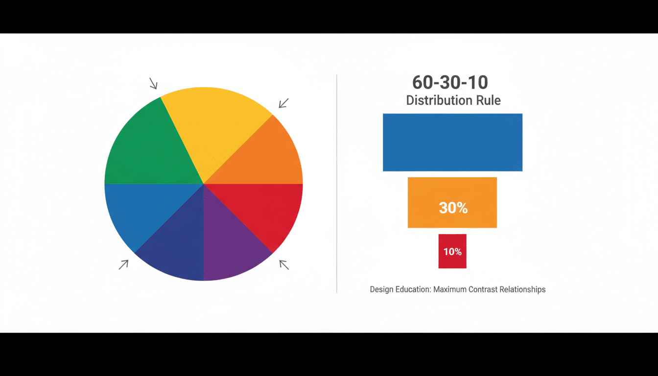
The One Rule That Saves Complementary Colors: Don’t Do 50/50
Here’s where people accidentally make a room feel like it’s arguing with itself: they use both complementary colors in equal amounts.
When opposites are equally loud, your eyes ping pong around like the DVD logo hitting the corner of the screen. (Stressful. Yet weirdly compelling.)
Instead, use a simple ratio that designers love because it works:
- 60% main color (biggest visual stuff: walls, sofa, rug)
- 30% secondary color (curtains, chairs, bedding, bigger accents)
- 10% punchy accent (pillows, art, decor, that one “look at me” piece)
So if you’re doing blue + orange, maybe the room is mostly blue, with orange as the “spark.” Or mostly warm tones with blue as the cool anchor.
And if even that feels like too much for your nervous system (no shame), there’s the easier cousin:
Split complementary = pick your main color, then use the two colors next to its complement. Example: If your base is blue, instead of orange you’d use yellow orange and red orange. You still get contrast, but it’s less “BOOM” and more “ohhh, nice.”
How to Make It Feel Expensive (Without Actually Spending Money)
This is the secret sauce: you can keep the complementary “pop” while making it feel sophisticated by adjusting:
- Saturation = how bright/intense the color is
- Value = how light or dark it is
A few combos that almost always behave:
- Bright accent + light neutral-ish version of the other color (cheerful, crisp)
- Muted accent + deep, moody base (my personal favorite feels designer-y fast)
- Both muted (quiet, elevated, “boutique hotel lobby” energy)
One quick warning: if both colors are super saturated and close in brightness, the edges can look like they’re vibrating. Some people don’t notice it. Some people can’t unsee it and suddenly hate their living room. I like to avoid the gamble.
Common Ways This Goes Sideways (So You Can Skip the Drama)
1) Forgetting what you can’t change.
Floors, cabinets, tile those things have undertones. If your floors are warm oak, ice cool teal might feel a little “why are you mad at me?” in that room. You can still do it, but you’ll need a bridge (warm whites, wood tones, warmer versions of your colors).
2) No breathing room.
Complementary colors need neutrals like plants need water. Add white, cream, greige, natural wood, black accents something that lets your eyes rest.
3) Letting the two bold colors touch too much.
Big blocks of pure opposites right next to each other can feel harsh. Break them up with a neutral line, texture, or pattern. Even something simple like a creamy pillow between a blue chair and an orange throw helps.
Test It Like a Normal Person (Not a Color Scientist)
Before you paint the whole room or buy the $900 chair (that you will then feel morally obligated to love), do a quick test run.
- The “black and white” photo test: snap a pic of your samples and turn it grayscale. If everything blends together, you need more light/dark contrast.
- Look at it in night lighting: your house at 7pm is a different planet than your house at 1pm. LEDs can make some colors go weird. Check it where you actually live your life.
- Do a cheap “live with it” test: grab a couple throw pillows, a blanket, a piece of art something returnable and low commitment and scatter it around for a few days. If you keep smiling when you walk in, you’re onto something.
Online palette tools can help (Adobe Color, Coolors), but don’t let the internet choose your paint for you. Your room’s lighting will humble any digital swatch.
My Final Pep Talk Before You Start Painting Everything
Complementary colors aren’t scary they’re just powerful. Pick one main color, let the opposite show up as an accent, and give the whole thing some neutral “breathing room.” Adjust the shades so they feel like you (not a holiday aisle), and test in your actual light before you commit.
Start small if you’re nervous: one rug, two pillows, a piece of art. If it feels good after a week of real life laundry piles and all then go bigger.
And if you end up staring at paint chips until your eyes cross, welcome. You’re one of us.