
Why Dark Green Paint Can Actually Make a Small Room Feel Bigger (Yes, Really)
If the phrase “dark paint in a small room” makes you picture a medieval dungeon with a single sad candle… I get it. For years I was also in the “light and bright fixes everything” camp. Then I painted a tiny room dark green on a whim (read: caffeine fueled confidence) and suddenly the space felt deeper, cozier, and annoyingly like all the “moody jewel box” people on the internet were right.
So if you’ve been side eyeing deep green paint but you’re scared it’ll shrink your room into a closet with feelings, let me talk you off the ledge.
Dark green can make small rooms feel bigger as long as you don’t wing it. The magic comes down to depth, lighting, contrast, and choosing a green that doesn’t turn swampy in your specific house light (because every home has its own weird little lighting personality).
The trick: dark walls recede (aka they back away politely)
Here’s the thing designers know (and the rest of us learn after painting a sample at midnight): dark colors visually recede. Corners soften, edges blur a bit, and the room stops screaming its exact dimensions at you.
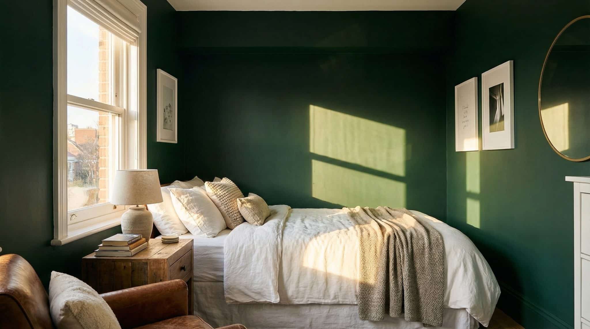
Think of a theater stage everything behind the actors is dark so it disappears. In your room, your walls become the “background,” and your bed/art/dresser become the “actors.” A white duvet against deep green walls? Stunning. A vintage mirror on a moody green wall? It looks expensive, even if you got it off Marketplace from a guy named Brad.
What usually ruins dark paint isn’t the darkness. It’s when everything goes flat dark walls, dark furniture, no contrast, one sad overhead light. Then it’s less “cozy cocoon” and more “why do I feel like I’m being punished?”
Quick reality check: is your room a good candidate?
You don’t need a sun drenched mansion to pull off dark green. You just need… a plan.
Dark green will probably work great if:
- You get some natural light (even a couple hours a day) or you’re willing to add lighting.
- Your ceiling is around 8 feet or higher (lower can still work just be strategic).
- You can create contrast with lighter bedding, trim, rugs, art, etc.
- You’re open to either:
- going all-in (walls + ceiling + trim), or
- keeping a crisp difference between the dark walls and a light ceiling/trim.
I’d rethink it (or at least test aggressively) if:
- It’s north facing, tiny, and you refuse to buy lamps on principle.
- You already have a lot of heavy dark furniture and don’t want to lighten anything up.
- It’s basically a cave and you’re expecting paint to solve that by itself.
Dark paint doesn’t “make a room small.” Dark paint plus no lighting plus no contrast makes a room feel like it’s closing in for a hug you didn’t consent to.
Do this first: the five minute “throw blanket” test (my lazy favorite)
Before you drop money on six sample pots and spiral into analysis paralysis, do this:
Grab a dark throw blanket or towel (deep green if you have it, but even charcoal works for the vibe test). Hold it up against the wall you want to paint.
Now check it:
- morning
- late afternoon
- night with your lamps on
You’re looking for a few red flags:
- Does it read muddy/gray instead of rich and green?
- At night, does it feel heavier than you expected?
- Does the room lose definition like everything’s melting together?
This isn’t about picking the exact shade. It’s about answering the big question: Will your space tolerate “dark” without throwing a tantrum?
If it looks kind of amazing? Congratulations. You might be a dark wall person.
Lighting: the part nobody wants to think about (but it’s the whole game)
If you take one thing from this post, make it this: your lighting matters more than your paint color.
1) Bulb temperature is everything
For dark green, I’m ride or die for warm LEDs: 2700K-3000K.
- 2700K = cozy, glowy, “I light candles even when I don’t.”
- 3000K = still warm, a bit cleaner
- 4000K+ = can make dark green look harsh, gray, or vaguely medical
Also: don’t mix bulb temperatures in one room unless you enjoy chaos. Swap them all so the space doesn’t look like it has multiple conflicting opinions.
2) Use multiple light sources (overhead light can’t do it alone)
In a small dark painted room, I like 3-4 light sources if possible:
- one overhead/ambient fixture (preferably something that doesn’t spotlight the floor like an interrogation)
- a table lamp or floor lamp
- sconces or a second lamp if the room is extra dim
- dimmers if you can swing it (they’re basically mood control)
Bonus trick: aim light at the walls or upward, not just down. When walls are lit, dark paint looks rich instead of heavy.
And yes, mirrors help especially placed opposite your strongest light source. It’s the closest thing to free extra light you’ll ever find.
Paint finish: my not too shiny sweet spot
Finish matters with dark colors because it changes how light bounces around.
Here’s what I use most of the time:
- Walls: eggshell or satin (enough glow to feel alive, not so shiny you see every roller mark)
- Trim/doors: semi gloss (it keeps edges crisp and intentional)
- Ceiling: flat/matte (unless you want to highlight every ceiling “personality trait” your house has)
Even if you color drench the whole room (more on that in a second), sheen choices on walls keep the room from becoming one big flat green blob.
The balance secret: contrast, contrast, contrast
When people tell me dark paint “made their room feel smaller,” I can usually guess what happened:
- dark walls
- dark furniture
- not enough lighting
- and everything kind of… blended
My quick rule of thumb: make about 40% of what you see lighter.
That can mean:
- lighter bedding (white, cream, oatmeal, soft gray)
- a lighter rug
- lighter curtains
- white or light trim
- art with bright negative space
- a big mirror with a light frame
Also, furniture with legs helps. Anything that lifts off the floor reads lighter visually than big boxy pieces that sit flat and heavy.
Material wise, dark green is gorgeous with:
- white oak / ash / lighter woods
- linen and cotton
- rattan/jute (if you like that cozy texture vibe)
- warm leathers (caramel/cognac is chef’s kiss)
Metal note: I personally love aged brass with dark green. Chrome can work, but it often looks a little cold unless the whole space is leaning modern.
Undertones: why “dark green” is never just dark green
This is where people get tripped up. Two paints can both be called “deep forest green” and look like completely different life choices on your wall.
A quick cheat sheet:
- Cool greens (blue/gray base): polished, calm, can go chilly in low light
- Warm greens (olive/yellow base): cozy, grounded, often friendlier in north facing rooms
- Muted gray greens: earthy and forgiving (great if your home has lots of wood tones)
If your room is north facing or dim, I usually lean warmer/olive so it doesn’t go dead looking.
If your room is bright or south facing, you can handle cooler, slinkier greens like HC 157 green without it turning into a cave.
A few dark green paint shades people actually love (test first, obviously)
Please don’t buy gallons based on a cute Pinterest photo taken in someone else’s magical lighting.
Paint a 2′ x 2′ swatch (minimum), and live with it for 3-7 days. Look at it in morning light, afternoon light, and nighttime lamp light.
A handful of designer loved options:
- Benjamin Moore Backwoods Green deep forest, balanced, tends to behave in mixed/north light
- Benjamin Moore Caldwell Green earthy/mossy and very cozy (great with brass + natural textures)
- Sherwin-Williams Jasper a strong pick for low light or even windowless spaces
- Clare Field Trip shifts through the day (a little brighter in sun, warmer at night)
- Farrow & Ball Studio Green dramatic. Can read nearly black in dim light, greener in brighter light
(And yes, dark greens can feel amazing for sleep… or feel like you’re being tucked into a jewelry box. That’s why we test.)
Three ways to use dark green (pick your bravery level)
1) Color drenching (the “jewel box” move)
Paint walls + ceiling + trim + doors the same green. It sounds like it would shrink a room, but it can actually blur the edges so the room feels endless and intentional.
This is incredible for bedrooms, powder rooms, and little reading nooks places where cozy is the goal.
Pro tip: keep the same color, but change sheen (matte ceiling, satin walls, semi gloss trim).
2) Dark walls, light ceiling (classic and safe)
If you’re nervous or your ceilings are low paint the walls dark green and keep the ceiling white or very light. It gives you drama without making the ceiling feel like it’s lowering itself in protest.
3) One accent wall (the baby step)
Do one wall (usually the bed wall, or the first wall you see when you walk in). Live with it. If you still love it after a few weeks, you can always paint the rest.
No shame in starting with a toe dip. I’ve toe dipped my way into entire room paint jobs many times.
Quick tweaks for specific small rooms
- Small bedroom: a dark green wall behind the bed is always a win. Keep bedding lighter, and consider a lower bed frame if the room feels tight.
- Bathroom/powder room: tiny rooms can handle bold color like champs. Add a big mirror and good lighting, and it looks instantly elevated.
- Home office: dark green can feel focused and calm, but you’ll likely need more light than you would with pale walls. (Your eyeballs will thank you.)
If it looks “off,” don’t panic (it’s usually fixable)
Before you repaint the whole room in a rage, try this shortlist:
- Feels flat/depressing: add lamps, swap to 2700K-3000K bulbs, and make sure light hits the walls (not just the floor). A slightly higher sheen on walls can help too.
- Trim disappeared: go semi gloss on trim or lighten it for contrast.
- Room is darker than expected: you need more light sources, period. Dark paint is unforgiving with a single overhead fixture.
- Ceiling feels too low: keep the ceiling light (or repaint it light) and add upward/wall wash lighting.
Nine times out of ten, it’s lighting and contrast not the color itself.
Your next step (do this today, no paint store required)
Grab a dark throw blanket, hold it up on your wall, and look at it throughout the day and tonight with your lamps on.
If you catch yourself thinking, “Wait… that actually looks really good,” then welcome. You’re officially flirting with dark green and I fully support this relationship.