
Dark Siding + Light Metal Roofs: The One Tiny Detail That Makes It Work (or Look Weird)
You know that feeling when you see a house with dark siding and a bright, light metal roof and you’re like… “Ooooh, that’s chic.” And then you see another one and it’s more like… “Why does your roof look like it belongs to your neighbor’s shed?”
Same idea. Wildly different vibe.
The difference is usually not the brand of siding, or whether the roof is standing seam, or how many Pinterest boards you have (no judgment, I have boards for “mudroom dreams” and I do not have a mudroom). It’s one boring sounding thing that matters way more than it should:
Undertones.
If you get the undertones wrong, your siding and roof will look like two strangers forced to ride in the same elevator. If you get them right, it looks intentional and expensive—even if you’re eating cereal for dinner because you blew the budget on exterior samples. (Ask me how I know.)
Let’s make sure you end up with the first situation, not the elevator one.
Why flipping the “normal” color scheme changes everything
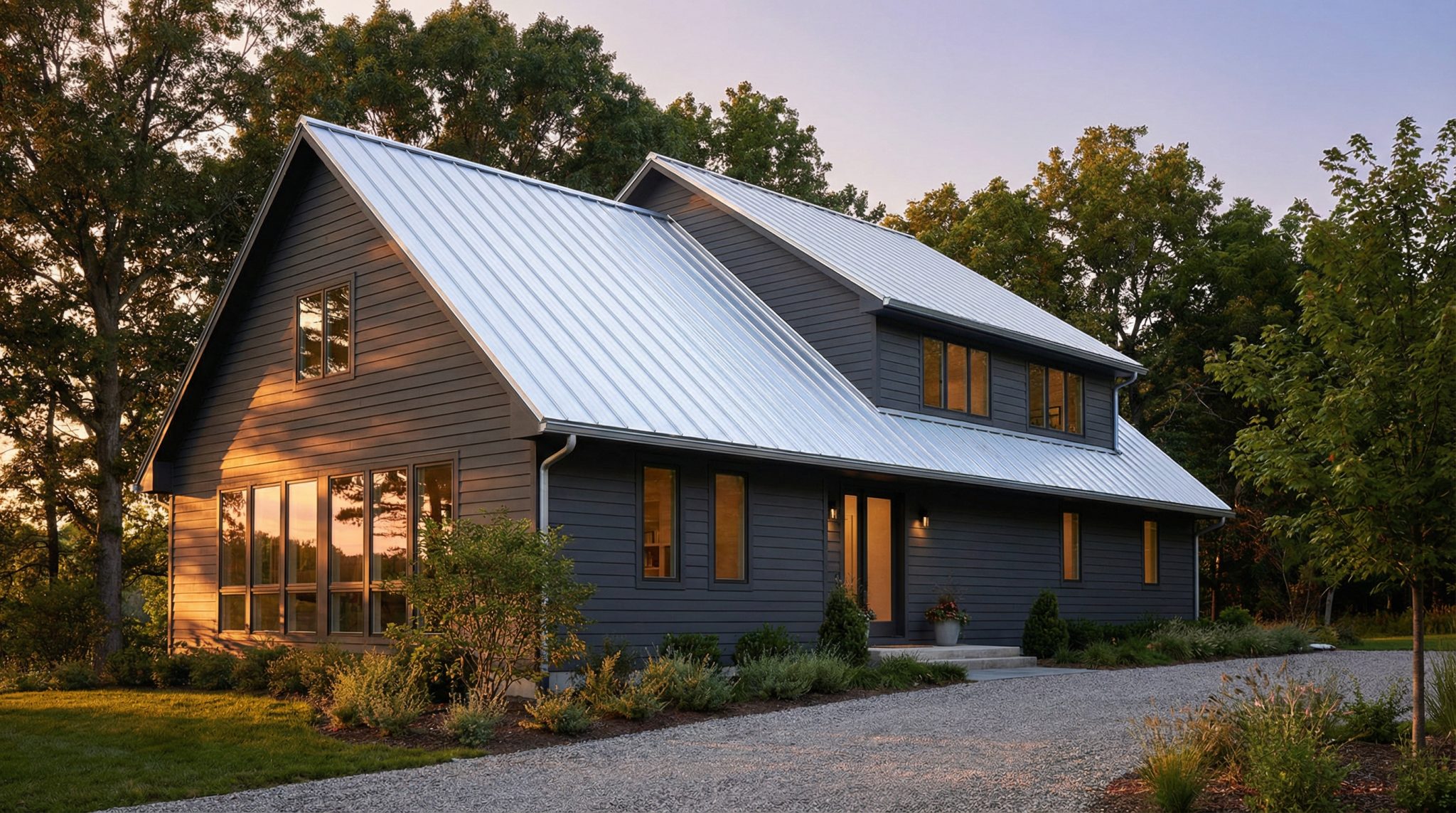
Most houses are built with the classic formula: light-ish siding + dark-ish roof. It’s safe. It’s common. It’s like ordering vanilla ice cream—nothing wrong with it, but nobody’s writing songs about it.
When you go dark siding + light metal roof, the whole visual weight shifts:
- The dark siding makes the house feel grounded and solid.
- The light roof pulls your eye up and actually shows off the roofline (which is kind of the point of… having a roofline).
It can look insanely good. But it’s higher contrast, which means the in between details matter more—especially trim. (Trim is the supporting actor that secretly carries the whole movie.)
The undertone rule (aka: the reason your colors are fighting)
Here’s the rule I wish someone had tattooed on my hand the first time I tried to pick exterior colors:
Warm goes with warm. Cool goes with cool.
That’s it. That’s the whole magic trick.
“Dark” isn’t just dark. A charcoal can lean:
- cool (blue/inky/slate vibes)
- warm (brown/coffee/earthy vibes)
And “light metal roof” isn’t just white or silver. It can lean:
- cool (crisp white, blue gray, clean silver)
- warm (cream, champagne, tan-ish metals)
If you mix warm and cool, you get that subtle but constant “something’s off” feeling every time you pull into your driveway. It’s like wearing black shoes with a navy suit. Technically clothing. Emotionally chaos.
Quick cheat sheet:
- Cool roof (silver, light gray, crisp white) → looks best with cool dark siding (slate charcoal, navy, blue gray).
- Warm roof (champagne, cream, tan, bronze-ish lights) → looks best with warm dark siding (espresso, brown based charcoal, deep warm greens, burgundy).
One of the most common “why does this look weird?” combos: warm espresso siding + crisp silver roof. Individually? Gorgeous. Together? The siding says “cozy cabin.” The roof says “modern warehouse.” They’re not in the same movie.
Trim: the 10% that does 90% of the work
If you do nothing else after reading this post, do this: stop treating trim as an afterthought.
With this kind of exterior, you’re basically working with a rough ratio:
- Dark siding: most of what you see
- Light roof: a big chunk
- Trim/accents: a smaller slice… that has to make the whole thing feel connected
Here are the trim routes I actually like in real life:
1) White (or soft white) trim
This is the “I want it to feel classic and not scare my neighbors” choice. It ties into the light roof and gives your dark siding a clean outline. It’s also HOA friendly if you live under the rule of the Architectural Review Committee.
2) Dark trim (black/charcoal)
This is the modern route. It can look amazing on contemporary homes. On super traditional houses, though, it can feel like the exterior is wearing eyeliner to a church potluck. Sometimes it works! Sometimes it’s… a lot.
3) Wood accents
A cedar door, brackets, shutters, or beams can soften the high contrast so it doesn’t feel harsh. Wood is like a warm handshake in a color scheme that could otherwise get a little icy.
My opinion: if you’re nervous, start with white/soft white trim for pairing trim with silver. It’s the easiest bridge between dark walls and a light roof.
Matte vs glossy: yes, the shininess matters
This is one of those details nobody thinks about until the roof is installed and suddenly your house is throwing sunlight into the neighbor’s breakfast nook.
Matte finishes tend to:
- look more modern and calm
- reduce glare
- feel “designed” instead of “new penny”
Glossy finishes tend to:
- emphasize contrast hard
- show off every bit of light
- feel more dramatic (sometimes too dramatic)
With dark siding + light roof, I personally lean matte or low gloss for the roof. It keeps the look bold without screaming, “HELLO I AM A ROOF.”
How to test samples without losing your mind (or your weekend)
Please don’t pick exterior colors from a screen and then act surprised when it looks different outside. Screens are liars. Lighting is a shapeshifter. Metal changes with angles. It’s a whole thing.
Here’s the testing routine that saves future regret:
1) Use a visualizer… only to narrow it down
Those manufacturer tools can help you get in the ballpark. But metal colors shift, your phone shifts, your laptop shifts, and suddenly you’ve chosen “Arctic White” that looks like “Sad Blue” in real life.
2) Get physical samples (big ones)
Ask for samples around 12″x12″ if you can. Hold them against your siding (or your siding sample) and look:
- morning
- midday
- late afternoon
And step back to the street. Up close, everything looks cute. From 30 feet away, undertones start yelling.
3) Do the “sunset check”
This is my favorite quick test: at sunset, hold the metal sample right against the siding. If they still look like they belong together in that warm light, you’re probably golden.
But wait—does a light roof actually save energy?
Sometimes, yes. Especially in hot climates.
A light metal roof can help reduce cooling load (how much your AC is fighting for its life) because it reflects more sun than dark shingles.
A few reality checks:
- Hot climates: this can make a noticeable difference.
- Cold climates: a darker roof can help with heat gain, so the “light roof = always best” rule doesn’t always hold.
- Mixed climates: you might land in a middle tone like light gray/charcoal depending on what matters most (and what you personally want to look at for the next 20 years).
Also: even dark metal roofing often performs differently than dark asphalt shingles because metal can reflect heat differently and many finishes include reflective pigments. So don’t assume “dark = doom.”
Durability (because faded siding next to a crisp roof is… not the dream)
High contrast exteriors are unforgiving. If one surface fades faster than the other, you’ll notice.
On metal roofs, the factory finish matters a lot. In normal human terms, it goes like this:
- PVDF (Kynar/Hylar): best for color retention and UV resistance. If you want your roof color to stay looking good for the long haul, this is the “buy once, cry once” option.
- SMP: solid mid range. Often fine, especially for lighter colors.
- Standard polyester: I’d avoid this for a bold, high contrast exterior if you can. Fading/chalking is not subtle when your siding is dark.
One more thing people don’t think about: dark siding may fade faster than the roof, depending on the material and exposure. So choose siding with a decent fade warranty, or at least go in knowing you may repaint down the road.
(Also, standing seam roofs can show “oil canning” a bit—those slight panel waves—especially in darker colors. It’s normal, but talk with your installer so you’re not shocked later.)
My go-to color pairings (the ones that usually don’t betray you)
You can absolutely get creative, but if you want combinations that tend to look good in the real world:
Charcoal / dark gray siding
My easiest “yes.” Pair with light stone, almond, or soft white roofing. Crisp and modern without feeling weird.
Navy / deep blue siding
Looks sharp with silver, light gray, or white roofing for silver roof siding combos. I usually skip warm metals here—navy + bronze can turn into a strange battle of undertones.
Black / near black siding
Proceed with a tiny bit of restraint. Bright white roofs can look like a piano keyboard (accurate and slightly aggressive). I prefer light gray or silver for a smoother transition. Add wood somewhere so it doesn’t feel cold.
Dark brown / espresso siding
This is where warm metals shine: champagne, tan, bronze, even copper if you love patina. This combo is chef’s kiss in wooded settings.
Forest green siding
So good with bronze, copper, warm light stone. It feels “belongs in nature” in the best way.
Which house styles pull this off best (and which ones throw a fit)
In my completely opinionated experience:
Easiest wins:
- Modern / contemporary: clean lines love contrast.
- Ranch: a light roof keeps the long roofline from feeling heavy.
Works great if you do it carefully:
- Farmhouse: keep trim light/creamy so it still feels classic. Dark trim can start to feel more modern than “farmhouse.”
- Colonial / Cape Cod: keep it restrained and traditional (think slate-y charcoals + soft whites + classic trim).
Proceed with caution:
- Craftsman: can go too modern too fast. Warmer/patina toned roofs help.
- Victorian: those ornate rooflines usually want richer, deeper roof colors. A bright light metal roof can feel… costume-y in the wrong way.
My final “don’t regret this” checklist
Before you sign anything or schedule install day, make sure:
- Your roof and siding undertones match (warm/warm or cool/cool).
- Your trim is chosen intentionally (it’s the bridge, not an afterthought).
- You’ve looked at real samples outside, in multiple lighting conditions.
- You’ve considered finish (matte/low gloss is usually the calmest choice).
- You’re buying a roof coating that won’t fade into a different personality in five years.
Do those things, and you’ll end up with that “wow, that looks expensive” exterior—without the nagging feeling that something is slightly off every time you come home. (Because your house should welcome you, not quietly roast you.)