
If the idea of painting a small room deep blue makes you picture a chic broom closet (complete with a mop and your regrets), I get it. Dark paint has been unfairly accused of “shrinking” spaces for years, like it’s out here stealing square footage in the night.
But here’s the thing I wish someone had told me before I stared at a wall of navy paint chips until my eyes crossed: it’s not the darkness that makes a room feel smaller. It’s the contrast. And the direction of your light. And whether your bulbs are basically a hospital hallway in LED form.
A good deep blue can actually make a small room feel deeper and calmer like the corners soften and the walls stop yelling “HELLO I AM A BOX.” Let’s talk about how to do it without creating a cave you’ll have to apologize for later.
The real “small room” villain is contrast (not dark paint)
Contrast is basically your room’s measuring tape. When you’ve got white trim slicing around dark walls, your eye goes, “Ah, yes. Here is the exact outline of this 9×10 situation. Noted.”
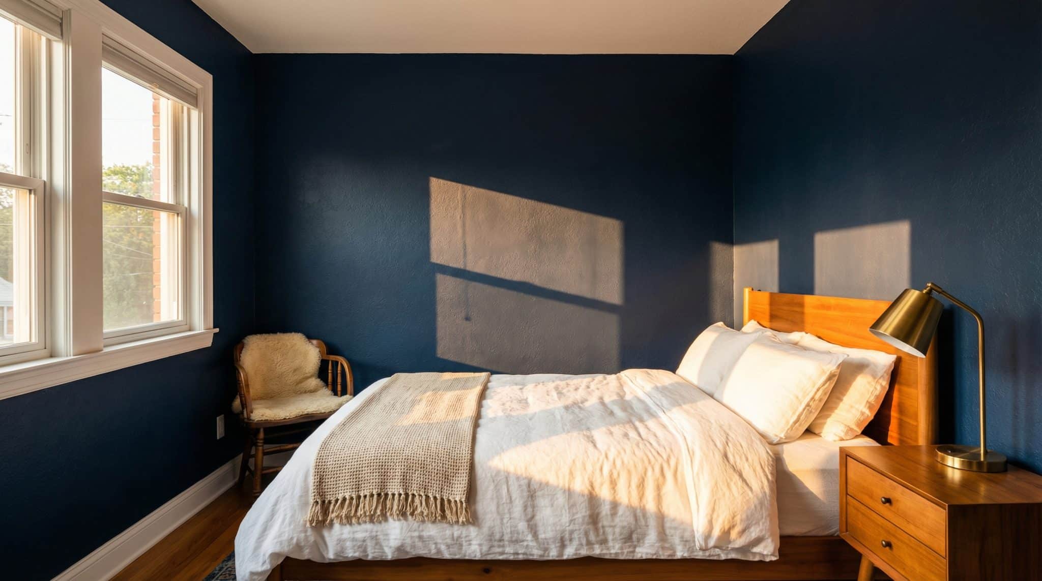
But when you paint the walls (and sometimes the trim and ceiling) in the same deep blue? Those crisp edges blur. The corners feel like they recede. The room stops looking like a shoebox and starts looking like a vibe.
This is the part people miss: deep color doesn’t automatically close a room in. Sharp lines do.
So if you want that “moody and expensive” look in a small space, the trick is simple: reduce the contrast that’s outlining everything like it’s been traced in Sharpie.
Before you pick a blue: where does your light come from?
I know, I know. Checking your room’s window direction is way less fun than scrolling “navy bedroom inspo” at midnight. But it matters more than your throw pillow choices for how blue changes by room (and I say that as someone with a truly unnecessary number of throw pillows).
Here’s the cheat sheet:
- South facing rooms: Congrats, you’re the teacher’s pet. You get warm, steady light that makes deep blue look rich instead of gloomy. Most navies behave nicely here.
- North facing rooms: The light is cooler and grayer all day. Deep blues can go icy or look weirdly flat unless you choose wisely (more on undertones in a second).
- East/west facing rooms: Drama queens. East light is bright in the morning then fades cooler. West light is meh in the morning and glowy later. Pick a blue that can handle mood swings.
One more practical rule I use: if your room gets very little direct sun most days, deep blue can still work but you’ll need decent lighting, or you’ll end up living in perpetual twilight like a Victorian novel.
Undertones: the sneaky little sidekick that decides if you love it
Two “navies” can look identical on the paint chip… and then one goes purple on your wall and you’re standing there in silence, holding a roller, questioning your entire personality. That’s undertone drama.
Here’s the simplest way to think about it:
- Blue green undertones (teal-ish): My personal safe bet for a lot of homes. They tend to feel a little warmer and more forgiving, especially in mixed light. In the shadows they might lean greener (which is usually prettier than going purple black).
- Blue purple undertones: Gorgeous in bright light, but in cooler/dimmer rooms they can go icy or inky fast. Not “bad,” just… not always friendly.
If you’re standing in the store thinking, “They all look navy to me,” you’re not broken. Bring the chip home and compare it against something clearly teal and something clearly true navy with a SW 6242 paint profile. You’ll start to see which way it’s leaning.
So… one wall or the whole room?
This is where you decide how brave you feel and how much you enjoy repainting (I do not enjoy repainting, so I plan accordingly).
Option A: The deep blue feature wall (low commitment, high reward)
If you’re nervous, do one wall. But please pick the wall that actually gets some light. A lot of people paint the darkest, most recessed wall because it “feels safe,” and then it just looks like a shadow got stuck there.
I like the wall opposite the window or the wall that catches daylight for a good chunk of the day. Let the light show off the color. Deep blue in darkness just looks… dark. (Shocking, I know.)
Option B: Full room deep blue (aka the “yes I meant to do this” look)
If you want the magic trick where the room feels deeper and cozier, going all in is where it happens: walls + trim (and sometimes ceiling) in the same shade. That’s how you make the edges disappear.
But full room only works if you accept one truth: you will need better lighting than you think. Navy is pretty, but it does not bounce light around like a helpful little mirror. It absorbs it like a sponge and then asks for more.
Trim + ceiling: the difference between “designed” and “boxed in”
If you want deep blue without the room feeling like it’s closing in for a hug you didn’t consent to, decide what you want the trim and ceiling to do.
My go-to options:
- White (or warm off white) ceiling: Safest, especially in small rooms. It gives your eye a “break” and keeps things from feeling heavy.
- Trim that matches the walls: This is how you get that seamless, expensive look. Also: fewer lines outlining the room, which is the whole point.
- Ceiling the same color as the walls: Stunning when it works. Also a bold life choice. I love it for cozy bedrooms, powder rooms, and little nooks especially if you’re intentionally going for “moody cocoon.”
If you’re on the fence, do this: keep the ceiling lighter, match the trim to the walls. It’s a nice middle ground that still softens the edges.
Lighting: don’t let your gorgeous blue sulk in a corner
Deep blue needs a lighting plan. Not “one sad overhead fixture and vibes.” A plan.
Here’s what I actually do in my own house (because I learned the hard way):
- Use warm bulbs: 2700K-3000K. Anything super cool/blue toned can make navy look harsh and weirdly clinical.
- Layer your lighting: One overhead light creates shadows and makes dark walls look flatter. Add at least two more light sources: a table lamp, a floor lamp, sconces, something.
- Put light where the room dies: Corners, far ends, the spot where you always feel like your face looks tired in the mirror. Uplighting and lamps help the walls glow instead of gloom.
If you do nothing else, swap your bulbs before you panic repaint. It’s amazing how often “the paint is wrong” is actually “my lighting is rude.”
How to keep deep blue from feeling cold
Deep blue without warmth can feel like the room is giving you the silent treatment.
My favorite fixes:
- Bring in warm neutrals: Creamy bedding, ivory curtains, a warm rug. Big soft light colored things = less cave energy.
- Add wood: Even medium tone wood warms up blue instantly. (I will die on this hill.)
- Choose brass over chrome: You don’t have to go full “gold everything,” but a little brass goes a long way in keeping blue cozy.
- Use a little shine: A mirror across from a window, a glass lamp, a satin finish instead of ultra matte tiny reflective touches help bounce light around.
When deep blue is a bad idea (no shame, just facts)
I love deep blue, but I’m not going to stand here and tell you it works everywhere, because then you’ll email me from your windowless basement like, “Why does it look like a submarine down here?”
Deep blue is usually the wrong call if:
- the room is tiny and north facing with one small window
- it’s basically windowless (basements, interior rooms) and you hate moody spaces
- you’re already struggling with low winter light and know dark rooms affect your mood
- your ceilings are low and you’re planning to go full cocoon without upgrading lighting
If that’s you, look at slate blues, blue grays, or a slightly lighter deep tone. You’ll still get depth just with fewer “why is it so dim” moments.
Test like you mean it (because paint chips are liars)
If you take nothing else from this post, take this: a paint chip is a tiny, flattering headshot. Your wall is full body daylight.
Do yourself a favor:
- Paint a big sample (at least 2×2 feet) on the actual wall.
- Put it in more than one spot: near the window and in a darker corner.
- Live with it for a few days and look at it in the morning, afternoon, and with lamps on at night.
If you skip this step and “just go for it,” you are braver than I am and your future self will be the one standing there repainting while muttering “never again.”
The deep blue small room formula (aka: how to make a wall disappear)
If you want the quick plan:
- Figure out your light (south/north/east/west).
- Pick an undertone that works with that light (blue green is usually easiest).
- Reduce contrast if you want the room to feel bigger (match trim, consider the ceiling).
- Layer warm lighting (2700K-3000K, multiple lamps, not just overhead).
- Warm it up with wood, creamy neutrals, and a little brass or shine.
Deep blue isn’t the enemy of small rooms. It just demands that you stop treating lighting and trim like afterthoughts.
Now go make those corners blur a little and let your tiny room be dramatic in the best way.