
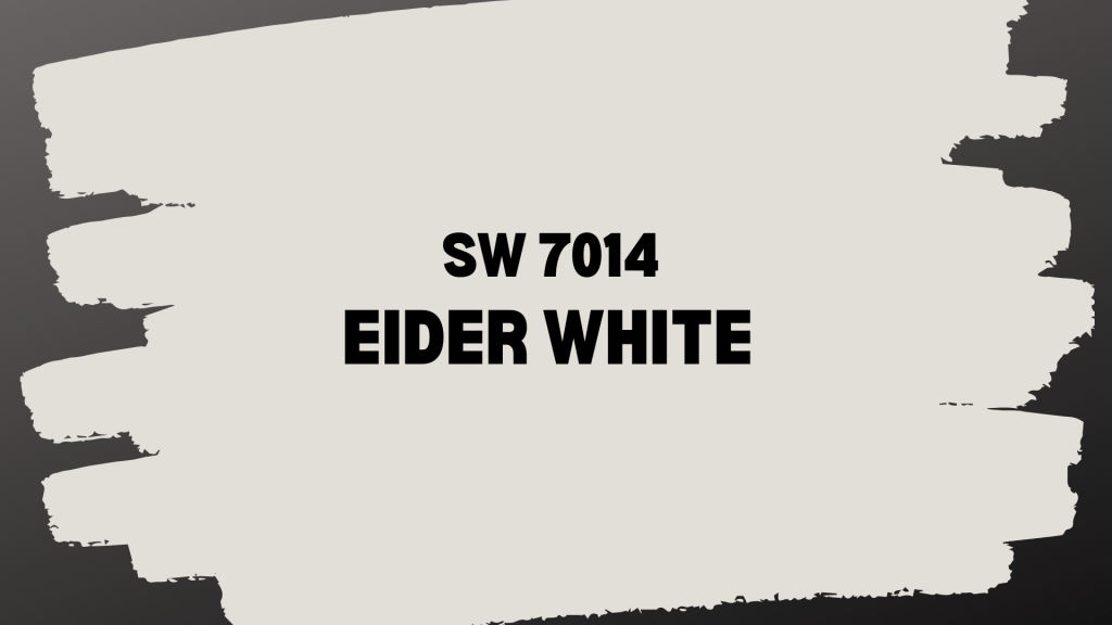
Eider White (SW 7014) by Sherwin-Williams is a go-to paint color for homeowners and designers who want something warmer than stark white but lighter than beige.
It’s a soft, warm off-white with subtle gray and purple-pink undertones that shift depending on the lighting. That’s what makes it so versatile: it looks crisp and fresh in bright rooms and turns cozy in dimmer spaces.
If you lean towards traditional, modern, or farmhouse styles, this color adapts beautifully without overpowering your decor.
With an LRV of 73, it reflects a good amount of light, helping small rooms feel bigger while adding depth in large ones. From walls and trim to cabinetry and exteriors, Eider White offers warmth, balance, and timeless appeal.
In this, you’ll learn its unique characteristics, color pairings, and room-by-room tips to help you decide if it’s the right fit for your home.
What Makes Sherwin-Williams Eider White Special
Eider White fills a specific need in the paint world. It gives you the brightness of white without the harsh, clinical feeling. At the same time, it provides the warmth of beige without making rooms feel heavy or dark.
This color works because it adapts to different lighting conditions. In bright rooms, it looks clean and fresh. In darker spaces, it shows more of its warm, cozy side. This flexibility makes it suitable for use in various rooms and decorating styles.
The magic of Eider White lies in its ability to be both neutral and interesting. Unlike stark whites that can feel cold or beiges that can feel dated, this color offers complexity without being overwhelming.
You can pair it with rich, warm woods and brass accents for a traditional look, or combine it with cool grays and blues for a more contemporary feel.
Eider White Color Details
| SPECIFICATION | DETAILS |
|---|---|
| Color Code | SW 7014 |
| Color Family | Warm off-white |
| LRV (Light Reflectance Value) | 73 |
| Hex Code | #E2DED8 |
| RGB Values | 226, 222, 216 |
| Undertones | Gray with subtle purple-pink |
| Temperature | Warm |
| Best Use | Interior walls, cabinets, and trim |
The LRV of 73 means this color reflects most of the light that hits it. This helps rooms feel bigger and brighter. It’s light enough to work in small spaces but has enough depth to look interesting in larger rooms.
Lighting & Undertones: SW 7014
Here’s what makes Eider White both beautiful and challenging – its undertones. Most people notice the gray base first, but there are also subtle purple-pink undertones that are hidden underneath.
These undertones show up differently depending on your lighting:
In north-facing rooms, the gray and purple tones become more pronounced. You might see hints of lavender or pink on the walls.
In south-facing rooms, the warm qualities take center stage. The color looks more creamy and soft.
Under Artificial Light: Warm LED bulbs (2700K-3000K) help balance the color, making it appear more neutral.
Under Cool Light: Fluorescent or cool LED lights can accentuate the purple undertones.
How to Use Eider White in Different Rooms
Eider White’s versatility makes it suitable for almost any room in your home, but understanding how it behaves in different spaces will help you get the best results.
Living Rooms
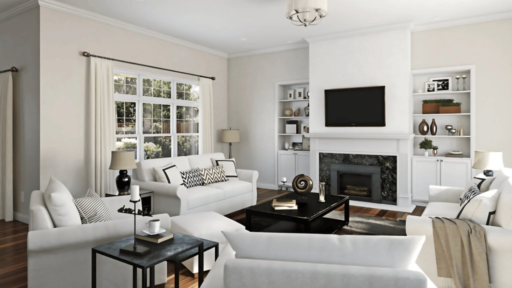
Eider White creates a calm background that complements your furniture and decor. It’s light enough to make the room feel spacious, but warm enough to feel inviting. The color works well with both traditional and modern furniture.
Bedrooms
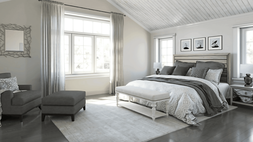
This color helps bedrooms feel peaceful and relaxing. The warm undertones make the space feel cozy without being dark. It’s especially nice in master bedrooms where you want a restful atmosphere.
Kitchens
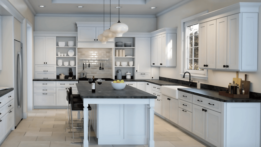
In kitchens, Eider White strikes a good balance. It’s clean enough to feel hygienic but warm enough to avoid the cold, clinical look that pure white can create. It looks great on cabinets when paired with darker wall colors.
Bathrooms
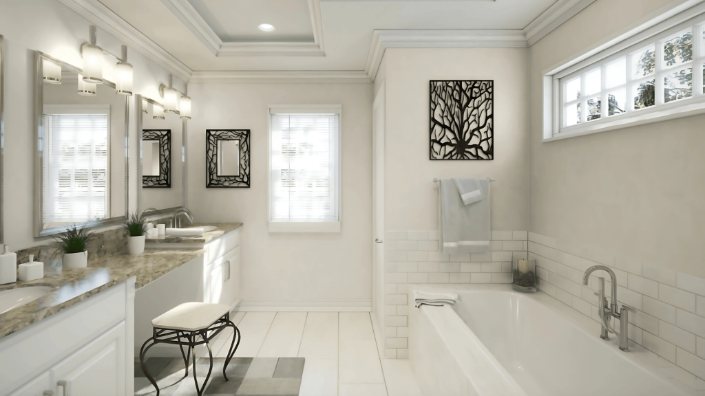
Eider White works well in bathrooms because it reflects light and helps smaller spaces feel bigger. The warm undertones keep the room from feeling cold or harsh, which can be a problem with pure white in windowless bathrooms.
Exterior Use
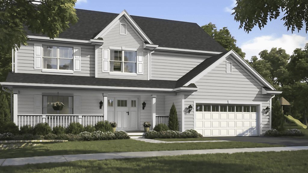
You can use Eider White on house exteriors, but be careful. The subtle undertones that look nice indoors can become more obvious on large outdoor surfaces. Always test it first and consider your roof color, landscaping, and other exterior elements.
Accent Colors That Work Well with Eider White
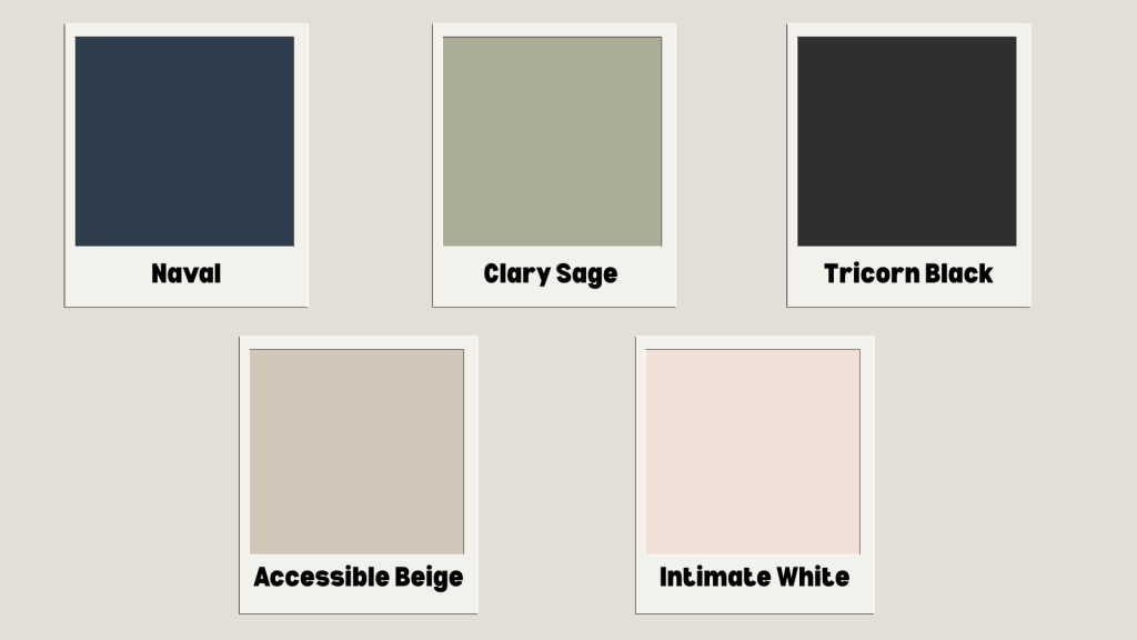
Naval SW 6244 creates a classic, timeless combination with Eider White. The deep blue provides a strong contrast while cool undertones complement Eider White’s subtle purple hints perfectly.
Clary Sage SW 6178 pairs beautifully with Eider White as green complements purple naturally on the color wheel. The earthy, muted sage balances Eider White’s warm undertones seamlessly.
Tricorn Black SW 6258 provides dramatic contrast while maintaining elegance. The deeper gray echoes Eider White’s gray undertones, creating a refined, layered monochromatic look for modern spaces.
Accessible Beige SW 7036 enhances Eider White’s natural warmth without competing for attention. Both colors share similar undertones, creating a harmonious, soothing palette for cozy living spaces.
Intimate White SW 6322pairs surprisingly well with Eider White, echoing the color’s subtle pink undertones. The combination feels gentle and feminine, perfect for bedrooms or nurseries.
Trim Colors That Lift Eider White
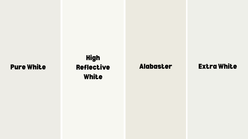
Pure White (SW 7005):The most popular trim choice with Eider White, providing clean contrast without being stark. Pure White’s slight warmth complements Eider White’s undertones while creating definition.
High Reflective White (SW 7757): Offers brilliant contrast while maintaining warmth with slightly more reflectivity than Pure White. Ideal for rooms where you want maximum brightness and a fresh appearance.
Alabaster (SW 7008): Creates a subtle, tonal approach with a layered monochromatic look alongside Eider White walls. Both colors share similar warmth, but Alabaster provides gentle contrast.
Extra White (SW 7006): Provides the crispest contrast with Eider White, perfect for modern and contemporary spaces. The stark white creates clean lines and architectural definition for minimalist aesthetics.
Eider White Comparison to Other Popular Colors
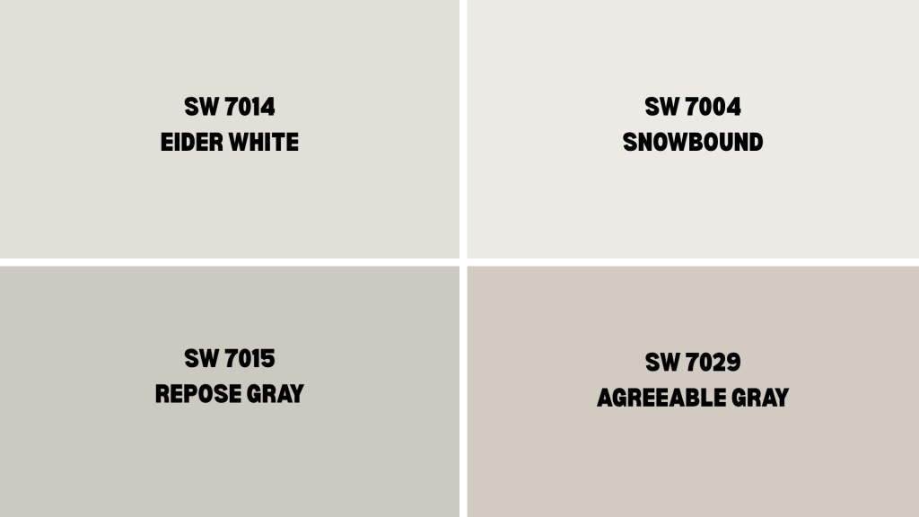
Choosing the right paint color often comes down to comparing similar options. Since Eider White sits in the popular neutral territory, it’s helpful to understand how it differs from other commonly chosen colors.
| COLOR | CODE | LRV | UNDERTONES | BEST FOR | KEY DIFFERENCE |
|---|---|---|---|---|---|
| Eider White | SW 7014 | 73 | Gray with purple-pink | Warm, cozy spaces | Complex undertones, adapts to lighting |
| Snowbound | SW 7004 | 83 | Minimal gray | Modern, crisp looks | Cooler, cleaner appearance |
| Repose Gray | SW 7015 | 58 | Greige (gray-beige) | Dramatic color choice | Darker, more saturated |
| Agreeable Gray | SW 7029 | 60 | Warm greige | Larger rooms | More depth and presence |
Final Thoughts
Eider White is more than just a paint color; it’s a flexible neutral that brings comfort, brightness, and elegance to any room.
If you’re updating your walls, cabinets, or trim, it offers the perfect balance of warmth and softness without feeling too stark or dated.
Just remember, lighting and surrounding finishes play a big role in how it appears. Always test it in your space before making a decision.
Thinking of using Eider White in your home? Bookmark this guide or share it with your painter or designer.
And if you’ve already used it, leave a comment with your experience; we’d love to know how it worked in your space.