
Why Your Green Paint Looks Blue (and How to Get Your Sanity Back)
You picked a green. A beautiful green. You stood in the paint aisle under those weird store lights, squinted like a professional color critic, and confidently said, “Yes. This one.”
And now your walls look… blue. Like “did I accidentally paint my living room the color of a pool noodle?” blue.
If this is you, welcome. I have been here. (I once painted a bedroom what I swore was a soft, calming sage, and it promptly turned into “dental office aquarium.” I lived with it for two weeks purely out of spite.)
The good news: most of the time, your paint isn’t “wrong.” It’s just doing what paint does reacting to undertones, light, and everything else in your room that’s quietly influencing it like a bad group project.
Let’s break down why it happens and what you can do before you go full repaint rage.
The real culprit 80% of the time: undertones (aka paint’s secret agenda)
When a green paint looks blue, it’s usually because it was always a little blue… you just didn’t meet that side of it in the store.
Paint companies create “green” by mixing different tints, and those tints tend to fall into three camps:
- Blue based greens: these are the “sea glass,” “coastal,” “spa day,” “Palladian whatever” greens. In the right light they’re gorgeous. In the wrong light they’re basically turquoise having an identity crisis.
- Yellow based greens: olive, sage, forest, khaki leaning greens. These tend to stay green more reliably in real homes.
- Gray based greens: can be pretty and sophisticated… and also very, very willing to slide into blue gray the second your room gets even a whiff of cool light.
And here’s the kicker: two paint chips can look nearly identical at the store, but the undertones are totally different. Store lighting is like a dating profile photo technically accurate, but not the full story.
Also: your biggest “non paint” surfaces are snitching on you. Floors, countertops, fireplaces, tile anything big and permanent will pull certain undertones forward. A green with a blue undertone next to cool gray tile? Hello, blue. A cool green next to honey oak? It can start looking even cooler by comparison.
Undertone is the foundation… but lighting is the loud friend that shows up and makes everything weirder.
Lighting: the reason your walls change personalities all day
If you’ve ever thought, “It looked fine yesterday but today it’s blue,” you’re not imagining things. Paint shifts constantly depending on light.
Here’s the quick and dirty version:
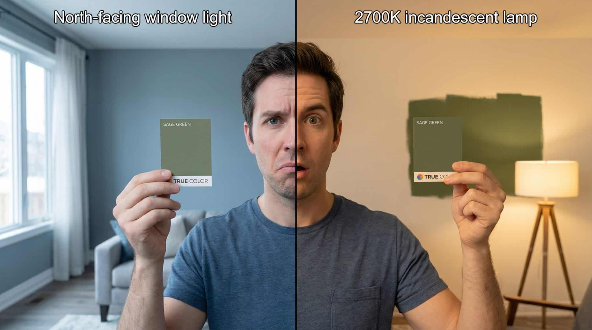
- North facing rooms = cooler, bluer light most of the day → blue undertones get stronger.
- South facing rooms = warmer, brighter light → colors look more “true” and behave better.
- East facing = warm in the morning, cooler later.
- West facing = kind of blah earlier, warm/glowy later.
Now add bulbs, because bulbs love drama.
If you’re using cool white bulbs (around 4000K-5000K), they’ll amplify blue/gray undertones like it’s their job. If you swap to warm white (around 2700K), a lot of “why is this blue?!” panic magically calms down.
This is also why paint can match perfectly under one light and look totally different under another. There’s a science word for it (metamerism), but I just call it “paint being a little liar.”
The sneaky saboteur: your stuff (yes, even your rug)
Even if the paint color is technically “green,” your room can bully it into looking blue.
A few common troublemakers:
- Cool gray floors or carpet reflecting onto the walls
- Blue or blue gray textiles (rugs, curtains, sofas) that bounce color back onto the paint
- Very bright, cool white trim that makes the wall look cooler by comparison
- Shinier paint finishes (satin/semi gloss) that bounce more light around and make undertones louder
Also: an empty room makes paint look unhinged. When there’s nothing else to look at, the walls are basically yelling. Once you add warm furniture, art, wood tones, and textiles, that same color often chills out.
So before you declare the paint a failure, let’s do a few quick tests.
The 3 “don’t spend money yet” tests (takes 10 minutes, saves your soul)
You don’t need fancy tools. You need daylight, your eyeballs, and maybe a white sheet you’re not emotionally attached to.
1) Undertone check (midday is best)
Stand in the room around midday and really look at the color.
- If it’s reading teal/turquoise, you’re dealing with a blue based green.
- If it’s reading olive/khaki, it’s likely yellow based.
- If it’s reading sage y but kind of slate ish, it might be gray based (often with a blue pull).
2) Time of day check
Look at the walls:
- morning
- midday
- late afternoon/evening
If it swings (blue in the morning, greener later), lighting is a major factor. If it looks blue all day long, that’s usually undertone.
3) Context check (my favorite weird trick)
Temporarily neutralize what’s reflecting color:
- Throw a white sheet over the floor (or a big rug) for a day
- Or move one big item that’s close to the wall (a navy chair, a cool toned dresser, etc.)
If the wall suddenly looks less blue, congratulations: your room decor has been quietly messing with you.
Bottom line:
If it reads blue in every condition, you’re probably not fixing this with a pillow. If it changes throughout the day, you’ve got options.
Fix it without repainting (or at least try, because repainting is a whole thing)
Before you grab a roller and lose an entire weekend, try these in this order:
1) Do the free resets first
- Pull dark/cool furniture a few inches away from the walls (yes, really)
- Temporarily remove art or decor with blue/purple tones
- Open window coverings during the day
- Live with it for 3-5 days (your eyes adjust sometimes you just need to stop staring at it like it owes you money)
2) Swap your bulbs (the fastest “why didn’t I do this sooner” fix)
If you’re using cool white LEDs, swap to 2700K warm white in the room.
I know, people always want the “perfect paint color” answer, but lighting is half the battle. Warm bulbs often pull a green back from the brink of “why is this bathroom the color of glacier water?”
3) Add warm tones near the walls
You’re basically giving your brain something else to read as “warm,” so the paint stops skewing cool.
Try:
- cream, beige, camel, rust, warm wood tones
- brass/gold frames
- warmer textiles (even one throw pillow can help, annoyingly enough)
4) Consider the trim (if it’s icy white)
Cool bright white trim can make a green wall look colder. Sometimes painting trim a softer cream or a warm greige shifts the whole balance without touching the walls.
Is painting trim fun? No. Is it sometimes easier than repainting an entire room? Also no. But it can work.
When you should just repaint (because life is short)
If you’ve:
- warmed up the bulbs,
- adjusted the decor,
- given it a solid couple weeks…
…and it still reads blue in every light? That paint is telling you who it is. Believe it.
When you repaint, here’s what I’d do to avoid round two of this nonsense with an SW 6195 color review:
- Choose a more neutral or yellow leaning green (especially in north facing rooms)
- Plan on two coats
- Use a good primer if you’re making a noticeable shift (or if the existing color is strong)
A typical DIY room repaint is usually a “half a Saturday plus the emotional recovery” kind of project. Totally doable just annoying.
How to pick a green that actually stays green next time
I’m going to save you from the “tiny sample swatch taped to the wall” trap, because it lies.
Do the foam board test (yes, it’s worth the extra step)
Paint your sample on white foam board (two coats), then move it around the room:
- next to the flooring
- near the trim
- in the darkest corner
- in the brightest light
Check it morning, midday, and evening under your actual bulbs.
If you test it on the wall, the surrounding colors influence it immediately, and you’re back in the undertone funhouse.
Ask one question at the paint counter
Ask: “Is this a blue green or a yellow green based on warm vs cool undertones?”
If they can’t answer, look at the color family/name and trust your instincts:
- Words like seafoam, aqua, coastal, mist, spa, lagoon? Usually a blue pull.
- Words like olive, moss, fern, thyme? Often more yellow/earthy.
(Brand names are not a guarantee, but they’re often… a hint.)
Match the green to your “bossy” fixed finishes
Your floors and tile do not care about your dreams. They will influence everything.
- Warm wood floors usually play nicest with yellow undertone greens
- Cool gray tile/floors often do better with true greens or gray greens (but be careful with blue greens they go sideways fast)
If you’re still stuck: yes, a color consult can be worth it
If you’ve repainted once already and still hate it, or you have multiple rooms connecting with different light exposures, getting a pro set of eyes can save you money in the long run.
Because nothing is more expensive than “paint was on sale” followed by “paint was a mistake.”
The takeaway (because you’ve got better things to do than argue with a wall)
If your green looks blue, it’s usually one of three things:
- The undertone was blue/gray leaning all along
- Your light (windows or bulbs) is making it skew cool
- Your floors/decor/trim are reflecting cool tones back onto it
Run the quick tests, try the bulb swap, warm up the context… and if it’s still blue no matter what, repaint with a more neutral or yellow leaning green and move on with your life.
And if you need permission to stop second guessing yourself: you are not “bad at color.” Paint is just an overdramatic little shape shifter.