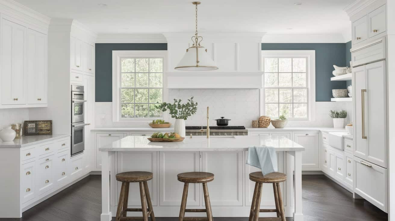

Staring at white cabinets while holding paint samples can leave you second-guessing every color choice.
Most homeowners feel overwhelmed when selecting wall colors for white cabinets. With countless paint options available, it’s easy to worry about picking the wrong shade that clashes with your kitchen’s style or makes the space feel off-balance.
The right wall color can make your white cabinets shine while creating the exact mood you want in your kitchen. You don’t need expensive renovations or design experience to get professional-looking results.
This guide reveals proven paint colors that work beautifully with white cabinets. You’ll learn how lighting affects color choices, why undertones matter, and how to create the perfect contrast for your space.
Whether you prefer calm and cozy or bold and modern, you’ll find colors that transform your kitchen into the space you’ve always wanted.
Why Wall Color Is Essential with White Cabinets?
White cabinets create a clean foundation, but they need the right wall color to reach their full potential. Without proper color support, your kitchen can feel flat, cold, or incomplete. The wall color you choose determines whether your white cabinets look expensive or cheap.
Key reasons wall color matters:
- Creates visual balance – Prevents the all-white look from feeling sterile or hospital-like
- Defines the space – Helps separate kitchen areas and creates clear boundaries
- Sets the mood – Cool colors create calm feelings while warm tones make spaces cozy
- Highlights cabinet details – The right contrast makes cabinet doors, trim, and hardware stand out
- Reflects your style – Shows whether your kitchen feels traditional, modern, or farmhouse
- Affects room size – Light colors make small kitchens feel bigger; darker shades add intimacy
13 Beautiful Paint Colors to Complement White Cabinets
Lets have a look on these exeptionally beautiful paint colors list for white cabinets:
1. Benjamin Moore Dove White – Oc-17

This clean white carries subtle gray undertones that keep it from feeling stark. It works beautifully as a wall color with white cabinets for a soft, unified look.
Pair Dove White with dark hardware or countertops to create visual interest. The gentle gray hints help bridge light and dark elements in your kitchen design.
2. Benjamin Moore Simply White – Oc-117

This soft, creamy white brings subtle warmth to any kitchen. Its yellow base brightens spaces with limited sunlight, making dark corners feel more open.
Simply White pairs well with nearly all cabinet tones. It creates a gentle backdrop that lets other kitchen elements stand out. Use this shade when you want a bright, fresh look without the harshness of pure white.
3. Benjamin Moore Cloud White – Oc-130

This classic creamy white offers a soft, warm glow on your kitchen walls. Cloud White has mild yellow undertones that bring comfort to your space.
It fits perfectly in traditional and transitional kitchens, adding character without being overwhelming. The warmth makes wood tones and brass fixtures look their best. For modern spaces, however, its creaminess might clash with cooler, crisper design elements.
4. Benjamin Moore Chantilly Lace – Oc-65

This pure white has almost no color undertones, making it exceptionally clean and bright. Chantilly Lace stays true in any light, with no surprise hints of pink, blue, or yellow appearing.
It works with any kitchen style, from farmhouse to sleek modern. The clean white creates a blank canvas that allows your cabinet details, hardware, and accent pieces to take center stage. Its clarity brings a fresh feel to your space while still feeling warm enough for comfort.
5. Benjamin Moore Paper White – Oc-54

This airy white carries subtle blue-gray undertones that give walls a cool, fresh feel. Paper White creates a gentle contrast with pure white cabinets, adding depth without strong color.
It shows best in rooms with good natural light, where you can appreciate its soft complexity. The cooler tone pairs exceptionally well with nickel and black hardware, highlighting these metal finishes. In north-facing kitchens, be aware it might feel slightly cooler than expected.
6. Sherwin-Williams Alabaster – SW 7008

This neutral creamy white brings gentle warmth to kitchen walls. Alabaster isn’t stark or cold but rather offers a soft glow that makes spaces feel welcoming.
It creates a perfect backdrop for white cabinets by adding subtle depth without contrast. The warmth in Alabaster helps all colors look their best, from cool blues to warm woods. Your kitchen will feel cozy yet clean, with a timeless quality that works year-round.
7. Sherwin Williams Origami White – Sw 7636
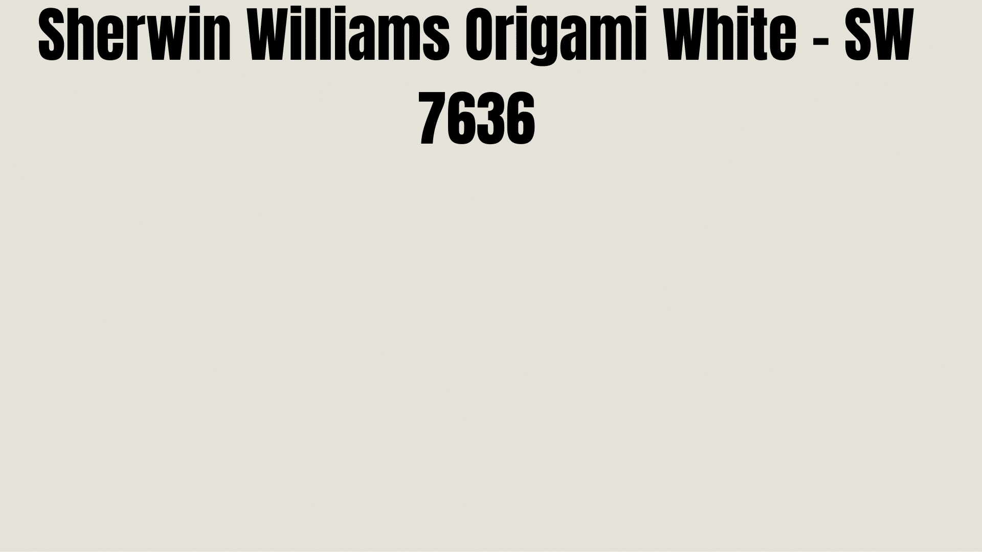
This warm white contains subtle gray-beige undertones that add depth to your walls. Origami White sits between true white and light gray, giving your kitchen softness and character.
The hint of warmth prevents it from feeling cold, while the gray notes keep it from being too creamy. With white cabinets, it creates a layered, refined look. The color shifts slightly throughout the day, adding visual interest as the lighting changes.
8. Sherwin Williams Pure White – Sw 7005
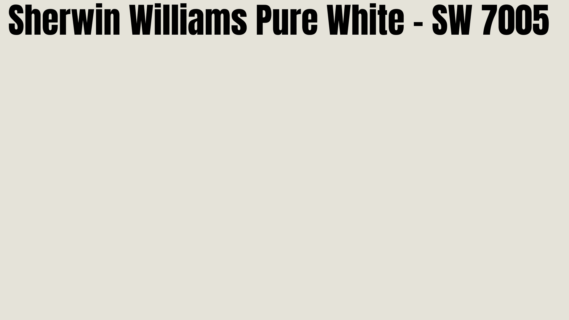
This bright, clear white reflects light beautifully with almost no color undertones. Pure White stays true in most lighting conditions without shifting to pink, yellow, or blue.
It creates a clean, fresh backdrop for white cabinets of any shade. The brightness opens up small spaces and makes darker kitchens feel larger. When you want a simple, crisp look that feels open and airy, Pure White delivers without feeling stark or cold.
9. Sherwin Williams Snowbound – Sw 7004

This cool white carries gentle greige undertones that add subtle depth to your walls. Snowbound creates a soft, misty background that feels both fresh and grounded.
It works especially well with cool greens, blues, and sandy tones in your kitchen accents. The hint of gray prevents it from feeling too stark.
10. Farrow & Ball All White

This true white has no added pigments, creating a pure, clean backdrop. Despite its lack of color undertones, All White feels soft rather than stark.
It makes an ideal wall choice when your kitchen features deep-colored accents or art. The clean canvas lets these elements shine without competition.
11. Farrow & Ball Castle Gray
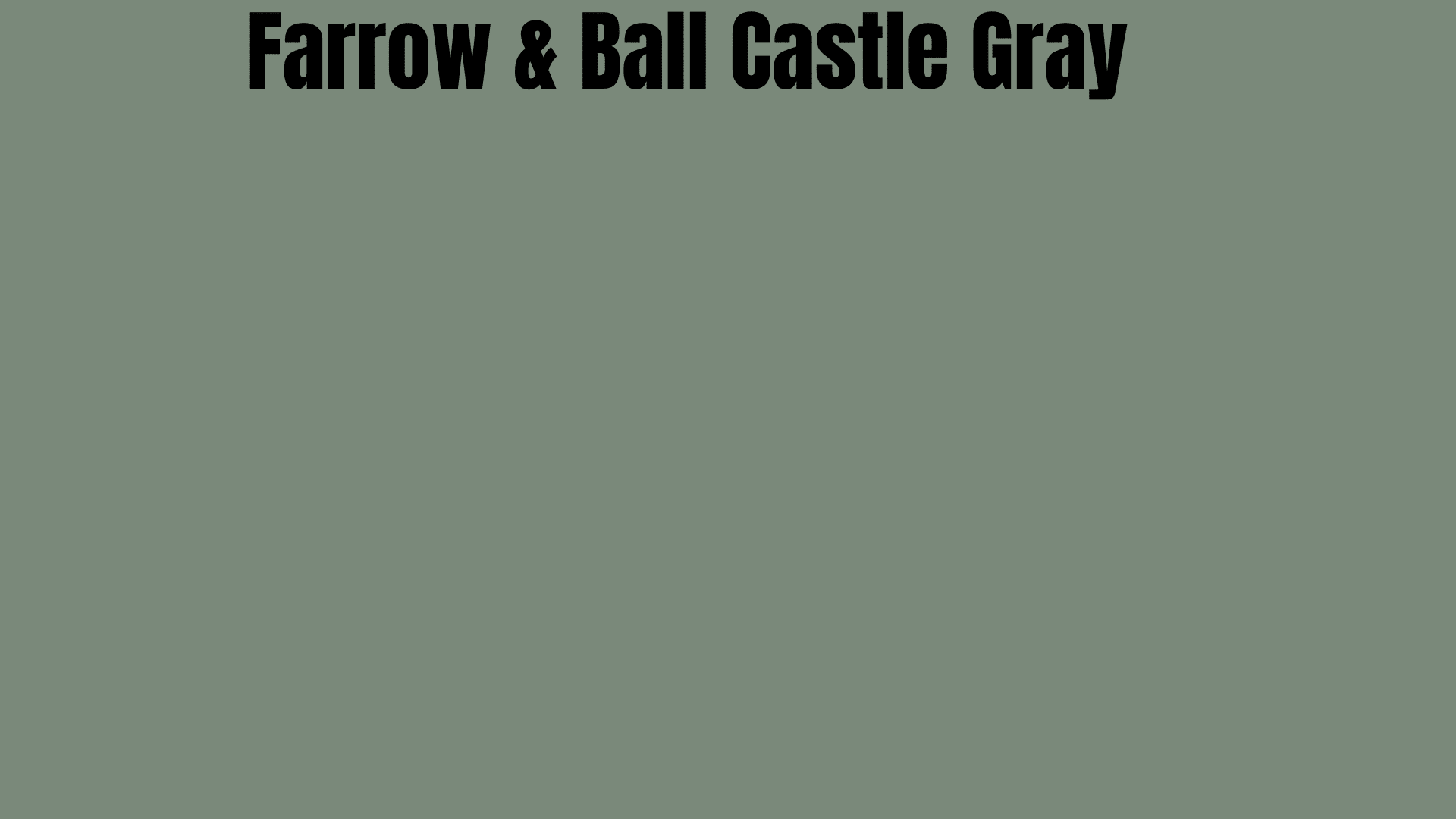
This green-gray hue brings earthy warmth and natural charm to your kitchen. Castle Gray, with its soft, muted quality, offers a perfect background for cottage-style spaces.
It works surprisingly well in kitchens with lower ceilings, as the color draws the eye without feeling heavy. Against white cabinets, it creates a rich contrast that highlights cabinet details.
12. Benjamin Moore Fog Mist
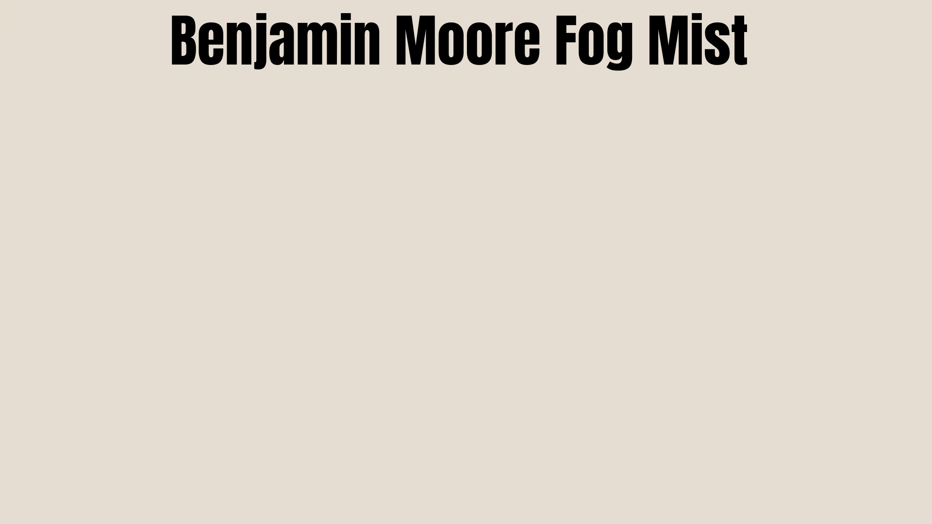
This soft off-white has a gentle, warm tone that feels cozy and welcoming. Fog Mist isn’t bright white or beige but sits perfectly in between with just a hint of warmth.
It shines in traditional farmhouse kitchens, especially those with texture from shiplap or wooden beams. The subtle color lets architectural details stand out while maintaining a light, open feel. With white cabinets, it creates a layered look that adds depth without obvious contrast.
13. Benjamin Moore Love & Happiness

This soft, warm pink hue brings a gentle blush to kitchen walls. Love & Happiness offers just enough color to add personality without taking over the space.
It works wonderfully in small kitchens or narrow galley layouts where stronger colors might feel overwhelming. Against white cabinets, this light pink creates a subtle, cheerful contrast that brightens the room.
How to Create Contrast and Depth?
The right contrast level can make or break your kitchen design. Finding the perfect balance depends on your kitchen size, lighting, and personal style preferences.
1. Bold Colors for Drama
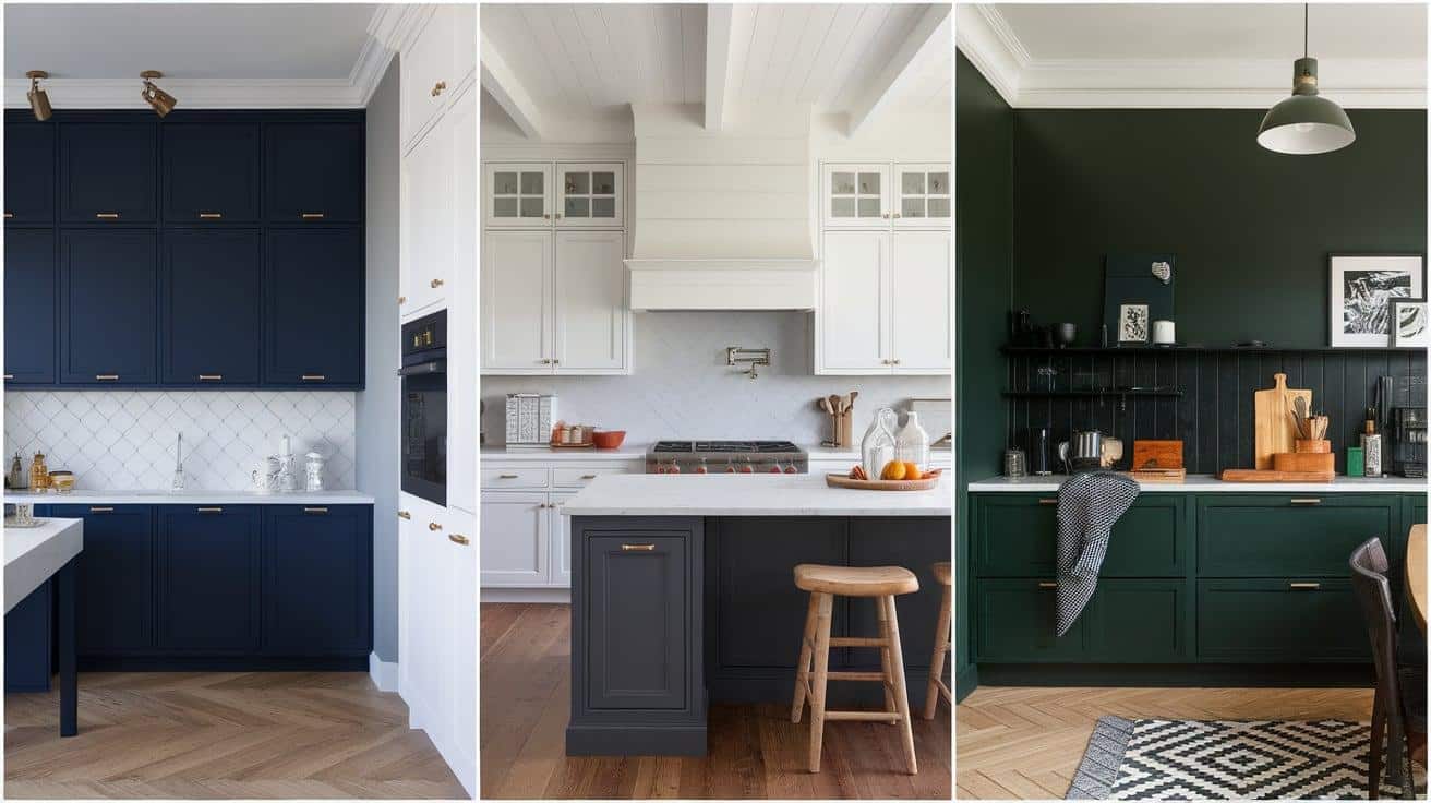
- Navy Blue: This creates a striking contrast with white cabinets, making them pop and adding a focal point.
- Charcoal Gray: This deep color grounds the space, allowing white cabinets to stand out in a clean, bold way.
- Dark Green: Pairs beautifully with white, bringing nature’s calm Into the kitchen. Works well in both large and small spaces.
- Tip: These bold colors work best with abundant white cabinetry to balance the space and reflect light.
2. Subtle Contrast
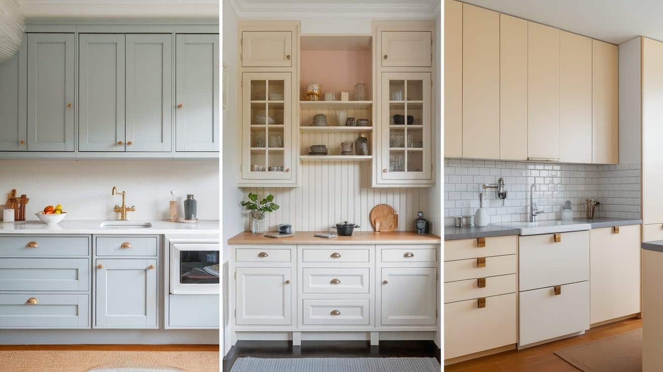
- Light Gray: Soft contrast that defines the cabinets without overwhelming the Space. It adds a calm, cohesive feel.
- Soft Beige: Warmth without strong statements, keeping the kitchen relaxed and welcoming while making white cabinets look crisp.
- Off-White: Minimal contrast that creates depth with slight tone variations. It is ideal for smaller kitchens where too much contrast could feel chaotic.
- Tip: In subtle contrast spaces, details like hardware and lighting become key design features.
Kitchen Paint Idea for a Calm and Clean Look
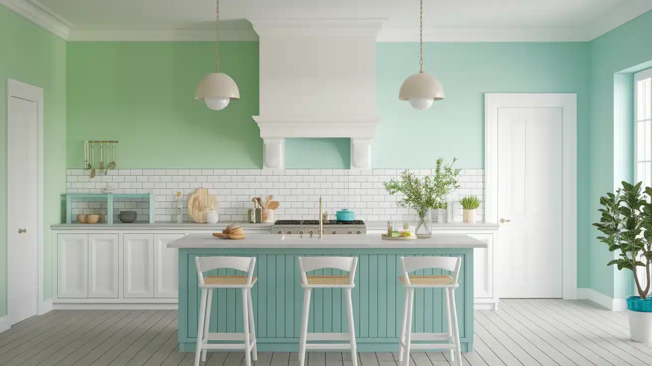
Soft Greens and Blues
Gentle green and blue shades make kitchens feel peaceful. They work well in spaces where you want to feel at ease while cooking. Soft mint walls next to white cabinets create a fresh, clean look that never feels cold.
These colors bring nature indoors without being too strong. They fit nicely in both small and large kitchens. The contrast with white cabinets is noticeable but not harsh.
Pro tip: Choose lighter green or blue tones if your kitchen has limited natural light. Darker shades work best in rooms with large windows.
Aqua Tones for a Fresh Touch
Seafoam and turquoise hues add a water-like quality to kitchen walls. Next to white cabinets, they create a space that feels open and airy.
These shades suit homes with beach or island themes. The color pairing feels clean but with more character than plain white walls.
Best for: Coastal homes, breakfast nooks, or kitchens that connect to outdoor spaces.
Monochromatic White for a Sleek Look
White walls with white cabinets create a clean, open space that feels larger than it is. This choice works well with simple lines and uncluttered counters. Add texture through items like wooden cutting boards or metal fixtures to keep the all-white space from feeling flat.
Key elements: Use different white shades with varying undertones to create subtle depth without adding color.
Graphite or Charcoal for Bold Statements
Dark gray walls make white cabinets stand out clearly, creating a strong visual impact. This high-contrast look fits well in kitchens with plenty of natural light. The rich background helps small details on white cabinets become more visible.
Best practice: Balance dark walls with light countertops and good lighting to prevent the space from feeling too heavy.
Conclusion
Your white cabinets are waiting for the perfect wall color to make them shine. The paint colors we’ve covered offer options for every style, from soft whites that create gentle contrast to bold charcoals that make a statement.
Remember to test samples on your actual walls, check colors in different lighting throughout the day, and match undertones between your cabinets and wall paint. What looks perfect in the store might surprise you at home.
Your kitchen’s lighting, size, and style all influence which color will work best. Take time to consider how each shade fits with your countertops, flooring, and overall home design.
Start with samples of two or three colors that caught your attention. Live with them for a few days before making your final choice.
The right wall color will redesign your kitchen into a space that feels perfectly suited to you and your family’s daily life.