
You know that feeling when you pick the perfect paint chip, you commit, you paint the whole room… and then you stand there staring at the wall like it just texted “k” and left you on read?
Yeah. Been there. More than once. (I wish I could blame it on “bad paint,” but no. It was me. And the lighting. And a little two digit number I used to ignore.)
That number is LRV and it’s the quiet chaos gremlin behind a whole lot of “why does this look weird at home?” moments.
Consider this your wall color’s vibe check.
So what is LRV (and why should you care)?
LRV = Light Reflectance Value. It’s a 0-100 scale that tells you how much visible light a paint color reflects.
- 0 = pure black (basically eats light for breakfast)
- 100 = pure white (bounces light like a disco ball in a gymnasium)
- LRV 50 reflects about half the light that hits it
Why it matters: your eyeballs see reflected light, not “paint in theory.” So if you paint a room with an LRV 35 color, you are choosing a color that reflects about 35% of the light available in that space. In a dim room, that can feel… dramatic. In a bright room, it can feel deliciously cozy.
Here’s the catch: LRV doesn’t tell you undertone
A teal and a greige can share the same LRV and look absolutely nothing alike. Because LRV tells you how light, not what kind of light.
Undertone is the sneaky part:
- Warm undertones (yellow/red) can feel richer/heavier especially under warm bulbs.
- Cool undertones (blue/green) can look cleaner… or go weirdly gray if the room is dim.
LRV tells you “how light.” Undertone tells you “what kind of light.” You need both, but LRV is the fastest way to stop auditioning 27 nearly identical off whites like you’re casting a Netflix show.
The only LRV “categories” you actually need (three. That’s it.)
I like to break LRV into three zones because my brain refuses to memorize 900 paint rules.
1) The Dark & Moody Zone: LRV 0-40
These colors absorb more light than they reflect, which is why they look so good in inspiration photos… and can look like a stylish cave in your real house if you don’t have enough lighting.
- LRV 0-20 (navy/charcoal/near black) is usually best as an accent unless your room is bright and you’re committed to the vibe.
- If your lighting is weak, dark walls will absolutely bully it.
Dark paint is fabulous. Just don’t forget to feed it light.
2) The Chill Middle Zone: LRV 40-55
This is my “safe but not boring” range. It’s balanced, it’s grown up, it’s the friend who shows up on time and works for a soft muted green shade.
Great for bedrooms and living spaces when you want calm without “dungeon.”
3) The Bright & Airy Zone: LRV 55+
These reflect more than half the light that hits them, so they’re the go to for “make it feel bigger,” “why is this hallway so sad,” and “I can’t add another lamp without it looking like a lamp store.”
- LRV 55-72 is bright without being blinding
- True whites often land around 82-94 and will bounce the most light
And yes, bright paint can still look wrong if the undertone fights your lighting. Paint is nothing if not dramatic.
The 5 point rule (aka: stop torturing yourself)
Most people can’t reliably see a difference of less than about 5 LRV points once paint is on the wall.
So if you’re comparing:
- White A: 82
- White B: 83
…congrats, you’ve found the same color in a slightly different outfit. Pick one and move on with your life.
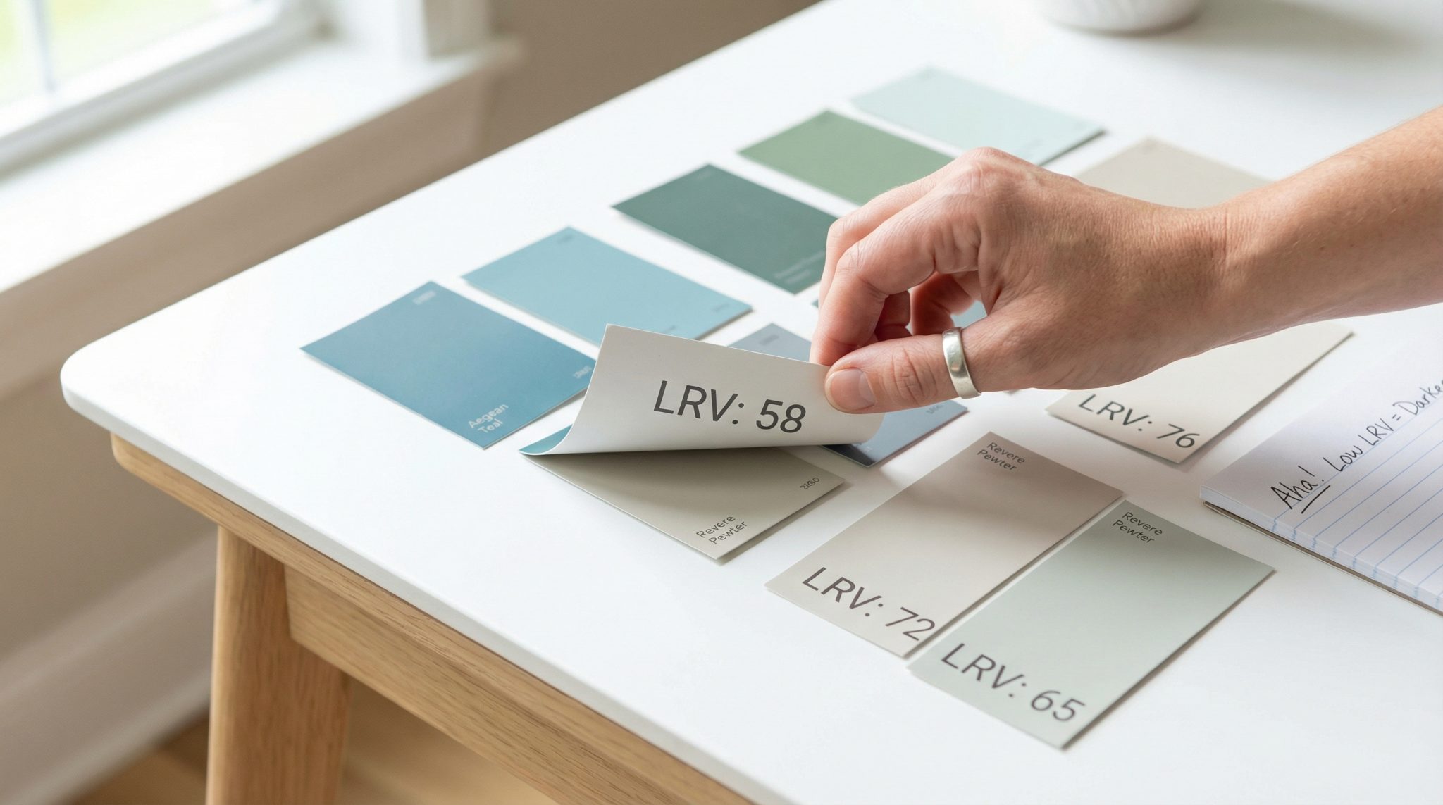
Where to find LRV (because it’s hiding on purpose)
Flip the paint chip over. Seriously.
The front is the “pretty marketing face.” The back is where the useful numbers live.
- On a physical chip or fan deck: usually printed on the back
- Online: most major paint brands list it on the color’s detail/spec page
If you truly can’t find it, the manufacturer can tell you. Every modern paint color has an assigned LRV somewhere in its paper trail.
Once you’ve got the number, you’re not guessing you’re choosing.
The part nobody tells you: your room’s light is moody
LRV stays the same. Your light does not. Your light is out here having feelings.
Here’s the quick and dirty version:
- North facing rooms: cool, indirect light = colors often read darker and a little grayer. If your room is north facing and you want it brighter, start looking around LRV 60-85.
- South facing rooms: strong light = colors can wash out. Mid range colors (LRV 50-70) usually behave really nicely here.
- East/west facing rooms: the light changes a ton throughout the day. These rooms are the reason paint testers exist.
- Windowless rooms: it’s all artificial light, baby. Even a high LRV white can look flat if your fixtures are weak.
Also: the wall farthest from the window will almost always look darker. That’s not you failing at paint. That’s physics doing physics things.
Finish matters more than you think (yes, even with the same color)
LRV is based on pigment, but sheen changes how light bounces and choosing the right sheen matters.
- Flat/matte tends to make colors look a bit deeper because it absorbs more light
- Eggshell/satin is usually closest to “what you expected”
- Semi gloss/gloss reflects more light and can make a color appear a little lighter (and shinier, obviously)
So if you picked a gorgeous deep color and it feels too heavy in matte, try it in satin. Or if your white feels too bright and glaring, matte can soften it just don’t do that in a dim room and then act surprised when it looks… tired. (Ask me how I know.)
My no drama paint picking order (do this, not vibes only)
If you want fewer do overs, do it in this order:
- Check the LRV (before you fall in love)
- Pick a zone based on the room’s light (north vs south, etc.)
- Narrow by undertone (warm vs cool, and what your floors/cabinets are doing)
- Choose your finish (because it will change the look)
- Test like you mean it (the step people skip, and then regret loudly)
Testing paint the right way (no, a tiny chip is not “testing”)
If you skip testing, you’re basically raw dogging a relationship with a color that might ruin your week.
Here’s what actually works:
- Paint a big sample. At least 24″ x 24″. Bigger if you can. Tiny samples lie.
- Test on multiple walls: one bright wall, one darker wall, and at least one wall that gets mostly artificial/bounced light.
- Check it at different times:
- morning
- midday
- late afternoon
- nighttime under your actual bulbs
- Live with it 24-48 hours. Your first impression is not always your final opinion.
If the color swings wildly (gorgeous at noon, depressing at night), the LRV is probably wrong for that space or the undertone is picking fights with your lighting.
Quick fixes for the most common “why does this look awful?” moments
“My bright paint (75+) looks dingy.”
That’s usually lighting, not paint. If your bulbs are very warm and/or too dim, even an LRV 80 wall can look flat.
If you want a cleaner, brighter look, try cooler bulbs (around 4000-5000K) and make sure your fixtures put out enough light. If you hate cooler light, keep warmer bulbs and choose a paint undertone that behaves nicely in that warmth.
“It looked perfect at the store and weird at home.”
Stores often have cooler, harsher lighting than most homes. Your warm living room bulbs can pull out undertones you never saw on the chip. Testing at home fixes this instantly.
“My off white looks yellow/gray/purple/like sadness.”
Welcome to undertone. Swap bulbs or swap paint. (Sometimes it’s easier to change a bulb than repaint a whole room. I don’t make the rules, I just learn them the hard way.)
“It looks different on opposite walls.”
Normal. Directional light is doing its thing. If you want more uniformity, go a little higher LRV (or accept that your house is not a photography studio).
One exterior note: vinyl siding has rules (and it’s not being dramatic)
If you’re painting vinyl siding, you generally need LRV 55 or higher not because the design police said so, but because dark colors can absorb heat and cause warping/cracking.
Always check your manufacturer’s guidelines. Vinyl doesn’t do “moody charcoal.” Vinyl does “I have expanded into a new personality.”
A tiny cheat sheet of popular whites (because you’ll ask me anyway)
These are common starting points people love (always test in your space, etc.):
- Benjamin Moore Chantilly Lace (LRV ~92): bright, crisp, great for darker rooms/hallways
- Behr Whipped Cream (LRV ~91): warm-ish, friendly, easy in open spaces
- Benjamin Moore White Dove (LRV ~83): balanced warmth, classic for a reason
- Sherwin-Williams Greek Villa (LRV ~82): soft warm white that usually behaves
- Sherwin-Williams Creamy (LRV ~81): warm and cozy, can glow under warm bulbs
- Sherwin-Williams Rock Bottom (LRV ~7): gorgeous, but you’d better have lighting (accent wall energy)
(And remember: if two whites are within a couple LRV points, undertone is what you’re really choosing.)
Your next move (do this right now, actually)
Grab the paint chips you’ve been hoarding “for later,” flip them over, and look at the LRV.
Pick your zone based on your room’s light, narrow by undertone, and test a big sample like a responsible adult who doesn’t want to repaint next weekend.
That tiny number can save you from a big mistake.